
Adobe’s Pantone Colors Fade to Black: Users Turn Rubine Over Removal of Libraries from Creative Cloud 2023
Everything you need to know about what's happening with Pantone colors in Adobe software.
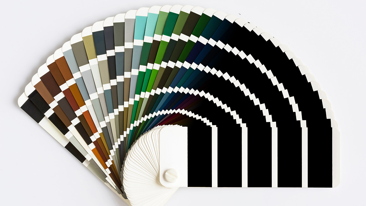
When you fire up the 2023 version of InDesign, the new artwork on the splash screen shows an eye-catching drawing of a color matching guide of bright colors—an ironic theme, given the shoes that have dropped in Adobe’s slow-motion breakup with Pantone in the past year and the changes in the software that users are now starting to see. 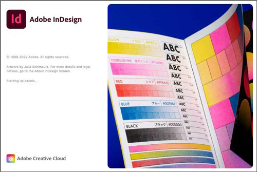 Even with months of warning that changes were in the offing, users opening an existing duotone in the new release of Photoshop found themselves shocked by a dialog box that reads, “This file has Pantone colors that have been removed and replaced with black due to changes in Pantone’s licensing with Adobe.”
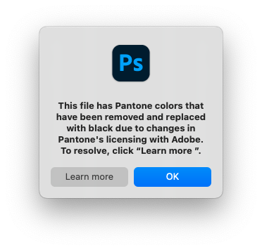
When you open a Photoshop file with a spot color channel that uses a Pantone color, you’re met with a terrifying dialog box.
Not long after the software’s release, Iain Anderson, a multidisciplinary creative professional in Australia, posted a tweet with an image of the message and a warning to Adobe users about the change. Anderson’s message went viral on Twitter, generating 18,000 retweets and inspiring a hair-on-fire conversation among Twitter users, whose views on the subject ranged from terror about the fate of their legacy files to white-knuckled fury about the principle of Adobe removing features from software.
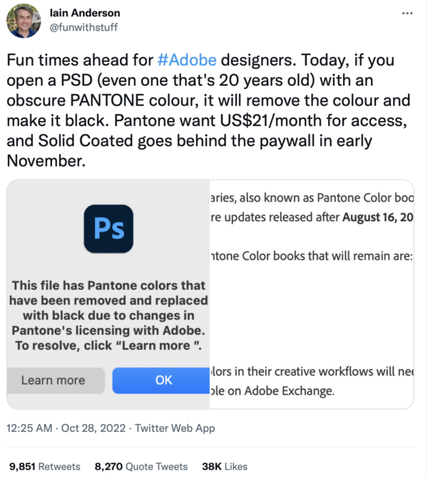
Iain Anderson’s tweet warning designers about the Photoshop changes went
viral.
The upshot is that users who want to continue to have access to the Pantone libraries unabated will need to subscribe to Pantone Connect, the company’s separate monthly subscription service ($14.99 per month or $89.99 per year U.S.; pantone.com/pantone-connect)—a price that has increased by 88% since January. At least on Anderson’s Twitter thread, that bottom line has reignited user backlash about Adobe’s Creative Cloud subscription model, which has been in effect for almost a full decade.
Changes, Explained
According to the help documents linked to the dialog boxes, after November, the only color libraries that will remain will be Pantone + CMYK Coated, Pantone + CMYK Uncoated, and Pantone + Metallic Coated. The remaining color books have already disappeared from Illustrator, and they now appear as subfolders in “Legacy Swatches,” a new folder in Photoshop’s swatch libraries. There, you can see the swatches but can’t use them. In practice, Adobe won’t touch your existing files, which should continue to work without modification. But the consequences of the change can still be jarring True to the warning, when you open a legacy Photoshop file with a Pantone-color-defined monotone, a duotone, a tritone, or another type of spot color channel, such colors will appear not in their original hues but as the default Photoshop black (#000000 hex, or 75C/68M/67Y/90K). Import that image into InDesign—even the 2023 version—and it will separate into spot colors as expected, with the original color intact. On importing an image file with a spot color placed into InDesign, that color will also appear in the Swatches panel as expected. But the swatch can no longer be edited. When opening a legacy file with Pantone spot colors in Illustrator, you’ll encounter a blue warning banner: “Some Pantone colors may no longer be available due to changes in Pantone’s licensing with Adobe.” In a YouTube video follow-up to his tweet, Anderson elaborated on his warning in a screencast. “Now, to be fair, most people won’t work like this very often, but it’s not an uncommon workflow in packaging,” Anderson said as he demonstrated a spot color channel opening as black. One user pointed out the havoc that these changes will create in a screen printing environment. “Shop I work at uses solid coated books for all our film outputs, Illustrator, and Photoshop,” the Twitter user wrote. “This is going to make confirming accuracy of a print’s design prior to garment application a damn nightmare.”
So—What to Do?
Judging from some of the responses to Anderson’s tweet, a number of Adobe customers are not conversant in what Pantone spot colors actually are. And as such tweets get traction outside the realm of graphic design, prepress, and printing, they command the attention of writers who likely have never encountered the terms “spot color” or “separation.” Case in point: “You’re Going To Have To Pay To Use Some Fancy Colors In Photoshop Now: Due to a change in how Adobe licenses Pantone colors, old PSD files could start being filled in black,” warns the headline of an Oct. 28 post on a gaming site, Kotaku. But the truth is that the customers most affected by the changes in the 2023 software, the users for whom color matching is essential to corporate identity or to print quality, are not going to be bankrupted by an additional monthly expense.
Alternatives and Workarounds
In the meantime, if you need to create a Pantone spot color in your files, you have some options. Remember that the actual color you pick to define your swatch won’t have any meaning for a spot color project. Your printer will print that color using inks prepared from Pantone’s proprietary ink recipes. You can create a spot color swatch directly in Photoshop, InDesign, or Illustrator and name it whatever you like—including by the old swatch name. You can visually use the traditional definition tools like the Color Picker or the sliders to match the printed color in a Pantone swatch book. For those who want a closer approximation, in early 2022, CreativePro published a workaround. The method, from Paul Nylander of the Twin Cities InDesign User Group, uses Pantone’s Lab color definitions available legitimately in the free version of its Pantone Connect extension. In Illustrator, you can use color swatches from an AI document with all the Pantone coated colors in its swatches, courtesy of a user who uploaded it to the Internet Archive. Those swatches can be exported as ASE (Adobe Swatch Exchange) files and imported into Photoshop or InDesign. For designers wanting to restore the swatches to which they’re accustomed, all it takes to add a color library is to add the appropriate ACB (Adobe Photoshop Color Book) file to a designated folder in your application’s Presets folder. And users who have earlier versions installed have access to those ACB files in InDesign, Illustrator, Photoshop, and Bridge, creating what many designers consider a gray area in accessing files that are already in their possession. For her part, earlier this year, Pantone Vice President and General Manager Elley Cheng described such workarounds are “neither legal nor ethical.” Meanwhile, artist Stuart Semple has weighed in with an alternative of sorts, with an open-source color matching system, Freetone, consisting of “1280 liberated colors” as a free download of an ASE file on his website.
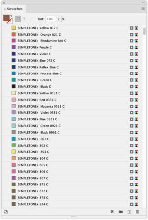
Artist Stuart Semple has released an ASE file with “Sempletone” colors.
“Understood, but swapping in black?” wrote Marc LaFleur, a software developer from Massachusetts. “It just feels like a case of ‘there are no good options, so let’s choose the worst possible one.’”
Commenting is easier and faster when you're logged in!

Recommended for you
How to Add Swatches with the Free Version of Pantone Connect
A simple trick lets you add spot color swatches in InDesign without subscribing...

Merging Separations into Composite CMYK plus Spot
Need to recombine pages that have been separated into individual color channels?...

InDesign Magazine Issue 122: Cross-Media Color
We’re happy to announce that InDesign Magazine Issue #122 (June 2019) is no...