
Great Sites: A Metaphoric Stroll Through the Shelburne Museum
The site weaves all these elements together to create a vision of the museum, and what we begin to understand by visiting the online site is that the museum is really a collection of smaller museums held together by a physical site plan of paths among the buildings. Instead of mown lawns and groomed trails, the Web makes liberal use of Javascripts to lead the browser along.
Likewise, instead of exhibitions mounted on walls, the walls themselves are part of the exhibition, and the landscape becomes the backdrop for art. The designers of the site, Tag New Media of Burlington, Vermont, understood and recreated this essential quality of a museum turned inside out.
Similarly, the Web site offers browsers a personal experience of the exhibition with a choice of paths through the museum. You can click on the starred locations on the map, choose a different map quadrant, or select one of the tours from the link hierarchy.
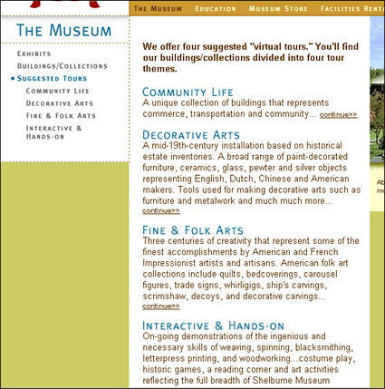
Everything about the Shelburne Web site has an earthy quality to it, reflecting a strong regional feel. The color scheme makes heavy use of harvest-like browns and golds that set off small photos nicely. Text is carefully typeset in narrow columns using sans serif type in a deep brick-red color. Headings are GIF text in blue, the color of the map highlights.
Graphically, the designers neatly divided the pages using color, images, dashed lines, drop shadows, and rounded corners. All of these clearly delineate information and navigation areas, and there’s always a comfortable feeling of knowing where you are. Each page has its own sense of place, and together they establish a coherent landscape and illustration of a lovely place to stroll, linger, and visit often.
For the Shelburne Museum, the site is a compelling way to show people from afar what the institution has to offer. For the site’s designers, www.shelburnemuseum.org is a an impressive accomplishment. For those of us in the business of designing for the Web, this site offers a welcome example of how to give visitors a good feel for a real-world place without coming off as a pathetically flat and lifeless imitation.
Read more by Clay Andres.
This article was last modified on January 8, 2023
This article was first published on September 17, 2001
Commenting is easier and faster when you're logged in!

Recommended for you

Cell Spacing in Tables? Sorta.
Two attributes of table cells have a long history in the web design field: "cell...
Heavy Metal Madness: Mapmaker, Mapmaker, Make Me a Map
Never having a very good sense of direction, I’ve always depended on maps...

Many QuarkXPress 9 XTensions On the Way
Press Release Quark announced the upcoming availability of hundreds of XTensions...