is now part of CreativePro.com!

Fixing a Slightly Flawed Font With GREP

15

Kepler is a staggeringly comprehensive typeface by Robert Slimbach, director of Adobe’s type design program. With 168 fonts within the family, in many widths and weights, it’s a beautiful workhorse. I’ve used Kepler Std Regular for the body copy in my Course and Compendium series of software books. In doing so, I discovered a definite kerning bug and what might be another (or could be an intentional setting with which I have a quibble).
By default (when using Metrics kerning), an open parenthesis followed by a lowercase “f ” has an egregious amount of space after it. You might think this a rare combination until you consider these parentheticals:
(for example…)
(for more on this, see…)
(first discussed in Chapter 4…)

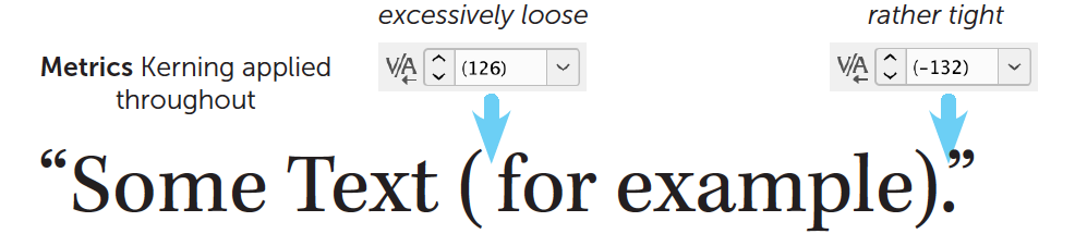
My copy editors have consistently flagged that space for removal thinking, of course, that I must have tapped my spacebar unintentionally. But if you were to insert the text cursor there, you’d see that the kerning is 126 thousandths of an em. I think this must have been accidental. For comparison, Garamond Premier sets this pair to precisely zero.
Reasonable people can disagree with my quibble about the tight kerning (-132) applied to a period followed by a close quote. I’d prefer it to be loosened a wee bit.
A possible solution is to apply Optical kerning in those situations:

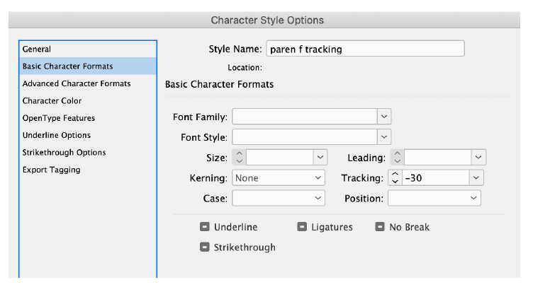
For ease, I’d suggest creating a character style for this. However, I find that Optical kerning is a bit too tight at body copy sizes and so is better suited to large sizes where its tightness is more useful. So, instead, I’d want to create two character styles with custom kerning values like below to apply in the these situations.

The problem is that we can’t have custom kerning in a character style. Only Optical, Metrics, or None are allowed. But I can use custom Tracking instead if I remember to set the Kerning to None (in case Mr. Slimbach decides to fix/change these kerning pairs).

Here’s the relevant part of one of those character styles:

To make it even easier, mindless in fact, I’d use a GREP style in my body copy paragraph style definition. To specify the GREP query for the open parenthesis, we must remember that parentheses have special meaning in GREP, so we have to escape that character with a backslash:
\(
To indicate that we intend to style only those open parentheses followed by a lowercase “f,” we add on a Positive Lookahead, meaning to “look ahead” in the text to see if an “f ” lurks there and, if so, apply our custom tracking character style.
\((?=f)
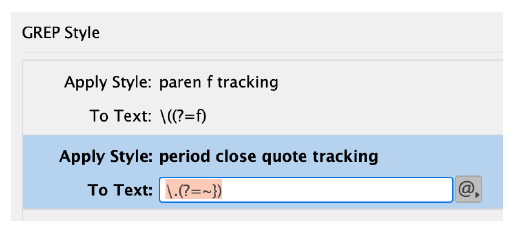
We can do the same for a period (which also needs to be “escaped”) with a close quote in a separate GREP style to apply its tracking style:
\.(?=~})
The ~} is special notation for the close quote.
The GREP styles in the body copy paragraph style definition will look like this:

Affiliate link disclosure: CreativePro will earn a commission on any purchases made through the Amazon links in this article, at no additional cost to you.

Steve Laskevitch is an Adobe Certified Instructor for Creative Cloud Design & Layout Solutions, teaching InDesign, Illustrator, Photoshop, and Lightroom. He's the founder of Luminous Works Training in Seattle and author of the Course and Compendium books on InDesign and Photoshop.
  • Keith Gilbert says:

    Thanks for sharing this Steve. Wonderfully geeky (and useful) stuff!

  • Gopa Campbell says:

    This is grand and I realized when reading it that I could probably use it to fix the odd kerning in ITC Giovanni Std. In this font periods are uniformly way too close to the character preceding them. I’m guessing I could do this with a Postiive Lookbehind, and define the look behind as “any character.” Would that be correct?

  • Ulrich Dirr says:

    Hi,
    I did know this technique already. But I suspect that applying a lot of GREP styles to paragraph definitions will slow down InDesign (I’d used this technique also for replacing certain characters with characters of another font and also for preventing hyphenation for specific strings. But I did slow down ID).
    My preferred technique now is to use Peter Kahrel’s fantastic useful script ‘Kern’ which uses a simple text table for a specific font family to ‘correct’ kerning pairs. There you could even use classes, e.g.
    ===Regular
    f [VW] 50
    [TVWY] 0

    etc.pp.

    • Yes, applying too many greps will indeed slow InDesign to a halt. Not only does Peter Kahrel’s script solve this, but also handles kerning pairs between roman and italics.

      • Ah Peter! Of course he has a solution!
        Incidentally, I often have about 8 or so GREP styles going in body copy and note no debilitating slowdown. I’m curious how many other folks use.
        When my editor makes changes, these keep things the way I like ‘em.

  • Magnus Gaarde says:

    I have used this trick a lot to fix kerning, apply no break and making other funky fix ups but as mentioned, Indesign can get extremely sluggish if you are working in a long document and there are many grep style hits.
    I will definitely have to try out Peter’s script. It sounds awesome.

  • Anne-Marie Concepcion says:

    This is a great solution Steve! I’ve had to use something similar to fix too-short em dashes, and in Gill Sans, to track out the period-Capital T … for some reason it looks like there is no space there. Clients were always circling that in PDF proofs with the note “missing space”

  • Lukas Engqvist says:

    A similar solution for when brackets/patentmedicin need a baseline shift. Or fixing a Lower Case hyphen/dash. As the title says a slightly flawed font (or one that did not take your needs into consideration)

    • Ken Darby says:

      In some, not all, fonts the parentheses strike me as low. This is most noticeable in phone numbers because there are no descenders. I like to do a baseline shift in a character style. I can then put it in a GREP style to limit it to parentheses in area codes.

  • Alisha Johnson says:

    This technique is only possible if you are using paragraph styles, correct?

  • Tobias Wantzen says:

    For me this issue doesn’t stop on kerning between glyphs, but also applies to the optical margin alignment: some glyphs definitely go too far over the left or right textbox margin. I want to adjust them either!

    But all we can do, is handicrafting around this issue, which could easily be solved by Adobe giving us a kerning editor inside InDesign. I posted a feature request on this every year since InDesign 2.0. And I made a feature request on uservoice for this in 2017:

    https://indesign.uservoice.com/forums/601021-adobe-indesign-feature-requests/suggestions/31111675-kerning-editor-with-individual-margin-alignment-o
    (Please leave a vote!)

    But it seems, that Adobe rests on its oars with its automated optical kerning. In my eyes, it’s not enough!

    I remember a DTP app, which incorporated this feature since it’s long gone version 3 in the late 1994s …

  • Derek Pell says:

    Good tips, Steve. Separate question: do you have plans to update your book, Adobe InDesign CC: A Complete Course ?

    • Steve Laskevitch says:

      Vague plans, yes. I’m sure my publisher would like to wait for paper and shipping prices to come down first.

  • >
    Notice: We use cookies on our websites to give you a great online experience. If you keep browsing, we'll assume you're ok with this. For more information, see our privacy policy. By closing this banner, you agree to the use of cookies.I AGREENo