


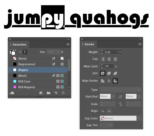
If you’ve ever tried to design type with underlines, you may have run into a problem where the underlines overlap the descenders of some characters and make things hard to read.

You could try using all uppercase or move the underline down further, but there’s a better solution: interrupt the underline with a stroke applied to the descenders. You can apply the stroke manually, or use a GREP style if you expect to have to do this kind of thing often.
If the text appears over a white background, you can simply apply a white stroke to the descenders.
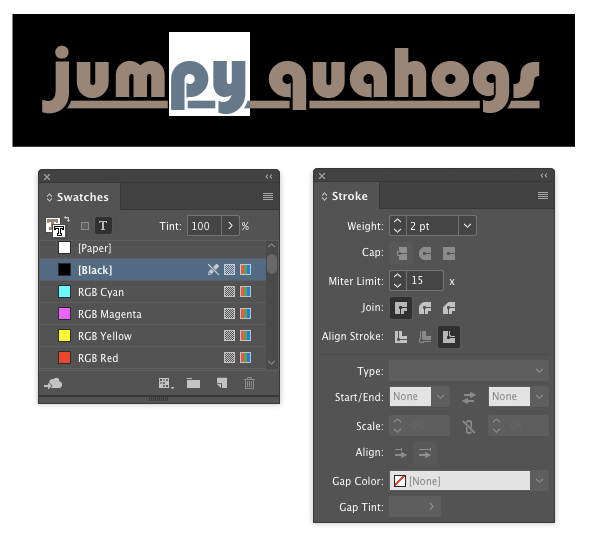
Or if the type is over a solid color background, use that color for the stroke.
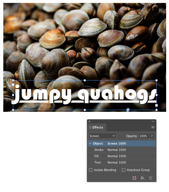
Things get more interesting when the background is a gradient or a photo. In those cases, you’ll have to use a transparency trick to make the stroke knock out the underline.
In this example, I set the stroke color to black.

Then selected the text frame and used the Effects panel to set the blend mode to Screen. This leaves the white text and underline unaffected, and causes the stroke to knock out the underline.

As I mentioned above, a GREP style can automatically apply the underlines to descenders. Something like this will do the trick. It applies the stroke character style to the letters q, j, p, y, or g. If you’re using a script font, you might also need to add the f and z.

This article was last modified on July 25, 2019
This article was first published on May 25, 2017
Commenting is easier and faster when you're logged in!

Recommended for you
Tip of the Week: Easy Fake Duotones
How to create duotone effects applied to images with a simple blend mode techniq...

Holiday FX: Do You Want to Build An InDesign Snowman?
Do you want to build a snowman? Come on let’s go and play! I know that thi...

Fun with the MakeGrid script
Keith wastes way too much time playing with the handy MakeGrid script that's inc...