


Before&After: Presentation Lessons from Apple
Timeless lessons from Apple on crafting a perfect presentation

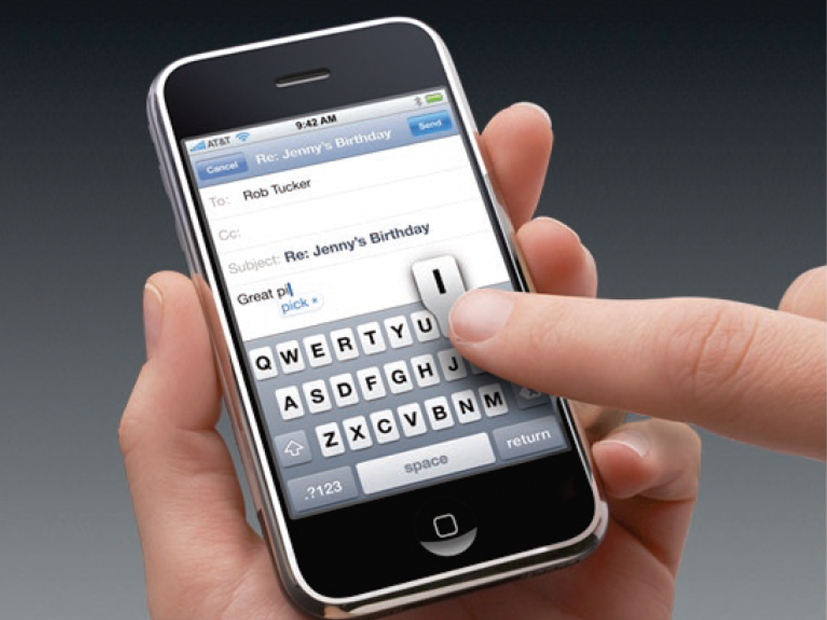
The iPhone was so different from the phones it came to replace. In the earliest years of the device’s history, the potential for misunderstanding among customers unfamiliar with smartphones was high. How did Apple’s marketing team do it? Look back in computing history as they confidently show you the phone as a friend would, put it in your hand, explain how it works. They present the phone from your point of view — calmly, lightly, naturally. Result: You understand it, and you like it. This 11-page article from issue 46 of Before&After Magazine demonstrates how Apple (in 2010) made a perfect presentation with the audience in mind.
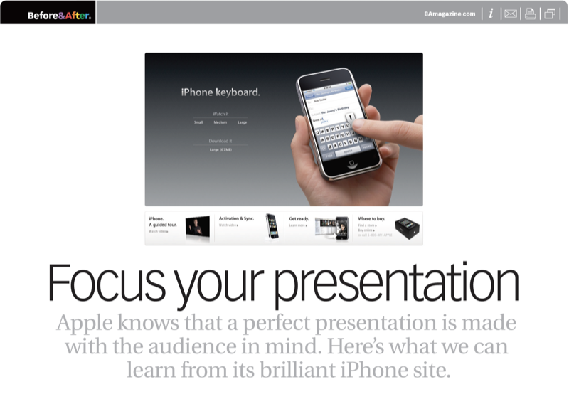
The heart of the site is video; the iPhone is explained in a natural, conversational way. Even in motion, the design remains focused; every detail contributes to clarity.

© John McWade/Before&After Magazine, courtesy of Gaye Anne McWade.
Commenting is easier and faster when you're logged in!

Recommended for you

Before&After: Design a Panoramic Booklet
The wide, linear format of a panoramic booklet is excellent for narrative-style...
Before&After: Design Like a Lazy Person
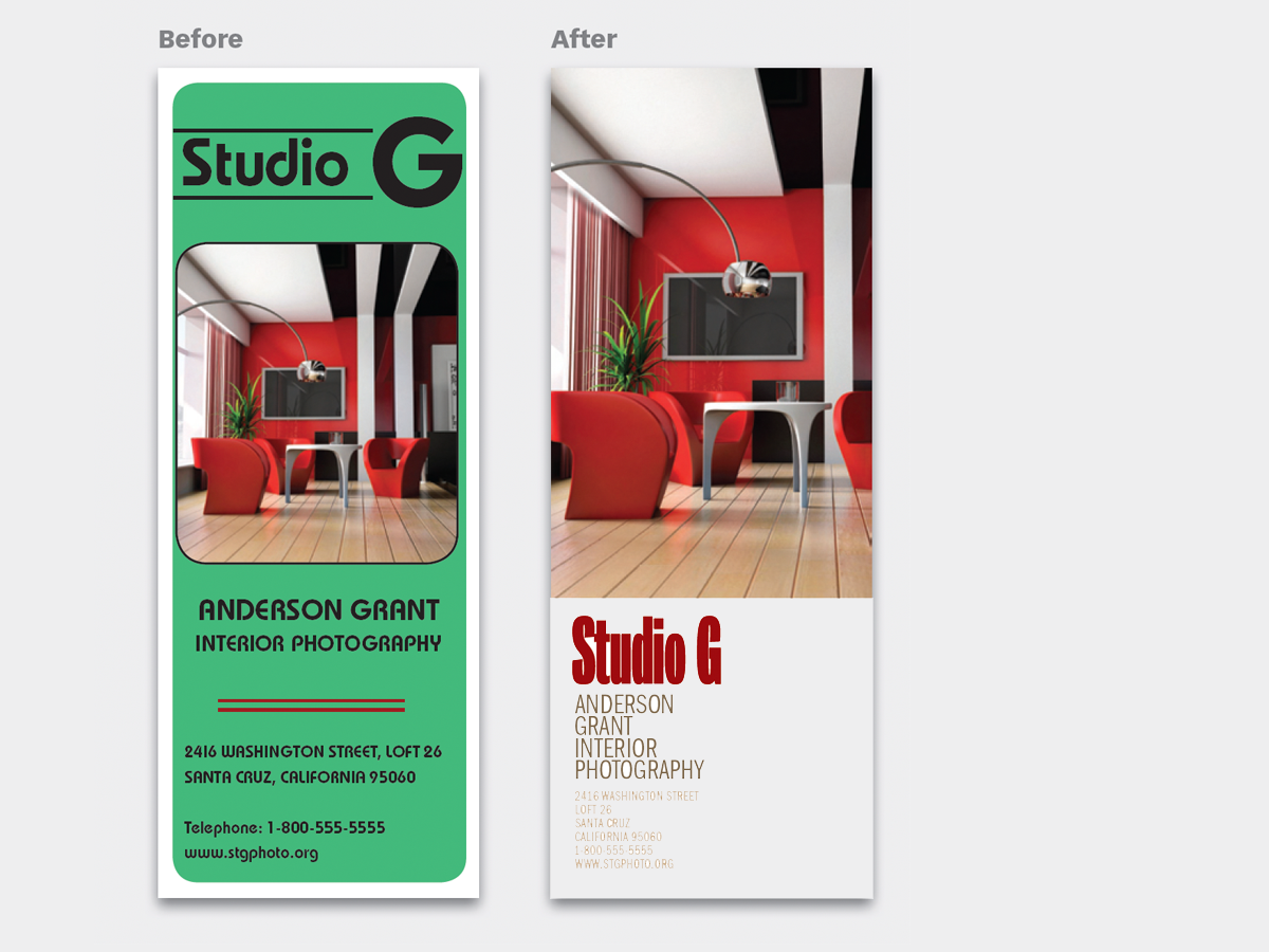
Design is easier if you segregate your page into two zones—image here, type ther...
Before&After: Design a Catalog of Rectangles
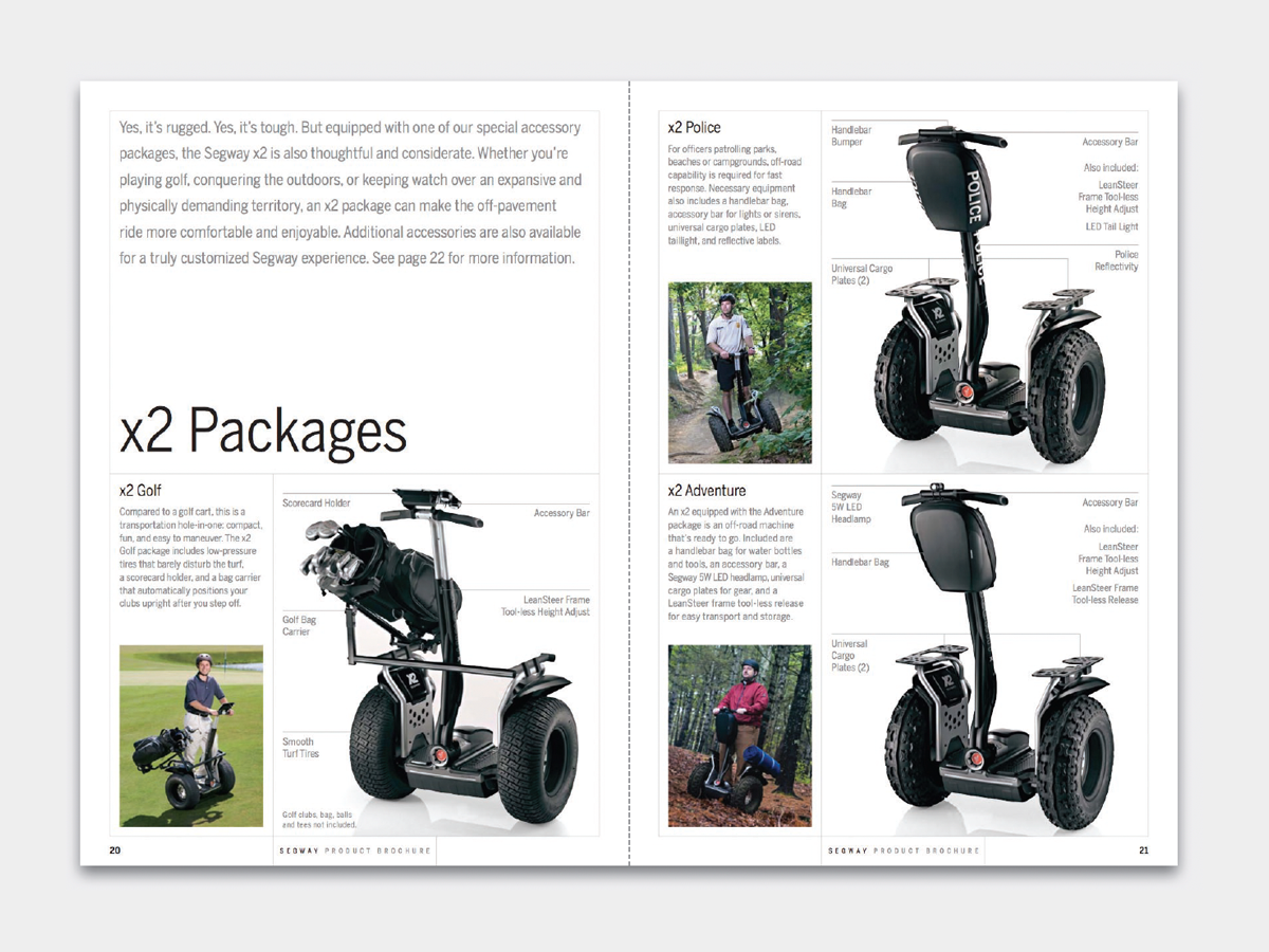
This catalog motif is simple, handsome, and versatile.