

Here’s a quick design tip on layout from issue 41 of Before&After Magazine.
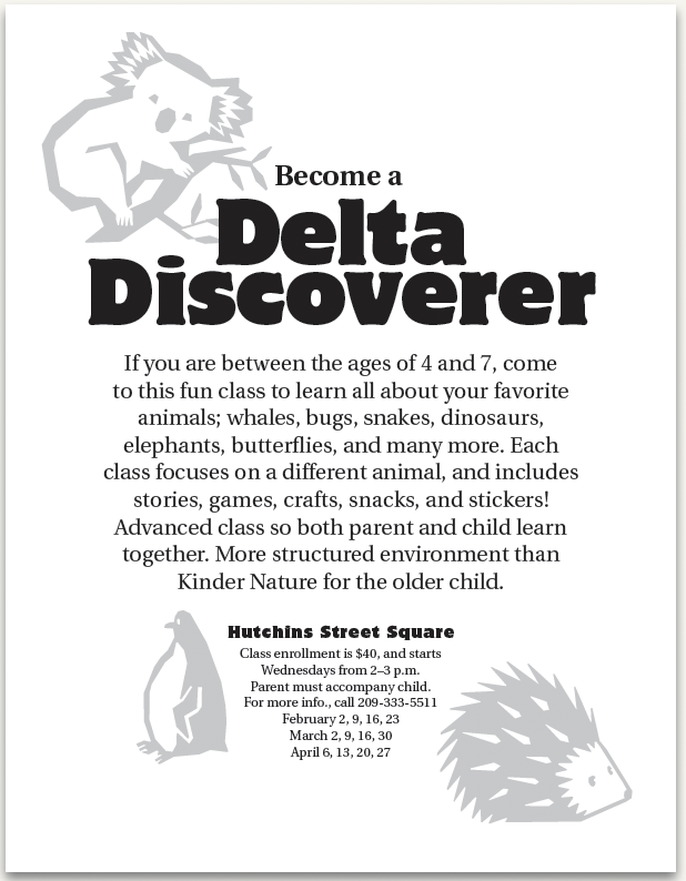
You’ve whipped out an inexpensive, black-and-white flier, but its cute little animals are starting to take over; they’re bolder than the text!
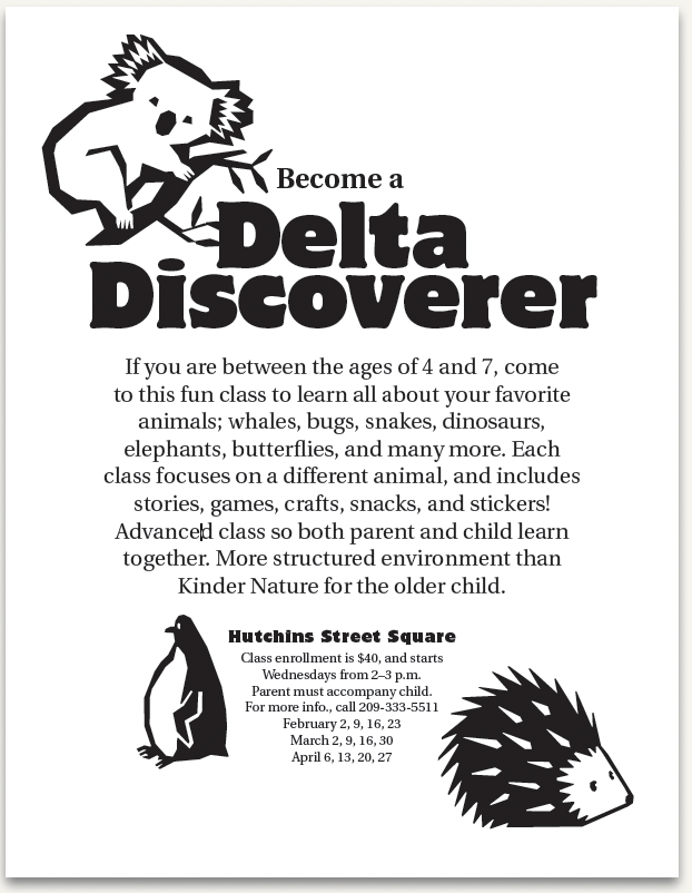
Here’s a quick fix: Instead of redesigning, just lower their opacity, and watch them quietly recede.
CreativePro members can download original content from Before&After Magazine, a beloved resource that taught a generation of newly minted digital designers how to design and communicate effectively with the written word. See our archive here.
© John McWade/Before&After Magazine, courtesy of Gaye Anne McWade.
This article was last modified on December 18, 2025
This article was first published on June 27, 2025
Commenting is easier and faster when you're logged in!

Recommended for you

Before&After: Evocative Business Card for a Tiny Budget
This musician’s business card gets a lot of visual atmosphere out of just a few...

Before&After Design Tip: Size and Placement Tell a Story
The size and placement of your image can have a dramatic effect on its impact.

How to Automate Layouts with Data in InDesign
Learn how to take data from a source file and automate a layout in your next InD...