
Here’s a quick design tip on working with photos from issue 43 of Before&After Magazine.
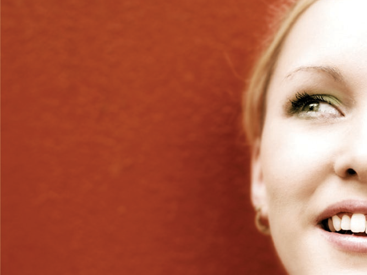
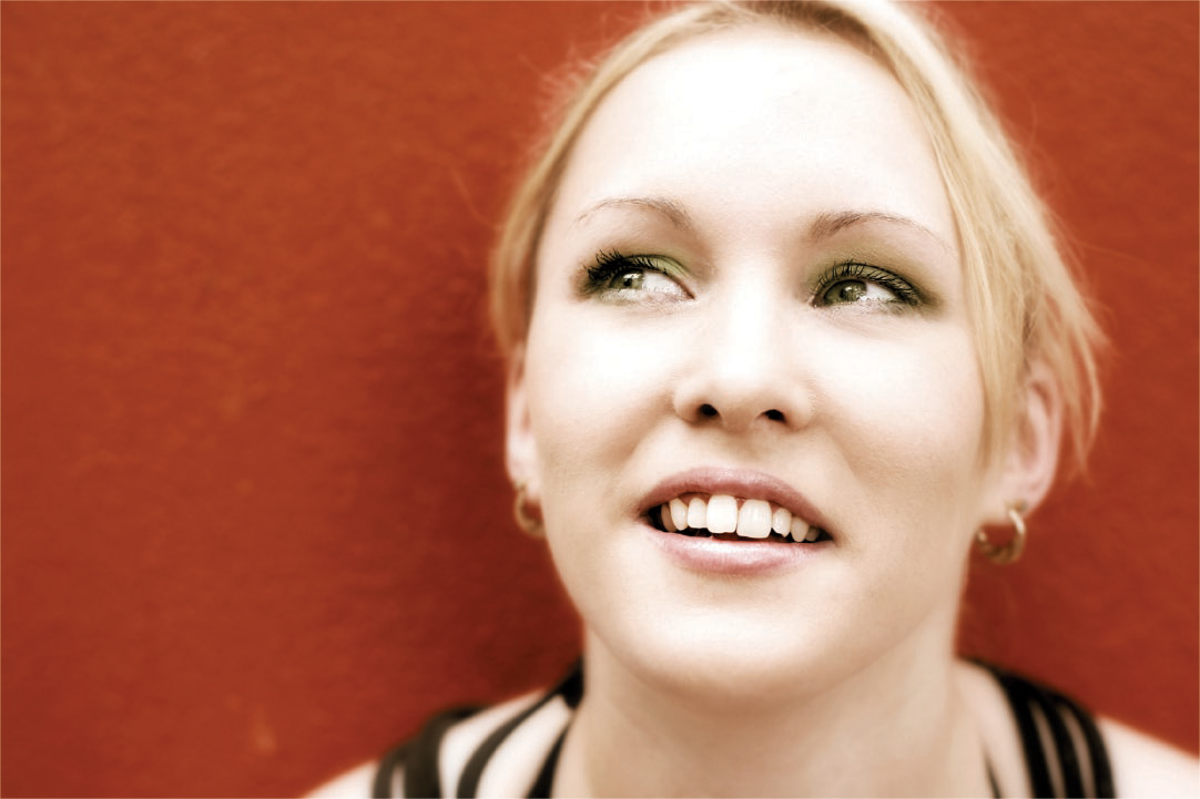
The original photo has lots of room on the sides, so it’s good for cropping. The problem is that her gaze is uninvolved with our message, like maybe she sees a bird on the roof.
But don’t throw this image away. Crop boldly! Zoom in and push her radically to the right, off the page, which adds mystery.

Just like that, our sense is no longer that she’s looking at a bird but thinking about the school. You’ll find similarly alterable meanings in many images.
CreativePro members can download original content from Before&After Magazine, a beloved resource that taught a generation of newly minted digital designers how to design and communicate effectively with the written word. See our archive here.
© John McWade/Before&After Magazine, courtesy of Gaye Anne McWade.
This article was last modified on January 4, 2026
This article was first published on September 20, 2024
Commenting is easier and faster when you're logged in!

Recommended for you
Before&After: Gestalt Theory: Isomorphism
We humans interpret visual objects based on our own experience and memories.
Before&After Design Tip: Crop and Zoom to Tell a Story
Zooming in on a photo changes its message
Before&After Design Tip: Use Color to Mark an Active Hyperlink
A little pop of color can increase clicks on a hyperlink.