
Here’s a quick design tip on collateral from issue 41 of Before&After Magazine.
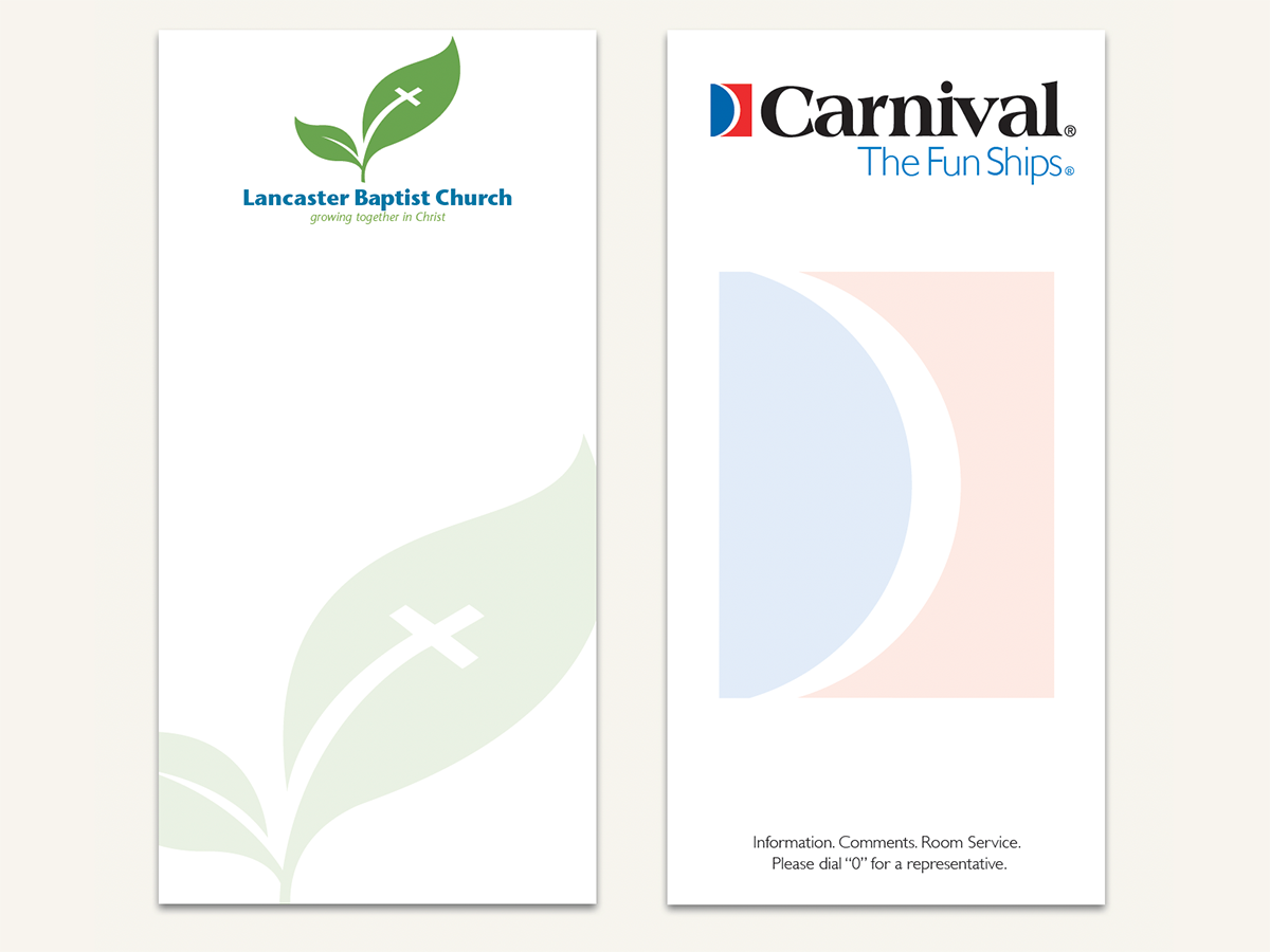
We’re not big fans of ghosted logos, which are normally overlaid by text, weakening (or obscuring) the image and complicating reading. But here’s a great exception: a 3½ in. × 7 in. notepad that shows off your logo and lets the reader cover it up—s-l-o-w-l-y spending time literally atop your image!
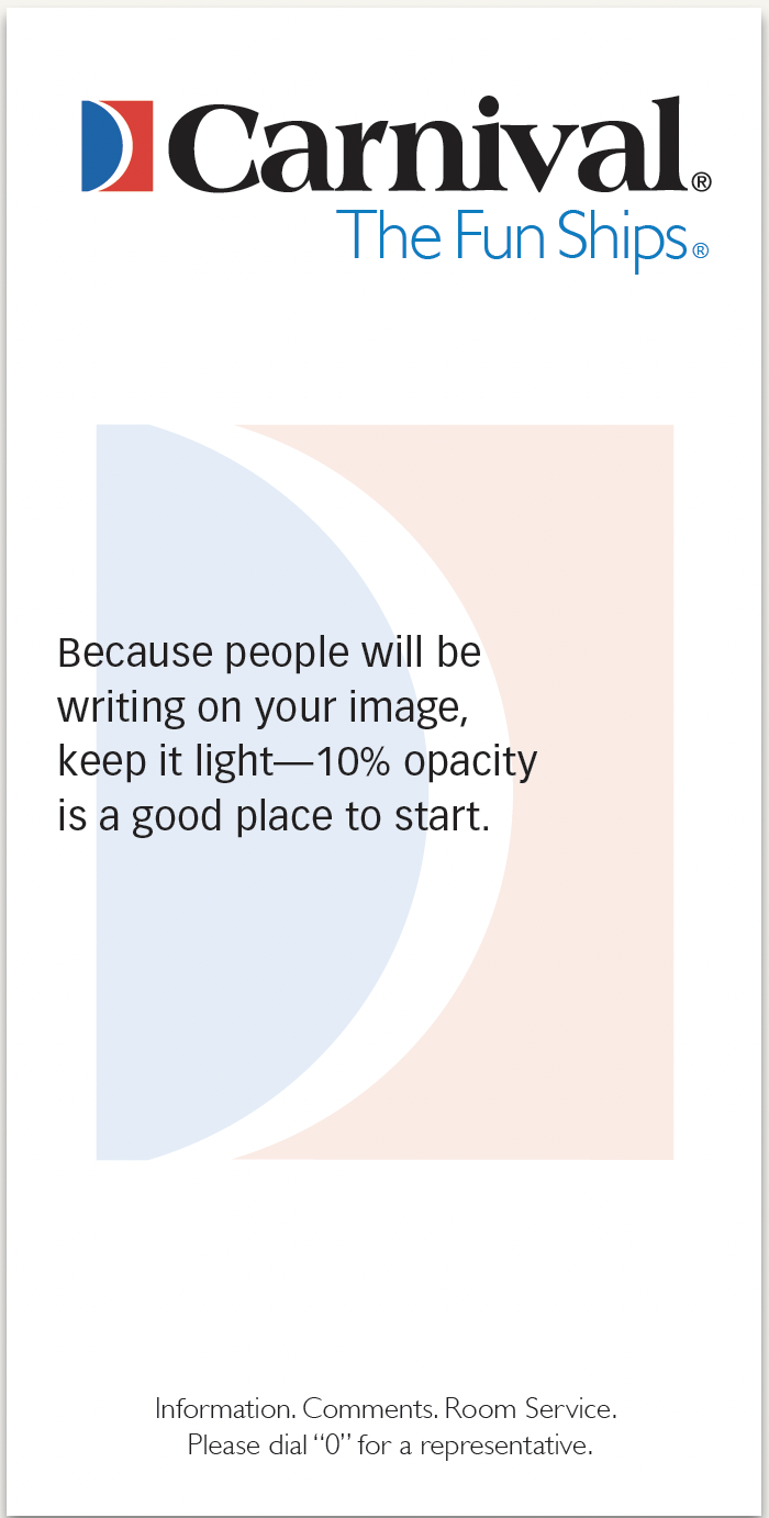
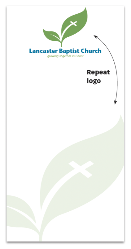
For branding integrity, run the logo normally at full strength, and make the ghost a duplicate.
CreativePro members can download original content from Before&After Magazine, a beloved resource that taught a generation of newly minted digital designers how to design and communicate effectively with the written word. See our archive here.
© John McWade/Before&After Magazine, courtesy of Gaye Anne McWade.
This article was last modified on March 30, 2026
This article was first published on December 15, 2025
Commenting is easier and faster when you're logged in!

Recommended for you

Before&After: Design a Panoramic Booklet
The wide, linear format of a panoramic booklet is excellent for narrative-style...

Before&After Case Study: UPS Branding
This 10-page article from issue 39 of Before&After Magazine lets you see how for...

Before&After: Design a Pocket-Size Brochure
Eight small pages unfold into an informative, letter-size sheet.