



Here’s a quick design tip from issue 43 of Before&After Magazine.
Small, fast, low-budget jobs are easiest to do when you think in extremes—make your image very large, or make it very small. Dip into your clip-art (or picture-font) collection, and have a look:
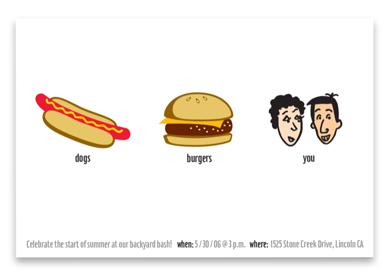
Small and repetitive: generic images seem less generic when your design is helping out. Here, three small pictures in a row make a playful design in minutes. Single line of small type adds sophistication. White is the dominant design element.
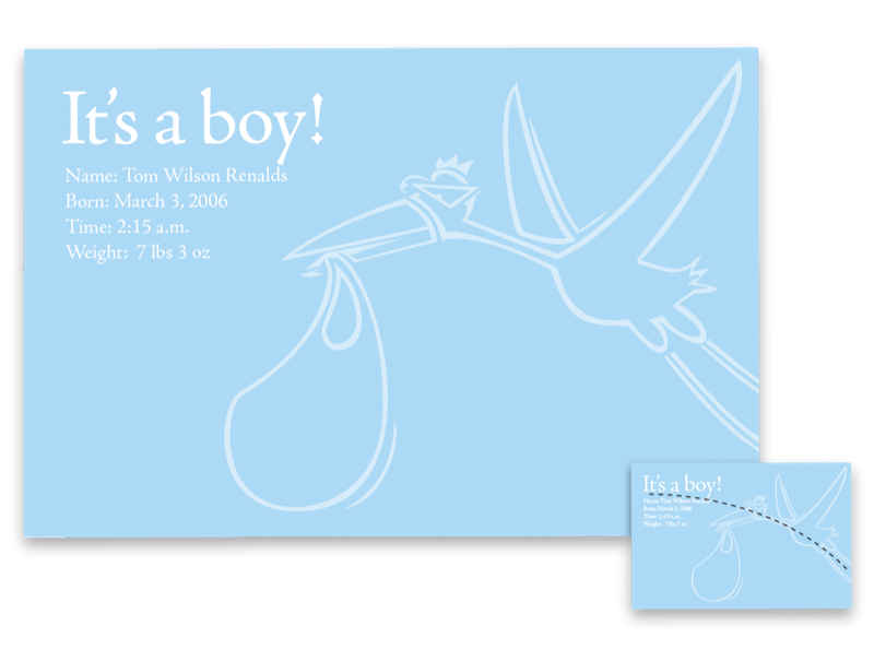
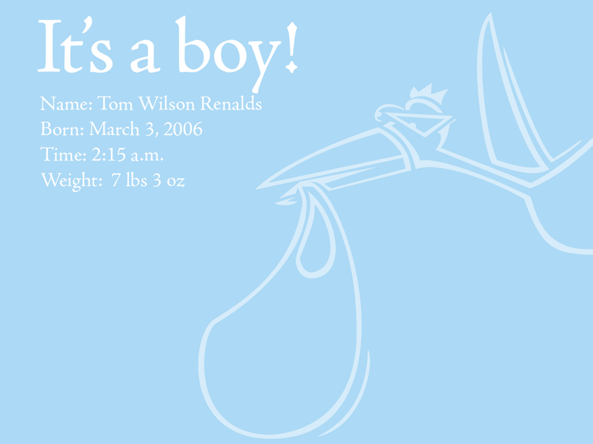
Big and simple: Scale a single image up, up, up, then lower its opacity, and you’ll have a cool announcement with almost no effort. Light type and image are a classy counterpoint to the goofy stork. Note the alignment (inset).
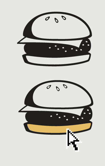
Black & white picture font? Need color? “Type” your picture (use the Glyphs panel in InDesign or Illustrator), select your text, and convert it to outlines. Then use the Direct Selection Tool (the white arrow) to select and fill areas with color.
CreativePro members can download original content from Before&After Magazine, a beloved resource that taught a generation of newly minted digital designers how to design and communicate effectively with the written word. See our archive here.
© John McWade/Before&After Magazine, courtesy of Gaye Anne McWade.
This article was last modified on January 4, 2026
This article was first published on August 23, 2024
Commenting is easier and faster when you're logged in!

Recommended for you
Before&After: How to Align Images by Eye
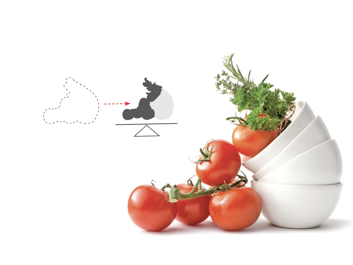
How do you line up irrregularly shaped objects and size and space them just so?

Before&After: Draw Great Visual Instructions
Have something to demonstrate or explain? Don’t say it; show it!

Before&After: Presentation Lessons from Apple
Timeless lessons from Apple on crafting a perfect presentation