

These three most common business documents are always designed as a package, yet they differ greatly in size and have very different proportions. Yet these documents must look and feel the same. The key is to establish rational and repetitive visual relationships between mark, type, and the spaces they occupy. This 16-page article from issue 40 of Before&After Magazine shows you how to turn a letterhead, an envelope, and a business card into a single visual presence.
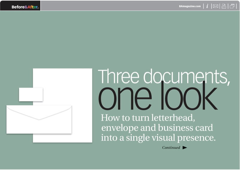
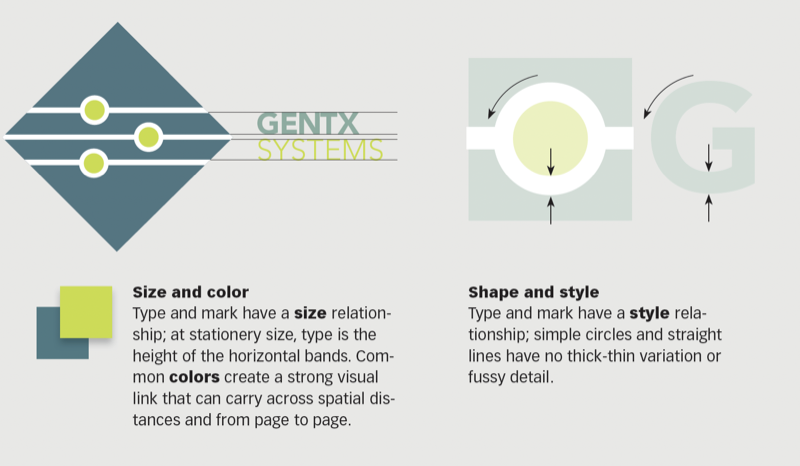
The key will be to focus on the logo, not the funny proportions of these three oddball formats.
© John McWade/Before&After Magazine, courtesy of Gaye Anne McWade.
Commenting is easier and faster when you're logged in!

Recommended for you

Before&After: Design Your Own Christmas Cards
This 16-page article from issue 42 of Before&After Magazine shows you how easy i...
Before&After Design Tip: Do More with Less
Sometimes using one photo can convey more than using several

Before&After Design Tip: Use Text to Supplement an Image
Turn a problematic image into a powerful one