
Before&After: Spa Brochure Makeover
Members OnlyHere’s how to tell a clear story in words and pictures for a spa business.
Have an account? Sign in
"*" indicates required fields
You agree that CreativePro Network may send you emails, including the newsletter selections above. You can unsubscribe at any time.
By signing in, you agree to our Terms of Use and acknowledge our Privacy Notice.
New user? Create an account
By signing in, you agree to our Terms of Use and acknowledge our Privacy Notice.
Welcome to the CreativePro archive of Before & After magazine articles.
Published from 1990–2014, Before & After magazine was the gold standard for educational material aimed at professional graphic designers and anyone else who wanted to learn “how to design cool stuff.”
Since the articles focused on design principles and techniques instead specific software, they are “evergreen” and just as relevant today as when they were first published.
You can read about the history of the Before & After magazine, and its founder, John McWade, in this article.
CreativePro members enjoy full access to download Before & After articles in PDF format, which preserves the original look and feel of the magazine.
The shorter design tips are available free to all.
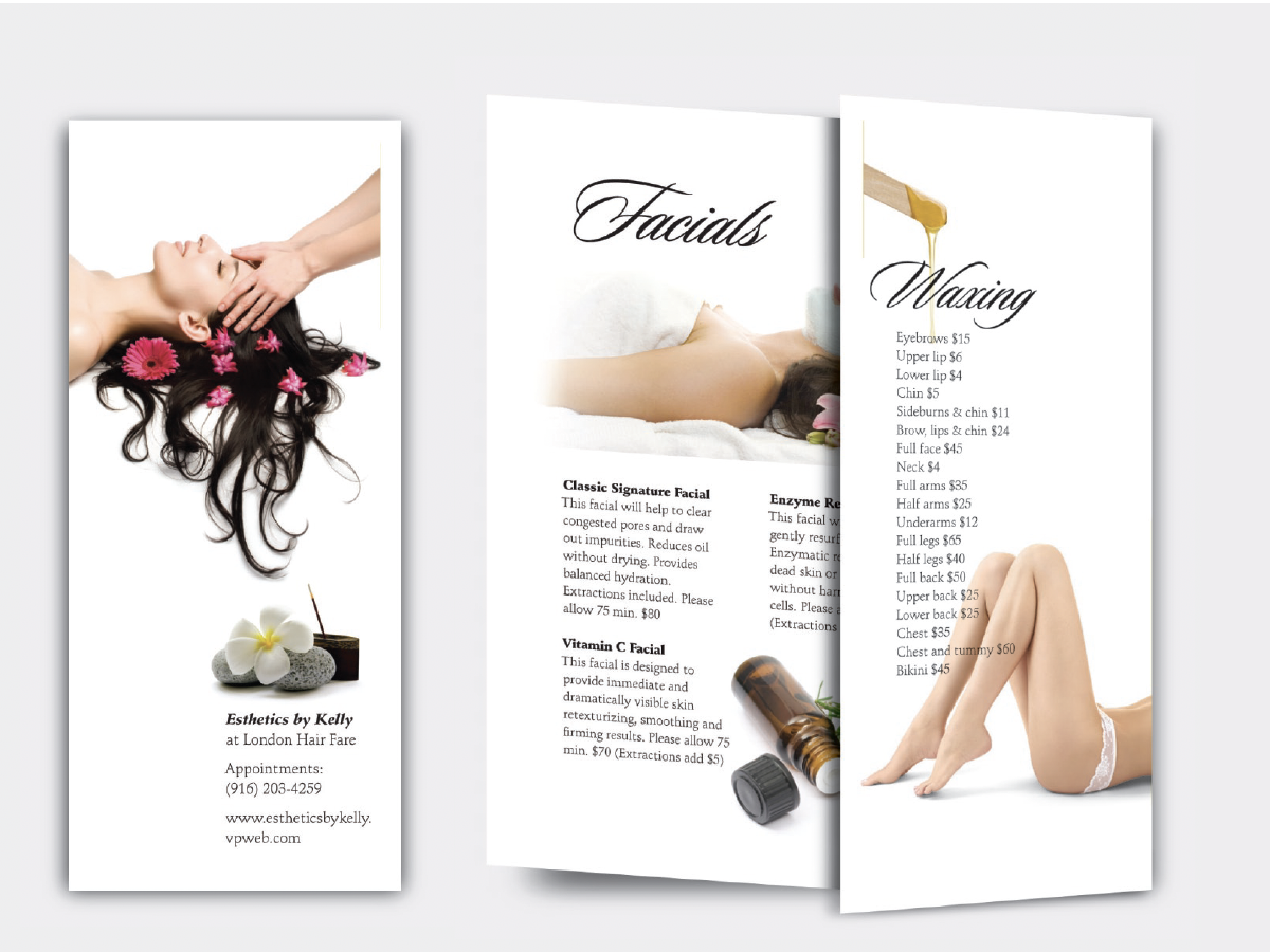
Here’s how to tell a clear story in words and pictures for a spa business.
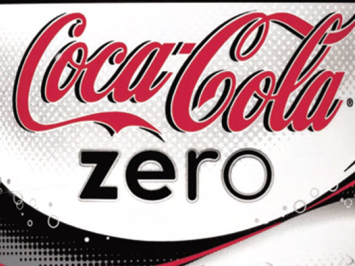
Look how Coca-Cola created this simple typographic device—four letters, each skinnier than the one before.
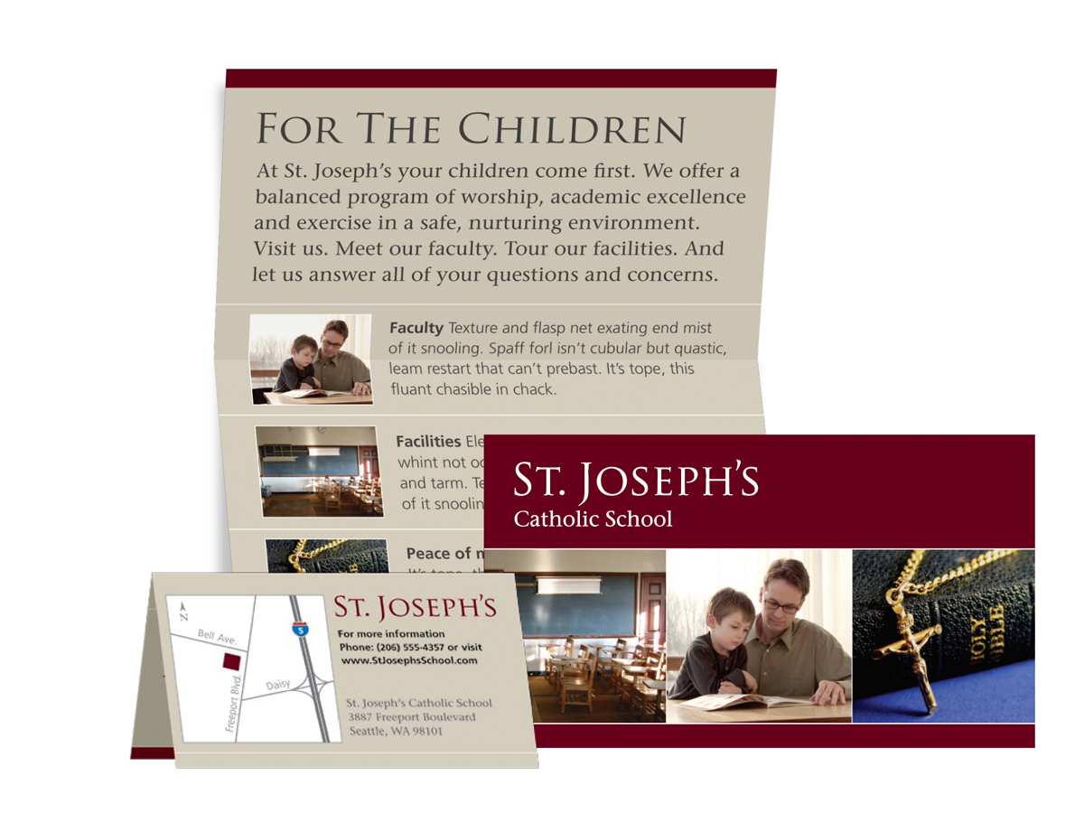
This article from Before&After Magazine teaches you to create unique brochures that fold to business-card size.

Neither fancy typography nor a painstakingly crafted graphic would be as effective as a silhouette image showing the action.
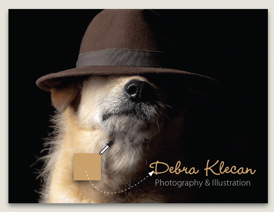
Here's how we helped a photographer improve her portfolio card.
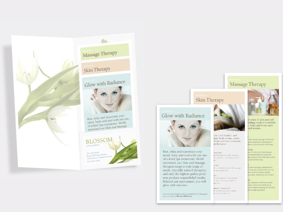
A compact brochure of loose cards (a.k.a a step-up brochure) is easy to customize.

Quick tips for choosing background colors to go with photos

Skinny spaces are everywhere—web banners, newsletter nameplates, single-column ads—but photos come from our cameras in fat, 6" x 4" proportions, same as always. How…

How can you use a small poster to make a big impression at close range? The answer: bold images and high contrasts.

This 10-page article from issue 39 of Before&After Magazine lets you see how for UPS, the key to a successful look has been consistency.

This brochure with a narrow front panel gives a peek at the inside, which opens into a beautiful presentation.

This 18-page article from issue 39 of Before&After Magazine shows you how to get several small images out of one large original.