
Here’s a quick design tip on logo design from issue 41 of Before&After Magazine.
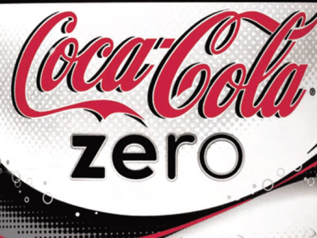
How do you combine the word zero, youth, and the idea of diet-friendly into a logotype without drawing a single image? Exactly as Coke did with this simple typographic device—four letters, each skinnier than the one before.
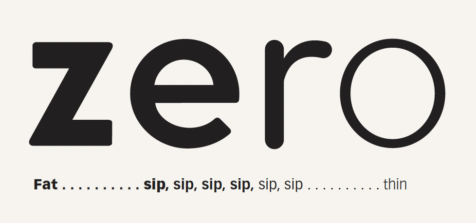
Lowercase says young; extra space between letters keeps the setting light.
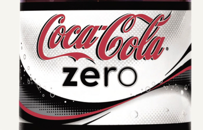
The cold silver outline adds chill (the product’s marketing slogan) to the image and physical dimension similar to Coca-Cola.
CreativePro members can download original content from Before&After Magazine, a beloved resource that taught a generation of newly minted digital designers how to design and communicate effectively with the written word. See our archive here.
© John McWade/Before&After Magazine, courtesy of Gaye Anne McWade.
This article was last modified on December 18, 2025
This article was first published on June 20, 2025
Commenting is easier and faster when you're logged in!

Recommended for you

Before&After: Design a Dual-Purpose Letterhead
A legal-size sheet can serve as your letterhead and provide a bonus, too.
Before&After Design Tip: Use Artwork to Create a Personal Connection
Learn how an inviting portrait can lend personal appeal to a design.

Before&After: How to Design a Second Page
You've designed a beautiful outside. How do you follow it up inside? Simply.