


Here’s a quick design tip on logo design from issue 41 of Before&After Magazine.
Her storytelling logo says it all: Jennifer exercises dogs for their busy owners. Neither fancy typography nor a painstakingly crafted graphic would be as effective as just showing the action.

A silhouette is easy to make—just trace and fill—and can be assembled from several images.

There’s a logo in this image One great thing about using silhouettes is that it gets rid of detail, which is one characteristic of a well-designed logo.

Even at thumbnail size, the silhouette is still clear.
CreativePro members can download original content from Before&After Magazine, a beloved resource that taught a generation of newly minted digital designers how to design and communicate effectively with the written word. See our archive here.
This article was last modified on December 18, 2025
This article was first published on June 6, 2025
Commenting is easier and faster when you're logged in!

Recommended for you
Before&After Design Tip: Use a Ghosted Logo to Make a Great Notepad
This small notepad shows off your logo and lets your reader interact with it slo...
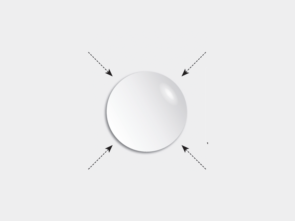
Before&After: Gestalt Theory: Equilibrium
Equilibrium gives your design elements rest, stability, and permanence.
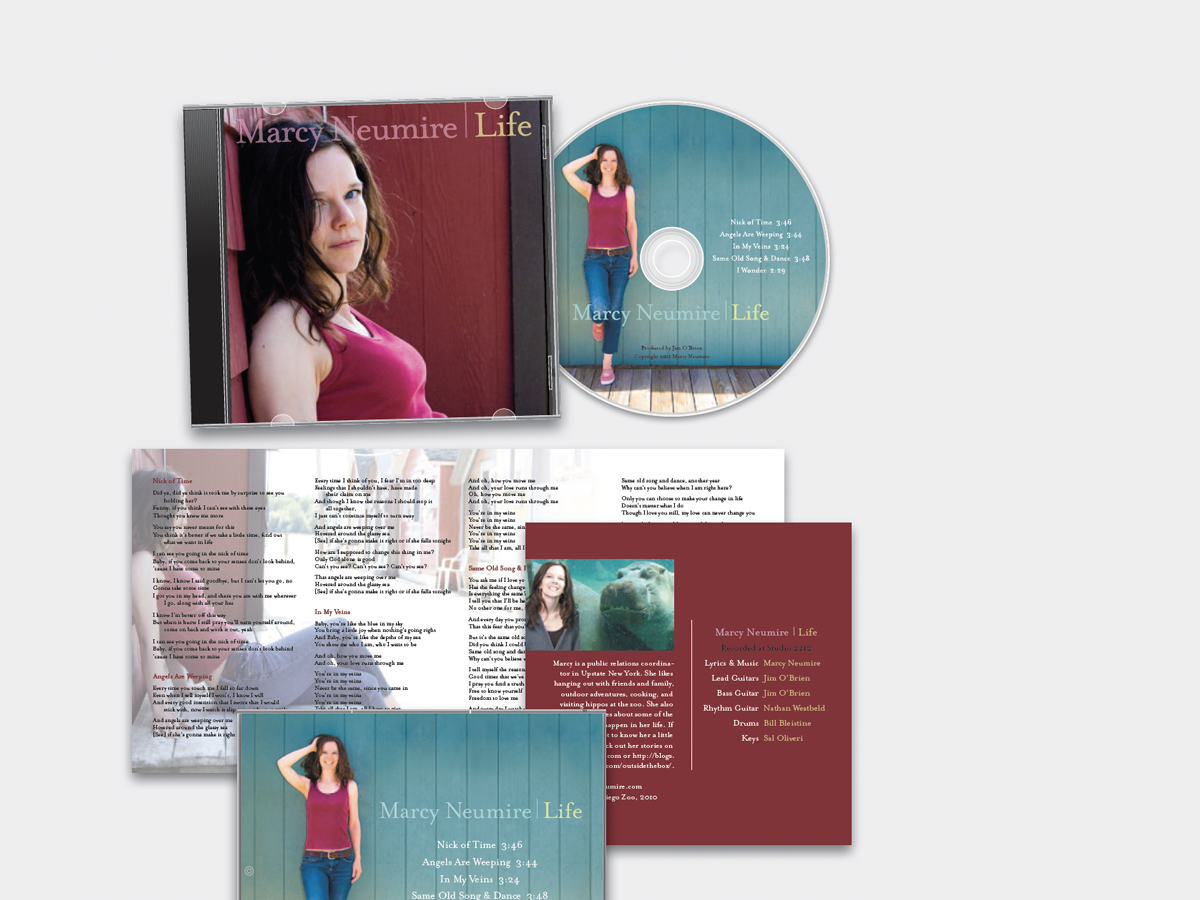
Before&After: Design a CD/DVD Package
We redesign a CD package to make it look as good as the music sounds.