
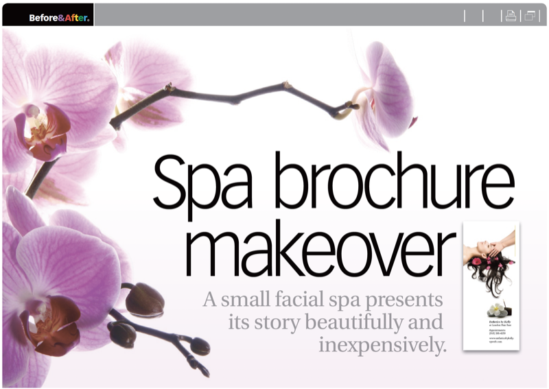
This spa’s brochure needed to be a simple one letter-folded sheet to give to customers—no need to “sell,” nothing to mail. With a built-in audience in familiar surroundings, you’d think that design would be easy, but telling a clear story in words and pictures would still be as demanding. This 18-page article from issue 50 of Before&After Magazine demonstrates how some carefully selected stock images and crystal-clear type help a small business present its story beautifully and inexpensively.
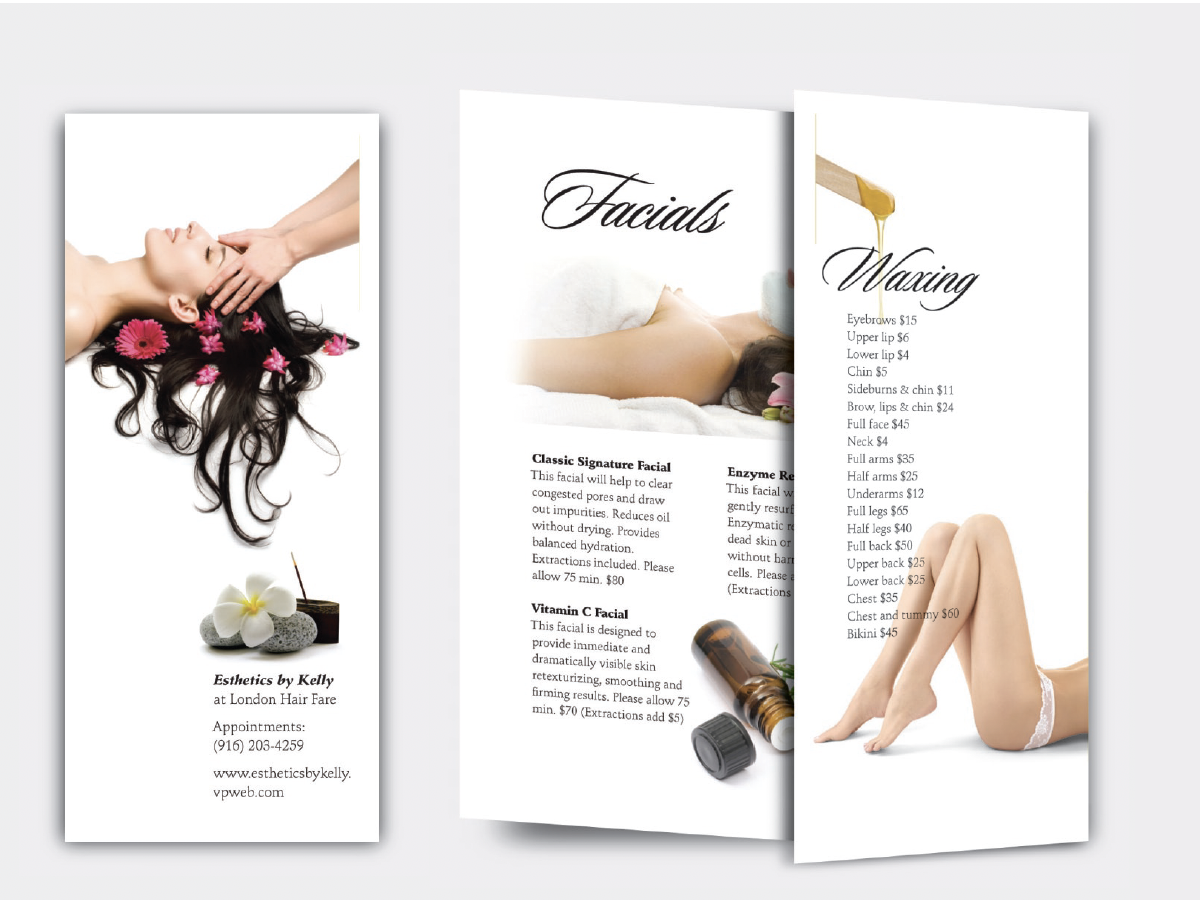
The cover is your most important page. It attracts the viewer and sets her expectation. Although work can begin elsewhere, the cover requires a strong, focused image.
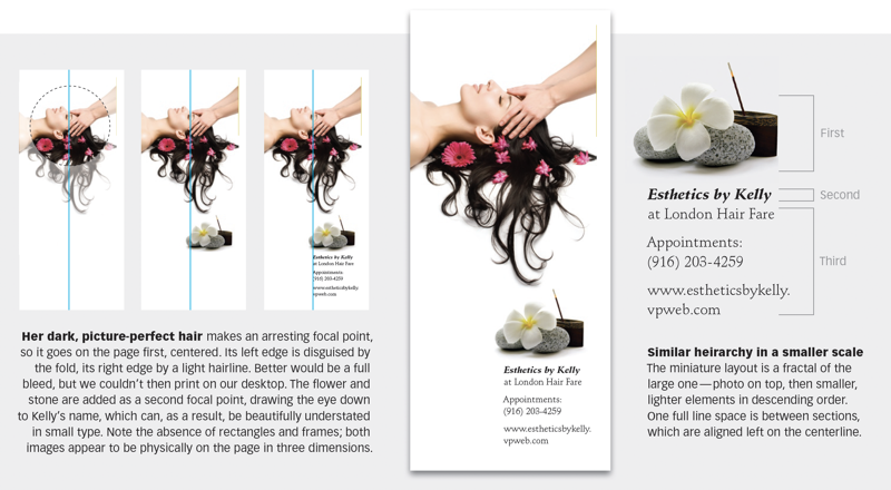
© John McWade/Before&After Magazine, courtesy of Gaye Anne McWade.
Commenting is easier and faster when you're logged in!

Recommended for you

Before&After: How to Design a Logo of Letters
Logos with ligatures are handsome, simple, and compact.
Before&After Design Tip: Use a Simple Photo in Your Web Ad
When space is tight simple, bold, and brief
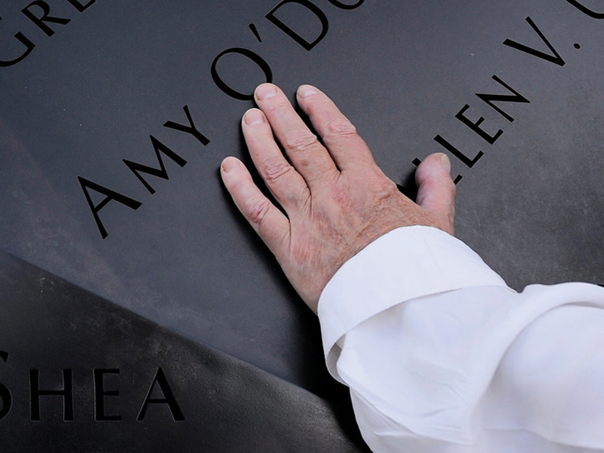
Before&After: Optima: The Typeface of 9/11
How Optima brings dignity and humanity to the National September 11th Memorial.