

Indents and other kinds of graphic text dividers are used to physically differentiate one paragraph from another. The purpose of having paragraphs is to separate different thoughts and ideas in the text, as well as to keep the reader engaged with shorter bursts of text and not be overwhelmed by one long block of copy. Choosing the right method to create paragraph separations not only helps with readability, but also adds flair, creativity, and visual excitement to an otherwise dull page. Although the most common technique is to add an indent to the first line of each new paragraph, there are other kinds of indents and other techniques that can enhance the text, as well as the overall design.
First Line Indent
As mentioned previously, indenting the first line of each new paragraph is the most common method. Naturally, this is called a first line indent. The depth of this basic indent should be somewhere between ¼ and ½ inch. The actual amount should be related to the width of the column—just enough to be easily noticed, but not so much as to create too much of a visual interruption. When setting up an indent, use the First Line Left Indent option in InDesign or Illustrator (build it into your body text paragraph styles). Do not use the space bar. Folks often use a tab, but that’s not a good idea either, since the default tab setting both in InDesign and Illustrator is ½ inch, which might not be right for the text size and column width. Never let your software defaults dictate style and taste.

Both InDesign and Illustrator have a First Line Left Indent feature located on the Paragraph
panel, which can customize and automate indents.

Typical paragraphs with first line indents, except for the very first line, which does not need one.
Extreme Indent
A more decorative approach to the first line indent is setting the first line (or the first few lines) deeper than the usual amount—even as much as half the column width, or more. This technique can create a stylish, unique look when used tastefully and appropriately. It looks best when saved for large amounts of text and wider column widths.

This extreme indent creates a very stylish and highly designed appearance.
Outdent (or Hanging Indent)
This technique is the opposite of an indent in that it takes the first line (or more) and extends it (or them) outside of the left margin. This can be a very dramatic treatment which is effective in highly designed environments such as magazines, brochures, annual reports, and even web pages. But keep in mind that it will reduce the amount of text that can fit in any given space.

An outdent is another creative approach which helps to emphasize a new paragraph. It can be used throughout the entire text, or just to introduce different sections.
Dingbats
For something a little more decorative, dingbats or other simple graphic elements can be used instead of indents between paragraphs. This can be done in two ways: 1) by inserting the dingbat between paragraphs which are separated by a line space, or 2) by running the paragraphs together and separating them with the dingbat. In either treatment, the size and simplicity of the dingbat, as well as the space around it, are essential to a successful treatment. You can even add color for an even more eye-catching look.

Dingbats, flourishes, or any simple graphics can be used instead of an indent. Here they are used between paragraphs.
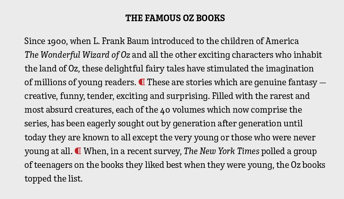
This dingbat, which is actually a paragraph symbol, is used to separate paragraphs which are run together. All above examples are set in Enclave and Wingdings 2.
Line Space
The practice of adding extra space (usually an entire line space) between paragraphs instead of an indent or outdent is a tried-and-true method of creating a strong, visual separation between paragraphs. It is most frequently used for letters as well as email correspondence, and can also be applied to short blocks of copy, such as advertisements, introductory copy, and any text on the web. A line space between paragraphs increases readability (especially on the web), adds emphasis, and contributes to a clean, open look when saving space is not a consideration. Keep in mind that this method is not usually used in lengthy print copy such as magazines, newspapers and the like, as it interrupts the overall look, texture and flow of a page.
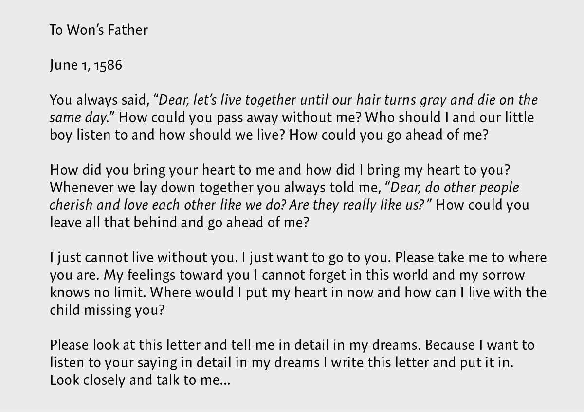
This personal letter uses line spaces between paragraphs, a technique that is commonly used in correspondence. Set in Expo Sans.
Commenting is easier and faster when you're logged in!

Recommended for you

What’s New in Illustrator: The July 2022 Release (Version 26.4)
Numbered and Bulleted Lists, a History panel, and new 3D features have been adde...

The Sign Painters
It’s easy to take for granted that the existence of digital tools for creating g...

Inheriting style settings
A seemingly small, yet incredibly powerful feature, that InDesign contains is th...