
Terrific Type Effects
Use these tried-and-true techniques to lend pizzazz to your pages.


This article appears in Issue 146 of InDesign Magazine.
Looking for ways to help your designs stand out from the crowd? Type effects always offer a good return on investment when it comes to adding flair. Here are some classic typographic effects created with InDesign, Illustrator, and Photoshop, all of which are quick to apply and easy to adapt. You’re probably familiar with some of these, but there are also some tricks that you may have overlooked.
InDesign
Let’s begin with some powerful techniques you can use right in InDesign with little or no assistance from any other program.
Stylistic alternates
Stylistic alternates—literally alternative versions of certain characters—add customization, personality, and uniqueness to your type treatments. You can turn them on with the flick of a switch (or the check of a box) (Figures 1-3) or deploy them on a case-by-case basis using the type contextual controls or the Glyphs panel (Figure 4). What can be frustrating about stylistic alternates is figuring out which fonts have them. Although some font sellers advertise their availability in the description of the font and some fonts may come with an explanatory PDF, oftentimes you just have to poke around and see for yourself.

Figure 1. Before and after alternates (Keep in mind that I may be “trying too hard.”)
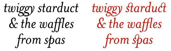
Figure 2. Being irresponsible with discretionary ligatures (My license to Font is hereby revoked.)
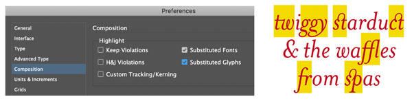
Figure 3. The Substituted Glyphs Composition preference highlights where ligatures are applied.

Figure 4. The Glyphs panel shows the discretionary ligatures available in Mrs Eaves. You can turn on discretionary ligatures locally from the OpenType menu or apply them as part of a paragraph style through the OpenType features.
Patterns of color
If you want to spice things up with color, then perhaps a nested style and/or a GREP style is what you’re after. Yes, you can always just select the characters on a case-by-case basis and change the color. If you have a small amount of text, that’s the best way to go. With a larger body of text, you can save time (as well as have more fun) by using nested styles. If you add in GREP styles, they take precedence over the nested style and so can introduce an element of randomness. In my example shown in Figure 5, there is an intentional contradiction: The nested style applies a character style that adds a positive baseline shift to every fourth character. To prevent this from looking too uniform, a GREP style adds a negative baseline shift to all the vowels. In a fight between nested styles and GREP styles, the GREP styles win: Every fourth character shifts up—unless it’s a vowel, in which case it shifts down. There’s also nothing stopping you from changing individual characters as well if you want to disrupt a particular sequence of colors. Need to get up to speed with GREP? Issue #59 is a great place to start.

Figure 5. The nested style shifts the baselines of every fourth character. The GREP styles apply colors to specific letters. I divided the alphabet into four: A–G take their color from the Paragraph Style settings; the rest get Color 1, 2, or 3. InDesign applies Color 4 to every third letter (it tickled me that in combination with the nested style this made a 3/4 rhythm). For this GREP expression I sought the help of the wonderful Treasures of GREP Facebook group, where GREP gurus share their expertise freely.
Chromatic fonts
Color SVG fonts may be the next big thing in font technology, but let’s not overlook their antecedents: chromatic fonts. The roots of chromatic fonts predate digital technology, first appearing in the mid-1800s (see “A Timeless Treasure Trove of Chromatic Type” below). They’re simple typefaces designed to be stacked on top of each other with the interior shape printed in a different color from the background or fill (Figure 6).

Figure 6. Here I stacked multiple iterations of HWT American, each with a different color applied. It can be helpful to use the Layers panel to target the separate pieces.
You know that “circus” font Rosewood? Ever wondered why the companion font to Rosewood Regular is called Rosewood Fill? It’s because they’re designed to be used together, one printed on top of the other. (Realizing this was a lightbulb moment for me.) Chromatic fonts are back in fashion, and there are quite a few of them available on Adobe Fonts. Some of my favorites are Rig Shaded, Industry Inc., Cheap Pine, Zebrawood, Balboa Plus, Rosewood, FF Prater, HWT American, and DeLittle Chromatic (Figure 7). Once you’ve added chromatic fonts to your design repertoire you may wonder how you ever got along without them.

Figure 7. Some of the chromatic (stackable) fonts available on Adobe Fonts
A Timeless Treasure Trove of Chromatic Type
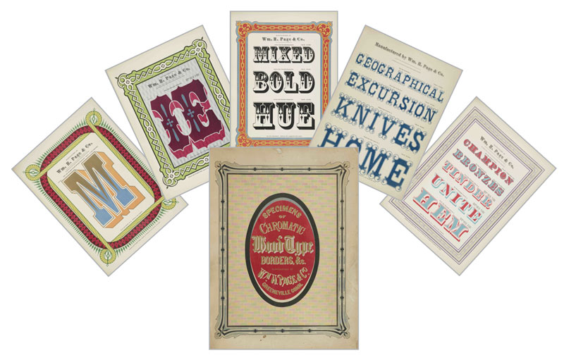
If you have any interest at all in chromatic type, do yourself a favor and check out Specimens of Chromatic Wood Type, Borders, Etc. Produced by the William H. Page wood type company in 1874, this 102-page book is packed with woody typographic goodness on every page. It’s beloved not only for its visual appeal and historic significance, but also for the amusing accidental poetry found in some of the samples. You can download a PDF of the book at the Columbia University Library website or purchase a print copy at Amazon.
Bendy columns
You’ve probably heard the old adage, When all you have is a hammer, everything starts to look like a nail. It’s like that in InDesign: When all you have is a text frame, everything starts to look like a box. But it doesn’t have to be this way. Not all text has to be in rectangles. Text frames can be any shape. And you can make those shapes bend (and curve) to your will (Figure 8).
Figure 8. Bendy columns: With the Pen tool, add anchor points to a rectangular frame at the sides, and using the Direct Selection tool, move these anchor points to change the shape of the frame (left). Note that to better determine the custom frame shape, I used justified text and instead of breaking the text into paragraphs, I used pilcrows (Option/Alt+7) to indicate the start of a new paragraph. Alternatively, scale up an interesting glyph, convert it to outlines, then use it as a text frame (right).
A text sandwich
Sandwiching type between the subject and background of an image never gets old, despite the fact that this technique has been around for ages. Heck, David Blatner first showed how to cook up an image sandwich all the way back in Issue #16. The keys to success are that the images must be perfectly in register (that’s what Paste in Place is for) and that the top copy shows only the portion of the subject that overlaps the type. For this you’ll need to enlist the help of Photoshop to make a mask and create a separate cut-out layer. Save the file as a PSD and place it in InDesign. Copy and paste a duplicate of the image above the magazine type, then use Object > Object Layer Options to hide the background layer of the top copy (Figure 9).
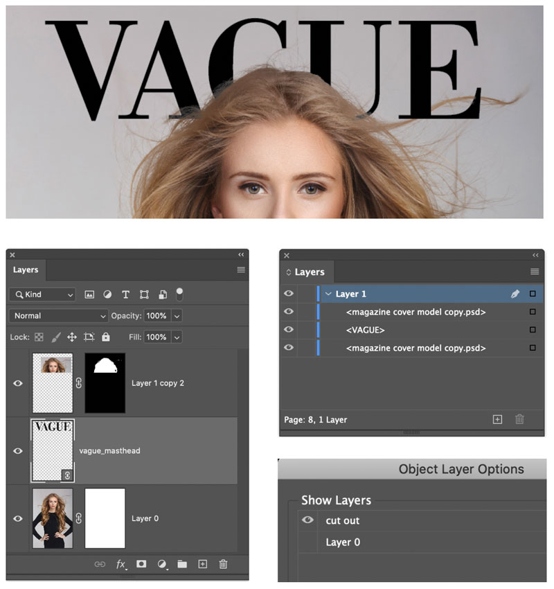
Figure 9. The magazine nameplate appears behind and in front of the image. Simply sandwich the text between two copies of the image: The top copy is a cut out of the head. Use Object Layer Options to hide the Background layer for this top copy.
Illustrator
Here are some tools and techniques for making eye-catching text effects in InDesign’s closest software sibling.
Touch type
For my money, one of the most satisfying—and possibly one of the most underrated—tools in Illustrator is the Touch Type tool. With just a few moves you can transform your type: shifting baselines, adjusting scale, and changing rotation on a letter-by-letter basis (Figure 10). It’s great for when you want to add some character and friendliness to your display type. There’s no need to convert the type to outlines, and it all remains live and editable, which is a big plus. Although if you do end up changing the content or character settings, you’ll probably want to start from scratch with your Touch Type adjustments.
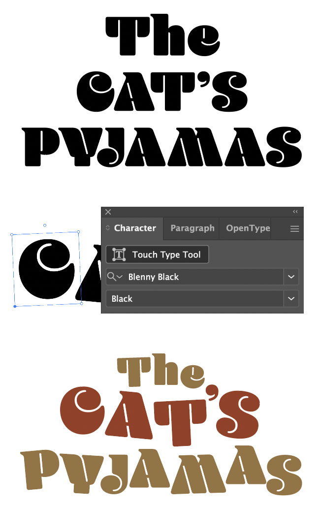
Figure 10. Add personality with the Touch Type tool by shifting baselines, rotation, and scale. When you select a letter, the top-center circle lets you rotate; to adjust vertical scale use the top left, for horizontal scale, the bottom right, and for proportional scale, the top right.
Offset outlines
This is one of the oldest tricks in the book, but not a bit less relevant than it has always been. By using Illustrator’s Appearance panel, you can apply multiple fills and strokes to the same object, each of which can be moved up or down in the stacking order of effects and offset independently. The type not only remains editable, but you can capture the settings as a graphic style (Figure 11).

Figure 11. In Illustrator, select the type and use the Appearance panel to add three fills. Choose fx > Distort & Transform > Transform to offset the position of the bottommost fill (black). Make the middle fill the same color as the background, and offset this a lesser distance. This effect is non-destructive and can be captured and reused as a graphic style.
While it’s possible to go crazy with multiple effects, the best results often come from the simplest treatments: two fills of different colors, one offset from the other, with a stroke or fill that is the same color as the background sandwiched between them. Be sure to keep the stroke below the top fill, so that the stroke itself, which is center weighted, doesn’t move inside the letter shapes. In effect, only half the stroke weight is visible outside the filled letter shapes. It’s true that you can create the same effect in InDesign, but Illustrator’s Appearance panel keeps all the components together as a single element, which makes it easier both to set up and edit.
Photoshop
When you’re ready to pull out all the stops and create some top-shelf type effects, it’s time to fire up Photoshop.
Hand-inked effects
There are numerous ways to achieve a (hastily) hand-inked effect, but here is my favorite: Prepare your text, then add a layer mask filled with black. To do this, start by creating the basic type with the Type tool. Then, with the type layer selected, hold Option/Alt when you click the Add Layer Mask button on the Layers panel. This conceals the whole layer, making the text invisible. The next step is to reveal the text by painting in white on the layer mask with a texture brush. I like to use Brayer Boss from Kyle’s Megapack (a free download here). To force myself to work more deliberately, I prefer to set the Brush spacing to 100% on the Brush Settings panel. Adjust your brush size by pressing the ] key (bigger) or the [ key (smaller). With the brush, dab, rather than swipe; this reveals the text with more imperfections. If you go too far—that is, if your text ends up looking too perfect—press X to toggle the foreground/background colors and paint in black on the layer mask (Figure 12). The fun part of this technique is that the result will always be unique. You wouldn’t be able to repeat the result exactly—even if you wanted to.

Figure 12. First, conceal the text with a black layer mask, and then paint it back in multiple passes using a white textured brush.
Textured text
When I teach Photoshop composition, I often say, “The answer is ‘Use a layer mask.’ Now what’s the question?” This is equally true when working with type in Photoshop. Layer masks are non-destructive, potentially transformative, and yes, it must be said, a little confusing. To put it simply, you paint in black on the layer mask to hide portions of the layer, and paint in white to reveal portions of the layer. Actually, it’s not just black and white, but potentially 256 shades of gray. And that means that you can use a grayscale version of an image as a layer mask. This is how I like to work with texture, so that I’m not introducing any color from my texture image.
Here’s how it’s done: Put the texture image on a layer above your type. Now to convert the layer into a layer mask, first load the luminosity channel or gray values of the layer by going to the Channels panel and Command/Ctrl-clicking the RGB thumbnail. Now return to the Layers panel. Hide the texture layer, target the type layer, and convert your active selection (marching ants) into a layer mask for the type by clicking Add Layer Mask (Figure 13).

Figure 13. Left: Select the gray values of the image (Command/Ctrl-click on the RGB channel). Right: Hide the texture layer and apply the selection as a layer mask to the type layer.
Depending on how much contrast you want, you may need to go further. With the layer mask selected, choose Image > Adjustments > Levels (Command/Ctrl+L) and increase the contrast by moving the white and black point sliders closer to the center.
For more contrast, choose Image > Adjustments > Equalize. This distributes the gray values across the full tonal range. It can wreak havoc with a “normal” image, but it’s a handy option for spreading out the tones in a texture image. If this still isn’t enough contrast, it’s time for the nuclear option. Choose Image > Adjustments > Threshold to convert the gray values to black or white (there are literally no shades of gray with this approach), then move the Threshold slider left (more white) or right (more black). This is a season-to-taste scenario and will depend upon the properties of the texture that you’re starting with (Figure 14).

Figure 14. Steps to adjust the contrast. 1: The layer mask without adjustment, derived from the gray values of the layer. 2: A levels adjustment applied to the mask. 3: Equalize adjustment applied to the mask. 4: Equalize adjustment followed by a Threshold adjustment.
Layer Mask Shortcuts
So that you can work fluidly, it helps to use keyboard shortcuts when working with layer masks in Photoshop.
Option/Alt+click the layer mask thumbnail to see just the mask. Option/Alt+click again to see the layer.
Shift+click the layer mask thumbnail to disable/enable the layer mask. A red X appears on the mask when it is disabled.
B selects the Brush tool.
[ reduces brush size.
] increases brush size.
Shift+[ reduces brush hardness.
Shift+] increases brush hardness.
D restores foreground and background
colors to black and white (or vice versa).
X toggles foreground and background colors.
Numerals change brush opacity: 1=10%, 5=50%, and 0=100%, for example.
Fitting FX
With each upgrade of software and every increase in computer processing speeds, the options for text effects and the ease with which they can be applied increases. What remains constant is that the best, most impactful techniques rely not so much on glitz or bling, but rather on being appropriate to the message. In addition, an effect will only work when applied to a well-chosen font, one whose characteristics make it suitable for the job at hand.
Commenting is easier and faster when you're logged in!

Recommended for you

Making Illustrative Effects in Photoshop
Combine illustration and photography to create an intriguing image. Drawing skil...

Quick Wins: Vector Drawing Skills
Use these five resources to boost your vector drawing skills.

How to Use Symbols to Update Artwork Quickly in Illustrator
Learn how to use symbols in Illustrator to create instances of artwork that can...