

Most designers and related creative professionals are familiar with the terms Italic and Oblique, yet confusion does exists on the part of many regarding the differences between the two. While each refers to a slanted, or angled design, there are important distinctions between both terms, which in turn can influence their potential usage.

Two typical examples of italic and oblique designs with their companion romans.
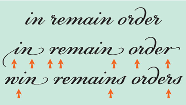
Italics are an angled typeface that has different design characteristics from its upright, roman companion. They are most often a separate yet complementary design, with unique features and frequently different character widths. Many italics have a somewhat calligraphic appearance, especially those that are designed for a serif typeface. Italics designed for a sans serif typestyle are often quite similar to their upright companion with the exception of a few (or more) differing characters, such as the lowercase a, g, and/or the f.

Many italics are completely different designs from their companion roman, as illustrated by Adobe Garamond (upper); other italics are similar designs that contain a number of varying characters, such as the italics belonging to Enclave (middle) as well as Harmonia Sans (lower). Note the character width differences (as noted in the line lengths) between each pair.
Obliques, on the other hand, are simply slanted versions of their roman companion with no major design differences, other than their angle. They are most often found in sans serif typeface families, although not all sans serifs have obliques as opposed to italics, as noted above. (An important point to note is that although this is a broadly accepted naming convention, there are exceptions to this unofficial, yet commonly applied rule. For instance, different versions of Helvetica can be found with the same slanted design named both italic and oblique.)

Obliques are a slanted, albeit optically-corrected, version of their corresponding roman, and thus have similar line lengths. Set in ITC Fenice, Glypha, and Avenir.
Professional-quality, “true-drawn” obliques and italics are not just computer-generated slanted versions of their roman companions, often referred to as “fake” italics or obliques, but are either hand-drawn or skillfully modified to optically correct the distortion that results from this action. In his blog post entitled Fake vs. True Italics, Mark Simonson describes the work that went into designing the italics for his Proxima Nova family, effectively illustrating the differences between the two. So remember: if professional typography is your goal, stay away from any fake, or computer-generated obliques or italics (including those that are commonly created in word-processing programs,) as they will degrade your typography and thus, the overall design.

Computer-generated slanting (shown in red) results in distorted letterforms and inconsistent stroke thicknesses, akin to a fun house mirror effect. True-drawn obliques (upper right), on the other hand, are proportionally balanced with correct stroke weights. Set in ITC Avant Garde Gothic.
So now that you know the difference between italics and obliques, how do you decide which to use? Both are commonly used for emphasis, as well as stand-alone usage. Most italics, especially the calligraphic variety, have a stronger contrast when used with their companion roman, compared to an oblique, which can be used in much the same way as italics, but has a softer “voice,” if you will. Therefore, when doing your font exploration, consider how much contrast is required for the project at hand, and conduct your search accordingly.

The ITC Legacy Serif Italic used in the setting on the left creates a stronger, more noticeable emphasis than the Avenir Oblique used on the right. Excerpt from Gulliver’s Travels, by Jonathan Swift.
This article was last modified on April 29, 2022
This article was first published on July 23, 2014
Commenting is easier and faster when you're logged in!

Recommended for you
TypeTalk: Glyph Substitution
TypeTalk is a regular blog on typography. Post your questions and comments by cl...
Prep for Winter Now: New "Snowflake" Font
Press Release Snowflake, designed by Jessica Hische, is a new display font that...

All Berthold BE Fonts Now Available in OpenType Pro
Berthold opens 2008, its 150th anniversary year, by adding another 100 OpenType...