
Showing results for mon con9 com mon mon con9 com 75cm com1093699 chosen47 mon con9 com chickn con9 com com1093747 com ( com ( c’mon c’mon c’mon c’mon
In these modern times of environmental responsibility, plenty of companies are choosing to ‘go green.’ And while we all have different opinions on the best way to reduce, reuse, recycle – printing is one of those areas where businesses often choose to save costs and reduce their environmental footprint.
While there’s nothing I like more than a beautiful coated PANTONE ink on some quality textured heavy stock, I can totally understand businesses that want to send letters, invoices, and quotes via email, rather than expending energy and cash on paper, printing and postage.
Good luck to them, I say, until they ask me to convert the amazing letterhead I’ve just designed for them in InDesign into a Word template that can be used by their administrative staff and sent via email, rather than snail mail.
Still, I’m sure you want to save our planet as much as I do, so let’s discuss how we can make this happen. And while we’re discussing letterheads in this example, the same techniques can be applied for any custom Word template (like envelopes, reports, invoices etc)
Setting Expectations
Of course, your client has been thrilled with the work you’ve done on the original letterhead and you don’t want them to be disappointed with anything that you submit, so it’s important to have an upfront discussion about what you can and can’t control when it comes to converting your artwork into Word. Here are some important topics to cover.
Bleed
If your client wants a design that goes right to the edge of the paper – no problem! Until they want to print it out. Make sure they understand that anything that’s viewed onscreen in Word’s Page Layout View (or in Acrobat if the Word doc gets exported to PDF) will have artwork that goes to the very edge of the page. However, if they want to print it out (or have their customers print out the email copy they receive) there will always be a white non-printable area around all four sides of the document. This area is where the standard office printer grips onto the paper as it’s moving through the printer and therefore the space cannot be printed on. The only option would be to trim it off after printing, and most people aren’t prepared to take on that extra workload.
Fonts
With all the fabulous fonts now at your disposal, you’ll have chosen something amazing that suits your client’s image perfectly. And they may have even installed that font on their own computers. But their customers most likely will not have it. Any text in your design will be rasterized as part of the process which won’t give results as good as a commercially printed letterhead.
Color Fidelity
There’s no such thing as PANTONE or other spot color inks in Word. Your client will have to be satisfied to use the CMYK equivalent of their logo colors. And how close the output is to their intended color depends on a range of factors, including the thickness of the paper, the quality of the printer and whether it’s running out of ink.
So, if your client is still keen to proceed after understanding the limitations of bleed, font and color, let’s make it happen!
Recreating the Letterhead Template in Word
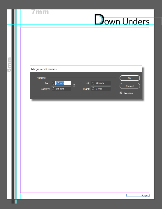
For this example, I’m using Creative Cloud 2019 (14.0.1) and Word 2016 for Windows (18.11) so my screenshots might look a little different to yours, but the concepts remain the same. I’ve created a letterhead in InDesign which has a different first page to the consecutive pages. Measurements are included in my images below.
Export Artwork
Unless it’s an incredibly simple design, don’t even think about re-creating it in Word. It’s much simpler to export elements of your design from InDesign into PNG (Portable Network Graphics) files which can be imported into Word in the appropriate positions.
If your design has elements on more than one side, (art across the top and down the left, as in my sample letterhead above), you’ll need to export each side separately.
For each side that you’ll be exporting:
- Select all the objects that make up that side
- Choose File > Export, give your file a name and from the Save As Type dropdown, select the PNG format.
- Click Save
- Use the PNG Options dialog box to specify that you want to export the selection and choose the resolution and other settings (see my recommendations below).

Because of the way I’ve created my letterhead, I’ve ended up with three files – one for the first page header, one for the header on consecutive pages and one for the stripes that go down the left side on all pages. (TopFirst.png, TopAll.png, Side.png). I don’t export the page number text (which appears at the bottom-right of the second and subsequent pages) because I want to build that in Word so page numbers can be calculated automatically in there for documents as they’re created.
Setup the Template in Microsoft Word
Now that you have the various elements exported, we can build the template within Microsoft Word by setting up our layouts and placing our elements into the header and/or footer areas. These areas are similar to Master Pages in InDesign in that elements in these areas will repeat on all pages, sitting on a layer underneath the copy text on each page.
Start a new letter-sized document by clicking File > New > Blank document. If you want to see the page as a whole, the zoom control is at the bottom right.
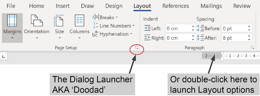
Click the Layout tab to display the Layout ribbon. While there are separate buttons for each function, the quickest way to make changes to Margins, Orientation and to let Word know if you want to use a different header on the first page is to click the little doodad at the bottom right of the Page Setup section on this Layout ribbon. Its official name is the ‘Dialog Launcher’ but I think it’s much easier to call it a doodad.
Quick tip: you can also double-click the grey area at the beginning of the horizontal ruler to access the layout options. If you’re rulers aren’t showing, click the View tab to display the View ribbon and check Ruler.
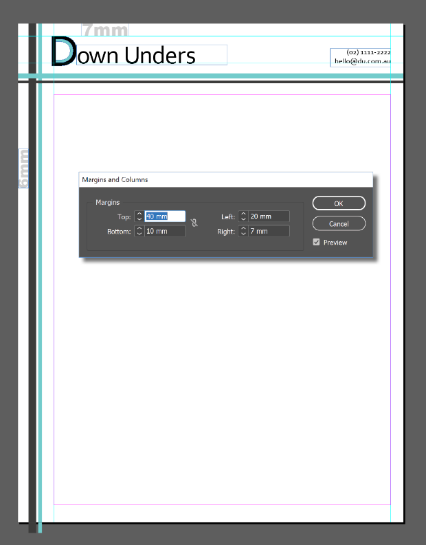
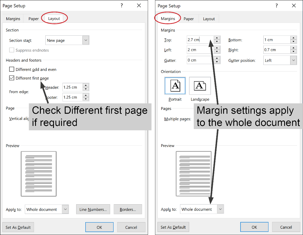
On the Layout tab, check Different odd and even if you want facing pages and/or Different first page if your first page design is different to consecutive pages (like mine). On the Margins tab, enter your margin settings and change your orientation if required. Note: despite checking Different first page on the Layout tab, the margin settings displayed on the Margins tab are for the Whole Document. If you’re looking to set a larger top margin on the first page (like I am), enter the smaller settings here (ie the settings you want for all consecutive pages) and we’ll need to adjust the first page later. Click OK when you’re done.
When you’re happy with your initial setup, save the file as a Word Template (.dotx extension). When saving as a template, Word will recommend you store the file in the default Template location – this is up to you, but if you store it here, you can test it regularly because it will appear as an option when you select File>New>Personal. I recommend saving regularly as you’re working (way more than you think is necessary) because things can get a little fiddly and you don’t want to lose anything after you’ve tweaked it into perfection.
Import Artwork into the Header
To access the header area in Word, click the Insert tab to display the Insert ribbon and then click Header > Edit Header (or Footer > Edit Footer).
Quick tip: you can also just double-click in the blank area at the top or bottom of the document to display the header or footer panes. Double-click outside the header area to return to the page working area.
Now we’re in the Header pane, a few things will look different …
- A dashed line will appear with a tag that says Header to indicate you are now in the header area. (If you’ve selected a different first page header, this pane will be labelled First Page Header)
- Your cursor will be positioned inside the header pane
- The Header & Footer Tools Design ribbon will be made available
- The vertical ruler changes to indicate you’re in the header pane (if you’ve got rulers displayed)
- If you’ve already got some text on the page, it will appear ghosted
… and we’re ready to import the PNG file that we want to appear at the top of our first page.
On the Insert ribbon, click Pictures and navigate to the image you need (TopFirst.png for me). Select it and click Insert. This will embed the art into the Word file like an inline object without creating a link back to the original in the way that File > Place does.
It’s likely the image needs to be scaled and repositioned. While it’s still selected, the Picture Tools Format ribbon will be available. This ribbon is where Word puts all the good stuff like cropping, adding borders and effects but since you worked all that out before exporting, you shouldn’t need to do any of that here. What you will need to do is click the Dialog Launcher doodad next to Size to edit the scaling and position of your placed picture.

In this dialog, use the Size tab to return the Scale setting to 100%, click the Text Wrapping tab and choose Behind Text which will sit the image behind the text, allowing you to add any extra text (like a page number or file name) in front of the image and will also allow you to specify an XY position from the Position tab. Most likely, you’ll set your Horizontal alignment to Left, relative to the page and Vertical alignment at an Absolute setting to match the distance your design sits below the top of the page. Unfortunately, there’s no preview checkbox so you’ll need to click OK to see your changes take effect. You can revisit this dialog a number of times to tweak the position measurements but if you’ve taken down the measurements from your InDesign layout, this process should be reasonably simple.

Import Artwork into the Footer
If there’s a footer image you want to include, you’ll need to activate the footer pane. If your header is still open, the Header & Footer Tools ribbon will include a Go to Footer button or you can just scroll down to the bottom of the page and click inside the footer pane. Once again, if you’ve selected Different first page, this footer pane will be labelled First Page Footer. However you get to the footer pane, once you’re there, repeat the whole process above of inserting, repositioning and resizing your image until you’re happy with the result.
If you’ve got elements that are meant to appear on the sides of your document, they can be included here in the footer pane. There’s no problem including a couple of elements in this pane (for left and right), just insert one element and then insert another and lay them out to match your original design as best as you can.
In my example, I’ve put the header items in the First Page Header pane and the left side stripes in the First Page Footer pane. The Horizontal position of my stripes element is set to 6mm to the right of Page and Vertical alignment is set to Top relative to Page to match my original layout.

Checking your document
Close the header and footer panes and take a look at your document so far. There’s a Close Header and Footer button on the ribbon but you can just double-click on the page outside the header or footer pane to return to the main body of the document. The elements that you’ve just added will ghost out to indicate that those panes are no longer active and therefore can’t be easily selected and moved. Don’t worry, they’ll print out at 100%, they’re only ghosted on screen. To see pages 2, 3 and later, you can add a bunch of carriage returns to create a second and third page or just hit Ctrl+Enter a couple of times to force some page breaks. Use the zoom control at the bottom right of your screen to view the document as a whole. You’ll find it easiest from now on if you keep your document zoomed out to about 50% to allow yourself to see pages 1, 2 and 3 the whole time. I also recommend you show your hidden characters at this point to make sense of what you’re seeing. Do this by clicking the Show/Hide button on the Home Ribbon.
![]()
You might be surprised to find that the headers and footers you’ve set up aren’t appearing on all pages you’re displaying. Where they are displayed will depend on whether you’ve checked Different First Page or Different Odd & Even pages. I selected Different First Page, so the header and footer I setup was only for the first page. That means my second and third pages still appear blank.
If this is also how your document is looking, you’ll now need to repeat the whole insert/reposition/resize process repeatedly to add the visual elements into the other header and footer panes that you’ve created.
If you’ve selected Different First Page, you’ll just need to put something in the panes labelled ‘Header’ and ‘Footer’ on the second page. But if you’ve selected Different Odd and Even pages, the empty panes on Page 2 will be labelled Even Header and Even Footer, and on Page 3 will be labelled Odd Header and Odd Footer (and they’ll all be available for you to add graphic elements into if you wish).
If your header and footer panes haven’t worked out the way you wanted, you can use the Header & Footer Tools ribbon to access the Different First Page and Different Odd and Even checkboxes to clarify the settings you want.
Don’t forget, you should be saving regularly so as not to lose any tricky tweaks you’ve made along the way.

Final Tweaks
After you’ve completed all header and footer panes on pages 1, 2 and 3 as required, you’ll need to consider if you want to change the margin settings. We setup the margins for the whole document during the initial document setup in Word, but I want my first page to have a larger margin area at the top – I want to set mine to 40mm for the first page only.
Unfortunately, there’s no setting in Word that makes this possible. All you can do is add some whitespace into your first header to create some ‘breathing space’ between your artwork and the body text. Here’s a little tricky way I developed to make this happen easily and all it requires is a teensy bit of math.
Make sure you’re in the First Page header pane and take a look on the Page Setup dialog on the Layout tab to locate how far the header is set to start from the edge of the paper (remember, you can access this dialog quickly by double-clicking the grey part at the beginning of the horizontal ruler).
The default here is 1.25cm but you can change the header setting here a little bit without having too much impact if it makes the following math easier for you. I’ll leave mine set to 1.25mm. Remember from my initial InDesign image that I want my top margin to be set to 40mm. All I need to do here is subtract the difference between these two to work out how much extra whitespace I need to add in (40cm-1.25cm=2.75cm). So, I need to get 2.75cm of extra white space inside the First Page Header pane. And the easiest way to do that is by inserting that much space before the empty paragraph that’s sitting inside the First Page Header pane.
Now that we’ve worked this out, cancel out of the Page Setup dialog and click the Home tab and then click the Dialog Launcher doodad for the Paragraph section. Change the setting of your Spacing Before to match the amount of white space that you want to add. For me that’s 2.75cm. (Just like in InDesign, you can type the measurement plus the unit of measurement you’re using and Word will convert to the default unit of measurement, so I’ll type 2.75cm and it will convert to points). Click OK and your paragraph mark (only visible if you’ve got your hidden characters showing) will have moved down to allow this space and the First Page Header pane will have grown accordingly to allow the white space to fit.

Now, if you want page numbers added for page 2 onwards, we’ve still got some work to do. Make sure you are in the Footer Pane on page 2. Press Ctrl/Cmd+R if you want your page number right-aligned. Type any text required like “Page ” and then, from the Header & Footer Tools Ribbon, click Page Number > Current Position > Plain Number. This should insert a 2 since you are currently on page two. You can format this text to the font and/or size you like using the controls on the Home ribbon.

Testing it
When everything’s looking good on screen, it’s time to test it out. If you’ve saved the file in your default templates folder, you can select File > New > Personal and select the template from there. Create a new document based on your template and add some placeholder text (this isn’t possible automatically in Word, just type “The quick brown fox ..” or something similar and copy/paste repeatedly until you’ve got a couple of full pages). Your printout will show if the elements are placed correctly on the printed page, and if the quality is up to scratch. On mine, I discovered that the email address on the first page had been cut short by that non-printing white area around the page edge, so I had to move it back to the left a little.
If you find that Word takes too long to print, don’t be afraid to edit your original elements or change the resolution of your PNG files to improve the final output. Consider sending a copy to your client so they can print it out and check it as well. It’s best to spend the time to get this stuff right.
Finishing Up
You might want to edit the built-in paragraph styles for date, salutation, body text and signature to save your users time when they’re using your template. Make sure you select a font that you know your clients have!
When you’re done, remove any page breaks so that the document is only one page long. (The settings for page 2 and beyond will be saved in the template file even though you can’t see them. When the template is being used, it will start as a single page and when a second page is required, the header/footer and margins will automatically be applied.)
Save the file one final time as a Word template (.dotx). Take a look at the file size and ensure that it’s not too mammoth. If this file’s going to get rejected by the recipients’ mail servers your client’s not going to be too happy. Once you’ve completed the entire process, send the file to the client and have them copy it into the default templates folder for each user. To access it, they choose File>New>Personal and it will appear as a custom template.
Phew! Well I warned you that it was quite a process but you’ve done your part towards saving the planet and can give yourself a pat on the back for a job well done.
The original version of this article was written by Anne-Marie Concepción and published on Apr 2, 2008
Excerpted from The Digital Photographer’s Notebook: A Pro’s Guide to Adobe Photoshop CS3, Lightroom, and Bridge. Copyright © 2007. Used with permission of Pearson Education, Inc. and Peachpit Press.
Photography has undergone an earth-shattering sea change in its transition from film to digital. At the same time, the foundation of photography — light — remains the same. Photography literally means “light writing,” which means that photographers are light writers. The ability to bend light to our vision is what makes us photographers. After all, anyone can buy a high-quality digital camera. Very few can light a subject well. You might say light writers light right.
Eye versus Camera
It all starts with how our brain sees light — and how the camera records it. Adding to the complexity is that what your camera records may not be possible to reproduce on the printed page. Here’s how it breaks down.
The range of light on a bright sunny day is too wide to capture detail in both the shadows and highlights with a camera, whether digital or film-based. This fact doesn’t seem to jibe with how the brain handles visual processing. When we look at a scene that has too wide a range, the brain looks first at the brightest areas. It remembers the details in the highlights and midtones, then it tells the pupils to widen to see what’s in the shadows. The brain combines the two images — the lightest and the darkest — in real time, allowing us to think we see a wider range of brightness than we really do. In other words, the brain is doing Photoshop on the fly. Who knew?
Digital cameras can record a wider range of brightness than film can. That’s good. The problem is that printers can’t begin to reproduce the brightness range of film, much less that of digital. There is a range of brightness of light that can be printed that will give detail in the highlights and shadows at the same time. A good inkjet printer can hold detail if the image has RGB numbers of around 25 to 40 in the shadows and a range of 242 to 249 or so in the highlights. Printing from Lightroom works the same, except the RGB values are presented as percentages. From 7% to 95% will provide a brightness range of reproducible shadow and highlight detail. Your printer, ink, and paper combination will also affect the results. Newer printers can extend that range on glossy or luster papers. Fine art papers, matte, watercolor, or canvas have smaller ranges between highlight and shadow detail. If the RGB number reads lower or higher when sampled, detail must be sacrificed in either the shadows or the highlights. Digital cameras today have sophisticated built-in software to help with setting exposures that return fairly consistent quality images. The algorithms tell the camera which end of the brightness range to favor and which to discard. The usual bias is to keep detail in the highlights and let the shadows go dark. It’s a good compromise for point-and-shoot situations.
Lightroom Numbers
Lightroom’s engineers (along with about half a million beta testers) took a fresh look at everything digital photographers do. Then they asked, “Does this really make sense?” One of the items that didn’t make sense was how Red, Green, and Blue values are displayed. Lightroom shows RGB data as percentages. So 0% is black and 100% is white. Photoshop and Bridge show 0 as black and 255 as white. Photographers used to the 0–255 system can be confused by Lightroom’s percentages. A workaround is to multiply the percentage reading in Lightroom by 2.56 to convert to the familiar 0-255 scale. So 97.3% in Lightroom is 249 RGB. And 25 in the RGB world is not quite 10% in Lightroom speak. Graphics in The Digital Photographer’s Notebook will show both numbers where appropriate.
In Figure 1, Photoshop and Camera Raw RGB numbers are shown across the top. The equivalent Lightroom values are at the bottom. There are twenty-one steps in this grayscale between complete black and paper white. How many can you count? For comparison, a continuous tone grayscale runs through the middle of the step wedges.

Figure 1
Specular highlights — catchlights in the eyes, or sun glinting off a chrome bumper — are reflections of the source of light. They have no detail and don’t count when considering the tones for printing. When printed they appear as paper white.
The photographer’s job is to use light to control (and often compress) the brightness range so both subtle shadows and highlights shine through. Lighting starts with exposure.
Exposure and Metering
Exposure, or the amount of light that hits your camera’s sensor, reveals the diffused value or true tone of the subject. That’s simple to say and a bit trickier to do, especially with a digital camera. There are two methods of reading light to determine exposure. One measures light after it has already lit the subject, bounced off, and is on its way to the camera. The other measures the light before it hits the subject. The first method is reflected metering. It interprets the amount of light that has already illuminated the subject. The second is called incident metering because it measures light before it reaches the subject. Let’s look at each in turn.
Reflected Metering
Reflected meters are the kind that are built into cameras. This type of meter sets a default exposure that returns a middle gray value, or RGB numbers of around 127 (Lightroom: 50.2%). If your camera’s meter reads a white value, the meter tells the camera to underexpose the scene by 2 2/3 stops so that it yields the desired middle gray. Pointing the meter at a black value results in a two-stop overexposure so that it once again results in middle gray (Figure 2). Reflected meters return an exposure value equal to 12.5% gray on any value they read.

Figure 2
Look at the average RGB numbers for the three separate exposures shown in Figure 2. Each average is taken from white, gray, and black areas in the scene. The results of the separate exposures for the three swatches are: white: 129 (LR: 51.3%); gray: 130 (LR: 51.1%); and black: 127 (LR: 50.5%). The only exposure that can be called useful is that made by reading the gray patch. To make accurate reflected-meter readings, it’s common for photographers to carry a neutral gray card or the GretagMacbeth ColorChecker Gray Scale balance card, shown here. If a card is not available, worn asphalt and green grass can do the trick as both are close to 12.5% gray.
Incident Metering
Incident meters — separate handheld devices not built into the camera — are the most effective meters for setting proper exposure because they measure the light falling on a subject. Unlike reflected meters, they are not affected by the tonality of the subject. Incident meters are held at the subject’s position (Figure 3). The dome receiving the light is aimed at the source of light. The reading is then set on the camera. This exposure setting is the diffused value. Once the exposure readings are entered in the camera, everything else in lighting is subjective and done at the photographer’s whim for the desired effect.

Figure 3
Contrast
Contrast is the difference between highlights and shadows. When the contrast range is greater than four f/stops from darkest to lightest, the result will be out of the range most printers can handle. Usually the result is solid black shadows (Figure 4). The shadow area in the photograph of model Marie Friemann shows a reading well below the 25–40 minimum RGB range that’s required to show detail. This example is a high-contrast photograph. The difference between the lightest and darkest areas is well beyond a reproducible four stops. The shadows are blocked up so much as to be black.

Figure 4
Lowering Contrast
Adding light to the shadows lowers contrast. My assistant, Holly Jones, holds a reflector panel that bounces light from the source back into the shadows at Marie’s right (Figure 5).

Figure 5
As a result, detail within the shadows is revealed (Figure 6). The Red channel now reads 69 (LR: 21.3%). Her hair, forehead, cheek, ear, and the texture in the shadow area of the background are revealed. The exposure remains the same, as no more light is coming from the source.

Figure 6
One of the reasons photographers love the light in the latest part of the afternoon, just before the sun dips below the horizon, is its directionality, warm color, and lower contrast. The shadows are filled in by the open sky.
Quantity or Quality?
Light is confusing. Consider this question: “As a subject gets closer to a light, does the light become harsher or softer?” Think about this for a minute. Imagine you are in a room at night with a single table lamp across the room providing illumination. Hold up your hand. Walk toward the light. Does the amount of light falling on your hand increase? Yep. Sure does. So the closer you move to the light, it gets brighter and harsher. Right? Well, half right, anyway. It does get brighter. It also becomes softer. And we humans, thanks to the way our brains work, universally confuse brightness with harshness. We mix up the quality of light with the quantity we see.
Shadow Edge Transition
Imagine you are walking away from the light. Hold one finger over the other palm of your hand. It casts a shadow. Look at the edge of the shadow. It sharply outlines the shape of your finger (Figure 7). The edge marks the transition from highlight to the shadow. If the shadow has a sharp edge, the light is harsh. Now think of shadows cast on a sunny day. They are very defined. The earlier photographs of Marie as seen in Figures 4.4 and 4.6 are made with harsh light. The edges of the shadows cast by her nose and chin are very sharp.

Figure 7
Now pretend you are walking toward the lamp. As you get closer, notice the edge of the shadow cast by your finger on your palm. The edges of the transition from highlight to shadow are blurred. By the time you get next to the lamp, the shadow and the highlight almost merge. What’s going on here? The light is really bright and the shadow edge is soft. Hmmm. Well, there are a couple of things happening.
First, the light has become much larger in relation to the size of the subject so the transition from highlight to shadow is spread out (Figure 8). The result is an almost shadowless image similar to what you see on an overcast day in which the whole sky is the (really big) source of light. Second, as the light gets brighter the exposure on the camera has to be lowered to compensate. The background becomes darker.

Figure 8
The larger a light source is in relation to the subject, the softer the quality of the light. Large light sources make soft light. The transition from highlight to shadow is spread over a large distance. Small light sources create harsh light and sharp shadow edges.
Instant Soft Light
Soft light is great for portraits of women and children. The long shadow edge transition minimizes texture in skin and enlarges the catchlights in the eye. It is very pretty. Best of all, it is easy to achieve. Either wait for an overcast day or slip a diffusion panel in front of the light source. Think of diffusion panels as on-demand clouds or port-a-clouds.
Sunny-day Soft Light
Outdoor sunlight streaming through tree leaves creates areas of very bright highlights and deep shadows, resulting in a high-contrast scene (Figure 9). The sun on Cara’s face and legs is so bright that the detail in her skin disappears completely due to overexposure. Closing down the aperture on the camera to compensate would make her outfit go completely black. Look at her black robe draped over the chair. You can see folds in it. The exposure is correct for the shadows because these details show. So how can the contrast be lowered?

Figure 9
Remember that the only way to lower contrast is to add light to the shadows. The solution is to bring in a diffusion panel that is large enough to soften the light falling on Cara. In this case, it’s a 42 x 72-inch Chimera frame with a full translucent panel on it (Figure 10).

Figure 10
Now the patches of bright sunlight and the shadows cast by the leaves blend into soft light (Figure 11). The panel’s fabric reduces the amount of light reaching Cara by 11?2 f/stops. If we open up the camera’s aperture by that amount, the exposure adds light to the shadows, thereby lowering the contrast on Cara. At the same time, the increased exposure brightens the background not covered by the panel by 11?2 stops, as well. The light hitting the stone wall behind her is much brighter now, complete with blown-out highlights. Brightening the background in a photograph by reducing the light hitting the subject and then increasing the exposure to compensate is called subtractive contrast control.

Figure 11
Harsh then Soft Studio Light
Any light you find in nature can be duplicated in the studio — and it’s not hard to do. In this section, you’ll see how to place a single flash to replicate the effects of sunlight on both a clear and an overcast day.
Photographs do much more than tell the story of their subject. They also share exactly how it was lit. (Well, if someone has been playing around in Photoshop, it may not be exactly how the subject was lit.) Learning to read the lighting cues in a photograph goes a long way when you are creating the lighting yourself. Specular highlights reflect the source of light in the subject. Look for them on the hood of a car, on the glass of a window, in the water of a pond or lake, and in the eyes as they catch the light (Figure 12).

Figure 12
Specular highlights show you the size of the light shining on the person. A big catchlight reflects a large source and that means a gradual shadow edge transition, the indicator of soft light. A pinpoint of light in the eye would lead you to look for a quick, sharp shadow edge. Sometimes you can uncover retouching done on photographs by examining the catchlights. If the shadow edge transitions don’t jibe with the specular highlights, you can be almost certain that Photoshop has touched the photograph. Now that you know how light works, your photographs with long, smooth shadow edges won’t have teeny tiny catchlights in the eyes, will they? Of course not.
Harsh Light, High Contrast
This photograph of Marie is lit with harsh light (Figure 13). The tell-tale signs are the sharp transition from dark to light in the shadow cast on her cheek by her nose and on her shoulder by her chin. The tiny catchlight in her eye shows the size of the light source.

Figure 13
The high-contrast harsh-light image is made with a single flash set twenty feet from Marie and positioned forty-five degrees to her left and forty-five degrees above her (Figure 14). The flash is both the origin of light and the source of light because there isn’t a modifier (such as a diffusion panel) between it and the subject. At twenty feet, the 51?2-inch reflector is about the same relative size as the sun.

Figure 14
Here’s an easy way to see if your light will deliver sun-like quality. Hold your thumb at arm’s length from your eye. If your thumb blots out the light, it will be very close in quality to the sun. I guess this really is a “rule of thumb.”
Soft Light, Low Contrast
This photograph shows Marie in soft light with low contrast (Figure 15). The shadow edge transition is spread over a wide distance. The change from highlight to shadow is almost undetectable because of the low contrast. Again, the catchlights in Marie’s eyes show the size of the source of light.

Figure 15
Three changes have been made — two on the set and one in the camera. Two incident controls — a diffusion panel and a bounce panel — have been added. Incident controls modify light before it reaches the subject. Some other changes have happened by adding the incident controls. The diffusion panel becomes the source of light. The source of light always illuminates the subject. In this setup, the flash is the origin of light. It lights the source. The bounce panel, in this case another Chimera panel covered with silver lame, catches light from the source of light and the origin of light to fill in the shadows, seriously lowering the contrast (Figure 16).

Figure 16
Take a closer look at Marie’s eyes (Figure 17). The silver bounce panel shows on her right, and there is another reflection on the lower part of her iris. The white floor adds even more fill light.

Figure 17
Finally, as in the earlier example diffusing the light outdoors on Cara in Figure 11, the exposure on the camera has been increased to compensate for the brightness reduction caused by adding the diffusion panel.
Soft Light, High Contrast
Removing the bounce panel from the set takes light away from the shadow side of Marie’s face and the contrast increases (Figure 18). Adding light to the shadows lowers contrast. Removing it from the shadows increases contrast. Contrast, and the quality of light, are all subjective decisions made by the photographer. Once you have set the diffused value (exposure on the camera), everything else is relative to it and under the rule of your every whim.

Figure 18
Creative Lighting
Learn to see your muse, as the camera will record it. One way to truly shortcut this process is to hook your camera up to your computer so you can see each image large on the screen. (See Chapter 3.)
Open a JPEG or RAW photograph in Photoshop. Zoom in to see the actual pixels at 100% and check your focus. Look at the catchlights in portraits. Be aware of the contrasts in the photograph. Is there a shadow that has lost detail? Are there any blown-out highlights (aside from the specular highlights)? Where would a little more light make a big difference? Those differences can be so subtle — you may only notice them by comparing them to other photographs.
Take a look at the photograph of Atlanta Falcons cheerleader Nikky Williams (Figure 19). Look at her left arm. It has a deep shadow. Her hair on that side falls into shadow and looks dull. The addition of a silver 42 x 72-inch bounce panel behind her adds a rim of light to her hair, along her arm, and along the edge of her gown (Figure 20).

Figure 19

Figure 20
Light Different
Break down your lights after each shoot. Or a least move them off set and, in the case of electronic flash, disconnect them from the power packs. That removes the temptation to treat each subject the same as the one before. Each subject, especially when that subject is a person, is different. Remember Apple’s “Think Different” ad campaign? Make your slogan “Light Different.” Consider this photograph of Lauren. When we met, I was completely taken with her strong angular face, high eyebrows, and blue eyes. The editorial shoot called for three quarter-length poses (Figure 21).

Figure 21
After we’d finished with the assignment, I moved in for close-ups. The lighting is two 2 x 3-foot Chimera Super PRO soft boxes. They are forty-five degrees from the lens to subject line and about two feet away. This is a soft, lower-contrast light that you won’t find outdoors in “natural” light. And it is very compelling. A close look at Lauren’s catchlights tells the setup’s tale. Notice the highlight around her upper lip and the specular highlight showing off the shape of the lower one (Figure 22). Break rules. Light differently.

Figure 22
Play
I can’t begin to describe how important play is in creative lighting. Try stuff. Shoot a photograph into your computer and study it. Change something. Shoot another and scrutinize that one. Keep going. Make notes or, even better, take photographs of the setup with a point-and-shoot camera. Never stop asking, “What would happen if…?”
I’ll close with a happy result of light play. I had a cucoloris (also called a cookie in the motion picture industry) made of metal screening that had been burned with a blowtorch. I wanted to see what it looked like when photographed (Figure 23). I put up a blue background paper then placed the cookie in front of a bare-bulb flash head. That makes it a very small origin of light. The result is a sky full of clouds (Figure 24). I had no idea that would happen. Now I have another technique in my lighting kit.

Figure 23

Figure 24
Play. The rewards are indescribably useful and, well, lots of just plain fun.
Thanks
The techniques in this chapter came from several years of being around the late Dean Collins. Many (if not most) of the photographers of my generation owe Dean for our knowledge of how light works and how to make it work for us and the camera. He gave us the definitions describing light.
Here’s a photograph of Dean grabbing a couple of beers out of the darkroom sink during a party at my studio in March of 2002 (Figure 25). I hadn’t used the darkroom since 1999 for processing and printing. It was great for parties, though. The darkroom has since been converted into a digital workroom, and I wrote this book sitting where the enlargers once stood. Things change. Photographs remind us of what is gone. For more on Dean, visit software-cinema.com.

Figure 25
Listen in your browser: InDesignSecrets-166.mp3 (19.8 MB, 35:56 minutes)
See the Show Notes for links mentioned in this episode.
Or view the transcript of this podcast.
- Upcoming InDesign Events and Deadlines
- March 2: Early bird ends for Print + ePublishing Conference (May 14-16, San Francisco)
- March 3: Creating Digital Publications with InDesign, UC Berkeley
- June 13-14: InDesignSecretsLive! in NYC
- Recap of the O’Reilly Tools of Change Conference (TOCCON)
- Interview with John McWade, founder of Before&After magazine
- Quizzler Update: Code Breaker! C’mon people! (see below)
- Obscure InDesign Feature of the Week: Sample Buttons
News and special offers from our sponsors:
>> eDocker, the fine people who sell the InDesign > Flash magazine solution (now known as eDocker2 Desktop Publisher) that we’ve talked about before, just released a new InDesign digital publishing solution called eDocker Tablet Publisher. With this program you can create, from InDesign, an HTML5 Web publication that works in all devices, including iPads, and that you can publish through your own server. Normally $995 for a Single User edition, InDesignSecrets users can get Tablet Publisher for only $895 through April 30 2012 with the coupon code 10IDS2012. For more details and more discounts for InDesignSecrets fans, go to https://www.edocker.com/ids.
>> Recosoft continues to improve and enhance their breakthrough product, PDF2ID, now at v3.0. PDF2ID is a cross-platform plug-in for Adobe InDesign that enables you to directly open and convert PDF documents within Adobe InDesign CS3/CS4/CS5. It supports multiple languages and can even pull in PDF annotations (comments) into the InDesign layout! As an InDesignSecrets fan, you can get an incredible 50% off of PDF2ID Standard or Professional with the promo code IDSECRETS. Note this promotion ENDS on March 9, 2012!
—
> Diane Burns’ Creating Digital Publications with InDesign, UC Berkeley
> Info and registration for our 2-day, single track InDesignSecretsLive! in NYC
> O’Reilly eBooks optimized for Kindle Fire 8
> Anne-Marie’s Professional Web Site Design book
> Presentation Zen that very few presenters paid any attention to
> EPUB 3 Resources from TOCCON, collected by Matthew Diener from EPUBSecrets.com
> John McWade’s Before&After Magazine
> MOO.com Luxe Cards
> All about QR Codes and Teacup Software’s solution

He’s hardly the stereotypical computer hacker — some hormone-addled, ultra-nerd 15-year-old who kills Saturday nights by breaking security codes. In fact, judging by the photos and bios posted on numerous Web sites, including www.freesklyarov.org, Dmitry Sklyarov is a gainfully employed Ph.D. student, a father of two, and an all-around good guy who’s being unfairly jailed and prosecuted by the U.S. Department of Justice.
And Adobe was apparently to blame — until last week, at least, when the company revoked its support for the prosecution of Sklyarov, the Russian cryptologist who developed a PDF password-pummeling application for the Russian company ElcomSoft. Though by now it’s jumped to the other side of the fence on this issue, Adobe originally called the FBI’s attention to Sklyarov’s software and to his presence in the U.S. Sklyarov was subsequently arrested, the fury of those who oppose the Digital Millennium Copyright Act (DMCA) was unleashed, and what will likely prove a pivotal test case for the law is now on the docket. Barring a miracle, we’re not going to hear the end of this for a long, long time.
Who, What, Where, and When
For those of you who have been in Bora Bora for the last few weeks (or just driving your U-Haul away from San Francisco, having sworn off technology when you left your Palm Pilot at your dot-gone desk), let me fill you in: On July 16 the FBI arrested 26-year-old Sklyarov in Las Vegas, where he was speaking at the Def Con 9 hackers conference. He found flaws in the security of PDF-based e-books, but instead of pointing them out to Adobe and helping them improve the security options in Acrobat, Sklyarov developed a product for ElcomSoft to exploit the weakness. The Advanced eBook Processor cracks passwords, thereby allowing licensed PDF-based e-books to be distributed for free, regardless of any protections that might have been encrypted in the file.
Adobe, as you might imagine, didn’t like the idea and eventually pressured ElcomSoft into taking the product off the market in the U.S. under threat of a lawsuit; its efforts were the basis of the Sklyarov’s arrest by the U.S. government. Sklyarov is being held without bail on charges of violating the DMCA by “trafficking in a product designed to circumvent copyright protection measures,” according to a statement from the U.S. Attorney’s office. He faces a potential $500,000 fine and up to 5 years in jail.
Why?
I’m not a big fan of Mr. Sklyarov. I don’t appreciate the software he developed, or the attitude by his supporters that Adobe is a brutish bully and he’s an innocent victim of corporate and governmental exploitation. (The Boycott Adobe site brandishes a clever but extreme twist on the Adobe corporate logo: a hammer and sickle in the middle of a red Adobe-like “A”.) I’m not saying the DMCA is perfect, but it’s the best protection we have at the moment against digital copyright violations. And it seems pretty clear to me that Sklyarov and ElcomSoft violated the DMCA, which states, “no person shall manufacture, import, offer to the public, or otherwise traffic in any technology …[designed to circumvent] a technological measure that effectively protects a right of a copyright owner.”
Moreover to my way of thinking, the product Mr. Sklyarov helped develop is just plain wrong. There’s an analogy being drawn that seems apt: Image that a locksmith discovers that the lock on your front door can easily be picked, using a paperclip bent in just such a way. Instead of notifying you that the lock should be changed, the locksmith begins selling paperclips pre-bent for the purpose, along with instructions for using it, thereby facilitating illegal entry and theft. The analogy is hardly perfect, but the comparison is valid: Sklyarov helped make a product that breaks e-book passwords, which facilitates copyright violation.
I know there is a contingent of people who believe that outlawing Mr. Sklyarov’s lock-picking kit is an assault on free speech, but that’s really a stretch in my mind. And many who are upset about Mr. Sklyarov’s arrest paint the scenario as that of a big, bad corporation — Adobe, of course — persecuting a high-minded individual who dared to stand his ground. Nothing personal, Mr. Sklyarov, but it just doesn’t wash: After all, Adobe is giving away the eBook Reader; ElcomSoft stood to profit from its Advanced eBook Processor software.
About Face
As far as I can see, wrongs on both sides have been righted, at least by the involved corporate entities: ElcomSoft took the product off the virtual shelves, and Adobe has backed down. First Adobe held that the software was a threat to copyright holders, but then it reversed itself: Adobe has by now gone so far as to say that ElcomSoft’s software could do good things, too, like allow e-books to become accessible to visually impaired readers. One has to wonder: If the software doesn’t really violate copyright law and can actually do good deeds, why make ElcomSoft pull it? The reversal was as blatant a PR move as could be on Adobe’s part, propelled by purely selfish business reasons (threat of a boycott in a weak economy). But who cares? Adobe has seen the light and has asked the government not to prosecute.
So why is Ashcroft’s office refusing to let it go? Probably because it wants to make an example of Mr. Sklyarov to all those so-called Liberals-with-a-capital-L who oppose the 1998 DMCA. But prosecuting Mr. Sklyarov is what we call “negative reinforcement” in parenting circles, and it’s a big no-no. The preferred method of discipline is to reward good behavior, and ElcomSoft ultimately did the right thing, by ceasing to sell the Advanced eBook Processor.
I bristle at hackers like Sklyarov, and at the whole argument that somehow because intellectual property is now available digitally — from MP3 music clips to DVDs to e-books — we should be allowed to share it freely. Frankly, I think Sklyarov is less a principled academic with high-minded convictions about intellectual property and more an opportunist who’s using our free-market economy and our tolerance of free speech for his own ends.
But the longer the government drags this out, the more it puts Sklyarov on a pedestal not just for the copyright counter-culture but also for the mainstream public. And making an example out of one individual — and not even the founder and president of the ElcomSoft, who was also at Def Con 9 — sends the wrong message: that those who would safeguard digital-media copyrights are as petty as the hackers are. I’m all for protecting copyrights, but let’s do it maturely, responsibly, and with a level head.
For more information and points of view on this topic, visit the Electronic Frontier Foundation, the Association of American Publishers, Planet eBook, eBookWeb, and www.anti-dmca.org.
Excerpted from Erica Gamet’s article on CreativePro Week 2017 in issue 98 of InDesign Magazine (coming soon).
What do you get when you combine four of the best creative conferences into one megaconference? Why, CreativePro Week of course! The inaugural outing of CreativePro Week was held May 22–26 in the Buckhead area of Atlanta.

Atlanta’s Westin Buckhead. Site of CreativePro Week 2017
Organized by CPN, the event was comprised of four separate, but complementary shows: Photoshop + Illustrator Conference, The InDesign Conference, PePCon: The Print + ePublishing Conference, and The Creative Developers Summit. Featuring over 40 speakers, the multi-day event did not disappoint. Each conference included a core set of sessions with optional pre- or post-conference tutorials. The tutorial days seamlessly overlapped the other conference days, which blended into a cohesive event full of learning and networking.

Ps/Ai: The Photoshop + Illustrator Conference
The week kicked off with the Photoshop + Illustrator Conference for Designers (Ps/Ai). Unlike a typical Photoshop-centric event, this conference set its sights on the production end of each of these flagship products. Expert speakers on these core apps included Paul Trani, Bert Monroy, Von Glitschka, Jesús Ramirez, and Mark Heaps, among others.
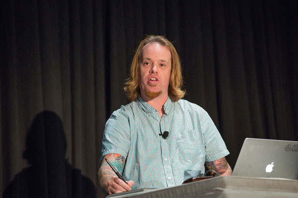
Mark Heaps shared some mind-bending things you can do to improve photos with Camera Raw.
From Dave Cross’ “Power User Tools” opener to sessions on 3D and interactive design, the topics were laser-focused on the production tools and techniques for mastering Photoshop and Illustrator.

Dave Cross revealed the secrets of Photoshop and Illutrator power users.
The last session of the day was the always fun—and competitive—”Three Minutes Max,” where speakers try to one-up each other with a spectacular tip or trick. Playing for specific attendees, the stakes are high as the best tip—which is determined by applause—wins that speaker’s attendee/partner a full year of Adobe Creative Cloud.

CreativePro Week swag bags full of goodies for attendees
The one-day Ps/Ai event was capped by a networking reception which is often a favorite of any CreativePro event. Anyone who has attended any CPN Conference in the past is familiar with “Networking Bingo,” where attendees try frantically to fill their bingo card for prizes. Spaces include gems such as “Has over 1,000 Twitter followers,” “Has their passport on them,” and “Can sing a song from the musical ‘Hair’ right now.” One slight change was that the cards were filled out over the course of the entire week, which presented more opportunities to play and win but without the intensely competitive nature of prior versions.

If you’re a fan of Bert Monroy (and who isn’t?) you were in the right place!
At the core of CreativePro’s events lies the advantage they have over other similar industry events: community. From its earliest days, PePcon—and later The InDesign and PS/AI Conferences—has always been about bringing together like-minded creative professionals. Whether an attendee’s objective is to cram their brain full of tips and tricks, find the workflow solution that’s perfect for them, or have the chance to pick the brains of world-class speakers and others who are dealing with the same issues, the opportunities to do so are around every corner.
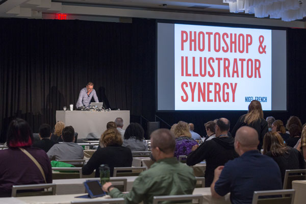
Nigel French showed how to make Photoshop and Illustrator work together smoothly.
Wrapping Up The Wrap-up
The four separate conference communities always had some overlapping topics and attendees, but the combined event truly succeeded in blending everything together to create a cohesive learning experience. Most of the attendees I spoke with were pleased with the combining of the conferences into one big show. The reasons given included not having to choose between the individual conferences, and gaining access to such a varied pool of experts and enthusiasts.

Von Glitschka gave away signed copies of his posters.
As usual, at the end of every CPN-spearheaded conference, I am both exhausted and invigorated. The week was a lot to pull off—and a lot to take in. But the amount of creativity, new ideas, different perspectives, talent, and information available at CreativePro Week gave me the fuel I need to make the coming year great and full of exciting creative endeavors. C’mon 2018! Where will CreativePro Week venture next? Stay tuned.

Paul Trani wants to see you at next year’s CreativePro Week!
***
Couldn’t join hundreds of your creative colleagues in Atlanta?
Attend CreativePro Week 2017—Virtually!

The premier “how-to” event for design and publishing professionals, CreativePro Week 2017, has come and gone. But if you couldn’t make it to The InDesign Conference, PePcon, or PS/AI: The Photoshop + Illustrator Conference for Designers, you can ensure you didn’t miss out by booking a Virtual Pass. You get video recordings of the sessions, speaker handouts, a private attendee/speaker forum, and discounts and show specials from our sponsors! Details and registration options are on our Virtual Pass page.
Press release
HOW Design Live (@HOWbrand – #HOWLive), the biggest, most inspiring, educational and talked-about design event anywhere in the world, is gearing up for its 25th anniversary conference and expo, May 4-8 at the Hyatt Regency Chicago.
HOW Design Live is where creative professionals in all disciplines come to learn from the brightest minds in the creative industry — and beyond. It’s where creatives can discover new ideas, new sources of inspiration, new skills, new connections with other creative professionals and come face-to-face with brand leaders, big thinkers, design heroes and innovative companies. Conference details and registration are at howdesignlive.com (early bird rates expire Feb. 3).
Gary Lynch, vice president/group publisher, design and publishing communities, F+W, A Content + eCommerce Company, says, “HOW Design Live can be a life and career changing experience. It is an opportunity for creative professionals to immerse themselves for five days in creative inspiration, creative learning and be among other creative professionals. People wait years for the opportunity to attend and emerge with life-long friendships and new ways of thinking about their career and their work. I think the best way to describe the HOW Design Live experience is magical.”
Over the course of five days at HOW Design Live, industry icons distill the most important lessons they’ve learned in their careers into concrete advice and inspiration. HOW Design Live 2015 keynote presenters include:
—Philippe Apeioig, graphic designer, Studio Philippe Apeloig
—Michael Bierut (@michaelbierut), partner, Pentagram
—Matteo Bologna (@mrmucca), founder and creative director, Mucca Design
—Dr. Brené Brown (@BreneBrown), research professor, The University of Houston
—Aaron Draplin (@Draplin), sole proprietor, Draplin Design Co. / Field Notes
—Jessica Helfand (@jessicahelfand), partner, Winterhouse Studios
—Michael Hendrix (@rmichael), partner, IDEO
—Tom Peters (@tom_peters), author
—Karim Rashid (@karim_design), president, Karim Rashid, Inc.
—Tina Roth Eisenberg (@swissmiss), founder, swissmiss
—Paula Scher, partner, Pentagram (@pentagram)
—Adrian Shaughnessy, designer, writer, educator and publisher, Unit Editions (@uniteditions)
—Simon Sinek (@simonsinek), author
—Jessica Walsh (@jessicawalsh), partner, Sagmeister & Walsh
HOW Conference Program
HOW Design Live offers both the inspiration to rekindle one’s passion for creative work, plus the tactical, take-home information needed to achieve and advance a career. HOW has its finger on the pulse of the creative industry and delivers practical sessions that address current challenges. The event is divided into five programs, each with a specific focus. Attendees can customize their personal agenda by picking the sessions, workshops and social events that help fulfill their goals. The five programs include:
—HOW Design – covering everything from working with clients to choosing type to staying creative on demand. Attendees will discover new skills and processes to supercharge creativity.
—Dieline Package Design – packed with best practices and case studies from top brands, designed to develop strategic skills, taking attendees’ branding expertise to the next level.
—HOW Leadership – bursting with effective leaders, creatives, authors and business folks – those who are shaping the future of design. These sessions will build attendees’ personal leadership mantras.
—In-House Management – led by long-time in-house team managers, this program offers insights on business, communication, creative and leadership skills, to help attendees produce their best work.
—Creative Business – offering expert guidance on creating a business action plan, pricing work, cultivating a strong client base, and finding all the resources needed to run a successful business.
Visit howdesignlive.com to sign-up for HOW Design Live (early bird rates expire Feb. 3), or e-mail howdesignlive@fwmedia.com to inquire about attending, sponsoring or exhibiting.
About F+W, A Content + eCommerce Company
F+W, the company behind HOW Design Live, is an enthusiast-focused Content and eCommerce company. F+W serves 20 Million consumers annually via the Company’s print portfolio, ecommerce stores, extensive online education programs, trade and consumer events, popular consumer catalog brands, nationally-broadcast TV programs and more — all in service of passionate niche communities of professionals. (fwcommunity.com)
For InDesign power users, it’s not a question of if, but when.
At some point, you are going to encounter a text-heavy project that you know would benefit from a script.
Maybe you’ll find yourself slogging through design and production of a dense, academic book, or series of books, with multi-language typesetting or math or science, with a complicated index, cross references, footnotes, or endnotes.
Or maybe you’ll find a persnickety irritation in InDesign that will haunt you as you open a server’s worth of files—perhaps, a font that doesn’t quite match and needs to be replaced in every file you’re going to open for the next two weeks.
That is when users discover and delight in the world and the work of Peter Kahrel—scholar, editor, designer, and JavaScript programmer.
As InDesign ascended to become an industry standard in book design and pagination, Kahrel began making his scripts freely available—dozens of them, all meticulously organized by function—as he wrote them and used them in all aspects of production of some breathtakingly complex books.
Do you want to sort a multilingual list alphabetically? Kahrel’s got it. Do you have a folder of images that need batch conversion? Yup. A need to make line edits on tables that are rotated on multiple pages in your book? Sure. He has little fixes to InDesign features that you haven’t thought about enough to realize they were broken.
For the past five years, CreativePro Networks has hosted the Kahrel archive, which was in danger of being displaced from a web server of an internet service provider that he would no longer be using.
These editorial, design, and production gems are sitting in our own backyard, in a matter of speaking, and we think our readers should know they’re there and what they might be able to do for you.
Here’s the fun part: Kahrel really never made these scripts for anyone but himself. Nobody test-marketed anything or ran anything by a focus group. He just methodically built up a collection of code that made his creative life simpler and more productive. He speaks with pride about the precision and complexity of work that this automation has made possible for his clients over the years. And he’s happy to share them with anyone who just might find them useful.
So read on, and learn about a couple dozen exceptional scripts from the archive. You can click each title to jump to that script’s page at CreativePro.com.
Batch-Process Documents (Convert/Export/Import)
Do you have a folder of InDesign files you need to print? Turn into PDFs or PNGs or JPEGs? This Swiss Army Knife of a script could become an essential tool for you. Simply select the folder with the files you want to work with, select another folder for the files you output, and configure away (Figure 1).
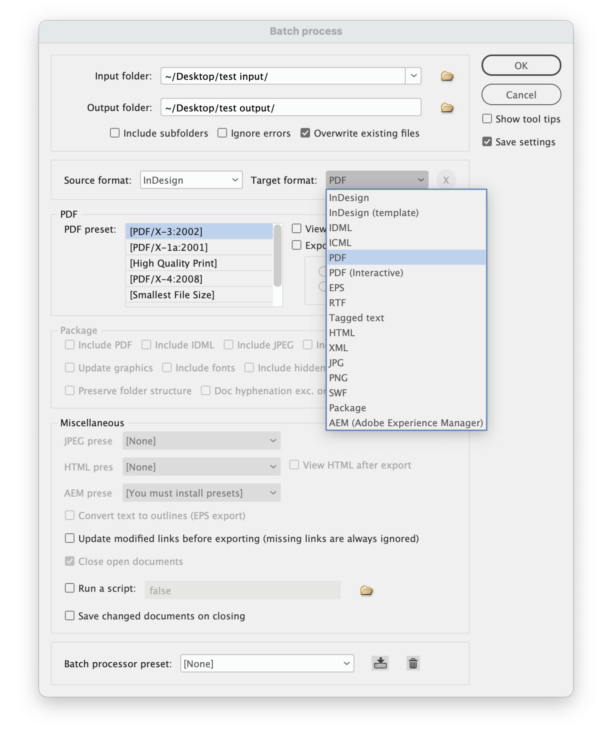
Figure 1. This script turns InDesign into a powerful file conversion utility.
Font Substitution
Sooner or later, we all get irritated by having to use Find/Replace Font on a bunch of files. This script lets you automate the process, ultimately enabling you to do the find/replace process easily and accurately with one click (Figure 2).
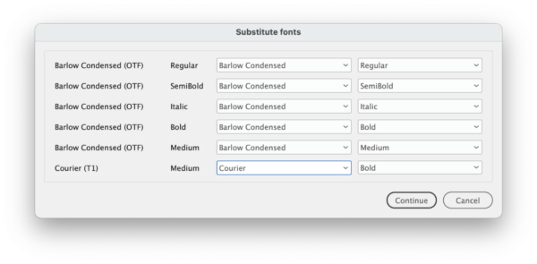
Figure 2. The Font Substitution script lets you attack missing fonts with precision.
Dynamic Sidenotes
A book with sidenotes instead of endnotes (Figure 3) can be a lovely variant on traditional design, but it can easily become a production nightmare. This script automatically converts InDesign’s footnotes to sidenotes anchored to the main text so the notes move with the text flow (Figure 4). The script creates an array of styles for easy, consistent design tweaking. Another script can convert them back to endnotes if you change your mind.

Figure 3. Designing with sidenotes can make a text with copious endnotes appear more spacious and inviting…
Figure 4. … and the Dynamic Sidenotes script lets you execute this design with automated anchored text frames.
Page Set-up
Book designers and compositors could get some use from this script (Figure 5), which builds a document based on common publishing specifications (top margin, inside margin, and number of lines).
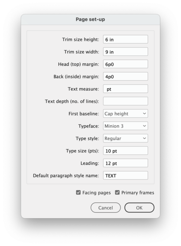
Figure 5. The Page Set-up script’s parameters
Spread Rotation Menu Commands
InDesign allows you to view a spread so you can work on rotated text without getting seasick, but those commands are buried three levels deep inside the Pages panel menu. Run this script once, and a quick click of your context menu will let you rotate a spread 90° clockwise or counterclockwise (Figure 6).

Figure 6. One script silently adds 90° rotation commands to contextual menus for the Pages panel.
Rotate Spreads
You’ve got a long document with multiple rotated tables that need corrections. You could rotate each spread manually, or you could use this script to rotate all spreads with rotated objects en masse (Figure 7). Make your edits, run the script again to revert the rotation, and blow the imaginary gun smoke from your index finger with triumphant satisfaction.

Figure 7. With one click, the Rotate Spreads script will rotate every spread in your document which contains a rotated object—perfect for editing massive numbers of rotated tables over multiple pages, as in this book project.
Show a Document’s Fonts with Type and Status
Unless you’ve been living under a tree, you know that Adobe is discontinuing support of Type 1 fonts. This script gives you a deep-dive report into all the fonts used in a document—far beyond whether a font is Type 1 or OpenType (Figure 8). It will pull information from deep within your font files, whether they’re in your own library or you’ve activated them with Adobe Fonts.

Figure 8. A deep-dive report on your font usage is indispensable, especially with Type 1 fonts incompatible with the newest InDesign releases.
Price Adjuster
“Oh, by the way, we need to change all the prices in this price list from dollars to euros.”
“Oh, by the way, we need to add a $1.50 surcharge on all prices in the catalog.”
Run this script, type in the formula for conversion, configure a few options (Figure 9), and get a whole new version of your document without breaking a sweat.

Figure 9. Need to change all prices in a document by 25%? It’s a breeze with the Price Adjuster script.
Go to a Page in any Book Document
If you’re wont to maneuver around your InDesign documents with Command/ Ctrl+J to jump to a numbered page, you will probably love this script, which lets you do the same thing with an active Book (Figure 10).

Figure 10. You can configure your keyboard shortcuts to replace the original non-Book-savvy dialog box with the Go to Page script.
Go to the Parent Spread Applied to the Active Spread
There’s no easy way to immediately open the parent page applied to the page you’ve selected… right? Well, now there is. Run this script (Figure 11), and bam! If you’re in and out of editing templates and tweaking multiple parent pages as you build, this script will help you work more fluidly.
Figure 11. Effortlessly navigate to any page’s parent with the click of a script.
Move Selected Paragraphs
This set of two scripts (Figure 12) will let you move full paragraphs associated with selected text up or down. Assign them to keyboard shortcuts for quick access!

Figure 12. Move Selected Paragraphs will take full paragraphs (in magenta) associated with selected text and move them en masse through your text thread, up or down, depending on which script you use.
Manage Text Anchors
It’s not easy to see where you’ve used text anchors in your document, and depending on what you’re doing, there could be a lot of them. Bring some order to that chaos with this script, which can list all the text anchors in your document, help you navigate to them, and show you what they were used for (Figure 13).
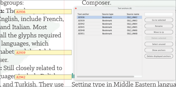
Figure 13. You can even use the Manage Text Anchors script to generate bright temporary frames to flag their use visually.
Title Case
Editors rejoice! This script replaces InDesign’s almost useless Title Case command, by allowing you to apply correct capitalization to titles (Figure 14). The script works with a text file of “exception” words that won’t get capitalized, so you can customize it for your needs. It also includes six modes for choosing which text gets processed, (such as all text in quotes or all text in italics) so you can fix the capitalization in an entire bibliography at once.
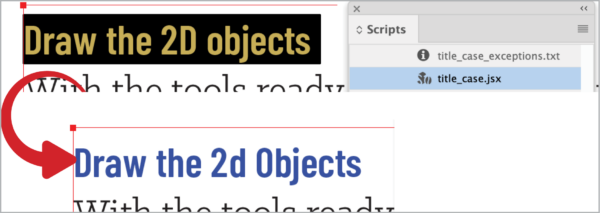
Figure 14. The Title Case script offers a better way to convert capitalization in headlines and titles.
Select a Line
If you’ve ever had to follow editorial directions like, “Insert this text at the end of line 13 in column 2,” you’re going to like this script. It allows you to jump immediately to a line of text a certain number of lines up or down from your cursor (Figure 15).

Figure 15. Make your way through correcting a huge and complex book.
Export Book Documents
If you’re using Book files to tame a gargantuan project, you will appreciate having more control over export of those pages and files. This script (Figure 16) lets you export PDFs of individual INDD files in your Book, and it lets you export individual pages and ranges of pages.

Figure 16. This script offers a better way to control exporting pages, chapters, or a full InDesign Book.
Collect Hyphenated Words
For generations, copy editors have had complicated relationships with words hyphenated by computer. I know a few who sure would have appreciated how this script (Figure 17) gives you a report on every hyphen inserted into the text flow and where you can find (and maybe correct) it.
But wait—it gets better! Mark up the hyphenation report with simple codes, run a second script (Implement Corrections in Document or Exception List), and you can sit back and watch as InDesign automatically makes your corrections.

Figure 17. This script lists all the words that InDesign has hyphenated.
Remove Spurious White Space
Here’s a simple one. Do you have text with multiple tabs and returns? Click the script, and blast them all to oblivion. (And c’mon—where else are you going to find a script whose name includes the word spurious?)
Write Pasted and Embedded Images to Disk
When you cut and paste images into your INDD instead of linking or embedding them, one major problem emerges: InDesign won’t show you any information about the image in the Links panel. This script will ask you to tell it where to save the files, then specify a file format (Figure 18). Access to information restored (Figure 19)!
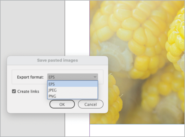
Figure 18. You can make your pasted image a linked PNG, JPEG, or, if you’re feeling nostalgic, EPS.

Figure 19. Presto! Your image metadata and resolution is restored.
Highlight Word and Letter Spacing
You can use some of Peter Kahrel’s scripts as infrared binoculars (of sorts) to see type attributes that would otherwise be invisible to you. Want to quickly see paragraphs where you’ve locally tweaked the justification settings? Run this script, which uses conditional text to color-code text affected by glyph scaling, horizontal scaling, letterspacing, tracking, and word spacing (Figure 20).
The Highlight No Break script works the same way, highlighting any text to which No Break has been applied.
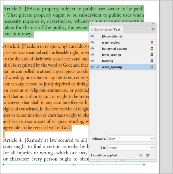
Figure 20. This script will add (nonprinting) color flags to paragraphs whose spacing deviates from the style.
Change Custom Text Variables
Text variables are such powerful tools, and this script makes them even better with an improved user interface for updating them without having to click through multiple dialog boxes one at a time (Figure 21).
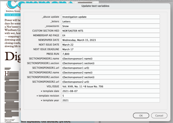
Figure 21. Run this script to update your text variables all at once.
Sort Tables
This script does—well, exactly what you expect it to (Figure 22). You can sort the content of an entire table or a selection of rows according to multiple criteria, with options to define the sorting order, ignore header and footer rows, and set the direction (ascending or descending).
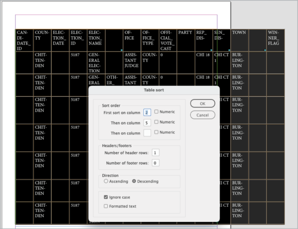
Figure 22. The interface of the Table Sort script allows you to apply sophisticated sorting to tabular data.
Set/Find a Bookmark
You’re slogging through a huge document, and you need to check something on another page. The first of these two scripts invisibly marks this location. Running the second script brings you back to that exact location from anywhere else in the document.

Peter Kahrel, right, checks out some code with Kris Coppieters of Rorohiko Workflow Resources at a CreativePro conference of yore.
Peter Kahrel’s scripts seem tailor-made for those working with multiple files, long documents, InDesign Book files, citations, and indexes.
That’s no accident. They were!
Kahrel, who lives in Spain by way of Britain and his native Amsterdam, comes to the InDesign world through many years of typesetting, editing, and paginating books, mainly for university presses. With a Ph.D. in linguistics and experience in programming, going back to 1980, he easily took to scripting InDesign from the program’s early versions.
“Much of typesetting is very dreary work,” Kahrel says, a hint of mischief in his voice. “And I always had fun writing scripts, which also improved my work as a typesetter. Because you work quicker, the tedium gets out of the way so you can concentrate on things that are more interesting.”
He soon accumulated a lot of scripts, and “I thought they might be useful for other people as well,” he says. By 2007, he had made them available on his website.
For Kahrel, those scripts made possible the seemingly impossible, like a three-volume, 1,300-page book with sidenotes. One by one, his script pulled each sidenote from the text flow, drew a text frame in the margin, pasted the sidenote, and applied a style to it.
This code, which took all of a couple of hours to write and 15 minutes to run, became the Dynamic Sidenotes scripts that Kahrel has made available for all.
Time Is Money
Kahrel no longer uses his own scripts regularly. He now works with Typefi, a global software developer whose product, written in JavaScript, automatically paginates heavily templated books and other documents with InDesign Server. The world of per-page book typesetting became too cutthroat, he says.
For those still in that world, he says that using time-saving automation like scripts is essential.
“With rates falling, it becomes more important that you [work] efficiently and quickly,” he says. “Otherwise, you make no money.”
And moreover, and more importantly, “If you get your script right, [your work is] flawless,” he says.
He does acknowledge that even some power users resist the idea of using scripts, much less writing them.
In the end, it’s their loss.
“All I can say to those people is good luck,” Kahrel says with a smile.
Peter Kahrel is only one of a tight-knit world of kind and smart InDesign scripters who are unstinting with all aspects of their coding. For new users who are struggling with an error, these scripting veterans help with debugging via posts on social media or web forums.
When these freely distributed scripts become enormously helpful to you in your own journey as a designer—and help contribute to your professional bottom line—consider dropping a donation. It’s good for the InDesign community, and it’s the right thing to do.
 This article appeared in Issue 138 of InDesign Magazine.
These InDesign automation solutions are scary good.
If you’ve ever seen any of the old Universal horror movies, you know that digging around in dusty old crypts usually leads to some very bad things. Our heroes go bravely in search of knowledge and treasure but end up bringing home only a horrible curse. But trust me, this time it’s different. This time, we’re not desecrating a pharaoh’s tomb or nosing around in the cellar of a certain Transylvanian count. We’re going to explore the deepest, darkest corners of the InDesignSecrets archives. And with over 3,500 posts and 8,000 forum discussions, there are many dark corners to thrust our torches into and see what comes to light. So put away the garlic and holy water and follow me as we bravely go in search of 20 great scripts from the crypts!
Let’s make this frighteningly easy
To save you the hassle of downloading and installing these scripts one by one I’ve compiled them all into a ZIP archive that you can grab here. Need help installing them? Read this post.
Remove Underlines
If you’ve ever had to apply underlining to a bunch of text you might have noticed the rather annoying way that InDesign applies the underlining to spaces at the end of each line. It’s bad enough when the text is left-aligned, but when it’s centered it can look downright goofy (Figure 1).

Figure 1. Before and after using the Remove Underlines script
The script works by creating a No Underline character style and applying it to the spaces at the end of each line. It will leave other end characters, including soft hyphens, untouched.
What happens when the text is edited and the No Underline style is applied to spaces within the paragraph? In that case, you can do the following:
- Edit the No Underline style, and turn underlining on.
- Delete the No Underline style, and choose Preserve Formatting.
- Re-run the script.
Move Pasteboard Items to the Current Spread
For some jobs you might have a bunch of objects that you need to place throughout a document. One way that some folks do this is to stash said objects on the pasteboard, and then move them down to each successive spread when it’s time to work on that one. Sure, this routine works, but you gotta admit that selecting, cutting, moving, and pasting can grow awfully tiresome—especially if there are lots of little bits and pieces you have to keep moving. So what about a script that moves everything on the pasteboard to the current spread? Yes, please!
Note that the script will only move objects that are entirely on the pasteboard. Items that touch the page edge will be moved, but any that overlap the page at all will be left in place.
See Issue 95 for Sandee Cohen’s collection of pasteboard pointers.
Convert All Swatches to Process
I’m tempted to call this one the Lady Macbeth script, because it enables you to say, “Out, damned spot!” and rid your files of spot colors by converting them to process CMYK.
While the script will convert RGB swatches too, note that it works only on swatches that are unused or applied to objects in your layout. So like Lady Macbeth you may see spots that stubbornly refuse to go away—when you have placed graphics that use those spot colors.
Bonus tip: To leave your swatches unchanged and make sure there are no spot colors whatsoever in the files you output, open the Ink Manager (either from the Swatches panel menu or in the Export PDF dialog box) and turn on All Spots to Process.
Add or Multiply Values in Table Cells
At the risk of stating the obvious, InDesign is not Excel. By itself, it can’t use formulas or perform any kind of calculations on data in tables. If you need that sort of thing, you could look into a commercial solution like Smart Styles by Woodwing or Active Tables by DTP Tools. But if your needs are simpler, these scripts may do the trick. One will add all values in selected table cells. The other will multiply those values. Both scripts handily ignore any currency symbols.
When using either script, you need to extend your selection to include an empty cell where the sum or product will go. Otherwise, the scripts will ask you if it’s okay to overwrite the contents of the last selected cell. You can run the scripts on fully or partially selected rows or columns of data (Figure 2).

Figure 2. Need to add or multiply data in tables? Put away the calculator and let scripts do the work for you.
Both scripts have one notable limitation in that they can’t handle negative numbers. More specifically, they ignore any minus signs and treat all numbers as positive.
See Issue 116 for a great collection of Excel tips for InDesign users.
Apply an Object Style to Graphic Cells
Good news! The client loves the catalog layout you designed, with all their products neatly presented in a tabular format.
Bad news! They want a little tweak: “Could you add a rounded stroke around all the images. And please throw on a drop shadow while you’re there to make ’em all pop. That would be great.”
At this point you could put on another pot of coffee to keep yourself awake as you spend hours manually applying those settings to hundreds of graphic table cells—all the while praying that the client doesn’t call back to ask for yet another change. Or, you could run this script and be done in seconds.
To use the script, first open it in a plain text editor and replace the code yourObjectStyle with the name of the object style you want to apply to all graphic table cells in your document. Save the change, then run the script.
Change Case by Style
When it comes to paragraph styles, you can choose only case options like Small Caps, All Caps, or OpenType All Small Caps to format your text. There’s nowhere to apply the settings found in the Type > Change Case submenu, where you can choose Uppercase, Lowercase, Title Case, or Sentence Case. That’s where this script comes in. Just select a text frame or put your cursor in a story and run the script. You’ll get a dialog box where you can choose a paragraph style and the case you want to apply (Figure 3). Note that the case change will be applied to all text in the document formatted with the paragraph style you select, not just text in the frame you selected.
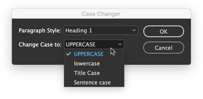
Figure 3. Need to fix the case of a bunch of titles in a hurry? Just pick the style and the case you want.
Sync Layers Across a Book
As someone who regularly works with InDesign book files, this one especially warms my heart. Books are, like so many InDesign features, half-great. So we get things like the ability to synchronize swatches and styles throughout a book, but not layers—which seems like a pretty darn important thing to keep in sync, wouldn’t you say? Fortunately, this script saves you drudgery of opening every file in a book and manually setting the visibility of the layers as you want them.
When you run the script it opens all book documents and presents you with a dialog box to choose which layers are shown and which are hidden throughout (Figure 4). You can also choose whether to leave all documents open or to save and close them.

Figure 4. Syncing the visibility of layers in book documents is a snap with this script.
See Issue 130 for a collection of 10 other great scripts for working with long documents.
Set Poetry
Here’s one for your next highbrow project—or a set of dirty limericks, I’m not here to judge. It makes setting poetry a snap by finding the longest line in a selected range of text, horizontally centering that line in the text frame, and making the rest of the lines flush left with the longest one (Figure 5). Bill Shakespeare never had it so good.

Figure 5. This script takes all the fussy alignment work out of setting poems.
Make a Font Table
The Glyphs panel is great for many reasons. You can use it to search or browse through your fonts to locate specific glyphs and insert them in text. You can even save a collection of glyphs in the panel for later reference or use. But wouldn’t it also be nice if you could save a collection of glyphs in an actual InDesign document as live text? That way you could view them in any size or color, see how they interact with other elements on the page, or share them with your colleagues. This script allows you to do just that.
When you run the script, you get a dialog box where you can choose a font and the range of glyphs you want (specified by beginning and ending Glyph IDs). When you click OK, the script creates a new document and puts all the glyphs in a text frame, set in a paragraph style called FontTableStyle (Figure 6).

Figure 6. Creating a sample of any set of glyphs (like these Greek letters) is easy with the Font Table script.
Now I hear you saying, “Mike, that’s all well and good, but I have no idea what Glyph IDs I want. I’m not that much of a font geek.” Well, neither am I. But I have no problem figuring out the IDs I want, because I just go to the Glyphs panel and pause my cursor over the first and last glyphs I want in my range. The Glyph ID numbers appear in a tooltip (Figure 7).
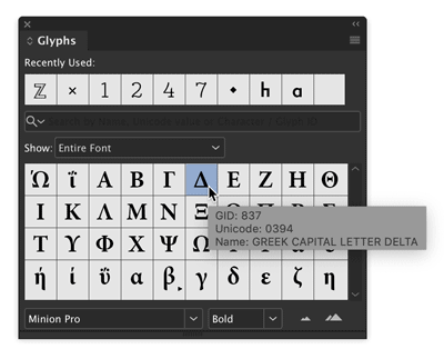
Figure 7. Pause the pointer over a glyph in the Glyphs panel to see its Glyph ID value.
Add a Place Command to the Context Menu
To me, right-clicking to use the context menu is like the missing link between using menu commands and keyboard shortcuts. It’s not quite as nerdy and efficient as a shortcut, but it’s definitely faster and slicker than going all the way up to the main menus at the top of the screen to find and execute a command. But some important commands never appear in the context menu. One of those commands that you probably use throughout the day is Place. For whatever reason, Place never founds its way into the context menu, but this script rectifies the situation (Figure 8).
Figure 8. This script adds the Place command to the bottom of the context menu when you have a frame selected.
There are two important things to note with this script. First, you must have a frame selected for the Place command to appear in the context menu. Second, you need to run the script each time you restart InDesign—or put the script in the Startup Scripts folder so it runs automatically every time InDesign launches. You can find the Startup Scripts folder inside the Scripts folder in the InDesign application folder.
Sync Superscript and Subscript Preferences
Here’s another one that’s a gift to anyone working with InDesign books. This script allows you to synchronize superscript and subscript settings for all documents in a book. These settings are found in Advanced Type preferences, which seems kind of weird at first glance, but I guess it makes sense since you probably want them to be consistent throughout a given document, and not vary from style to style. But there is no excuse for not letting users sync document preferences across book files. C’mon, Adobe, show us some long-document love!
Curious about which preferences are document-specific? Here’s a handy guide to show you. This script won’t sync all document preferences, but at least your superscripts and subscripts will all look alike with no sweat.
If you would like a script that sets all InDesign preferences (one document at a time), check out Keith Gilbert’s Setup script, here.
Generate Color Swatch Variants
The Color Theme tool and Adobe Color Themes panel give you lots of options for sampling a color from your layout and creating variations of it. But this script offers something unique: the ability to mix colors using HSB, CMY, and RGB sliders at the same time. So, for example, you can create a new set of swatches where the color varies in both saturation and cyan (Figure 9).

Figure 9. Mixing up new color swatches with the Variations script
See Issue 106 for a deep dive into InDesign’s features for picking, organizing, and sharing colors.
Tidy Up Email Hyperlinks
File this script under the “better safe than sorry” category. It fixes an annoying little issue with email hyperlinks that InDesign creates, where the @ symbol is replaced with %40. So when you tell InDesign to make an email link to mike@creativepro.com, what you actually get is a link to mike%40creativepro.com. You can see this even before you export the file in the tooltip that appears when you hover over the link in the Hyperlinks panel (Figure 10).

Figure 10. By itself, InDesign substitutes %40 for the @ symbol in email hyperlinks.
While it looks sloppy and might confuse some folks, the link will actually work in most cases. But when you lay your head on the pillow at night wouldn’t you rest easier knowing that your email hyperlinks look right and will work in all cases? I do, because I run this script on the files we use to make the very magazine you’re reading now. So if you end up using this script send me an email to let me know!
Count List Items
This script will count the number of paragraphs set in a certain paragraph style and make that number appear in your document. Why would you want to do such a thing? Well, one reason is to display the total number of items in a list or steps in a set of instructions.
Before you run the script you need to edit it so it has the names of the style you want it to count (the list style) and the style where you want the results to appear (the heading style). When you run the script, it inserts the number of list paragraphs it finds in a text string at the end the heading paragraph (Figure 11).

Figure 11. The script counts paragraphs in the list and puts the number at the end of the heading paragraph. The different formatting is from a nested style, not the script.
For advice on making great-looking lists, see Nigel French’s article in Issue 55.
Paste on Multiple Pages
Here’s a script you can use to convince your co-workers you have InDesign super powers. After all, it’s not possible for a mere mortal to simply select one or more items with the Selection tool and then paste that selection onto any number of pages in the document faster than a speeding bullet, right? That would have to be the work of a “Super.” Right, Clark. Just be sure to double-click the script when no one’s looking; your secret is safe with Lois and me.
Sync Layers in Placed Photoshop Images
InDesign has allowed you alter the visibility of layers in placed Photoshop files since CS2, via the Object Layer Options command in the Object menu. But if you’ve placed large number of Photoshop files, it can be a pain to change which layers are visible in all of them.
But with this script the job couldn’t be much easier. When you run it you get a dialog box with a list of image layer names. Just use the checkboxes to set the visibility the way you want and click OK. Note that there is a tiny bit of prep work you have to do before running the script. You need to edit the line of code that lists the layer names in your image files (Figure 12).

Figure 12. The script gives an easy way to set the visibility of layers in placed Photoshop images, once you tell it the layer names.
Update all TOCs at Once
If I had to vote for my favorite long document feature in InDesign, it would definitely be tables of contents. They’re incredibly useful for building not only TOCs but things like glossaries, image credits, and so on. So it’s a great thing that you can build as many TOCs as you like into one InDesign document. What’s less great is how you have to update each one of those TOCs individually. But this script does the trick, so you have time to think up even more uses for TOCs in your documents. Or, y’know, just watch a video of a panda eating bamboo.
Apply Master Pages Based on Styles
There are a few different solutions for making InDesign apply a certain master page whenever it finds text on a document page formatted with a particular style. ID-Extras’ Mastermatic ($57) is probably the most robust, because you can set it to work automatically, so that as text reflows the applied master pages are always correct. It also supports applying master pages based on the presence of object styles and gives you the ability to define multiple style-master page pairs. So cool!
But if you’re in the market for a simpler solution (or your plug-in budget is $0), this script might suit you. Unlike Mastermatic, the script can associate only one paragraph style with one master page at a time. You will also need to re-run the script if text reflow causes the key paragraph style to move to different document pages.
To make the script work with your files, you need to edit the code so it includes the name of your desired paragraph style and master page (Figure 13).

Figure 13. Edit lines 6 and 9 in the script to make it work with your styles and master pages.
Shift Table Contents to a Different Cell
This pair of scripts moves the data in every table cell forward one cell (Shift Up.jsx) and back one cell (Shift Down.jsx). It would particularly useful if you’re creating calendars and need to start each month on a different day. Outside of that, I’m not really sure what it could be used for, but it’s so darn cool I had to include it.
Convert All Bullets and Numbering to Text
If you have a file with automatic bullets and/or numbering that you want to be absolutely sure never changes, you can convert those bullets and numbering to regular text. You can do this pretty easily at the paragraph level: Put your cursor in the paragraph, right-click, and choose Convert Bullets/Numbering to Text. You can also select all the text in a story and use the same command to convert all the lists in the story to live text. But there is a real gotcha waiting to, well, getcha: When a list is continued over multiple stories in unthreaded text frames, manually converting to live text screws up the numbering.
There are two ways that I know of to get around this problem. The first is to select the style for your numbered list in the Paragraph Styles panel, then go to the panel menu and choose Convert “(the style name)” Bullets/Numbering to Text. Or, if you want the ultimate solution, use this script to instantly convert all Bullets/Numbering to Text throughout your document. Note that the live bullets and numbering the script creates represent an override to the paragraphs styles you’ve used, so if you re-apply those styles you’ll have double bullets or numbers. Caveat converter.
Bonus: Give Yourself a Star
There’s nothing wrong with a one-trick pony, if the trick it does is a nifty one. That’s the case with this script, which, as its name suggests, just makes perfect stars. “Perfect” meaning, a 5-pointed star like you’d expect to see on the American flag (Figure 14). You can, of course, make the same thing with InDesign’s Polygon tools, by playing around with the values in the dialog box. But if you know exactly what you want already, why not just make it perfectly in about two seconds? So go ahead give give yourself a star for being so smart and efficient!

Figure 14. There’s no need to wish upon a star when you can just pick the location and size you want.
Exploring on Your Own
For the brave among you, there’s plenty more treasure waiting to be unearthed in the blog and forum posts of InDesignSecrets. Occasionally you’ll be disappointed by a link to an Adobe Forum post that has given up the ghost. Or you might hit a dead end where an ancient script won’t work in the latest version of InDesign, but most (shockingly) do. The only way to find out if a script will work for you is to try it.
In the forums, you may encounter scripts where the code is posted right in the discussion, instead of as a downloadable file. Don’t get spooked! This post has instructions for taking code out of a post and saving it as a working script. And this post has some advice on how to make small tweaks to get a broken script working again. So don’t be afraid to try out whatever you find. But be smart: Always save your documents before running a script and check them carefully afterwards, just in case there was something monstrous lurking in the code.
Fangs for reading!
Thanks to the scripters!
Of course this article wouldn’t exist without the folks who’ve shared their time and skills over the years to help a bunch of strangers in the comments and forum posts at InDesignSecrets. Their talent and generosity make them the real heroes of this story.
- Masood Ahmad
- Jeremy Bowman
- Martinho da Gloria
- Theunis De Jong (aka Jongware)
- Max Erickson
- Gabe Harbs
- Khalid Hussain
- Olav Kvern
- Kai Rübsamen
- Dave Saunders
- Kasyan Servetsky
- Ari Singer
Press release
Adobe has announced the availability of Camera Raw 8.4 Release Candidate on Adobe Labs. The release candidate adds support for 14 cameras, including Nikon D4s, Canon EOS Rebel t5 and Fujifilm X-TI; the full list includes:
• Canon EOS 1200D (REBEL T5, KISS X70)
• Casio EX-100
• DJI Phantom
• Fujifilm X-T1
• Hasselblad H5D-50c
• Hasselblad HV
• Nikon D3300
• Nikon D4S
• Olympus OM-D E-M10 (*)
• Panasonic LUMIX DMC-ZS40 (DMC-TZ60, DMC-TZ61)
• Phase One IQ250
• Samsung NX30
• Sony Alpha a5000 (ILCE-5000)
• Sony Alpha a6000 (ILCE-6000)
(*) Denotes preliminary support.
The release candidate also includes a new preview mechanism for better before/after image comparisons and an improved set of color matching profiles for Fujifilm X-Trans cameras; it also corrects issues reported from the CameraRaw 8.3 release. The Camera Raw team would like to thank customers who helped track down the details of these issues.
Adobe encourages the community to provide feedback so it can ensure the highest quality experience for customers working on diverse hardware and software configurations. Thanks to all who provide feedback via the community-powered site: feedback.photoshop.com.
Pricing and Availability
Camera Raw 8.4 is available as a free update for both Photoshop CC and Photoshop CS6*. Please note that CameraRaw 8.4 for CS6 only includes updated camera and lens profile support as part of the recent camera raw policy change. For more information, visit https://labs.adobe.com (available for both Mac and Windows).