
Today, I’m sharing a story from the trenches about the possibility that all designers dread (or should dread): finding out the colors in your file are not printing as you intended or as your client expected.
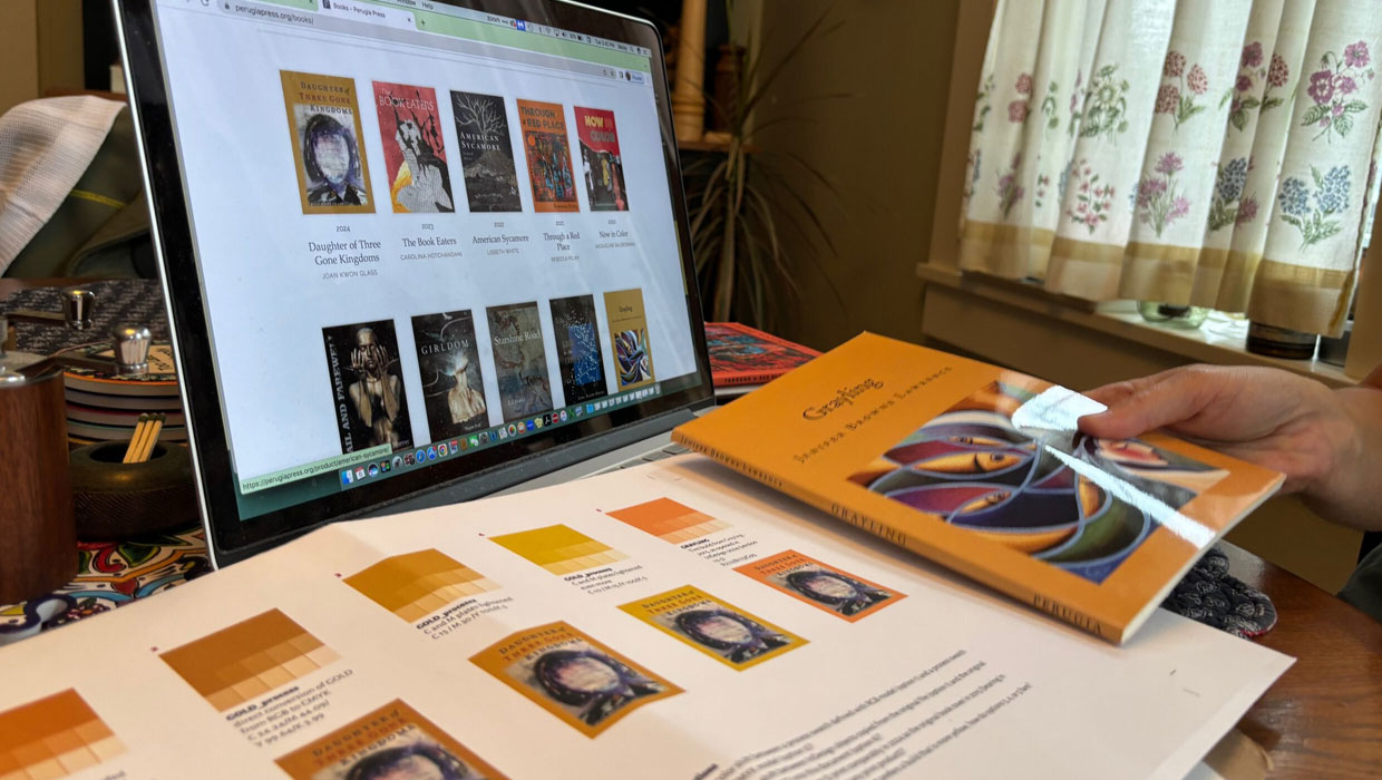
For 25 out of the past 26 years, I’ve helped a tiny nonprofit publishing house, Perugia Press, with design, production, and print management of its annual collection of poetry from an emerging women poet (Figure 1).
Figure 1. The nonprofit Perugia Press has published first or second books from women poets since 1997.
Even though I no longer primarily design books for a living, as I was doing when Perugia’s founder, Susan Kan, called my landline from the Yellow Pages in 1998 desperate for a designer, I still design the press’s one book a year working closely with Susan’s successor, Rebecca Hart Olander.
Becky is an English professor by profession and a poet by calling, so a good chunk of my job is to help a non-designer find ways to translate a new poet’s artistic vision while we collaborate in transforming a manuscript into a book of beauty. She has maintained Susan’s tradition of involving the poets in the major decisions about the book’s look and feel as brought to life through typography, cover art, and design.
After a quarter century, we’ve developed a rapport and a routine. Becky’s now talking fluently about fonts and paper grades, and for my part, I can now throw around terms like “lineation” as though I know the first thing about poetry. We have some good belly laughs and fun working together, yet all the while both of us are dead serious about making a beautiful book, the best book possible.
We’ve been through a few production challenges, but the books are elegantly simple, classic, and reserved. They are not difficult or time-consuming titles to put together. Our printer, Bookmobile, offers on-demand digital printing that’s truly impressive. Perugia has been working with this firm for at least 12 years without major incident.
So it came as an absolute shock when I sent off the cover of this year’s title to the printer, and Becky said the color was very much not what she was expecting. That rich gold process build on the front cover? It came back on the proof as … a sickly orange (Figure 2).
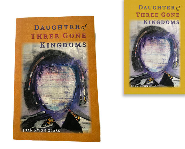
Figure 2. We designed the cover with a gold tint build, but the proof came back … well, not gold.
Becky was nervous. This tiny press can’t afford mistakes, nor can it afford substantial time to correct them.
Diagnosis: Color
So what happened?
Before contacting Bookmobile, I wanted to look at what I had done in the production process. If it was my mistake, I needed to know that.
My first thought was about my process in general. Over the years and with the shift from a conventional offset book manufacturer to Bookmobile, I’d become complacent. It had been years and one global pandemic since Becky and I had actually sat down together to look at contract proofs of her books. I started wondering whether her 10-year-old computer’s screen had created a distortion in the entire creative process, handled by Zoom screen sharing and PDFs.
But that couldn’t be the case. If she thought the color was going to be gold because it was distorted on her screen, it would have been orange on my screen. And it wasn’t!
Next, I took a hard look at my InDesign files and the PDFs I exported from them.
Prior to shipping the files, I had scoured the Bookmobile’s website to see if its settings had changed—and, no, I was using the same PDF presets file that they’d supplied since 2015 (Figure 3). I did double check to see if I had accidentally used a different preset by mistake. Nope.

Figure 3. When printers supply settings, I use them.
My colors truly were not outside of the CMYK color gamut.
My swatches were specified as process but defined using the RGB mode. Could that be a problem? I wondered.
I sure didn’t think it would be—I’d been defining swatches this way without incidence. Selecting RGB as the color mode adds an eyedropper tool to the Define Colors dialog box (Figure 4). That tool makes it beyond easy to sample artwork and quickly assemble a palette for a terrific design.
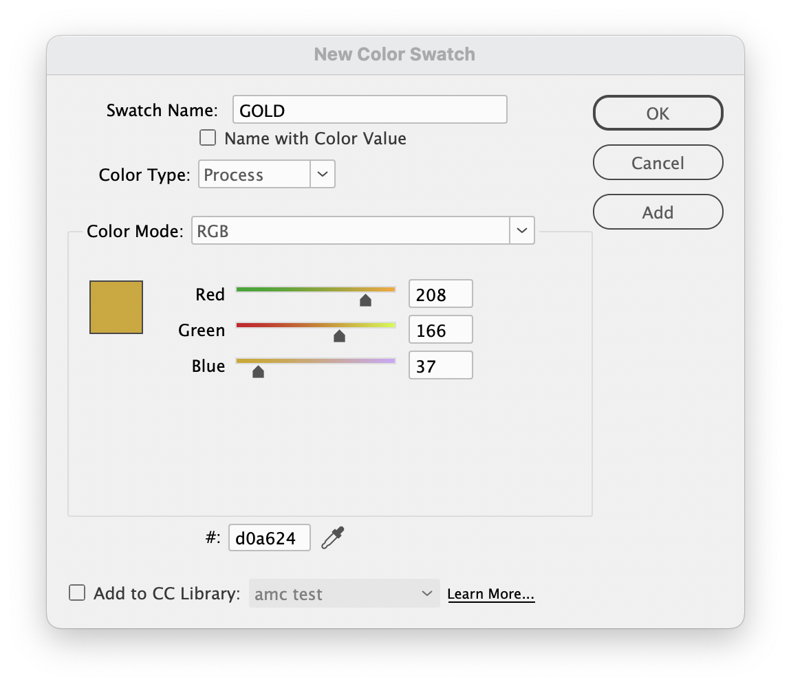
Figure 4. That little eyedropper makes it a snap to define (or redefine) colors based on the art in your InDesign file.
I also remembered that years earlier, I had noted that in its guidelines, Bookmobile recommended RGB—and that came as no surprise. For many years, CreativePro has been urging designers to relax and be confident that the industrial-grade software at printing facilities will handle the conversion of images from RGB to CMYK in a way that should ensure more reliable results from that printer’s workflow.
I saw no obvious reason for gold to shift to orange, so I turned to my next strategy.
I would design a test file, engineered to address two objectives. First, I wanted to explore how Bookmobile’s press handles color. But in the meantime, I wanted to determine how to get exactly the color Becky wanted on her book cover—now.
To keep the prepress costs to a minimum, I confirmed Bookmobile’s press sheet size: 12 in. × 18 in. I built a 9 in. × 12 in. document that could be run two-up, so the printer could keep one copy to look at while Becky and/or I would reference the other (Figure 5).
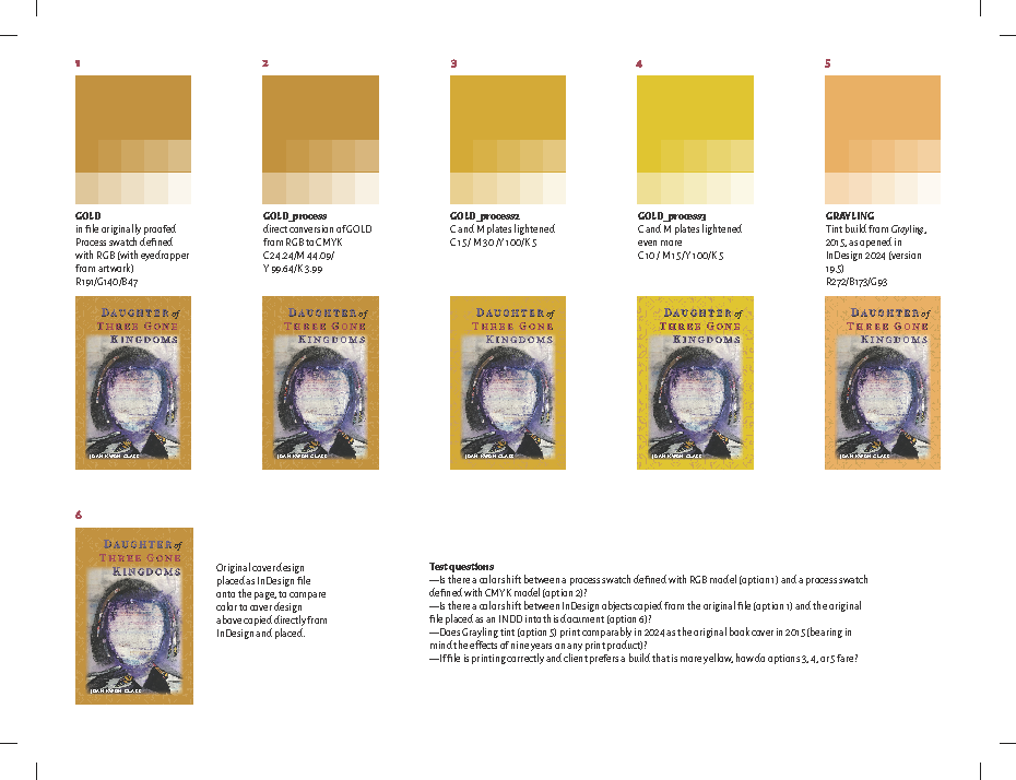
Figure 5. The test document
Literally, this technique is a way to keep you and your printer on the same page when something goes wrong.
Testing 1-2-3
I wanted to create some variant color swatches that would show tints of GOLD from 10% to 100%.
First, I copied and pasted a frame with the “GOLD” swatch from the cover design file to the fresh document (Figure 6).
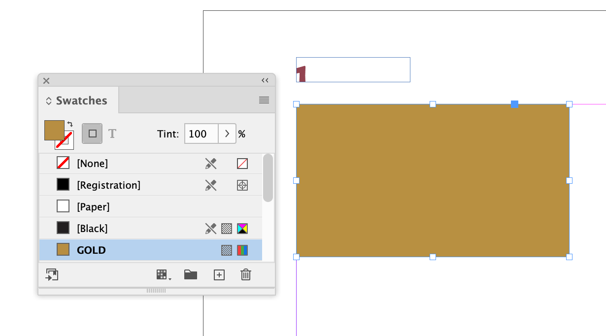
Figure 6. We started by pasting an object with the troublesome color into a fresh document.
I created a small frame, applied the swatch, then duplicated it. I used the Make Grid script, a default in the Scripts panel (Window > Utilities > Scripts), to convert the duplicate into a grid (Figure 7) that I could then adjust to create a series of tints (Figure 8).
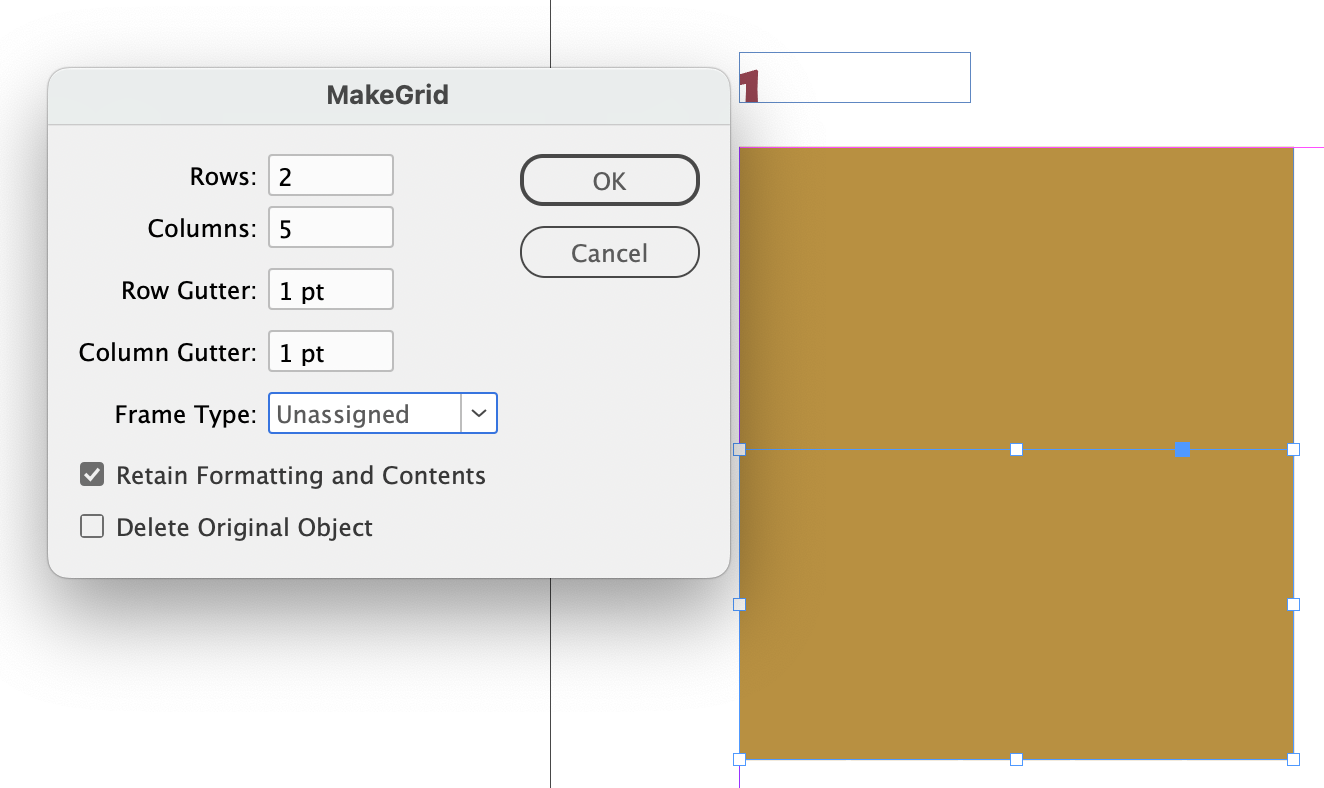
Figure 7. I use the Make Grid script all the time. It’s worth knowing about!
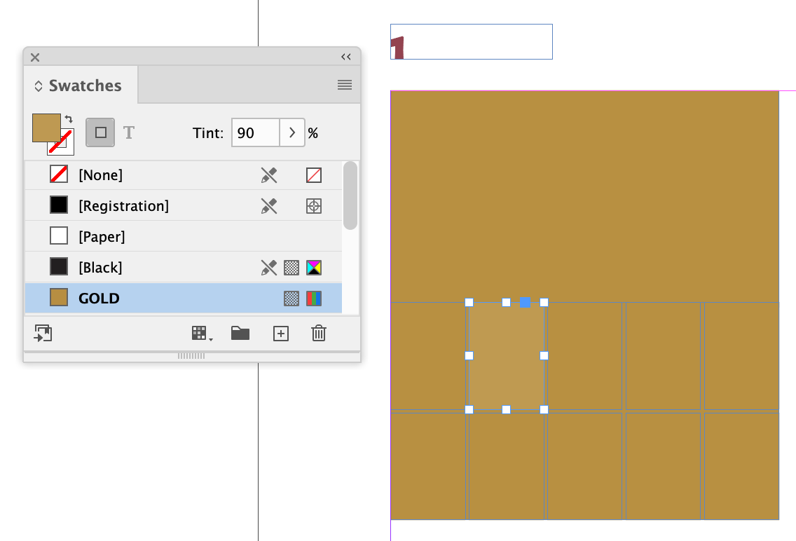
Figure 8. I had no idea how useful the tints would be, but that would be part of the discovery process. As it happened, that information was useless. It still was worth doing.
I could now copy this geometry and create swatches of anything I wanted. What would be useful?
Well, for starters, I wanted to see if RGB could be the culprit. I duplicated the swatch, renamed it “GOLD.process,” and changed the mode to CMYK (Figure 9). I’d expect the proof to come back from Bookmobile with GOLD looking identical to GOLD.process.
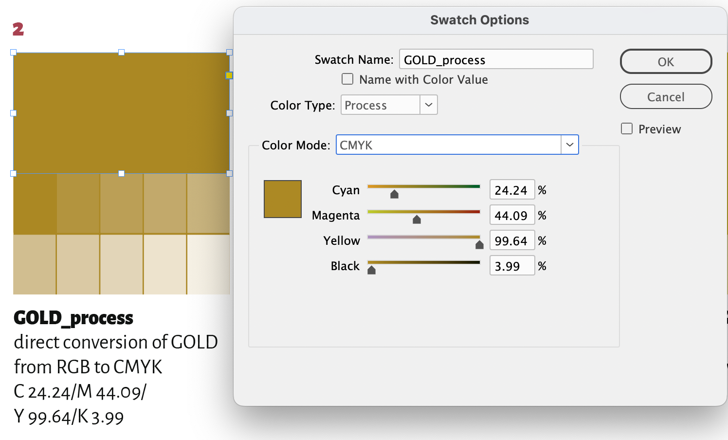
Figure 9. Maybe a straight RGB-to-CMYK swatch conversion will unearth some clues to the problem.
Now it was time to test some alternate colors so Becky could see various process color recipes of gold (see sidebar “The Gilded Page”) and know with assurance that what she was seeing on the proof would be the tint on her corrected book cover—even if we were still working to figure out the problem. I made two such alternates, “GOLD.process2” and “GOLD.process3” (Figure 10).
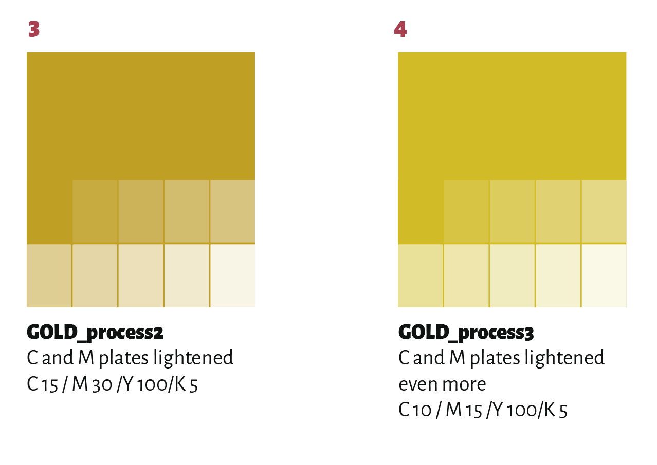
Figure 10. I created some alternate choices for my client given the color that she was originally imagining.
Finally, Becky had mentioned the light gold cover of Grayling, the Perugia book from 2015 (Figure 11), also printed by Bookmobile. I copied and pasted the tint from that book file into the test document. That became the swatch “TINT.grayling.” Interestingly, the color looked more orange in my 9-year-old INDD file than the cover image that I exported at the time for the Perugia website.
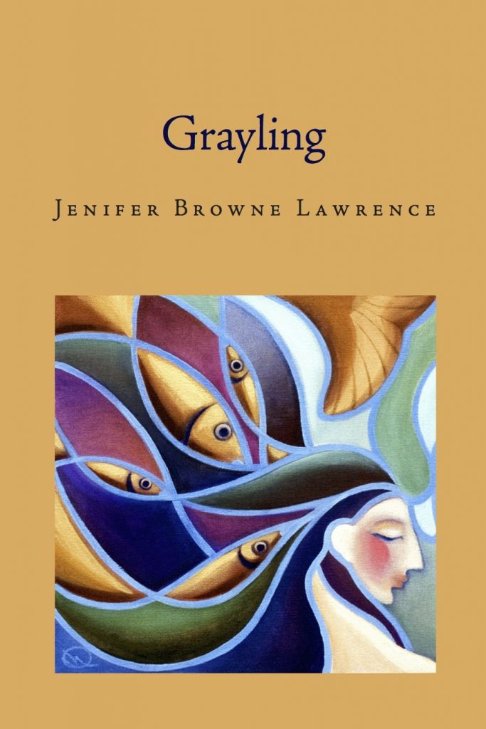
Figure 11. We designed the cover of Grayling to be a lighter gold. At least that’s how it looked on the publisher’s website.
I copied the front cover design and pasted it into the test document, then grouped and scaled the geometry to the swatch width, duplicating one per swatch. This would let Becky easily see and compare the colors in context (Figure 12).
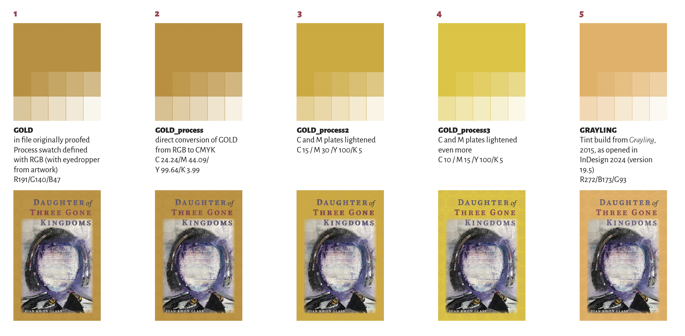
Figure 12. Each color swatch in the context on a small facsimile of the cover
I had one last thought. I generally design the front cover in a document built as a 6 in. × 9 in., then place it as an INDD into a final file built with the back, the front, and the spine. Would this Russian doll of a file create some room for color shifts?
With the placement of other INDDs a feature of InDesign since 2007, that would not be a likely culprit. But why not test it anyway? I placed the original INDD into the document to see if it would print differently from the cover art with the same swatch applied in the document.
With that, I exported the PDF with Bookmobile’s presets and sent it to press for it to be output on the same cover stock and laminated with the same matte laminate, which would likely affect the colors, too.
Proof Positive
When Becky received the proof (Figure 13), I drove to Perugia Press’s world headquarters; i.e., her kitchen table.

Figure 13. The color proof arrived, and we sat down to figure out what happened.
The RGB swatches were the culprit.
The original GOLD swatch reflected the color of the original cover proof. The GOLD.process swatch, which should have looked the same, looked like the color we had defined. (And, as I expected, it made no difference whether the RGB swatch was defined in an INDD file that was placed into the document or applied directly to objects in the file itself.)
As for the Grayling cover on the proof, that tint—also defined as RGB—looked less like gold and more like Creamsicle. And as another surprise, the book itself looked closer to the proof than to the lightly tinted gold on the graphic online (Figure 14).

Figure 14. I just don’t remember this color shift from gold to Creamsicle happening in 2015, but I guess this is why we archive our files.
The proof gave Becky the opportunity to select the tint with confidence. In the end, I sent a file with two versions of the cover: GOLD.process2, and a new build that split the difference between that swatch and GOLD.process, the CMYK build of the original color.
In the end, Becky got full cover proofs of the two new versions and, with confidence, she selected the new tint (Figure 15).
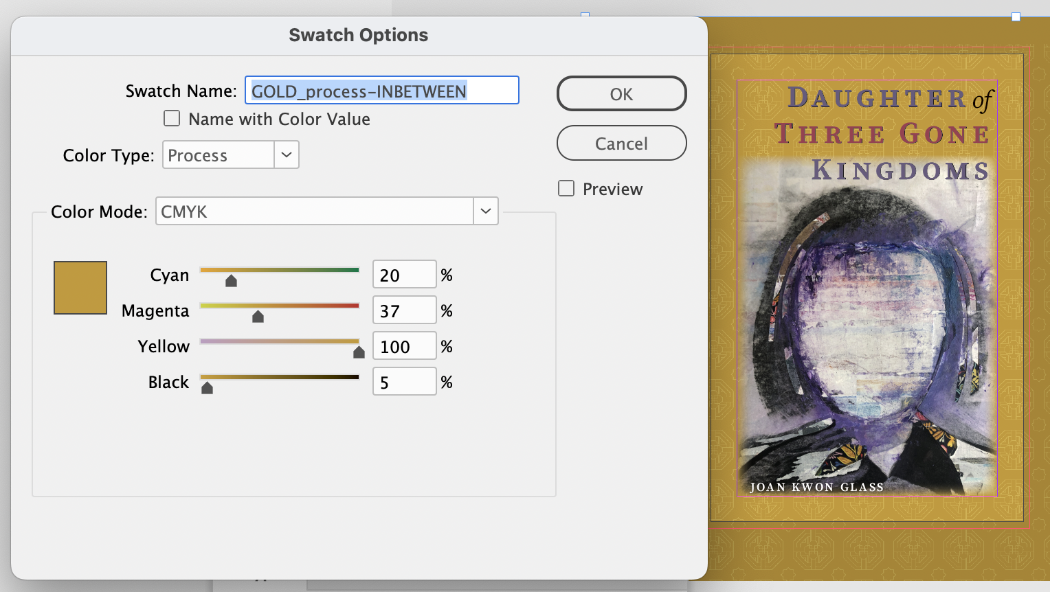
Figure 15. The final color ended up between the intended gold and the next lighter alternative I made on the proof. The proof helped us arrive at that decision.
And with that, the rollercoaster came to a stop.
After All This, What Happened?
Our book was fully in production, leaving me with a happy and relieved client—the best possible outcome for everybody. But I still didn’t know what went wrong with my colors originally.
Turns out there’s a simple answer.
Nicole Baxter, director of sales, marketing, and publisher services for Bookmobile, gently pointed out that the RGB recommendation was for images only, with its workflow optimized for reproducing color photos. Tint builds, she noted, should remain in CMYK. To me, that was not clear in their instructions. She’s super receptive to my suggestions for amending Bookmobile’s file preparation guidelines, and I’m hoping our experience will help everyone avoid color surprises.
For my part, here are the lessons I’m taking away.
1. Just because something bad hasn’t happened with a design workflow doesn’t mean that it won’t under different circumstances. I’ve gone for years without really thinking about the file preparation for these books. I got complacent.
2. Trust your printer’s specific advice over others’ general advice. Too many designers still reflexively think that RGB should never, under any circumstances, be used in building a print project. We at CreativePro often tell you that it’s the 2020s and that you should be thinking anew about these things—and, yes, that’s absolutely true. But that doesn’t mean that some printers still won’t need your files and colors as CMYK. It’s also up to you to stay on your toes and ask your printer how your file should be prepared for the prepress processes that will prepare it, for the press that will print it, and for the paper stock it will be printed on.
3. Don’t rely on screens. Get real proofs—proactively. No PDF will quite capture the look and feel of a color on a cover stock with laminate. It would behoove us to get a similar proof sheet of front-cover tint builds after the front cover is designed, far earlier in the production process. Digital on-demand book manufacturers can provide such proofs so easily now, and it would be good insurance against the stress of potentially sabotaging the book’s schedule or having to settle for a project that doesn’t live up to what it could have been. If you make a proof like this as you’re designing, you can create your own color palette reference customized for your project so everyone will see exactly how a swatch will print.
4. Don’t discount the possibility of technical gremlins. As I was writing this post in my CreativePro user account on my computer, I installed all the Bookmobile settings in this environment so I could get screenshots. When I opened the test file, the original gold color swatch looked orange! This entirely new twist suggests that something was wrong with my installation of InDesign on my usual user account, which I used to design the book and the press proof. So next year I plan to reinstall a fresh copy of the printer’s recommended settings before starting the cover.
Finally, I checked in with Nicole Baxter of Bookmobile when I was trying to figure out if she had some insight into the printing of the 2015 book. In the world of a busy on-demand printer, there’s no paper trail or memory of a tiny small-press poetry title from nine years ago. We’ll never really know.
But Nicole did give me another sobering reality to keep in mind.
“Our printers do change over the years—we get new printers, printers get new parts, papers change, lamination, etc.,” she said. “Technology changes so much too, even month to month! Even offset printers can’t guarantee a color is going to print the same in 2024 as it did in 2015.”

One printer’s suggested process breaks for simulated metallic colors
This article was last modified on February 12, 2026
This article was first published on August 20, 2024
Commenting is easier and faster when you're logged in!

Recommended for you

InQuestion: Color Matching for Digital Press Jobs
InQuestion is a regular column devoted to answering your questions about working...
RGB vs. CMYK
It’s time to close the case on this ancient debate that stretches back to the be...

Using RGB Images in InDesign, from Photoshop to Final PDF
A step by step guide to entering the twenty-first century by using a RGB workflo...