
Top Tips of ’25
A time capsule of tips and tricks you’ll want to remember forever

This article appears in Issue 50 of CreativePro Magazine.
Where does the time go? 2025 seems to have gone with “blink and you’ll miss it” speed. So, to commemorate another amazing year of learning, creating, and sharing in the one-of-a-kind CreativePro community—and to celebrate the 50th issue of CreativePro Magazine—here are 50 great tips from our 2025 events, newsletters, videos, and downloadable resources.
Make Table Styles From Scratch in InDesign
Basing a new style on existing content is usually a good shortcut in InDesign. But table styles are an exception. If you’re planning to make a new table style, first make sure you have nothing selected. You’ll have fewer unexpected glitches when you apply the style later on.
—Mike Witherell
Don’t Rely on Color for Communication
Avoid using color alone to convey information. Pair it with text, icons, or patterns to ensure everyone can understand your design. Try viewing your design in black and white. If the information still makes sense without color, you’re on the right track!
—Nikki Kuhn
GIFs FTW
Want to design emails for bigger impact? Try adding an animated GIFs. They can grab attention, increase engagement, and drive higher conversions. One of my top choices for converting and compressing MP4 to Animated GIFs is Gifski.
—Chris Converse
Copy/Paste Animations in PowerPoint
You can copy and paste animations using the Animation Painter, so that you don’t have to recreate everything from scratch each time.
- Click Animations.
- Select an object with animations you want to re-use.
- In Ribbon, click the Animation Painter to copy the animations.
- Click on another object to paste the animations onto it.
Note that any existing animations on the second object will be removed, and the new, pasted animations will appear at the bottom of the animation timeline.
—Richard Goring
InDesign Layer Shortcuts
Use these shortcuts for efficient layer creation in InDesign:
- New Layer Above: Click the New Layer icon.
- New Layer Below: Hold Command (Ctrl) while clicking.
- Top of List: Hold Command+Shift (Ctrl+Shift) while clicking.
- Duplicate an item: Option/Alt-drag the item’s Proxy Icon in the Layers panel.
—Julie Shaffer
Start Small with Pattern Brushes in Illustrator
When creating pattern brushes, use a small base shape (around 100 px works well). It’s much easier to scale brushes larger by increasing the Stroke Weight than it is to scale them smaller (where you have to use decimals).
—Kat Kremser
Change Text on Signs with Gen Fill in Photoshop
Photoshop now supports third-party AI models that offer different capabilities than Adobe’s Firefly models. You can choose a model in the Contextual Task Bar before using features such as Generative Fill. Google Gemini 2.5 is particularly good at text replacement. It will match the original font style and integrate the new text naturally into the image.

Prompt: Change [old text] to [new text]
—Rob de Winter
Instant Swatch Replacement in Illustrator
To instantly replace a swatch in Illustrator Alt/Option-drag one swatch over another. It works with symbols, too.
—Laura Coyle
From PowerPoint to Google Slides: Design Like You’re Headed for Disaster
If you know a PowerPoint file will eventually land in Google Slides, do yourself a favor:
- Use only the most basic fonts.
- Keep animations minimal.
- Prepare all chart data so you can quickly rebuild charts in Google Sheets.
- Avoid columns.
- Stick with basic layout structures.
- Expect to spend time reformatting.
—Stephy Hogan
How to Keep the Book Panel from Disappearing in InDesign
If you work a lot with the Book panel in InDesign, you may have noticed it has an annoying trait. It will disappear if you visit the Home screen. The only way you can show it is to choose it from bottom of the Window menu. Even more annoying, when the panel reappears it will be undocked and in the top left of the screen.
Fortunately, the fix is simple: Never dock the Book panel. Keep it free floating, and it’ll be back on screen where you left it when you get back from the Home screen.
—Mike Rankin
Apply Colors to Make Data Feel Intuitive
Improve your graphs, tables, and maps by applying branded colors using one of the following techniques.
- Binary: “Presence” is darker.
- Sequential: One color. “More” is darker.
- Diverging: Two colors. Poles are dark.
- Categorical: One color per category.
- Storytelling: “Look here first!”
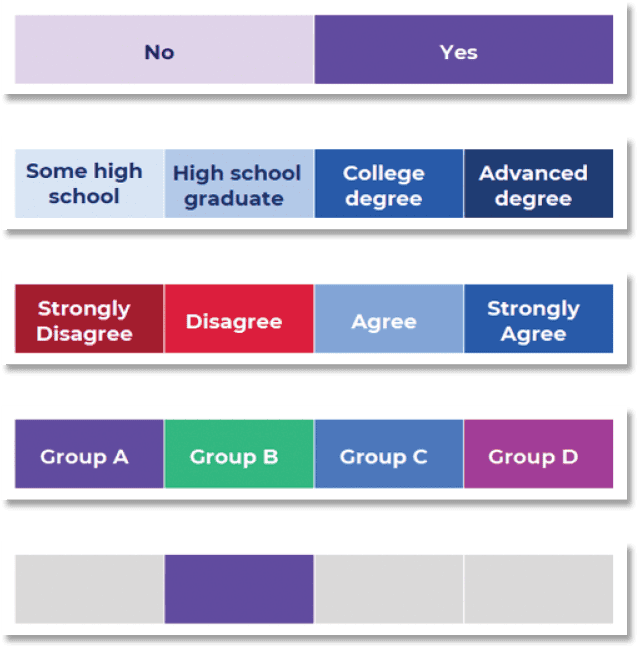
—Ann K. Emery
How to Compare Two PDFs in Acrobat
To see the differences between two PDFs, open both files in Adobe Acrobat. Then, go to Tools > Compare Files. You can compare the text only, ignoring graphics and photos, or use the settings to restrict the comparison to specific page ranges and content types.
—Mike Rankin
Think Strategically When Adding Alt Text to Images
It’s great that you can add alt text to an image in InDesign, but if the image might be placed into multiple documents, it’s more efficient to add the alt text to the image’s metadata in Photoshop or Bridge.
—Colleen Gratzer
How Often Should You Calibrate Your Display?
If you asked me “How often should you calibrate?” 25 years ago, my answer might have been “every week” for professional work. But, as flat-panel displays became popular, they progressed from cold cathode fluorescent lamps (CCFLs) to today’s light-emitting diode (LED) backlights and organic light emitting diodes (OLEDs) that emit their own light. Compared to the fat, heavy, cathode-ray tube (CRT) monitors of yore and CCFLs, LED backlights last longer and are much more stable, so you might have to recalibrate only every few months.
—Conrad Chavez
Locking Brand Assets in Adobe Express
If you need strict brand compliance or just want to ensure no one gets too creative with unapproved fonts or colors, you can lock elements inside Adobe Express.
Select the text or image you want to lock. Click on the three dots to see an additional menu pop up, and select Lock: Allow to Replace. Then you can either lock all editing capabilities or allow specific behaviors by selecting Edit Replace Settings.
—Nicte Cuevas
Scripting Tips for AI
AI-powered tools like ChatGPT and Microsoft Copilot can help you automate repetitive processes with custom scripts—even if you’re not a coder. Personally, I find Copilot slightly better for scripting. But sometimes AI can get stuck on a wrong idea, even after you make corrections. This often happens when it clings to earlier prompts. If this happens, here are two approaches to try:
- Correct the Previous Prompt: Go back and clarify or reword your earlier request. Sometimes, this is enough to get the AI back on track.
- Start a New Chat: Starting fresh often clears the AI’s “memory” of past interactions, giving you a different and often better result.
—Katja Bjerrum
Creative Cloud Libraries: Pay Attention to Color Space
CC Libraries do not offer a method to filter assets by color space, but you can use these workarounds:
- Make the information part of the asset name, such as Logo (RGB) and Logo (CMYK) or Apple Red (RGB) and Apple Red (CMYK). This is the method I usually employ.
- Create separate RGB and CMYK groups within a single library.
- Create separate RGB and CMYK libraries.
- Thankfully, when you hover over a color swatch in a library, you can view the color breakdown.
—Keith Gilbert
Run Scripts in InDesign with QuickApply
For my money, the fastest, easiest way to run scripts in InDesign is to use Quick Apply. There’s just one bit of set up you have to do first. By default, Scripts are turned off in Quick Apply, so you have to open the dialog box by pressing Command+Return/Ctrl+Enter. In the drop-down menu, choose Scripts.
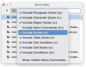
After that, any time you want to run a script, press Command+Return/Ctrl+Enter and start typing the name of the script. When you see it highlighted in the dialog box, press Return/Enter.
—Mike Rankin
Smart Object Shortcuts in Photoshop
In Photoshop, right-clicking a Smart Object (on the name, not the thumbnail) is the fastest way to access lots of useful commands.
- You can convert an embedded Smart Object to a linked one or vice versa by right-clicking and choosing Convert To Linked or Embed Linked.
- Right-click a linked Smart Object to reveal it in the Finder or File Explorer, update modified content or relink to a local file or CC Library item.
—Steve Caplin
Swap the Position of Two Items in InDesign
Did you ever need to swap the position of two items in your layout? It only takes a couple seconds with this little trick.
- With the Selection tool, select both frames.
- In the Control panel make sure the reference point is sent to the center. Then click the Control panel button for Flip Horizontal and then the button for Flip Vertical.
- At this point the frames will be in the correct positions, but they’ll be upside down and backwards.
- To fix that, keep them selected and choose Object > Transform Again > Transform Sequence Again Individually.
Ta da!
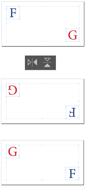
Hat tip to Martin Braun for sharing this idea.
—Mike Rankin
Create Custom Layouts in PowerPoint
When you need a layout different than the default layouts, create a custom layout instead of adding or removing placeholders from the default layouts.
To create a custom layout, in master view, use Insert Layout to insert a new layout.
Then use Insert Placeholder to insert the type of content container to support your content.
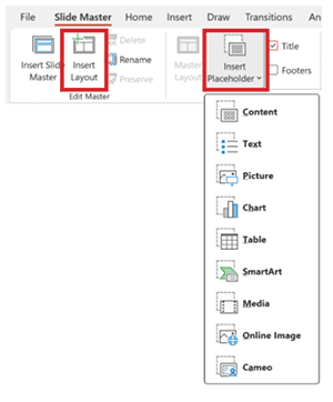
Right-click the layout thumbnail to name it appropriately so users know how it can be used. This will also help Copilot know what the layout is intended for.
—Echo Swinford
GenAI: Prompt for Personality
Every AI tool has its own personality. Understanding how each tool interprets language helps you communicate more effectively and get better results.
ChatGPT excels when you give it clear structure, defined roles, and context about your goals. Example: You are a brand strategist. Write onboarding copy for a Gen Z fashion retail team. Format it as short, punchy paragraphs in a confident, casual tone.
Midjourney responds best to compact, stylized prompts that combine visual descriptors with specific command flags. Example: young fashion employees walking into a minimalist store, editorial lighting, cinematic mood –ar 16:9 –v 6 –stylize 750 –style raw

Adobe Firefly works best with descriptive, semantic prompts that include visual details like color, lighting, mood, and subject positioning. Example: A futuristic city skyline at dusk, cinematic lighting, reflective glass buildings, in the style of a digital matte painting.

—Justin Seeley
InDesign: Aligning Decimals in Tables
InDesign’s decimal tab is smarter in tables than it is in plain text. When a decimal tab is set in a table cell, the tab before the number that’s required everywhere else in InDesign is optional. These “smart” decimal tabs will align table text to the position of a decimal point provided that your paragraph alignment is flush left. Right alignment will override this helpful feature. Also, If there’s not enough room after the decimal-align tab to fit the remaining numbers in your cell, InDesign highlights the numbers that won’t line up properly.
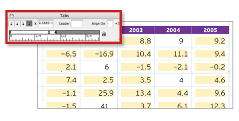
—Michael Murphy
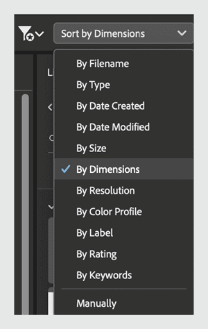
Be a Sorting Savant in Adobe Bridge
When viewing your files in Adobe Bridge, there are loads of sorting options, including the possibility of sorting by Dimensions which instantly sorts vertical from horizontal images. It’s incredibly handy when you need to run separate batches of images through processing operations.
—Khara Plicanic
Making Telephone Hyperlinks for Interactive PDFs
To make a hyperlink in an interactive PDF that dials a phone number when clicked or tapped, first create a new hyperlink with a URL destination. Change the protocol from http: to tel: and remove the slashes. Add the country code (for the US it’s 1). And follow that with only numbers (remove any dashes, dots, or parentheses.)
—Myra Ferguson
Accessibility: Desaturate to Increase Perceived Contrast
We get a better perception of lightness without chroma (color). So, you can increase perceived contrast by changing the image Mode to Grayscale in Photoshop. Or, for a nondestructive change, create a black or white layer fill above the image layer(s) and set it to the Saturation blend mode.
—Jessica Oddi
Removing Indents (without Removing Your Sanity) in PowerPoint
On a PC you can delete indents from the keyboard or without changing the formatting of styled text. But the same is not true on the Mac. Instead, Mac users can show the Ruler (View > Ruler) and drag the indent all the way to the left to remove it.
—Amanda Dalton
Workflow: Outsource Documentation to AI
Documenting your processes is an important part of each project, especially larger ones. AI is great at helping to fill the gaps, so why not ask it to help to create documentation for your team members to use in your next project? (Your future self and team members will thank you!)
—Dean Perry
Future-Proof Your InDesign Project Archives
You can use InDesign’s Package feature to create an archive of a project. When you do so, it’s a good idea to include a PDF version of the document. This ensures that even future non-InDesign users will have a view of the document and a fundamental reference if they ever have to recreate the layout using different software.
—Pariah Burke
Extract All Images from a PDF
Ever been asked to provide all the images in a PDF as separate files? Or maybe you need to use the images in another project, but you don’t have the original working files? In either case, you can simply export all the images at once.
- Open the PDF in Acrobat.
- Select Export PDF from the righthand toolbar.
- Select Image, and turn on the Export All Images option to export them individually.
Only need to extract one image? Right-click it with the Selection tool and choose Save Image As.
—Colleen Gratzer
Make Smarter Adjustments in Photoshop
Using adjustment layers allows you to make nondestructive changes in Photoshop. But adjustment layers can be tricky to manage because they are not directly linked to the layer to which they are applied. Moving one up or down the layer stack will change the appearance of your image.
Instead, try this:
- Select one or more layers from the Layers panel.
- From the Layers panel menu, choose Convert to Smart Object.
- Choose Image > Adjustments and choose an adjustment.
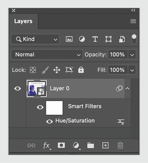
Now, the adjustment will act like a Smart Filter, sticking to the layer, and making it impossible to accidentally separate the Smart Object and adjustment.
—Bart Van de Wiele
Be Careful Where You Drop Anchor in InDesign
When placing anchored items, avoid dragging the anchor into the middle of a word, which will mess with spell check and Find/Change.
—Laurie Ruhlin
A Quicker Color Picker in Illustrator
Starting with Illustrator 2026, you can also access the Color Picker tool by taking the Eyedropper tool (keyboard shortcut: I) and holding Shift. A color ring will appear. As you move your pointer over your artwork, you’ll see the newly sampled color in the top half of the ring and the old Fill/Stroke color in the bottom half.
Click to see a preview of the color applied to anything you had selected. Click OK, or press Return/Enter to apply the color to the selection and close the dialog.
—Mike Rankin
Create a Stepped-Blend Color Palette in Illustrator
For an old school approach to creating color palettes, use the Blend tool. Create your start and end colors, apply them to simple objects, then create a stepped blend between them. I kept it simple. When you’re happy with the result, duplicate the blend object and choose Object > Blend > Expand to convert it to individual shapes, from which you can create a Color Group. Reuse the original blend object to repeat the blending process with different sets of colors to create multiple palettes.
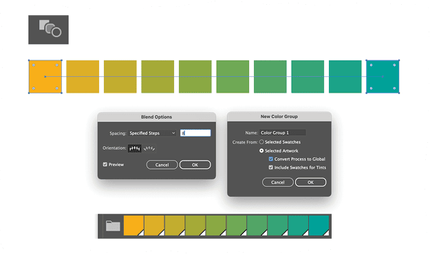
—Nigel French
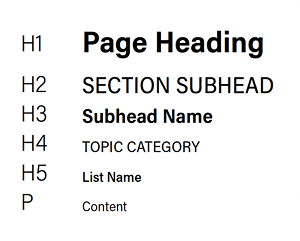
Alternate Title Case and All CAPS for Headers
A trick to help designate the full stack of headers, subheaders, sub-subheaders, etc. is to alternate the use of Title Case and ALL CAPS as you go. You should also vary weight and size, of course.
—Prescott Perez-Fox
Increase Resolution in Photoshop with Generative Upscale
Generative Upscale allows you to enlarge images using generative AI, which typically produces better results than traditional upscaling methods, especially for small images.
- Open an image in Photoshop.
- Go to Image > Generative Upscale.
- Choose how many times you want to upscale (2x or 4x).
- Click OK.
Photoshop will create a new document with two layers:
- The original upscaled layer (bottom)
- The generative upscaled layer (top)
You can toggle between layers to compare the difference. The generative version typically shows much better detail and quality, especially suitable for printing at larger sizes.
—Rob de Winter
Reveal Hidden Swatches in Illustrator
Did you know Illustrator comes packed with a secret stash of color swatches? No, I’m not talking about the default swatches you see every day. I’m talking about about hidden color libraries that most people don’t even know exist. In the Swatches panel, click that little library icon at bottom left to access dozens of swatches organized by themes such as Art History, Foods, Nature, and more.
—Khara Plicanic
Create Concentric Shapes in Illustrator with Offset Path
Offset Path comes in very handy when you want to make concentric shapes in Illustrator. It works better than scaling, especially with complex shapes. Select the path, and choose Object > Path > Offset path. Positive Offset values will make a new shape larger than the original; negative values make smaller shapes.

—Jason Hoppe
Scripting Tips for AI
Whether you use the MATE extension, or work directly with ChatGPT, Claude, Gemini, or Mistral, use these tips to get better results when using AI to create scripts.
- Divide tasks into simple steps. Break down complex design routines into clear, sequential actions.
- Detail the context. Specify your document setup and your visual goals.
- Identify terms using quotes. Put your specific names of styles, layers, and the like in quotes.
- Specify frames versus content. Clarify whether you want to adjust your frames (their dimensions and where they are placed on the page) or their content (what’s contained within those frames).
- When working with text or a table, be specific. Are you searching the selected text or all text in your document? The row your cursor is in, the column, or all the cells in the table?
- Converse with the AI to refine results, and ask for changes or fixes. Build on previous responses to get better code.
- Generate a UI. Ask the AI to create a custom interface panel to make polished scripts.
—Jean-Claude Tremblay
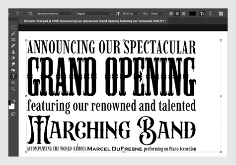
Controlling Dynamic Text in Photoshop
To create text that’s dynamically sized to fit its container, take the Type tool and in the Options bar, click the Toggle Dynamic Text button. Dynamic text often looks best if you apply all caps, but feel free to experiment with different fonts. To control the size of dynamic text, manually insert returns to separate the text into paragraphs. The shorter the line of text, the larger the characters will be.
—Steve Caplin
3D: Getting Started with Project Neo
Want to get started in 3D but confused about where to start? Try Project Neo.
I recommend you watch the See How It Works video on the Neo Home page—and watch it at half speed. There’s a lot going on, so be ready to pause frequently!
Then, try one of the four options: Create A New Design, Import Vectors, Create 3D Type, or Generate From Scene.
If you want to create a new design, I recommend you remix one of the samples. You can play with it as much as you like, knowing you can’t accidentally mess anything up permanently.
—Alan Gilbertson
Swipe a Solid Color from a Gradient in InDesign
Would you like to sample one of the colors in a gradient to make a new solid color swatch? It’s not at all obvious how to do that. If you just click with the Eyedropper tool you’ll sample the whole gradient. The trick is to go to the Swatches panel menu and choose New Color Swatch. Then, drag from the Eyedropper button in the dialog box to the spot on the gradient that you want to sample.
—Mike Rankin
How to Be a Better Designer: Study the Past
If you want to become a better designer, step one is to learn from history. We’ve all heard that there’s nothing new under the sun, and that applies to graphic design as much as to anything. Rather than be demoralized by this, we should find it reassuring, because the past is an inexhaustibly rich vein of inspiration.
Read books, go to museums, listen to podcasts, attend conferences. Be a sponge, and soak up all that history. You’ll be inspired by the best work our civilization has produced as well as humbled by the skills, techniques, and tricks of those who came before you. Through this process of absorbing the past your future contributions will be more original while at the same time continuing a conversation with the past.
—Nigel French
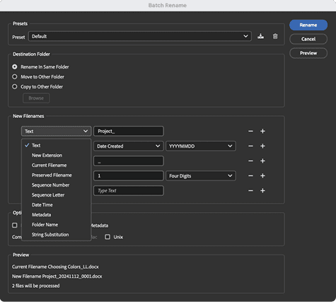
Bridge: Batch Rename Files
Adobe Bridge makes it easy to rename hundreds of files at once with a consistent naming system. You can include custom text, numbering, dates, or metadata fields in your new names. This is especially helpful when preparing deliverables for clients, uploading files, or organizing archives.
—Melissa Piccone
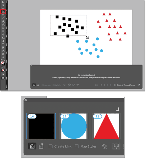
InDesign: How Many Objects Do You Have Selected?
If you want to know exactly how many objects you have selected in InDesign, drag the Content Collector tool (shortcut: B) over the objects you want to count.
The number is displayed in the tool’s panel.
If you want to count other sets of objects, drag over them. Note that groups will be counted as one object.
To reset the display, press Esc.
—Mike Rankin
Be Smarter About Text Warp Effects in Photoshop
Like most tasks, there are several ways you can approach the job of warping text in Photoshop.
Good: Use the Options bar when you have the Type tool selected.
Better: Access additional warp options by choosing Edit > Free Transform with a type layer selected.
Best: Convert text layers to Smart Objects for access to all possible warp and transform effects. A Smart Object text layer can be transformed like an image layer without damaging the text. Double-click the Smart Object layer to edit the original text content.
—Theresa Jackson
Workflow: Use Slack Canvases for Documentation
Slack now includes a feature called Canvas. It’s essentially a wiki-style document editor that anyone can update, and it lives inside a channel. Unlike Google docs, canvases don’t get lost behind 50 links and a cluster of permission configurations. They’re right there where you need them. Use these for:
- SOPs and how-tos
- Onboarding guides
- Project checklists
- Event run-of-show documents and speaking scripts
- Archives of fun animated GIFs and memes
—Prescott Perez Fox
Publish Online: Decoding Error Messages
Publish Online provides a way of publishing your InDesign documents online as HTML web pages by storing them on Adobe servers. Once they’re published, anyone can view these pages from a browser on a computer, tablet, or smartphone. You can include interactive features such as buttons, animation, slideshows, video, and audio.
And Publish Online is very simple to use. It just works—until it doesn’t. And sometimes when it doesn’t, all you have to troubleshoot is some cryptic error codes. Here’s your secret decoder ring that reveals what those codes mean.
—Steve Werner
Reduce Color in Charts (and Use It with Intention)
When designing charts in PowerPoint, do not use color decoratively, but rather use it deliberately and to help communicate your data and story. More often than not, multicolored charts distract the eye and serve no purpose other than needless decoration. Use grays or monochromatic schemes whenever possible.
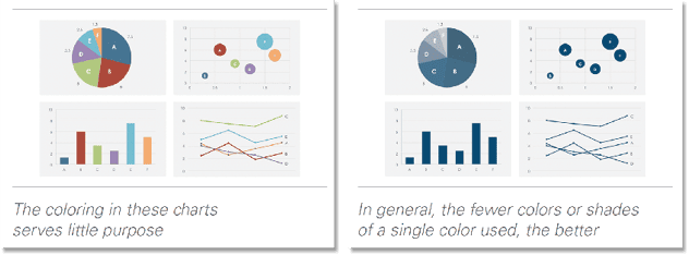
—Nolan Haims
InDesign: Preflight Is Not Just for Print
Creating preflight profiles with the right conditions enabled isn’t limited to for-print publications. Set your profile to disallow CMYK colors. Doing so will help you make sure your screen-only projects don’t exclude the most vibrant colors.
—Pariah Burke
Commenting is easier and faster when you're logged in!

Recommended for you

All-Time Favorite InDesign Tips
Mike Rankin and David Blatner team up to share two dozen of the most useful InDe...

Tips and Tricks Every InDesign User Should Know
Top experts share their favorite InDesign techniques, from the super to the subl...

CreativePro Week Conference Speaker Spotlight: Bert Monroy, the Digital Art Pioneer
Welcome to our Speaker Spotlight series, designed to highlight some of our Creat...