


Color holds power. It can impact our moods, emotions, and behaviors. It can also be a source of information. So it is vital to optimize color in designs. Here are some key tips to follow.
Select the right color
Color can say a lot about your brand values. The right color will tell your target audiences who you are, what you sell, and what you’re about.
Countless research has been conducted on the use of color in brand design and marketing.
Some key highlights include:
• Brand awareness is increased by up to 80% through effective use of color in marketing, packaging, and logo design.
• Brand perceptions are created by consumers in the first 90 seconds. Color alone influences between 60% and 90% of these judgments.
• Purchase consideration is influenced heavily by color. 93% of shoppers focus on visual appearance alone when they consider a purchase.
So it is vital to choose a color to reflect your brand personality. Being careful to understand that each color evokes a different emotion in us.
Choosing the best color mode
The first step in creating effective design is to identify where and how the final result will be displayed.
Both RGB and CMYK are modes for creating color in graphic design. The RGB color mode is best for digital work, while CMYK is used for print products. But you need to understand the mechanisms behind each, as one color space is always better than the other.
What is RGB?
RGB (Red, Green, Blue) is the color space for digital images. Therefore, use the RGB color mode if your design is going to be displayed on any kind of screen. It is important to be aware that different devices detect or reproduce light differently. Therefore, the output color is device-dependent.
This additive mode of using color mixes a selection of red, green, and blue light onto black to create the perfect pigment. When RGB light is mixed together at equal intensity, they create pure white.

What is CMYK?
CMYK is the color space for printed materials. The CMYK acronym stands for primary colors in the printing process – Cyan, Magenta, Yellow, and Key.
‘Key’ actually means black. It is called Key because it’s the main color used to determine the outcome of the image. The black ink provides depth and shading, whereas the other colors create different colors depending on how they are mixed. For example, cyan and yellow create a green when one is overlaid on the other.
A printing press uses dots of ink to make up the image from these four colors by layering the 4 colors in varying degrees of intensity. This is known as subtractive mixing. All colors start as blank white, and each layer of ink reduces the initial brightness to create the preferred color. When all colors are mixed together, they create pure black.

What is meant by spot colors?
Spot colors are single or solid use of ink used to produce the printed image. The pre-mixed color is printed using a single run versus process colors which are printed by a series of dots of different colors.
Select the best file format
It is important to select the right file format to export your file.
• JPGs – ideal for RGB files. A middle ground between file size and quality. Readable almost anywhere.
• PSD – the native file format for Adobe Photoshop. Standard source file for RGB.
• PNGs – support transparency. Better for RGB graphics that need to overlay others, such as interface elements like buttons, icons, or banners.
• GIFs – motion images. Perfect for animations in RGB.
• PDFs – ideal for CMYK files. Compatible with most programs.
• AI – standard source file for CMYK. Native file format for Adobe Illustrator.
• EPS – source file alternative to AI when designing in RGB. Compatible with other vector programs.
Ensure your final designs are pixel perfect
It is important to ensure your final designs are pixel perfect. This is especially important for printed designs due to the costs incurred if there are any mistakes.
There are a number of popular tools for checking for mistakes before going to print.
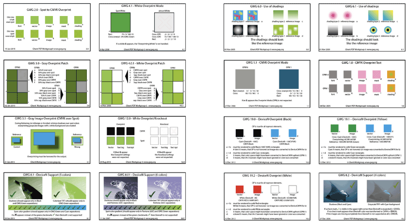
Ghent Output Suite
The Ghent Output Suite was created for professionals processing PDF files to determine they were behaving as expected in graphic art production workflows. The test involves a series of patches that are constructed to clearly show whether a rendering test is passed or failed.
For example, to check that transparency in the PDF file is rendered correctly. The test patches check the rendering of artwork effects such as transparency, CMYK, RGB and spot colors, font quality, overprint, etc., just to name a few areas.
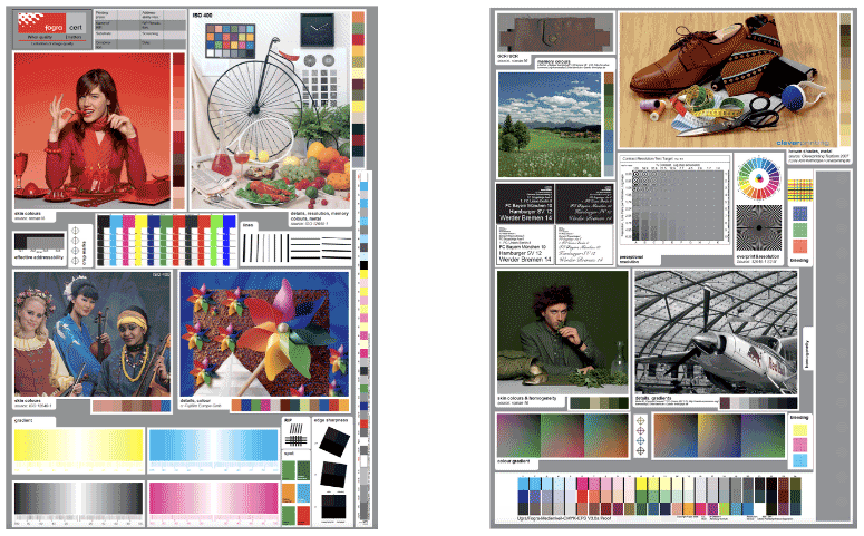
Fogra color matching
Fogra is another popular print check for the print and media industry. This quality control check is specifically designed for color and detail sharpness.
Proofing the color separation plates of your printed artwork
To avoid unexpected surprises when printing your CMYK designs, it is essential to preview the color separation plates. This will allow you to see visually how the various color layers in your document will interact with each other on the finished printed design.
Color is integral in design. From the outset, color needs to be optimized to reflect your brand message. Optimize your design by choosing the best color mode and file format. Don’t forget to review and approve the final design thoroughly to avoid any mistakes.
This article was last modified on August 8, 2022
This article was first published on August 4, 2022
Commenting is easier and faster when you're logged in!

Recommended for you
Recolor Images Using Extracted Color Themes in InDesign
How to unify a design composed of separate placed images by recoloring them with...
Live Paint in Illustrator
Illustrator’s Live Paint feature transforms the work of coloring graphics into p...

Tip of the Week: Using the Color Theme Tool
This tip was sent to Tip of the Week email subscribers on December 31, 2014. Sig...