Understanding the Difference Between CMYK and RGB

1

Many people are confused about the difference between working in CMYK and RGB, so here’s a handy guide that explains how the two systems work.

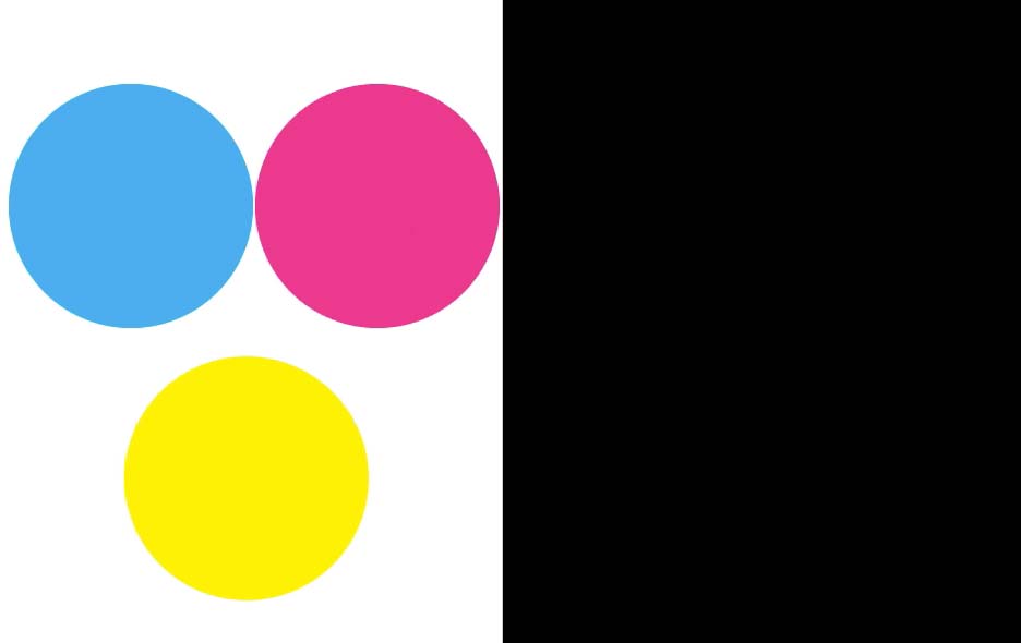
Working in CMYK is like painting on paper. You start with a white sheet, and any colors you add make the paper darker. Here are circles in Cyan, Magenta, and Yellow.

Three circles in cyan, magenta, and yellow on white background with black rectangle to the right

If you combine Cyan and Magenta, you get blue.

Cyan and magenta circles overlapping to form blue over yellow circle with black rectangle to the right

If you combine Cyan and Yellow, you get green.

Cyan circle overlapping with magenta circle to form blue and overlapping with yellow circle to form green with black rectangle to the right

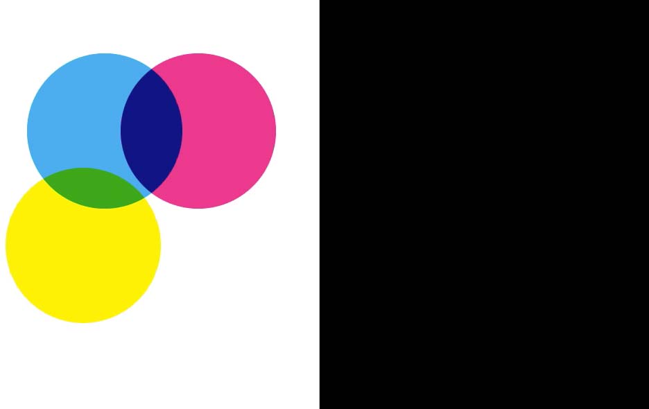
If you combine Yellow and Magenta, you get red.

Cyan and magenta circles overlapping to form blue, magenta and yellow circles overlapping to form red, black rectangle to the right

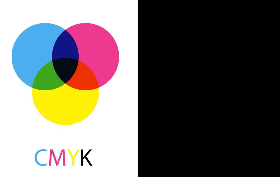
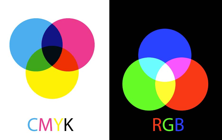
If you combine all three colors—Cyan, Magenta, and Yellow—you get black. Actually, you don’t: You get a dark brown instead. That’s why commercial printing adds a fourth color—Black—to make shadows richer. And that’s how we arrive at CMYK. There’s some argument over what K stands for, but the consensus is that it stands for Key.

Cyan, magenta, and yellow circles overlapping to form dark brown with black rectangle to the right

Working in RGB is exactly the opposite. You start with black, and any colors you add make the darkness brighter. Here are circles in Red, Green, and Blue.

CMYK diagram on left with blue, green, and red circles on black background

If you combine Red and Green, the result is brighter still: You get yellow.

CMYK diagram on left, blue, green, and red circles on black background on right with red and green overlapping to form yellow

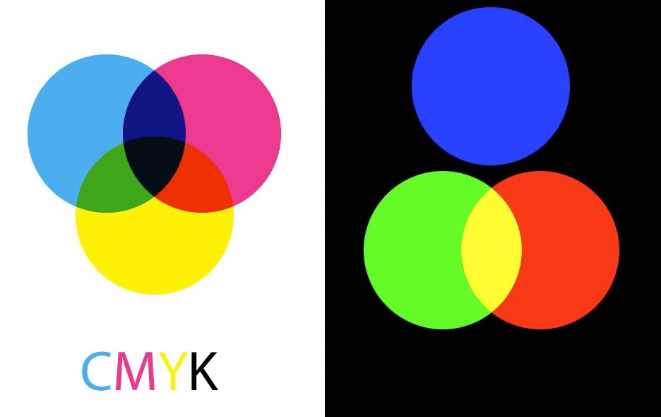
If you combine Blue and Green, you get cyan.

CMYK diagram on left, blue and green circles overlapping to form cyan and green and red circles overlapping to form yellow on black background

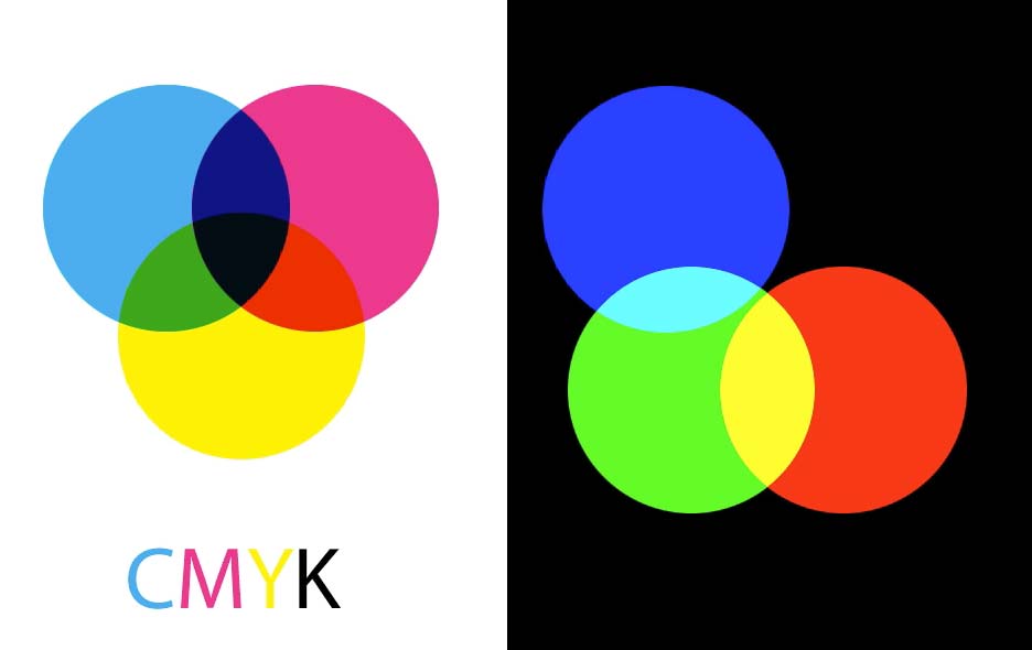
If you combine Blue and Red, you get magenta.

CMYK diagram on the left, red circle overlapping with blue circle to form magenta and overlapping with green circle to form yellow on black background on the right

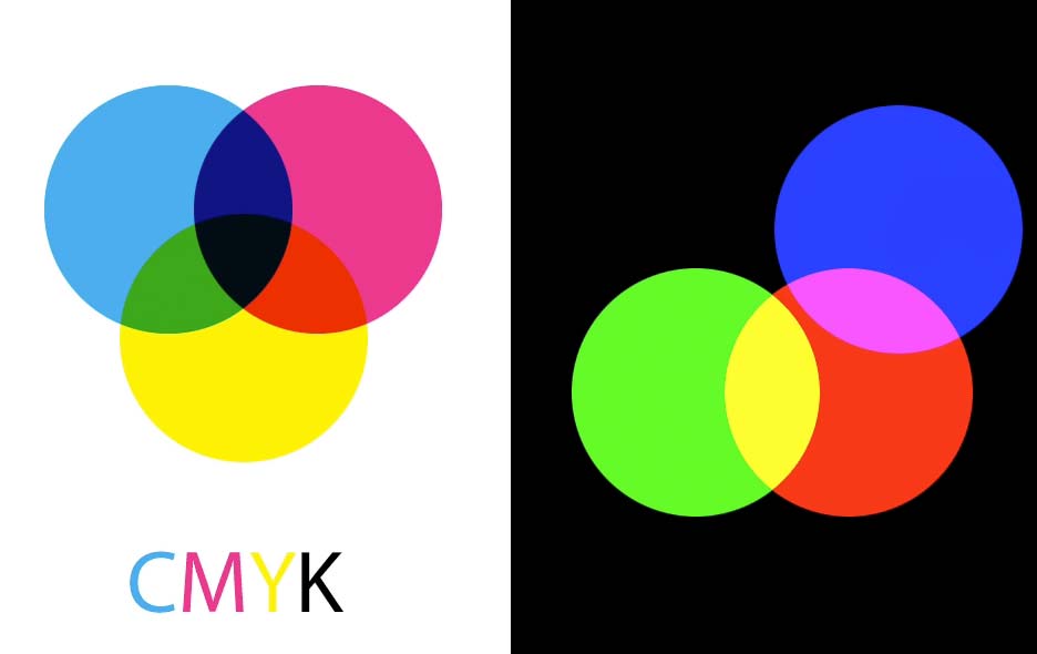
If you combine all three colors—Red, Green, and Blue—you get pure white. It’s worth noting here that RGB and CMYK are almost exact opposites: The overlaps inside the CMY circles make red, green and blue, while the overlaps inside the RGB circles make cyan, magenta and yellow.

CMYK diagram on the left, RGB diagram on the right

When you’re creating artwork for print, you need to be aware that the RGB color gamut is much wider than the CMYK gamut. This means you can create much brighter, more saturated colors in RGB than can ever be printed in CMYK.

Photo of clown with bright green hair and bright pink and purple shirt

If you’re working in RGB in any Creative Cloud program, you can check how the image will look when converted to CMYK by choosing View > Proof Colors, or using the shortcut Command/Ctrl+Y. Here, you can see how the saturated colors in this clown look much duller when converted to CMYK. So, if you’re working for print, you’ll need to adjust the colors to avoid disappointment later.

Photo of clown with green hair and pink and purple shirt

Check out the video version of this tutorial below and get a link to download the original artwork at https://www.2minutephotoshop.com/difference-between-rgb-and-cmyk/

Steve Caplin is a freelance photomontage artist based in London, whose satirical illustrations have appeared in newspapers and magazines around the world. He is the author of the best-selling How to Cheat in Photoshop, as well as 100% Photoshop, Art & Design in Photoshop and 3D Photoshop. He writes regularly for CreativePro and is an instructor at LinkedIn Learning. His YouTube channel 2 Minute Photoshop is a library of over 100 Photoshop tutorials, each just two minutes long, hosted at photoshop.london. When he’s not at his computer Steve builds improbable furniture, which can be seen at curieaux.com.
  • Mara Zebest says:

    I always explain to students that RGB is an “Additive” color model whereas CMYK is a “Subtractive” color model. The easiest way to remember which is which… has to do with how each color model gets to white (assuming the paper being printed on is white – which is also why the white color swatch in InDesign is called “Paper”)

    With CMYK – the subtractive color model – ink has to be subtracted (removed) to get to white (again, assuming this is the color of the paper). Conversely, with the additive color model RGB, all colors have to be present at maximum values to get to white (R=255, G=255, B=255). Which in the printing world is still going to be the color of the paper – even for the RGB model, although some newer high end machines are actually capable of applying a white ink if paper is a different color, but these machines are the exception, not the norm for many printing companies.

    And always am sure to remind students to save a copy of any RGB file before converting to CMYK since the CMYK model does not have as many colors available as RGB, thus colors will be lost in the conversion. In any Adobe program, in the color picker, an exclamation mark near an RGB color swatch indicates the color is out of gamut range for a CMYK model. In the same color picker, there is usually a swatch next to the exclamation mark of the nearest conversion color – so if you click on that swatch, the CMYK compliant color can be quickly chosen. Thus, if a designer wants to design in RGB but may also need a CMYK version later… they can quickly see if any colors are compliant in CMYK as well… and thus the resulting file will convert to either color model easily without loss (if colors chosen do not have the exclamation mark warning).

    When sending a file to a printing company, it is best to find out if the file will be printed via press or copy machines. If press (where traditional ink plates are made) then CMYK or Pantone color inks are best when designing. But if the file will ultimately be sent to a high end copy machine, then RGB is still the best model (this applies for home printers as well as professional copy print jobs). And of course RGB is the best model when designing for monitor viewing (i.e. a website, or emailing, etc).

  • >
    Notice: We use cookies on our websites to give you a great online experience. If you keep browsing, we'll assume you're ok with this. For more information, see our privacy policy. By closing this banner, you agree to the use of cookies.I AGREENo