
The Drama of Drop Caps
Initial caps add excitement to a design. Here’s how to make, format, and fine-tune them.


This article appears in Issue 39 of InDesign Magazine.
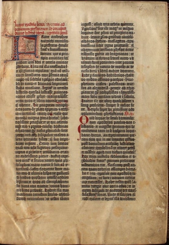
Figure 1. This page from a medieval text includes an illuminated first character painted by a scribe and a smaller initial character in red that indicates a new section.
of this tradition by leaving space in the printed text for the a scribe to add a decorative first letter. As printing evolved, the initial cap evolved into various forms, such as hung, dropped, and raised or “stick-up” caps. However, because InDesign uses the term drop cap for all forms of initial cap styling, that’s the term I’ll use.
B. I increased the size of the drop cap to create a drop cap/stick-up cap hybrid.
C. A simple stick-up cap.
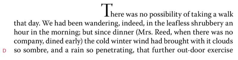
D. A stick-up cap combined with a large first-line indent.
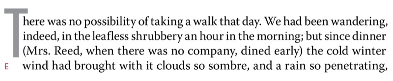
E. I cut and pasted the drop cap into a sepa- rate text frame that’s anchored to the main text frame, floating in the outside margin and moulded around the shape of the text frame.
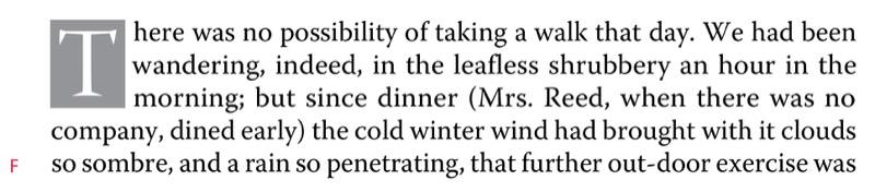
F. I cut and pasted the drop cap to its own text frame, which is anchored in the main text frame. I applied a text wrap to the drop cap text frame.
Creating a Basic Drop Cap
Contemporary magazine and book publishing continues the centuries-old tradition of initial letters by beginning some chapters and articles with large initial letters. With your text cursor in a paragraph, you can do this locally in InDesign: Type the number of lines for the drop cap in the Control panel, then specify the number of drop cap characters you want—usually one (Figure 2).
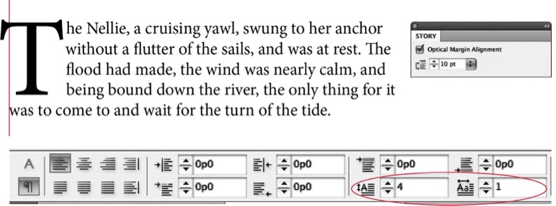
Figure 2. Using the Paragraph Control panel to apply a simple drop cap. Note that Optical Margin Alignment is turned on in the Story panel, allowing the horizontal crossbar of the T to stick out into the left margin.
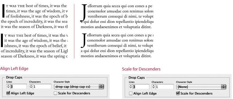
Figure 3. Making optical adjustments according to the character shape and style of the drop cap
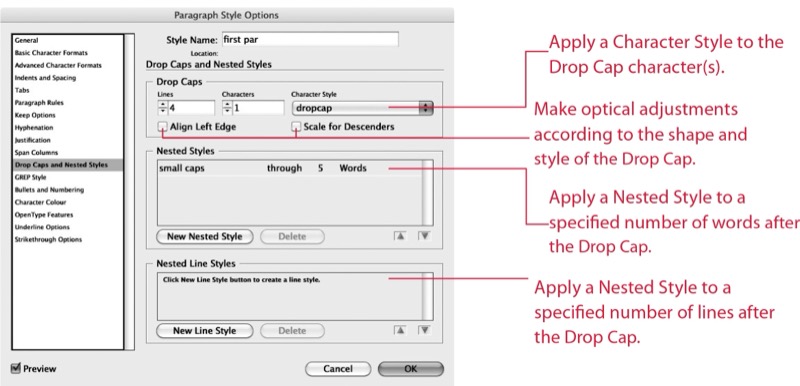
Figure 4. Incorporating a drop cap into a Paragraph Style definition.
Drop Cap Aesthetics
While there are no hard-and-fast rules concerning how big a drop cap should be, common sense should prevail. Size matters, although in this context bigger isn’t always better. The purpose of the drop cap is to signal your audience where to begin reading. To do so, it doesn’t need to scream at the reader, and it shouldn’t overwhelm any headline that precedes it. The drop cap comes below the headline in terms of page hierarchy, so usually (though not always) it will be smaller than the headline. Your drop cap typeface can match your body text, or contrast it—it’s hard to go wrong with the popular combination of a heavy sans serif face for the drop cap paired with a serif face for the text. The drop cap is also an opportunity to help define a signature color for the piece; sometimes setting the drop cap in a reduced tint percentage can help counterbalance the confrontational appearance of such a large letter. In addition to the initial drop cap for the first paragraph of a chapter or article, it’s common to use smaller drop caps as section markers (probably set up as a paragraph style based on the parent drop cap style). This breaks up the monotony of long columns of type, especially if the text has few illustrations, subheads, or other graphic elements. That said, if you sprinkle drop caps too liberally throughout a document, they start to become repetitive and annoying. A general rule of thumb is to use no more than two drop caps per page. These should not be close to each other and preferably should be different letters.
Kerning Drop Caps
A problem with automatically generated drop caps is that the big first character often collides with the body text that follows. Watch out for this—and where necessary, kern to fix such problems (Figure 5). Thankfully, when you kern between the drop cap and the first character of the text, kerning is applied to all the lines adjacent to the drop cap.
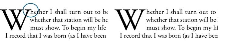
Figure 5. Kerning a drop cap. The example on the left shows the result of applying a three-line drop cap in Adobe Garamond Pro. The serif of the W collides with the “h.” Insert the type cursor between the two letters and press Option/Alt+Right Arrow to kern the space between the W and the “h” (right).
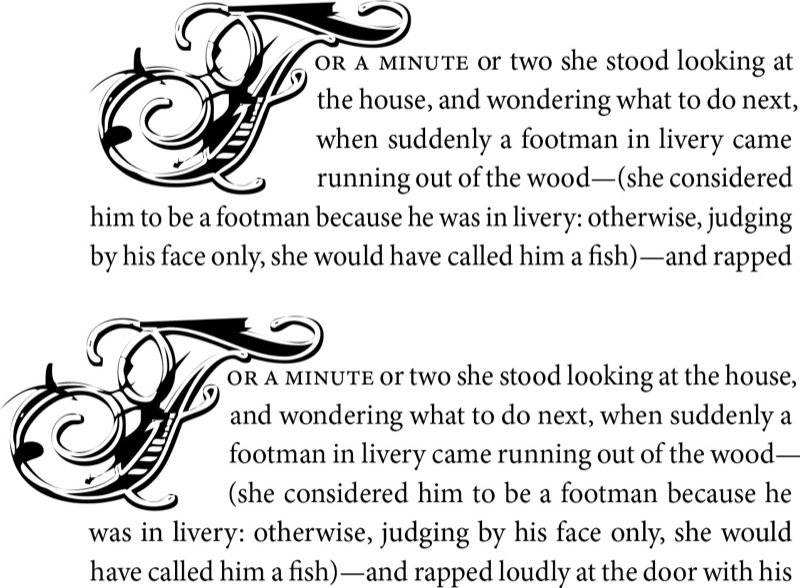
Figure 6. When working with highly decorative drop caps, InDesign’s Align Left Edge and Scale for Descenders options may not be sufficient for the optical spacing of the opening letter (top). In the bottom example, I added a thin space (Cmd+Shift+Option+M/Ctrl+Shift+Alt+M) before the dropped letter and then kerned back on this space, allowing the F to move into the left margin.
Contouring Drop Caps
Placing your drop cap character in its own text frame allows you to contour the text to the shape of the drop cap. Apply a text wrap to the drop cap text frame, then use the Direct Selection tool to sculpt the text wrap outline to conform to the shape of the letter (Figure 7). For best results make sure that the space around the drop cap is optically the same on the right side as it is beneath the drop cap.
Figure 7. A contoured drop cap. The W is in its own text frame. I applied a text wrap and then adjusted it to correspond to the letter shape.
Adding Small Caps
To create a visual bridge between drop cap and body text, you may put the words following the drop cap in small caps. This creates a transition from the large decorative character into the upper- and lowercase text so that the drop cap doesn’t look like an isolated graphic (Figure 8). How many characters are in small caps is up to you—it could be just the first word, the first phrase, a specified number of words, or the first line. Whatever you choose, be consistent throughout the publication.
Figure 8. Small caps applied through five words to ease the transition from the big first character to the upper- and lowercase text. To apply the small caps through a whole line, create a nested line style.
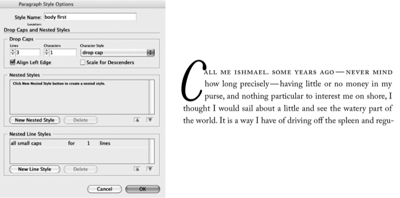
Figure 9. Small caps applied through five words to ease the transition from the big first character to the upper- and lowercase text. To apply the small caps through a whole line create a nested line style.
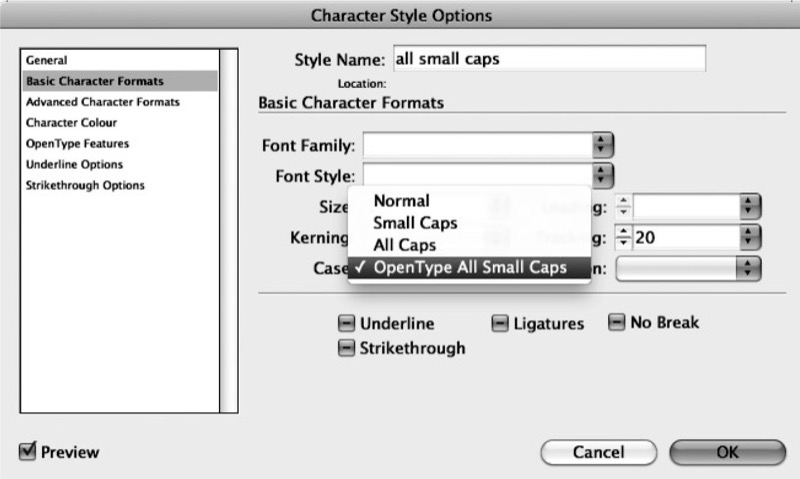
Figure 10. If available, choose OpenType All Small Caps when creating a small caps character style.
Difficult Drop Caps
Drop caps are just one way of kicking off a paragraph; they’re not always the best solution. Here are some instances when drop and/or initial caps are problematic:
- The first character of the paragraph is a number. If all chapter or section openers begin with a numeral this might not be a problem, but if you need to make an exception for an individual paragraph, consider rewriting to avoid the number.
- An opening paragraph begins with a quotation mark. You’ll need to drop both the opening quotation mark and the initial cap. If the opening quote mark looks disproportionately large, reduce its size, adjust its vertical position by applying a Baseline Shift, and kern the space between it and the drop cap that follows it (Figure 11). Exact amounts will vary according to the characteristics of the font. You should also hang the opening quote mark outside the left margin using the kerning trick I mentioned earlier.
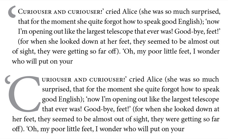
Figure 11. Because this paragraph begins with a quotation, the quote mark should be dropped along with initial cap (top). The number of dropped characters is specified as two. The punctuation is reduced in size and its vertical position adjusted by applying a Baseline Shift. The space between the punctuation and the C is then kerned.
- Opening paragraphs can’t accommodate the drop cap’s depth. Trying to sink a cap three lines into a one-line paragraph can create some visual confusion, although InDesign does an excellent job of cop- ing by allowing the next paragraph to move up (Figure 12). However, if you’re repeatedly using a three-line drop cap on paragraphs that are only one or two lines deep, consider using a raised cap instead.
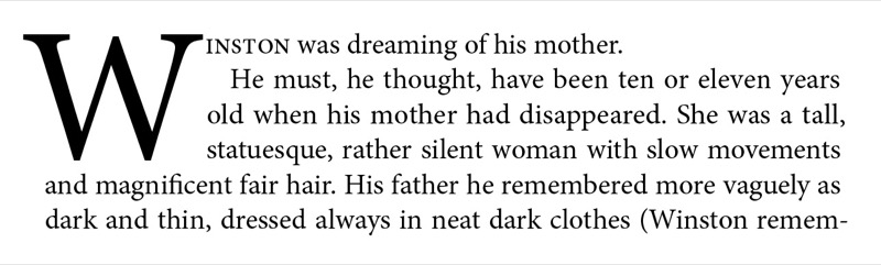
Figure 12. InDesign handles short opening paragraphs elegantly, bringing the second paragraph up next to the drop cap and maintaining its first line indent.
- Articles or chapters begin with poetry, song lyrics, or other quoted material. To apply the drop cap here would add an extra level of decoration, possibly con- fusing the reader. It’s possible to use the drop cap after such a passage, but it is no longer signaling the beginning of the chapter, article, or section, and so is extraneous and can look fussy.
Drop caps are a time-honored way of introducing your reader to an article or chapter, but they’re not the only way. Alternative opening devices include a larger font, spanning columns, increasing the lead- ing, and contrasting typeface, color, and weight, to name but a few. It’s up to you to decide which devices best serve your text and exactly how to use them. As with most design elements, a light touch is usually best, but when it comes to decorative caps for major feature articles, it may be worth checking your subtlety at the door and experimenting with some bombast. Pick up some well-designed magazines to see how contemporary designers are using drop caps, then go for it!
Commenting is easier and faster when you're logged in!

Recommended for you

Kerning Drop Caps
How to automate the kerning of tricky letter combinations in drop caps with InDe...

Adjust the Space Between a Drop Cap and the Next Letter with Kerning
When you assign drop cap formatting to a paragraph (so that one or more letters...

Drop Cap with Adjacent Text Wrap
[Note: This is a guest post from a longtime reader, Masood Ahmad. See links...