

Drop caps are a common way to decorate the opening paragraph of a book or long document chapter, but they come with a minor headache: common initial letters such as “T” and “V” require hand-kerning with the following regular-sized letter, because even InDesign’s smart Optical Kerning doesn’t do it automatically. GREP styles are the solution but because you can only specify tracking, not kerning, values in a Character Style this needs a special approach.
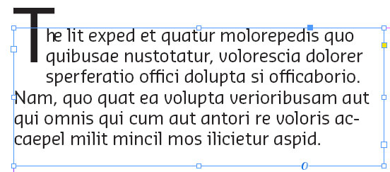
Here’s an example of a raised “drop cap” that illustrates the problem. You could fly a 747, or at least a drone, through that gap!

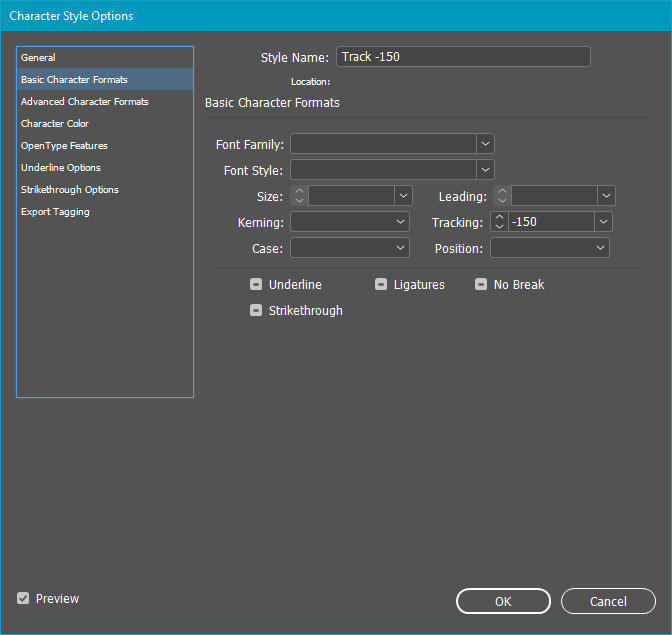
Kerning the Th pair back to -150 gives a decent balance, but a Character Style only allows us to specify tracking at -150.
We can set up a GREP style to apply this Character Style to the “Th” pair, like this:
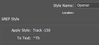
A caret (^) in GREPpish means “beginning of paragraph,” so the whole “To text:” GREP expression means “Look at the start of the paragraph for the letters Th.” InDesign obediently applies the negative tracking to both glyphs—not what we want—making for an ugly collision between the “h” and “e.”
The solution is to use GREP’s “optimistic forecast” feature. Okay, so its real name is “Positive Lookahead” (there’s a pessimistic counterpart called “Negative Lookahead,” but we’ll stay away from negativity here). Our expanded GREP expression says “Look in the beginning of the paragraph for the letter T followed by the letter h.” That “(?=)” bit is the Positive Lookahead. The droid(s) you’re looking for go after the equals sign, inside the parentheses.

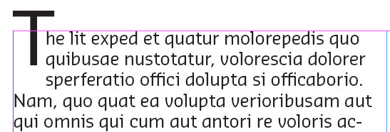
Now InDesign will apply the Character Style only to the T and not the following h, eliminating the uglies.
You can use this trick anytime you need to apply custom kerning to raised or dropped caps or when you have an odd letter pair that your font doesn’t kern properly. For more extensive kerning needs, see Peter Kahrel’s fantastically useful custom kerning script.
This article was last modified on June 29, 2021
This article was first published on June 4, 2021
Commenting is easier and faster when you're logged in!

Recommended for you

Speed Up Your GREP Styles
Fact: Searches and replacements done from InDesign’s GREP tab in the...

GREP of the Month: Negating Characters
Learn how to exclude a single character (or a range of them) with these handy GR...
GREP in InDesign Excerpt: Learning by Example
Get started learning the basics of GREP in InDesign in this free excerpt from Pe...