To provide the best experiences, we and our partners use technologies like cookies to store and/or access device information. Consenting to these technologies will allow us and our partners to process personal data such as browsing behavior or unique IDs on this site and show (non-) personalized ads. Not consenting or withdrawing consent, may adversely affect certain features and functions.
Click below to consent to the above or make granular choices. Your choices will be applied to this site only. You can change your settings at any time, including withdrawing your consent, by using the toggles on the Cookie Policy, or by clicking on the manage consent button at the bottom of the screen.
The technical storage or access is strictly necessary for the legitimate purpose of enabling the use of a specific service explicitly requested by the subscriber or user, or for the sole purpose of carrying out the transmission of a communication over an electronic communications network.
The technical storage or access is necessary for the legitimate purpose of storing preferences that are not requested by the subscriber or user.
The technical storage or access that is used exclusively for statistical purposes.
The technical storage or access that is used exclusively for anonymous statistical purposes. Without a subpoena, voluntary compliance on the part of your Internet Service Provider, or additional records from a third party, information stored or retrieved for this purpose alone cannot usually be used to identify you.
The technical storage or access is required to create user profiles to send advertising, or to track the user on a website or across several websites for similar marketing purposes.


great tip!
Note that shadows applied to image frames work fine.
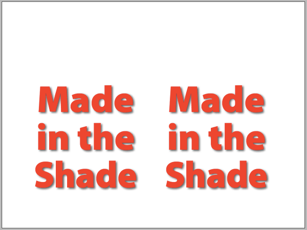
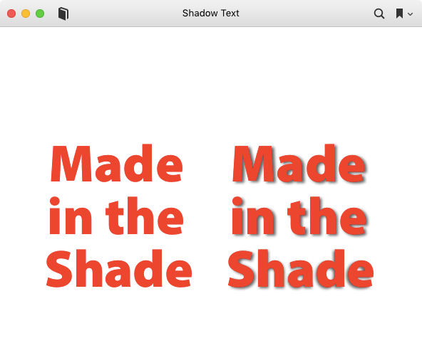
Use drop shadows with care. I used them on a book cover because they looked good on the cover itself. Unfortunately, shrunk down for display on retailers such as Amazon, that cover looked awful. Reduced in size, those shadows made the book title look cheap and blurred. Also, keep in mind people with vision impairments. That shadow most people see will just blur the edges of the text for them and fill in spaces inside characters.
For covers, I found I was often using drop shadows to make up for poor contrast between the text and its background. If I chose that background more carefully, that wasn’t needed. You can see that most obivously with this draft cover:
https://indd.adobe.com/view/094714fb-82c3-4f13-bfa1-07215cc064d1
Black on white means I don’t need to do anything to make that text stand out. I did, however, play with the color, spacing and height of characters inside ID to make each part of the cover text look distinctive. It’s the same font manipulated to look different.
—-
The unpredictability of spine alignment with print on demand publication has also forced another design decision on me. Both CreateSpace and Lightning Source can’t be trusted to get the spine alignment right. I’ve had spine placement in the same shipment from CreateSpace vary by as much as a quarter of an inch. That can look really awful if the front, spine, and back have different background colors. So I’m doing what you see on that cover. All three areas will have the same background, in this case white. So So even if the spine is missaligned, only the placement of text and pictures moves slightly. That’s not nearly as noticable as background colors intruding into other spaces. I also keep the spine text relatively small for the same reason. It may be tiny, but it stays on the spine.
In short, limiting design choices to fit the limitations of publishing may be a nuisance, but it beats getting ticked off by problems that can’t be controlled. I went round and round with CreateSpace about cover issues and go nowhere. This way I don’t have to worry. Shrunk down or misalligned, the design still works.
Can this be done adding multiple effects to the text in ePubs?
useless article. does not work. where is the code? reminds me of the wendy’s where’s the beef commercials: WHAR’Z THE CODE.
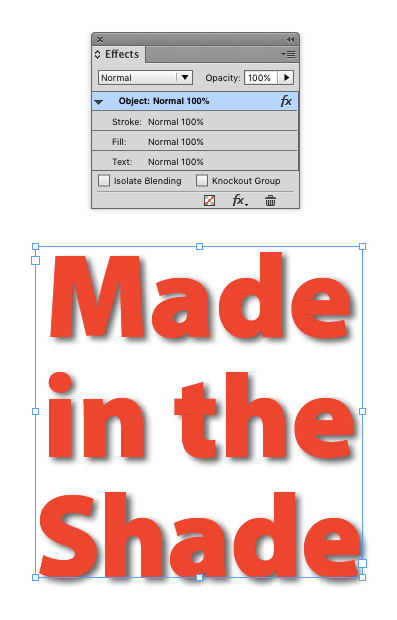
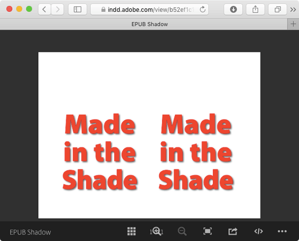
The point of this post was to show how to avoid a problem with disappearing shadows by setting up the InDesign source file correctly. Once you do that, you can export to FXL EPUB, crack it open, and get whatever code you’re looking for.