Teaching Typography with Flickering Fonts

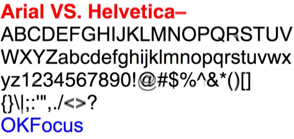
No matter how you pronounce them, animated GIFs, with their brevity, humor, and visual inventiveness have certainly found their place in Web culture. We’ve come a long way from rippling flags and dancing babies. Nowdays GIFs can be quite artful, and they can be used as teaching tools as well. Case in point: the site Arialvshelvetica.com. It’s just one page filled with a GIF that flickers with strobe-light speed between the basic character sets of Arial and Helvetica.
The flicker first draws your eye to the biggest differences in the two typefaces, like capital R. But then you might start to notice more subtle, but significant differences in other characters (if you don’t have a seizure from staring at all that educational flickering). For best results, view the site with Chrome or Safari, not Firefox.
And if you’re interested in a great mini-documentary on the history and the amazingly creative things people are doing with GIFs today, check out the PBS Arts Off Book episode devoted to the subject.
Thanks: Core77
This article was last modified on January 8, 2023
This article was first published on September 26, 2013
Commenting is easier and faster when you're logged in!
Recommended for you

20 Desert Island Typefaces
If you could use only twenty typefaces for the rest of your life, which ones wou...

10 Essential Tips for Working with Text in Photoshop
A picture’s worth a thousand words but occasionally you may need to include a fe...

Designing with Lead-ins
Lead-ins draw attention and add flair to text by highlighting the opening words,...


