Taming Baseline Grid Previews in InDesign
Tweak your Baseline Grid settings to make it easier to see what you're doing in InDesign.

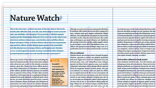
Is there anything more glaring and distracting than thousands of glowing blue horizontal lines eating up your layout? I think not. Yet so many InDesign users, forced to work with baseline grids, grit their teeth and put up with it, because that’s how they appear, by default, when you choose View > Grids & Guides > Show Baseline Grid.
Ow! Makes my eyes bleed.
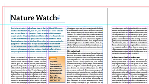
When I work with baseline grids, I set them up so they only appear inside text frames, not margins and gutters, and they use a much subtler, non-distracting hue.
Here’s a close-up:
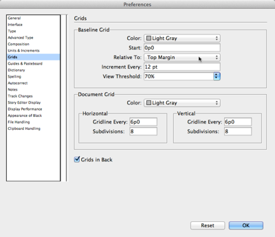
How is this magic accomplished? By going to Preferences > Grids, and changing a couple settings for color and offset. First, you can change the color of the baseline grid at the top of this section. I like Light Gray when I’m working with black text.
Second, to confine the grid to your main text area, set the grid to start Relative to: Top Margin (where my cursor is pointing to above) instead of the default Top of Page. Assuming your main text flows inside your page’s margin settings (Layout > Margins & Columns), the grid will show only where there’s live body text, and you won’t be bothered with the baseline grid impinging on the white space outside of the margins.
This article was last modified on March 13, 2024
This article was first published on April 10, 2013
Commenting is easier and faster when you're logged in!
Recommended for you

How to be a Better Designer: Design on a Grid
When you design on a grid, it helps you decide what goes where, so you can spend...

Before&After Design Tip: Using Many Photos? Display Them in a Grid!
A beautifully simple way to display a group of photos

The Mystery of the Moving Overset Contest Answer and Winner
Solve this InDesign mystery for a chance at winning a great prize.


