
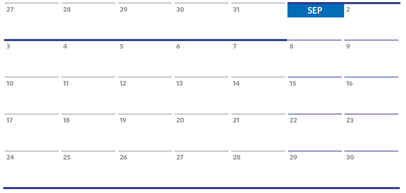
I recently had to design a calendar in InDesign using complex table formatting with very specific requirements for row and column strokes:
- Thick lines separating each month, spanning across the columns
- Names of the months in white, with a colored background
- Individual days with row dividers, but not column dividers
- Row dividers could not span across the columns
- Weekends formatted like the weekdays, but with blue row dividers
- Weeks starting with Monday
Initially, I tried to use InDesign’s row and column strokes to accomplish this, but that proved to be impossible. We InDesign users have been complaining for years about how difficult it is to format tables.
After mentally chewing on this issue for a week, I decided to almost completely ditch the idea of using row and stroke formatting for this. This table is so complex and unusual that I thought I would share how I created it:
I set up the numbering using auto-numbering. So all I need to do to get a number in each cell is to add a space.

The next issue was row stroke. The issue with row strokes in table formatting is that they are affected by both the cell style of the row above as well as the row below. That’s one too many variables for me!
After ditching the idea of row strokes, I decided to use paragraph rules above to accomplish what I needed. That would also allow me to use the same paragraph style that I set up for the numbering. I adjusted the left and right indents a bit so that there would be some blank space in between each of the columns.

Formatting the weekends was as easy as making a new paragraph style based on the Weekday numbering style. All I had to do was change the color of the rule above.

Same thing for the divider bars in between each month: for those ones, I made the stroke thicker, and reduced the indent (thus making the line longer).

The last thing to tackle was the colored background behind the name of the month. At first glance, it looks like a separate cell. But if I did it that way, I would no longer be able to distribute the rows evenly. The most flexible method I could think of was to use paragraph shading. I wrote about that here as well. I adjusted the offsets so that it would sit where I wanted to.

The beauty of using paragraph shading for this formatting is that it can be built into the paragraph style, which now applies the typography, rule above, as well as the paragraph shading.
So in the end, the only thing I used cell styles for was for the cell insets.
 The only time that I needed to actually use the table row formatting was at the very bottom of the table, where there were no paragraphs below to provide the line.

This article was last modified on July 20, 2021
This article was first published on September 18, 2017
Commenting is easier and faster when you're logged in!

Recommended for you

Style Highlighting
A new free script can reveal at a glance where any style has been applied in you...

The Inconsistent Indent Contest Answer and Winner
Solve this InDesign mystery for a chance at winning a great prize.

Ruling headers… (or, Placing a Rule Behind a Header)
Consider this part 2 in the series 'working with text on a tinted background'!