
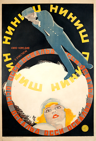
Movie poster for Ninich, by Vladimir and Georgii Stenberg, 1927
Constructivism was a groundbreaking movement in art, design, and architecture that began in Russia in 1913, but really rose to prominence after the Russian Revolution of 1917. This revolution was a time of great dissent and change, leading to the dismantling of the tsarist regime in favor of the Bolsheviks.
Russian Constructivism was considered more of a philosophy than just an art style. It reflected a belief in art for social change rather than personal expression. The Russian Constructivists were proponents of functional art and design as opposed to decorative, expressive art (such as easel painting). This echoed the revolutionary mood of the times, as the revolutionary proletariat movement was replacing the bourgeois culture.
The tools and techniques of more traditional, figurative painting and art styles were replaced with “constructed” photomontages and strong typography. Russian Constructivism characteristically used minimal color palettes, often just red, black and sometimes yellow. These works frequently had diagonal elements with circular and angled type and images. The resulting work was extremely dramatic, containing layered images coupled with powerful type treatments. The effect was exciting, often jolting, and even shocking, which was in line with the artists’ goal to change society. This movement was a dramatic shift from previous, more conventional movements and philosophies of art.
Although originally intended for political messages, the Constructivist style seeped into product advertisements and posters of all kinds, as well as book covers and their interiors. Three of the most influential designers of the Russian Constructivist period were Alexander Rodchenko, El Lissitzky, and the Stenberg Brothers. Here is a little background and a sampling of each of their work. Most of the work speaks for itself, but I have provided explanations for those pieces that call for it.
Alexander (Aleksandr) Rodchenko (1891–1956)
Alexander Rodchenko was a Russian designer, photographer, painter, and sculptor who was considered one of the founders of the Russian Constructivist movement. In fact, the term “Constructivist” was originally coined by the artist Kazimir Malevich in reference to the work of Rodchenko. Although his original focus was painting, Rodchenko later went on to play around with photography, typography, and imagery, combining them into what was then referred to as montage or photomontage. He eschewed easel painting for “industrial art,” as he called it—that is, art with a social purpose and message for the masses. Although he created much of his earlier work for political purposes, he went on to apply this artistic movement to ads for ordinary objects such as beer, pacifiers, cookies, watches, and other consumer products.
In March 1923, Rodchenko published an article in which he said, “There is now a new illustrative method: montage of printed and photographic materials focused on a certain subject. Providing ample material of great demonstrative value and conviction, it dispenses with illustration by drawing.”

Books (Please)! In All Branches of Knowledge, Alexander Rodchenko, 1924.

Poster for the Russian state airline Dobrolet, Alexander Rodchenko, 1923.
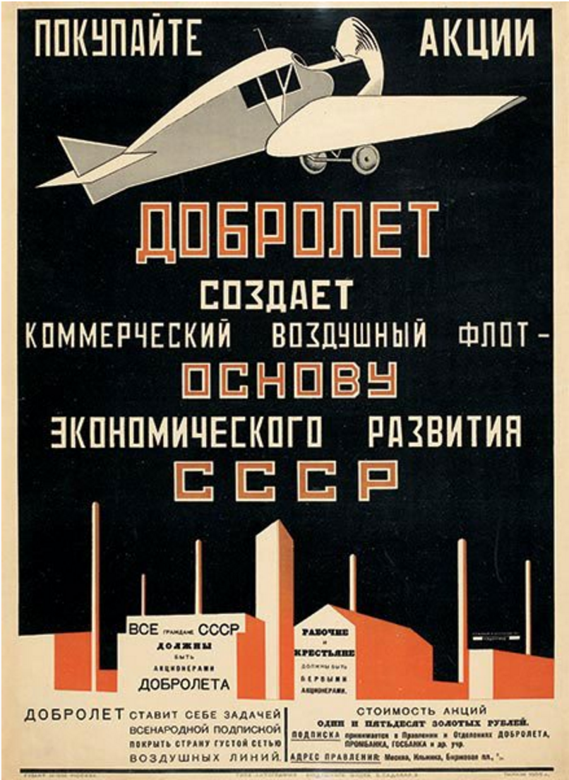
Another poster for the Russian state airline Dobrolet, Alexander Rodchenko, 1923.
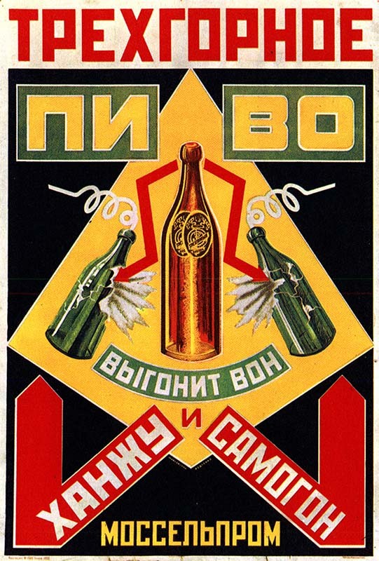
Trekhgornoe Beer Will Drive Out Homebrew!, advertising poster for Mosselprom, Alexander Rodchenko, 1925.
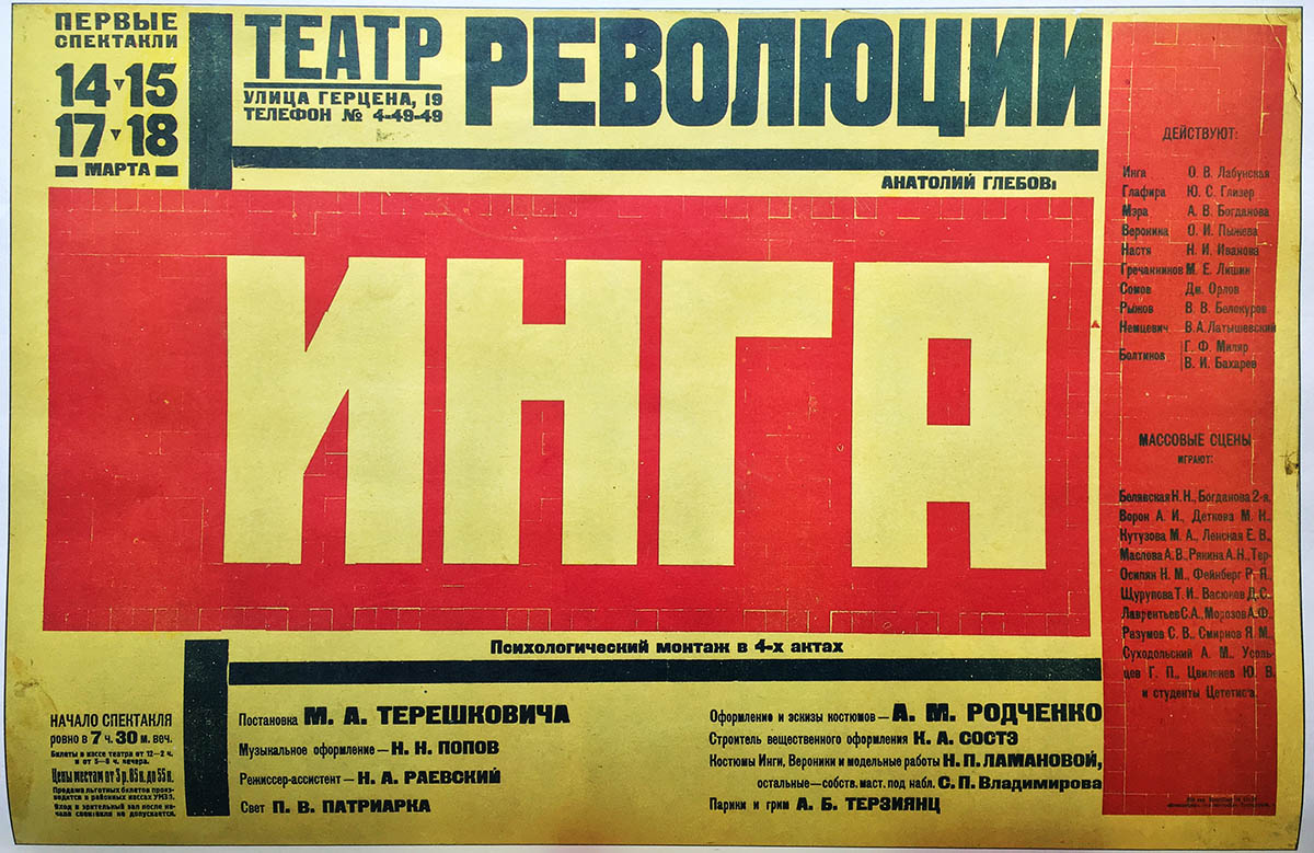
Playbill for Inga, staged by the Theatre for the Revolution, Alexander Rodchenko, 1929.
El (Lazar Markovich) Lissitzky (1890–1941)
El Lissitzky was a Russian-born painter, designer, and typographer who was associated with both the Suprematist and the Constructivist movements. He studied engineering and architecture in addition to art, giving him a very linear, logical approach to all that he did. His work, especially that which incorporated the Suprematist philosophy, was highly abstracted with minimal color, geometric shapes, and in some cases, deep symbolism. As with all Constructivists, he believed in using art as an agent of change.
El Lissitzky designed many books, posters, exhibitions, and other kinds of Soviet propaganda. Most of his work was politically oriented, as was most work produced in that era. These quotes by El Lissitzky express two of his design philosophies: “Typographical design should perform optically what the speaker creates through voice and gesture of his thoughts,” as well as, “Art can no longer be merely a mirror, it must act as the organizer of the people’s consciousness… No form of representation is so readily comprehensible to the masses as photography.” His thoughtful, somewhat cerebral work influenced modern art, including the Bauhaus and De Stijl movements.

Beat the Whites with the Red Wedge, El Lissitzky, 1919. This lithograph is one of his earliest politically charged works. The intrusive red wedge symbolizes the Bolshevik revolutionaries (known as the Reds), who were penetrating the anti-communist White army during the Russian Civil War. Note his use of simple colors and geometric shapes, all of which are integrated with the typography.
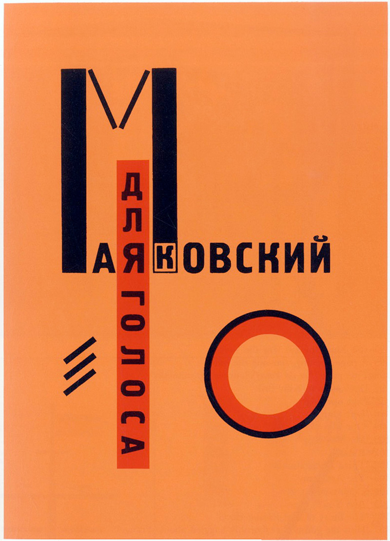
Dlia Golosa (For the Voice), a book of poetry, El Lissitzky, 1923. This combination of type and shapes makes for one of the most notable examples of El Lissitzky’s work.
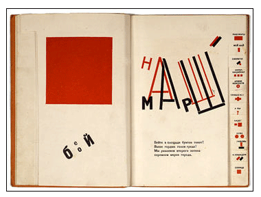
An interior spread from For the Voice.

Russian exhibition poster, El Lissitzky, 1929. In this piece, two huge figures of a boy and a girl are almost fused together, sharing one “eye” or vision, to emphasize the equality of the sexes in the Communist regime. Lissitzky’s art and political beliefs combine in much of his work at this stage in his career.

Book cover for The ISMs of Art, El Lissitzky, 1924. This purely type cover, with its simple colors, bold type treatments, and powerful geometry, became one of the most influential graphic designs of the 1920s.

Book cover for Good! by Vladimir Mayyakovsky, designed by El Lissitzky,1927.
Georgii Stenberg (1900–1933) and Vladimir Stenberg (1899–1982)
The Stenberg brothers were Soviet artists, sculptors, and designers. They always worked in collaboration and designed over 300 movie posters (what they are most known for) in the decade before Georgii’s untimely death from a motorcycle accident in 1933.
The new Bolshevik government was completely supportive of the cinema industry, especially its power to propagandize and spread its new message aimed at the masses. At that time, over 60% of the population was illiterate, so the Constructivist’s work, with its strong, jarring images and powerful design, was able to catch their eye and help spread this new ideology.
The Stenberg’s primary technique was montage. They designed their posters to be eye-catching and even shocking: “We deal with the material in a free matter… disregarding actual proportions… turning figures upside down; in short, we employ everything that can make busy passerbys stop in their tracks.” Their work rejected traditional styles in favor of other ways to convey the motion, dynamism, and rhythm that characterized the work of the 1920s. They frequently used unconventional viewing angles, radical foreshortening, and unsettling close-ups. Their posters even hold up today and can appear as striking as they did in their day. In fact, in 2000, ITC released two fonts inspired by the brothers’ work, entitled ITC Stenberg.

Movie poster for A Small Town Idol, Vladimir and Georgii Stenberg, 1921.

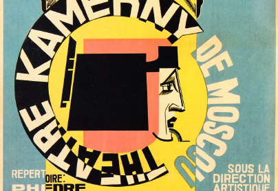
Poster for the Moscow Chamber Theatre, Vladimir and Georgii Stenberg, 1923.
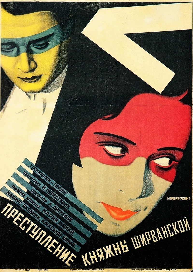
Movie poster for Countess Shirvanskaya’s Crime, Vladimir and Georgii Stenberg, 1926.

Movie poster for Berlin: Symphony of a Great City, Vladimir and Georgii Stenberg, 1927.

Movie poster for the experimental, avant-garde film Man With A Movie Camera, Vladimir and Georgii Stenberg, 1929.
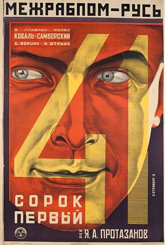
Movie poster for The Forty-First, by Vladimir and Georgii Stenberg, 1927.

Movie poster for In Spring, Vladimir and Georgii Stenberg, 1929.
Contemporary Posters in the Russian Constructivist Style

Poster for CBS Records, Paula Scher, 1979.

MoMA poster redesigned in a Russian constructivist style, Lauren Wells, 2009.

Concert posters for The Black Keys’ NYC tour, designed by OBEY’s Shepard, 2012.
This article was last modified on June 8, 2022
This article was first published on September 27, 2017
Commenting is easier and faster when you're logged in!

Recommended for you

TypeTalk: How to Attract Attention With Pull Quotes
A pull quote is a key phrase, sentence, quotation or excerpt that is taken, or p...
Hermann Zapf Sketchbook Kickstarter Project
I’ve been known to fall down the rabbit hole of Kickstarter projects, and...
Illuminated Manuscripts with Decorated Initials
Illuminated manuscripts can be a wealth of inspiration even for modern designers...