
20 Desert Island Typefaces
If you could use only twenty typefaces for the rest of your life, which ones would you choose?


This article appears in Issue 127 of InDesign Magazine.
When InDesign Magazine’s illustrious editor, Mike Rankin, asked me to write about my 20 favorite typefaces, I thought it would be fun to reinterpret the brief as my Desert Island Typefaces. I’m borrowing the format from a popular BBC radio show, Desert Island Disks, with which most people (of a certain age) in the UK are familiar. Each week a celebrity or luminary—the castaway—is interviewed about the recordings they would take with them into their hypothetical exile. You can read more about the show here. These, then, in no particular order, are the typefaces I can’t do without: my Desert Island Typefaces…
(You may notice I didn’t say “Desert Island Fonts.” That’s because a typeface is a complete alphabet, including letters, numerals, punctuation, and accents. A typeface often includes a set of variations within a “family.” A font is a specific size and style of that typeface. For example, Adobe Garamond Pro is a typeface; Adobe Garamond Pro Regular 10 point is a font. What I’m talking about here are typefaces. Of course, in everyday life we often use these terms interchangeably. But here in the terribly formal world of InDesign Magazine, we’re going to get our terminology straight.)
Tisa Pro
Elegant, contemporary, and highly readable—Tisa Pro is all those things, but to me it’s also a comfy pair of slippers, a familiar piece of soothing music, or a go-to meal. In recent years it’s become something of a personal “default font,” which is a worry because we tire of the default option, and one day my capricious mind will tire of Tisa. But today I love it. One slight annoyance is that the cursive version
doesn’t follow standard naming conventions. It is Regular Italic, rather than just Italic, so making easily interchangeable character styles is more difficult.

Tisa
Acumin Variable
Robert Slimbach for Adobe Originals
If you read Chad Chelius’s article on InDesign 2020, you know that variable fonts are now available in InDesign. And if you’re excited to try out variable fonts, Acumin Variable is a good one to start with. It includes three variable axes: weight, width, and slant, making it very adaptable for display uses where you need to fill the line while keeping the letterspacing consistent.

Acumin
Minion
Robert Slimbach for Adobe Originals
Poor Minion. In a world where designers are always looking for something different, Minion was made InDesign’s default font—the kiss of death, because a default font will be chosen unthinkingly and bent to all sorts of uses for which it wasn’t intended. And so it will look bad through no fault of its own.
Designed by Robert Slimbach for Adobe in 1990, and extended over the years to a wide range of weights and optical styles, Minion is a beautiful oldstyle serif that’s great for extended reading.
We used to have a thing, Minion and I, but that was long ago. We’re on speaking terms now, but it’s awkward. Every once in a while, I catch a glimpse of Minion from across the room, and wonder what might have been. (Nonetheless, I can’t help but add it to my desert island list.)

Minion
Myriad
Carole Twombly and Robert Slimbach for Adobe Originals
Available in a staggering number of styles and alphabets, as well as being an elegantly simple humanist sans serif, Myriad is great for multilingual publishing. Like Minion, with which it is frequently combined, it too became a default font, for Illustrator and Photoshop. I include Myriad as another of my “exes” out of respect for the past. And because you never know what surprises the future might bring.
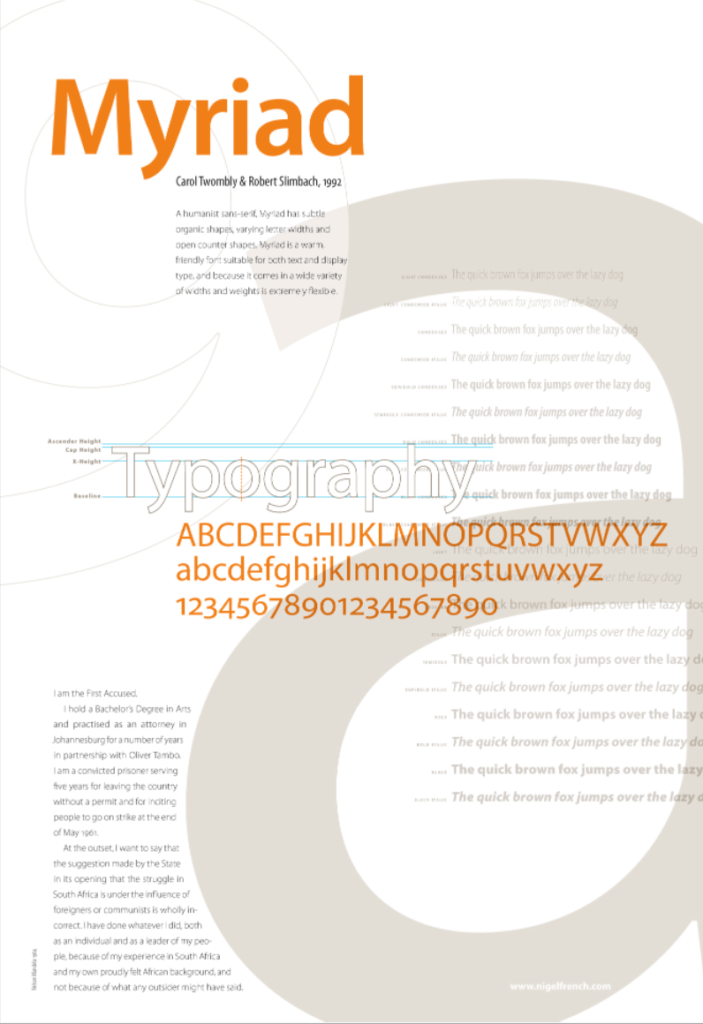
Myriad
Alternate Gothic
Morris Benton
I love condensed and compressed sans serifs set in all caps for headlines. You can fit a lot in and space the letters tightly for maximum impact. Alternate Gothic comes in three styles, but mostly I gravitate towards the first and most condensed member of the family.
Alternate Gothic
Noto Sans
Google’s Noto Sans is a superfamily that comes in over 100 styles. It’s open source and free to use. As well as regular width, there’s also Condensed, Semi Condensed, and Extra Condensed, all in weights from thin to black. There’s a Display version for use at larger sizes and supporting CJK (Chinese, Japanese, and Korean) versions. It is the ultimate allrounder, designed to achieve visual harmony (uniform heights and stroke weights) in all languages. In addition, its character set is massive, taking advantage of the potential of OpenType. Noto aims to banish the empty boxes that are rendered when there is a missing glyph. On the Web, these small boxes are some-times called “tofu.” Noto—as in no tofu—makes them a thing of the past. This universality was enough to convince global brand IKEA to switch from Verdana to Noto for all their publications and branding. And if that wasn’t enough, there’s also a serif version—but it would be flouting the limitations of this game to try to take that along too.

Noto
CarlMarx
Hidetaka Yamasaki for Adobe
2019 is the one hundredth anniversary of the Bauhaus, the German art and design school established by Walter Gropius in Weimar that continues to have a massive influence on our visual culture even now. One of seven fonts that make up the Hidden Treasures of the Bauhaus collection, CarlMarx is based on lettering by Carl Marx* (1911–1991), designed during his first semester at the Bauhaus in Joost Schmidt’s class, in 1932. Hidetaka Yamasaki redrew the letters from scratch and added all the missing characters for today’s needs.
*That’s Carl Marx, not Karl Marx

Carl Marx
Clarendon
Robert Besley
Evocative of everything 19th century and especially the type-heavy posters of the era, Clarendon has enough personality for display work, but also comes in a text version readable enough to be used for body text, albeit sparingly. This slab serif has been recreated by many foundries over the years, including the beautiful rendition by URW.

Clarendon
Gilbert
typewithpride
Even though I’m a castaway on a desert island, I’ll still want to keep up with emerging font technologies, like Color Fonts (yes, InDesign CC supports them!). An early example of what’s possible is Gilbert, created in commemoration of Gilbert Baker, the creator of the Rainbow flag. You can download it for free from typewithpride.com.

Gilbert
Funkydori
Laura Worthington
I’ll need a casual script face in my toolkit. I love Laura Worthington’s scripts and if I have to pick just one, it would be Funkydori, which evokes memories of the early ’70s. Fun and flamboyant, its name obliquely references one of David Bowie’s finest albums, which seems like as a good a reason as any for choosing a font. Funkydori is a powerful personality that I’ll be tempted to overuse, so apologies in advance if my message in a bottle is a bit over the top.

Funkydori
Futura and Avenir
Paul Renner
Adrian Frutiger and Nadine Chahine
I’m going to give myself a bonus typeface, because I want to bring along both Futura and Avenir—two similar fonts that are fun to compare. Futura has an impeccable pedigree both for the Nazi-hating credentials of Paul Renner, its creator, and because it was the first font on the moon. Amazingly, it still looks as modern today as when it was first created in the late ’20s. If you’re after a clean, contemporary look, it’s hard to beat.
However, because some clients don’t like Futura’s characteristic single-story a, or feel its lowercase j is a little too minimalist, I can’t help but take along Avenir, which has the same sleek look but with a two-story a and a more conventional j. (Besides, you’ll recall from high school French class that “avenir” means “future”—a fun typography joke that only works when you have both players present.)

Futura (left), Avenir (right)
Chartwell
Travis Kochel
There’s bound to be demand for infographics on my desert island, so I’ll want to be prepared with Chartwell, which, in its full set, allows you to easily convert (through the clever use of contextual alternates or stylistic sets) letters and numbers into slick bar charts, pie charts, donut charts, and the like. If you want to learn more about this astonishing font, you can read more in this InDesignSecrets article.

Chartwell
Fontawesome
Dave Gandy
Allowing easy access to social media and a gazillion other icons, all accessible through the Glyphs panel and usable as scalable fonts, Fontawesome is a tremendously useful “pi” or picture font. You can use the cheatsheet to find the symbols you need. Be sure to create a glyph set of your most frequently used icons for easy access.

Fontawesome
Gotham
Tobias Frere-Jones for GQ magazine
Inspired by the no-nonsense lettering of New York’s Port Authority Bus Terminal and made famous by its use in Barack Obama’s successful presidential campaigns of 2008 and 2012, Gotham was the typeface of the early 21st century. It is geometric, strong, and simple.Available from Hoefler&Co.
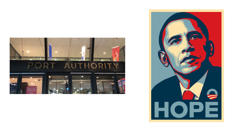
Port Authority, Hope
Whitney
Tobias Frere-Jones for the Whitney Museum, NY
Whitney is an extensive sans serif family designed by Tobias Frere-Jones. It has an understated charm and manages to tick that cool-and-contemporary-yet-still-traditional box. I particularly like the two-story lowercase g. A few years ago I designed my logo using Whitney—and since I’ve not yet gotten around to updating my corporate identity, I’d better take Whitney along to my desert island.

Whitney
Comic Sans
Seriously, why not? I include the infamous Comic Sans because I like to side with the underdog and because in my Font Republic all citizens are equal. Reports of its crimes against typography have been exaggerated—that gravestone with Comic Sans? That was Photoshop. And if I ever need a typeface for the speech bubbles of a children’s computer game, then it’s not a bad choice. I’ll have a lot of time to fill on my desert island, so I can amuse myself by creating signage in Comic Sans.
Comic Sans
Helvetica
Max Miedinger and Eduard Hoffmann
Many designers love to hate Helvetica. “Anything But Helvetica” was the mantra of many in the ’90s, but as Gary Hustwit’s fantastic 2007 documentary shows, Helvetica is extremely malleable and can be used to great effect in corporate identities, posters, and signage.

Helvetica
Anonymous Pro
Mark Simonson
No type collection is complete without at least one monospaced typeface. My current favorite is Anonymous Pro. I use it for those times when I want the letters to stack up, due to them all having the same width, or when I’m after that retro typewriter look. I could also use it if I need to set a line of code in a textbook.

Anonymous Pro
Bickham Script Pro
Richard Lipton for Adobe Originals
On my desert island, just as in real life, there will be the occasional call for wedding and other formal invitations. These aren’t my favorite jobs, but work is what pays the bills, isn’t it? I’ll try to sell my client on something cool and contemporary—some hairline sans serif with graceful curves. They’ll love it, but their parents are paying for the wedding, and the parents want a formal script. Bickham is a flourished script that comes with a boatload of contextual alternates and discretionary ligatures. Using the Glyphs panel, you can explore a wide range of variations and really get your baroque on.

Emoji One
Love ’em or hate ’em, they ain’t going away, so an emoji set is a useful addition to the toolbox. As well as the familiar smiley and winky faces, there’s also a wide range of arrows and flags. Use the Glyphs panel to explore.

Emoji
Just Deserts
With these 20 typeface families, I’m equipped to cope with just about any typographic challenge. Any list of favorite fonts is inevitably subjective, and mine is no exception. If I made this list next year, next month, or even next week, it would be different. But while some of the players might change, the positions they need to fill would stay the same—text and caption, headline and display, symbol and icon, historic and contemporary, evocative and neutral, casual and formal.
Commenting is easier and faster when you're logged in!

Recommended for you

Building a Photo Book with Object Styles
David Blatner shows how object styles can make designing layouts incredibly fast...

To Boldly Go . . . Or Is It Italically?
Your basic typeface family consists of four members: roman, italic, bold roman,...
InDesign Magazine Topic Index Now Available Online
Locating the articles you want is faster and easier than ever before, thanks to...