
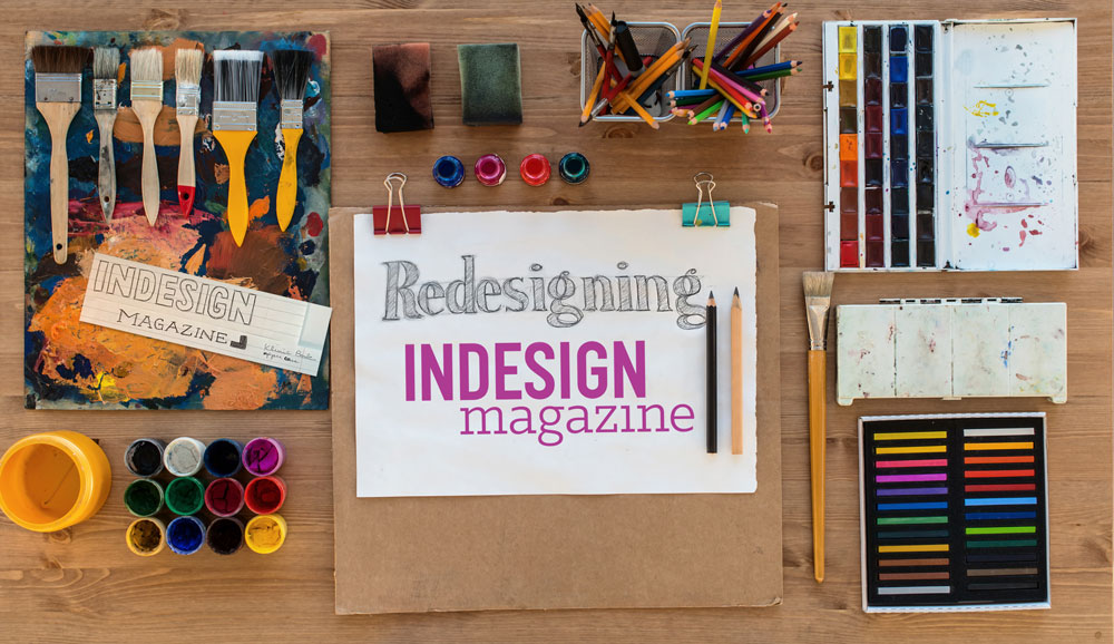
Redesigning a Magazine
An interview with designer Pam Sparks reveals the process used to redesign InDesign magazine.


This article appears in Issue 106 of InDesign Magazine.
There are many reasons to undertake a redesign of a magazine or journal, and often just as many reasons not to! Like so many creative endeavors, the pain of not performing a redesign must grow until it’s greater than the pain of doing it. And that’s exactly what happened over the past year: we just couldn’t take the old layout any longer. There was nothing technically wrong with it, but… well, you know that feeling when you’ve eaten oatmeal for breakfast for ten days in a row and, with a snap, you suddenly realize you just can’t do it again?
So… we have just completed the second major redesign of InDesign Magazine in the magazine’s 14-year history, and while it was an arduous journey, we loved it—both the process and the result.
Of course, the hardest part of redesigning InDesign Magazine was knowing that you, the reader, are an InDesign professional, and that you may pick apart all our choices—from fonts to colors to column width. So we’d like to use this opportunity to share with you why we made the choices we did. And we think the best way to do that is to ask our designer directly.
Meanwhile, as we noted in the last issue, we’d love to hear your thoughts about the magazine redesign! Please take 2 minutes to fill out this quick survey and let us know.
The following is an edited interview that took place via email between Editor in Chief Mike Rankin and freelance designer Pam Sparks.
Mike: How do you get started working on something like this? What are the first steps you take?
Pam: Honestly, it was a huge
undertaking. After I came down from the initial excitement, panic started to set in. The acceptance “handshake” took place in late August and we set a goal of unveiling the new design for the January 2018 issue. So in four months I had to deliver the overarching theme, a new logo, new set of fonts, color palette, cover design, page designs for every type of article, redesigned InDex page, new podcast page, special treatment for the Best of the Blog section, revamped navigation, author treatments, plus a variety of sidebars, and pull quotes. And to underpin all of those things, a workable template with grids, master pages and styles, all set up so that it all flows in smoothly each month. Also I had to develop a “brand guidelines” document with examples of everything listed above plus descriptions for how they were to be used.
So the first few days were a little overwhelming as the two halves of my brain fought against each other. In the right brain, some initial ideas bounced around and multiplied without any real direction, while the left brain tried to keep track of everything and organize it. Finally, my husband recommended that I create a Gantt chart listing every deliverable with a duration and due date from September through December. This did the trick because it allowed me to visualize the entire journey and break up one huge, scary deliverable into manageable bite-size tasks. After that, the job became much easier to tackle as I was able to focus on one thing at a time and gave myself permission to ignore anything that wasn’t on the docket for that day.
(Well, to be honest, if I get an idea for something outside the scope of what I was “supposed” to be working on, I would always take a moment to jot it down or sketch it, rather than ignore it completely and possibly lose it forever. The trick is to capture the essence and then send it to the back burner where it can percolate until its day comes.)
Another important prep step was to review the existing template, because to know where you’re going it helps to know where you’ve been! Previously I had only ever worked on one article of InDesign Magazine at a time and had never seen a whole issue stitched together. I wanted to look under the hood and see if there were any details I might not have planned for, so Mike sent me a recent InDesign book file with all the documents and supporting assets in a ZIP archive. That helped a lot. Once I saw how each issue was constructed, it took away that nagging feeling that some unknown obstacle lay in wait somewhere down the line that would derail the entire project.
A Quick Design History of InDesign Magazine
Scott Citron designed the first issue of InDesign Magazine in the summer of 2004, under the direction of editor Pam Pfiffner and founder David Blatner, based on a traditional magazine layout. Our first redesign rolled out three years later, in Issue 15, when we decided to switch from portrait to landscape orientation and really optimize the reading experience for on-screen viewing. The 2007 redesign was by Rufus Deuchler, with editor Terri Stone.
Jennifer Wills then followed up with a minor redesign in 2010, which launched in Issue 38. While the design was similar, it used larger fonts, largely predicated on the feeling that most subscribers would soon be reading the magazine on an iPad. In fact, we even launched an iPad version of InDesign Magazine… and published exactly one issue there before retreating back to PDF-only. That design served us well for almost eight more years!
Can you describe the overall workflow of the redesign? How did you share your ideas? How many meetings did you have?
With a project as important and intricate as a rebranding, it won’t do to just send files back and forth and rely on comments and markups. In the first stages, there are many critical decisions that can affect everything that comes after—essentially forks in the road. Page size was one of these decisions. If you’ve ever designed something in portrait that later needed to be changed to landscape or vice versa, you know that there’s no easy way to go back. Fortunately, many other elements (such as the logo or color palette) could be changed many times without throwing the rest of the redesign process into a loop.
It’s important that both the designer and the stakeholders can see and discuss design decisions in real time. So we (David, Mike, and myself, with Anne-Marie checking in at key points) met approximately every two weeks via screenshare and video chat. [Editor’s note: Mike lives in Boston, Anne-Marie lives in Chicago, David lives in Seattle, and Pam lives in Dallas. This project simply could not have been accomplished without a wide spectrum of collaboration tools, including Skype, Slack, Zoom.us, email, Acrobat, Google Docs, and Dropbox.]
I would share everything I had designed in the interim, usually starting with any revisions that came out of the previous meeting before going on to something new. In the early meetings I would put all my mockups into one presentation that could be scrolled through easily and I would make notes of what everyone liked or didn’t like, to funnel back into the process. Once we got past design comps, and template construction was in full swing, I would just share my InDesign or Illustrator documents with everyone. That way, we could dig into the styles, layers, and individual elements and sometimes even rework them in real time.
Talk about choosing the typeface for the body text. What characteristics were you looking for? How about the headings?
We’re all type geeks, so of course we talked about fonts in our very first meeting. David suggested a serif or slab serif for the body to maximize readability and provide a more friendly tone. To complement that, I proposed a condensed sans serif for headings and display text. We knew finding the right font pairing would be a key factor in the success of the design. Just like when casting a movie, it’s important to have a good chemistry between your two lead stars. I guess you could say we were type-casting—ha!
I started out using DIN Condensed for titles and headings because it had the basic overall shape and form I was envisioning. On the downside, it had only one weight. I had intended to search for a replacement later, but choosing the body font took all of our attention for a while. I mocked up full pages of placeholder text in various fonts to see how each one would perform in context. Although we all had our favorites, there just wasn’t a clear winner (Figure 1).
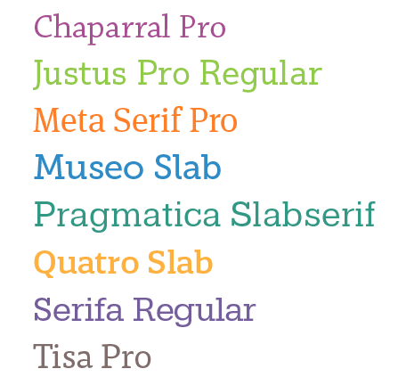
Figure 1. Some of the font contenders.
For the better part of a week we continued to search for just the right body font. David, Anne-Marie, and Mike all actively took part in the search effort, sending links and examples to the group for consideration. We probably debated over 30 fonts. Finally, we had a breakthrough! David found a wonderful slab serif called Klinic Slab. Not only was it readable and beautiful at both small and large sizes, but it had quality and personality in spades.
By then we had become so fond of DIN that we decided to keep it for the headings, despite having just one weight to work with.
Unfortunately, near the end of the project, we discovered an unexpected and horrible surprise. We had always assumed the cost of licensing DIN for a PDF magazine would be about the same as the print version… but we were wrong. We were shocked to learn that Monotype charged digital publications (such as PDF and EPUB) per issue. If this were a print magazine, the font would be less than $100, but as an eMagazine, the cost was over $5000 per year. That was a dealbreaker. So we had a moment of silence for DIN and then raced back to the drawing board to find a suitable successor. Mike widened the search net to include Google Fonts, and there we found our winner: Barlow Condensed. Happily, Barlow turned out to be even better than DIN—reasonably priced, lovely in layout, and with 18 different weights and styles to choose from.
How did you come up with the color schemes?
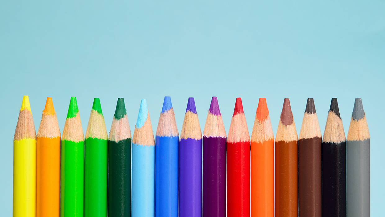
Choosing the color palette was probably the easiest part of the whole process. We all agreed we wanted a bold, vibrant color scheme. After some experimentation, I decided on two color “families,” a cool family composed of blues, greens, and purples; and a warm family of red, yellows, and oranges, with a little brown and gray to account for neutral tones. Then, for each swatch, I created a slightly darker pairing to enable a duotone effect. Finally, I grouped them all on a single page to make sure they all blended well together (Figure 2). The wide variety of colors, along with the decision to wield them generously, is probably the most dramatic change from the previous template, and definitely a key component in the design.
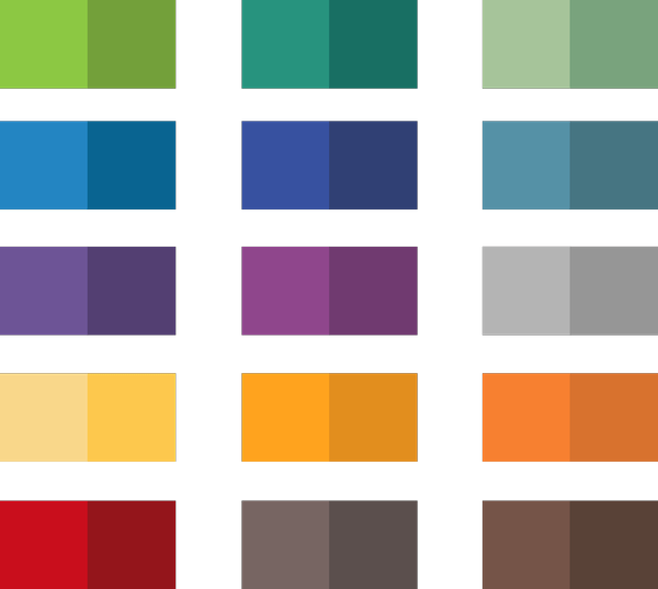
Figure 2. A bright and cheerful array of colors for any situation.
Diagonal lines seem to be an important recurring element. Why did you choose that?
The origin of the diagonal lines actually started with the InDesignSecrets logo, which features a “document” or page icon with a folded corner. From the start, I was thinking about incorporating iconography in some way, and the page icon is of course a natural representation for what we do in InDesign. One day, I was staring at this icon on my computer screen, and that folded corner—the triangle—kind of exploded in my mind. I saw it pulled apart, expanded, reversed, rotated, and all the myriad ways you can play with a single shape. That was the inspiration for the shape of the photo frames, the page flip on the InReview and InFocus articles, the triangles, and the diagonal lines. Everything is based off of 45- and 90-degree angles (Figure 3).
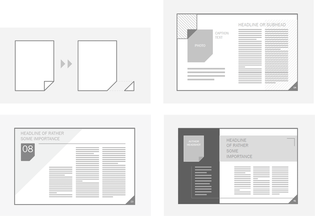
Figure 3. Digital “sketches” from the very first design review meeting; introducing the overall concept of the triangles and lines.
What drove the decision to go with a wider format?
The new page size was a collaborative evolution. Actually we started with the assumption that we’d stick to 1024 × 768 (the size of the previous design) because it’s a standard layout size that works well on most screens (Figure 4). And the 4:3 ratio matches many tablets, such as the iPad.
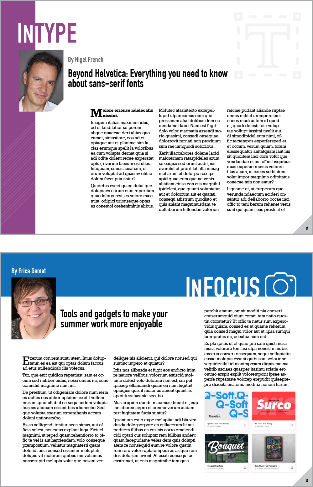
Figure 4. Some early design explorations, built using 1024 × 768.
But then, as often happens with redesigns, we started to question the status quo. Early on I asked if portrait was an option, like a traditional rack magazine, but because the first issues of the magazine had been portrait the consensus was that would be taking a step backward. Then David proposed the 16:9 format idea, which generated some exciting possibilities. Why not go wider? The magazine is digital, most monitors nowadays have a 16:9 format, and we had some recent survey data showing that most subscribers read the magazine on desktop and laptop computers, so why not maximize available space?
Fortunately, this idea was raised early on, during the comp stage, while we were still looking at sketches and rough-ups and I hadn’t started building the actual template yet. Widening the page size to 1280 × 800 turned out to be an especially fortuitous design change as it opened up more layout possibilities, including a 12-column grid that made 3- and 4-column layouts equally viable.
Were there dead ends in the process?
Dead ends are a natural occurrence in any creative endeavor—but a necessary one, I think. Many years ago, I read an article by a writer who was describing his writing process, of which an important part was forcing himself to write something every day even if he didn’t feel at all inspired. The rationale was that even if he ended up scrapping 99% of it, somewhere in the course of writing there would be an idea that would open up a new trajectory. He referred to this as “writing out the garbage,” and that phrase has stuck with me ever since.
The same applies to design. When you have design deadlines, you don’t have the luxury of waiting for inspiration to strike! Sometimes you have to face that blank page and just start working. And yes, many concepts will end in a dead end. You almost never achieve perfection on the first comp, so naturally you have to go through many iterations to get to the finished product. But every dead end is a learning experience. You learn what doesn’t work, and that allows you to change direction with better insight as to what will work better.
What was the most challenging task? What did you spend the most time on?
It might surprise you, but the new magazine logo was probably the most challenging part of the project. It’s definitely the one item I spent the most time on. The rest of the magazine progressed pretty steadily in comparison. I had my fair share of anxiety attacks through those four months, but time has a way of adding a soft-focus filter to those moments.
Can you describe the process of redesigning the logo?
Designing the new logo was both the most fun and most challenging aspect of the whole design. This is a perfect example of the question you asked earlier about dead ends. I spent many hours pursuing designs that eventually fell to the cutting room floor, but with each cut we learned something important about what worked and what didn’t, adding a new characteristic to the list of must-haves or must-not-haves.
My instructions for the new logo were pretty straightforward:
- Release the butterfly to greener pastures (Figure 5)
[Editor’s note: The butterfly was the original symbol of Adobe InDesign, and was featured in all of Adobe’s branding until version CS3 came out in 2007. We held on to the butterfly icon for an additional decade.]
Figure 5. InDesign Magazine logo with butterfly circa 2007-2017.
- If possible, try to incorporate the keyhole icon from InDesignSecrets.com (Figure 6)
Figure 6. The keyhole may not have made it into the new design, but the icon shape and “page flip” did!
- The word InDesign needs to have primary importance; Magazine is of secondary importance
- If possible, try to incorporate the issue date and number
- Modernize the feel, while maintaining a sense of tradition
In terms of “restrictions,” well, there weren’t very many, so I couldn’t have asked for a better situation! Of course, all the usual logo rules apply: it needs to work as a one-color option, it should be readable at all sizes and on any kind of background, and so on. But other than that, I was given a pretty long lead to explore with. I played around with the fonts, but you can see from the comps (Figure 7) that I stuck to the main requirements and worked in the optional requests where possible.
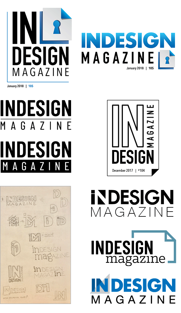
Figure 7. Logo explorations, including attempts to incorporate the InDesignSecrets keyhole and issue date/number.
However, incorporating that keyhole icon, like finding the right body font, was another area of intense collaboration. We put our collective minds to task, thinking creatively both inside and outside the box, to fuse those items together. We wanted it to be cohesive and have a positive relational context, as opposed to feeling forced and off balance, but we simply couldn’t find a solution that included the keyhole and still resonated. However, we did agree that the magazine name was compelling in its own right, so in the end we elected to let go of the keyhole in favor of the cleaner logo.
I know that David and Anne-Marie were initially disappointed, because even though InDesign Magazine is published by InDesignSecrets.com, it doesn’t display the site’s branding. But ultimately they agreed that the connection to the site was less important than having a strong brand for the magazine itself.
How did you test out your ideas to know they would work with the content?
During the initial stages I didn’t worry about the actual content as much as the overall design, but in the back of my mind I was always aware that we’d have to make it fit the content, as much as the content had to fit the design. Although you don’t want to propose something that ultimately isn’t going to work, you also don’t want to be too restrictive during the exploration phase. And the process of designing something from beginning to end is unlikely to be a straight line anyway. Ideas that sound like pure genius in your head often don’t work out once you put pen to paper (or Wacom tablet). But you won’t know until you try.
For example, one of the first logo designs I came up with looked great in my sketchbook and even better executed in Illustrator. I presented it at our first design review meeting and it was a fast favorite, but it was still early in the game, and we all agreed that further exploration of other concepts was needed. As the number of logo concepts started reaching double digits, I would occasionally dangle that “favorite” in front of the team again to see if it had gained any traction over time. It even made it as far as comps for the magazine cover, which was one of the last things we met about. But in the end, I had to concede that, while it had a strong standalone appeal, it was too busy for the cover and would have competed for attention against the featured content.
Where did you get the fonts and graphics you used?
For fonts, I did a lot of searching on Typekit, MyFonts, and Fonts.com but, as mentioned earlier, we settled on Barlow Condensed from Google Fonts and Klinic Slab from a freelance designer named Joe Prince. All of the icons come from the Noun Project, a resource I happily stumbled upon while reading Issue #101!
Have you ever searched for an icon or graphic and found something close to what you need, but you thought “if only it were a little more something, it would be perfect”? If so, you’ll love the Noun Project. Search just about any keyword and you’ll get hundreds of variations—one of them is bound to be right! (Figure 8)

Figure 8. A small sampling of results for the keyword “design” at the Noun Project.
Did you use specific magazines or other publications as inspiration? If so, which ones?
This was a big challenge, actually. In our first meeting we all agreed to go research other PDF magazines and… well, we found a lot of them, but none we liked enough to emulate! Most eMagazines are digital versions of print issues (even if the print issue isn’t printed any longer!), but we wanted something designed from the ground up to be read on screen.
A couple of field trips to Barnes & Noble provided some inspiration, mostly regarding type treatments and tables of contents. But inspiration often comes from unlikely or unrelated sources: album covers, signage, packaging, billboards, graphic animations, to name just a few. I like to look at shapes, colors, interaction of elements, type treatments, image treatments… It’s exciting to observe design principles in one medium and find ways to translate them into a completely different medium.
You mentioned building the templates; what do you need to consider when building a template for others to use?
If you’re creating something for PDF or print and you’re going to be the one producing it, you can do whatever you want behind the scenes—as long as the final result looks good, no one will be the wiser. But designing a template for someone else to use is a bit nerve-wracking because you know they need it to work without fail, and without any extra tricks or workarounds.
It’s like building a real car versus a model of a car. What’s going to happen when you turn it over to the new owner and they turn the key for the first time?
Plus, in this case, I was building an InDesign template for the publishers of InDesignSecrets, and you know they’re going to be looking into every nook and cranny and style declaration to see how it was built. Talk about pressure!
How many hours did the redesign take, overall?
Not including time spent thinking about it (which was pretty much all the time), I dedicated on average maybe 6–8 hours a day on the weekends and 1–3 hours on weeknights (after my normal 8–5 job). Fortunately, I also had a healthy bank of “use it or lose it” vacation days I had to burn before year end. So add that all together over the course of four months and you’re looking at a couple hundred hours. But the chronological aspect is of less importance to me than the personal growth and achievement aspect of it. Being able to look at the final product and say “I did that” is really satisfying and worth every hour spent.
Commenting is easier and faster when you're logged in!

Recommended for you
Designing with Lead-ins
Lead-ins draw attention and add flair to text by highlighting the opening words,...
17 Great Tools for Designers
Every designer, regardless of their niche, needs certain tools of the trade to g...
InDesign Magazine Issue 123: Nonfiction Design
We’re happy to announce that InDesign Magazine Issue #123 (July 2019) is no...