

Rob Keller took almost three years to design the Vesper typeface. He chronicles the process in the article “The Making of Vesper” on the excellent blog i love typography.
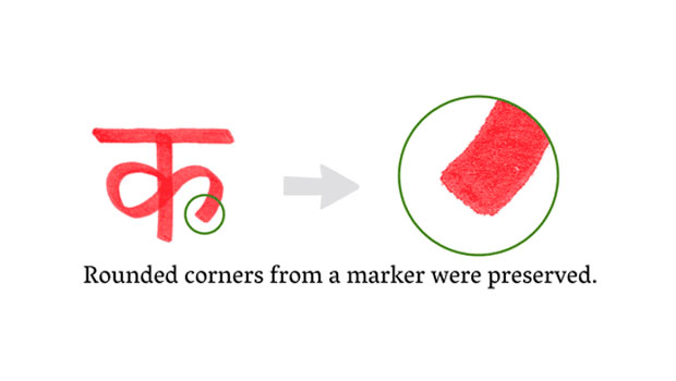
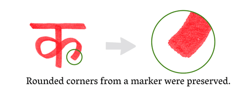
Vesper began as a student project and was informed by Kellers’ fascination with the Devanagari alphabet and non-Latin typography. His experiments in Devanagari lettering and calligraphy are reflected in Vesper’s stylistic features.
Read “The Making of Vesper” here.
This article was last modified on August 13, 2021
This article was first published on December 29, 2009
Commenting is easier and faster when you're logged in!

Recommended for you

TypeTalk: Optical and Size-specific Fonts
The phrase “one-size-fits-all” is a misnomer when it comes to digital fonts. Whi...

Can You Learn to Be Creative?
A few years back, I came across a question on the Graphic Design forum of the St...

Improve Your Talent for “Eyeballing It”
I’m kind of a stickler for neat and tidy layout; blame it on my printing b...