

Rob Keller took almost three years to design the Vesper typeface. He chronicles the process in the article “The Making of Vesper” on the excellent blog i love typography.
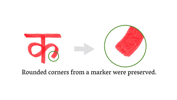
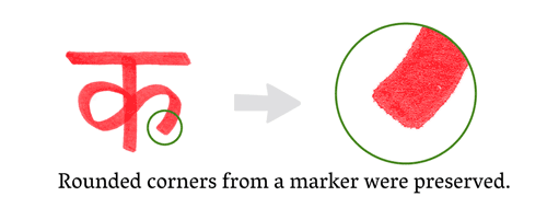
Vesper began as a student project and was informed by Kellers’ fascination with the Devanagari alphabet and non-Latin typography. His experiments in Devanagari lettering and calligraphy are reflected in Vesper’s stylistic features.
Read “The Making of Vesper” here.
This article was last modified on August 13, 2021
This article was first published on December 29, 2009
Commenting is easier and faster when you're logged in!

Recommended for you

TypeTalk: Helvetica vs. Neue Helvetica
What is the difference between Helvetica and Neue Helvetica? First, a bit of his...

10 InDesign Preferences You Must Change Today
10 ways you can customize your work environment in the panels of the Preferences...
TypeTalk: Are Free Fonts Worth the Price?
TypeTalk is a regular blog on typography. Post your questions and comments by cl...