TypeTalk: Optical and Size-specific Fonts

The phrase “one-size-fits-all” is a misnomer when it comes to digital fonts. While some can be used at a broad range of sizes, most cannot. Here’s why: All typefaces are designed with a specific size range in mind—usually text or display. Using a text typeface for much larger sizes often leads to the sacrifice of subtle design details, while setting a display typeface for text can result in reduced clarity and legibility. In order to expand the range of sizes a typeface can be successfully used at, some type designers have created optically-sized fonts. These are size-specific versions (sometimes called opticals) with subtle adjustments made to each variant in order to improve and maximize legibility, spacing, and overall appearance.

A punch (left) and the respective matrix produced from it (right). The small letters at the base of the matrix are founders marks.
In order to fully understand and appreciate the need for optical and size-specific fonts, it is helpful to know a bit about the history of typesetting. In the days of metal type, every point size of a typeface was cut by hand by a skilled craftsman called a punchcutter. Since type looks different at every size, they were able to make subtle adjustments in the weight, proportion, stroke thickness, and spacing of consecutive sizes of type to improve the aesthetics and functionality. When typesetting technology advanced and metal type was replaced by photo-typesetting (and then digital type), this practice was abandoned, as it was no longer economical.
The objective of optical sizing is to maintain the integrity and legibility of a typeface design throughout a range of sizes. Opticals are more commonly found in serif typestyles, whose design details need the most tweaking at different sizes. Typefaces with opticals often have text and display versions, as well as midrange and sometimes caption versions. Here is a selection of typeface families with opticals, with many more listed at the end:
HTF Didot
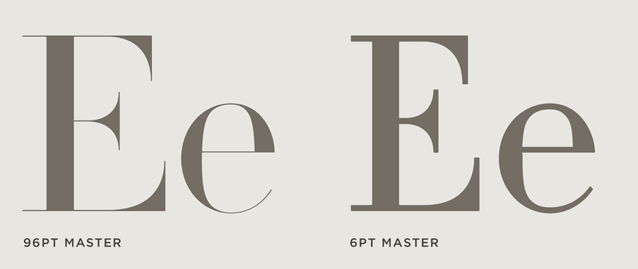
Didot has been a fashionable type design for almost 200 years. This version of Didot, designed by Jonathan Hoefler of Hoefler & Co., was created for “one of the most dramatic magazine reinventions in history” for the then new Harper’s Bazaar magazine. The goal was to create a typeface that works like no other, a Modern that would have hairline serifs, and maintain them over a range of sizes. In the service of the design’s thin hairlines, each of the family’s six styles come in seven different optical sizes to be used at 6, 11, 16, 24, 42, 64, and 96 point, for a total of forty-two fonts.
Consul
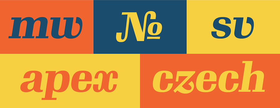
Consul, an optically-sized family by James Montalbano of Terminal Design, emerged from a custom display design he created for Mens Vogue magazine. This French Modern typeface is full of flex and curves, and soft serifs. James expanded it into an optical family with four size-specific versions: Caption, Text, Deck (subhead), and Display. The italics accompanying the six roman weights are on a very severe angle to provide a strong textural contrast.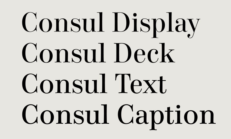
Warnock
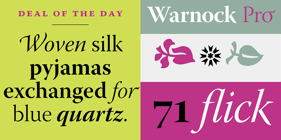
Designed by Robert Slimbach, Warnock Pro is an Adobe Originals 32 version family named after John Warnock, the co-founder of Adobe Systems, whose visionary spirit has led to major advances in desktop publishing and graphic arts software. Warnock Pro is a classic yet contemporary family that performs a wide variety of typographic tasks with elegance. This full-featured family comes in four weights with italics, each available in Caption, Regular, Subhead, and Display optical sizes.
Gimlet
Gimlet is a whopping 112-style family designed by David Jonathan Ross. Exaggerated curves are balanced by a geometric rhythm, while lively italics combine sloped roman forms with cursive characters. Gimlet features three optical sizes: Display, Text, and Micro, available in five weights from Light to Black (except in Micro). The family’s normal widths are complemented by Narrow, Condensed, and Compressed designs.
Miller
Originally designed by 2010 MacArthur Grant recipient Matthew Carter, the Miller font family is one of the most popular fonts in the publishing industry. It was based on the Scotch Roman genre, which was in turn based on designs cut by English punchcutter Richard Austin in the 19th century. Although it embodies a sturdy functionality, the typeface’s elegant details also make it useful for more delicate printing endeavors, such as invitations and announcements. The Miller superfamily incudes Text, Display, Headline, and Banner size variants, available in a variety of weights, most with italics.
Chronicle
Typeface designer Jonathan Hoefler describes Chronicle as a blended Scotch. His goal was to produce two families of fonts: a text face that would withstand the effects of different kinds of media, and a display face that would unlock the potential of the Scotch style to support a broad range of weights and widths. The result is Chronicle Text, a series of hard-working text faces produced in four press-sensitive “grades,” and Chronicle Display, an abundant collection of 46 display faces that includes three different widths, six different weights, and versions for two different sizes—each in both roman and italic.

Requiem
Requiem is an old-style serif typeface also designed by Jonathan Hoefler. Inspired by an illustration in a sixteenth-century writing manual, Requiem celebrates the world of Renaissance humanism. Requiem is available in roman and italic, plus an ornaments font in versions for text and display. In order to preserve the typefaces’ delicate features, each style is provided in three different versions—Text, Display, and Fine—to tackle different size ranges.
Kepler
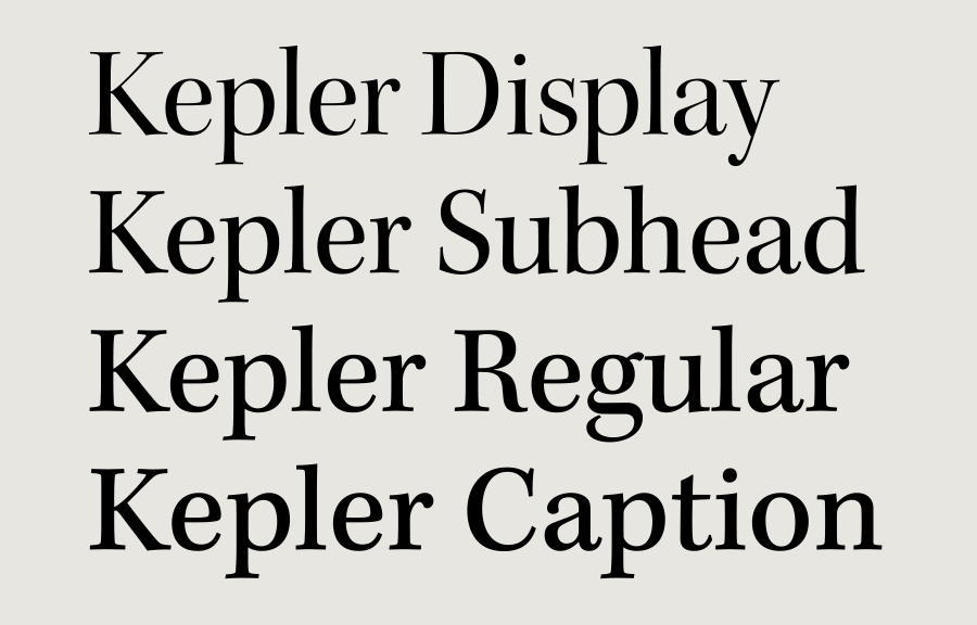
Named after the German Renaissance astronomer, Kepler is a contemporary type family created by Adobe type designer Robert Slimbach in the tradition of classic modern 18th-century typefaces. The Kepler family includes four optical size variations that have been optimized for use at specific point sizes: Caption (6 to 8 pt), Regular (9 to 13 pt), Subhead (14 pt) and Display (25 to 72 pt).
Chaparral
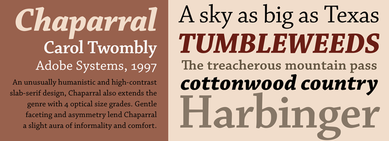
Chaparral is a slab-serif typeface designed by Carol Twombly, formerly of Adobe. Chaparral combines the legibility of slab serif designs popularized in the 19th century with the grace of 16th-century roman book lettering. The result is a versatile, hybrid slab-serif design. Unlike geometric slab serif designs, Chaparral has varying letter proportions that give it an accessible and friendly appearance in all weights from light to bold. Chaparral is a 32 font family that includes Caption, Regular for text, Subhead and Display optical sizes.
Sanvito
Designed by Robert Slimbach for Adobe in 1993, Sanvito is an informal script face based on the designer’s handwriting. An almost upright, non-joining script, the Sanvito font family is useful where an informal feel is required, including advertising, packaging, and on labels. This calligraphic font is available in four optical sizes: Caption, Regular for text, Subhead, and Display.
Minion Pro
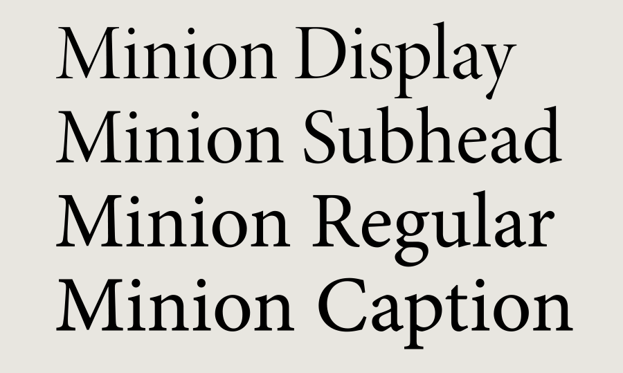
Minion Pro is an Adobe Original typeface also designed by Robert Slimbach. It was inspired by classical, old style typefaces of the late Renaissance, a period of elegant, beautiful, and highly readable type designs. The full Minion Pro family contains three weights and two widths, each with optical versions Caption, Regular for text, Subhead, and Display.
ITC Bodoni
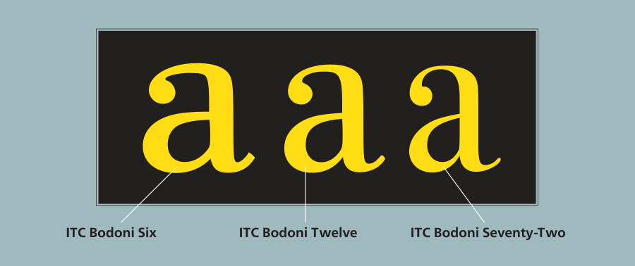
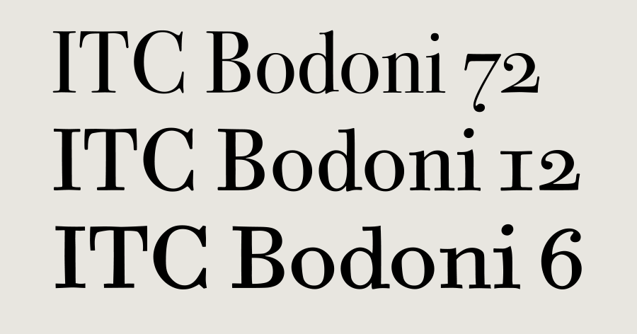
ITC Bodoni was designed by a team of designers after studying Bodoni’s steel punches at the Museo Bodoniana in Parma, Italy. They sought to do a revival that reflected the subtleties of Bodoni’s actual work. The result was three size-specific versions: ITC Bodoni Six for captions and footnotes, ITC Bodoni Twelve for text settings, and ITC Bodoni Seventy-Two—a display design modeled on Bodoni’s 72-point Papale design.
More Optical Fonts
If you can’t find what you need in the above listings, check out these additional fonts containing opticals:
Arno
Benton Modern
Brioso
Eldorado
Escrow
Fairfield
Farnham
Garamond Premier
Ibis
Jenson
Mercury
Neue Haas Grotesk
Poynter Oldstyle
Prensa
Surveyor
Tilda
Utopia
Zócalo
Google Optical Fonts
This article was last modified on March 27, 2023
This article was first published on June 27, 2016
Commenting is easier and faster when you're logged in!
Recommended for you

Scanning Around With Gene: Turning 25 in 69
Over the years, one of my favorite design publications has been Graphis, the int...
TypeTalk: Creative Indents
TypeTalk is a regular blog on typography. Post your questions and comments by cl...
Morisawa Font Library Now Available Outside Japan
Morisawa, one of the most prestigious type foundries in Japan, first made its fo...


