Making Some Text Obvious… Temporarily
Here's an oldie but goodie trick for making text stand out when you need it (when editing) and then blend in when it's not so important.

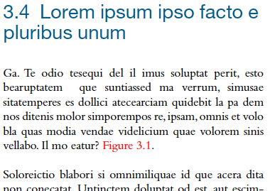
This is an old trick, but I was reminded of it recently when Aaron Andrade (Design Manager at Inís Communication) wrote to me to explain how he uses it, and I realized that some InDesign users may not know it. The set up is this: Sometimes you want text to be really obvious on the page while you’re working on a document, but then blend back in before printing. Aaron’s example is a great one: Figure references that you need to stand out clearly for checking (and re-checking):

The fact that the x-ref in the image above is red is obvious, even when zoomed out to fit the spread in the window. It catches your eye, reminding you that you’d better zoom in and check it out — after editing, is the figure still near the x-ref? is the number still correct? You get the idea.
But of course you don’t want that text to be red when it goes to press. The solution? As Aaron writes: “To help with this, I temporarily color the references red with an assigned character style (which I call ?LOCATION MARKER?) using the following GREP code in the Body paragraph style:”

Of course, grep styles only works in CS4 and later. In earlier versions, you could manage this by applying the character styles to the text manually, but that’s not as much fun.
Then, when you’re done: “After all layout is basically finalized, simply set the ?LOCATION MARKER? character style to any color (Command-click or Ctrl-click on the red swatch when editing the character style). This reverts the red to the base body font color.” Or, if you were really sure you were finished with editing, you could remove the grep styles from the paragraph style definition.
This article was last modified on December 20, 2021
This article was first published on May 19, 2010
Commenting is easier and faster when you're logged in!
Recommended for you

ALAP Releases ShadowCaster 3.2.2 Update
A Lowly Apprentice Production, Inc., (ALAP), a leading developer of extended tec...

Inmagine Launches its Premier Subscription-based Website: 123RoyaltyFree.com
Already well known for variety and speed, Inmagine, the leading provider of imag...

Recosoft Corporation Unveils a New PDF Document to InDesign Conversion Tool
Recosoft Corporation the developer of the PDF2Office® family of products and cro...


