

If you’re a seasoned Photoshop user, this little tutorial might not be for you. But for someone like me—who spends most of their time in InDesign and Illustrator—it should come in very handy. Recently, a client wanted me to make a last-minute addition to a just-approved logo, and the conversation went like this:
Client: Okay, the logo is totally approved. Let’s do it.
Me: Great I’ll get it…
Client: But let’s make it look old. Like weather-worn. You can do that, right? And I can still have it this afternoon?
Me: Of course, I’m a designer after all! (But, in my head: Dagnabbitit! I forgot how to achieve such a laborious millstone!*)
The problem is, I use the same 10% of Photoshop features regularly and I can’t always remember how I achieved a particular effect. I remember this particular one involved a mask, Photoshop masks being my personal Kryptonite for unknown reasons. But I eventually remembered and I thought I’d share it with everyone here, if nothing else so that I can ask y’all when I get stumped on this procedure again.
STEP ONE: The Logo
- Start with a logo, mine are almost exclusively vector art from Illustrator. Copy it.

- Create a new Photoshop document, making sure your resolution is high enough for your needs, and that you start with a transparent background.
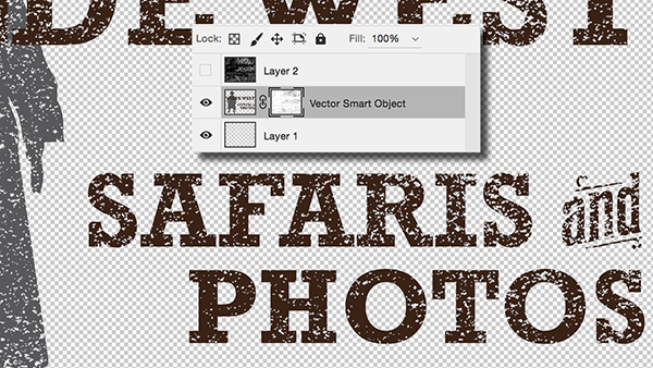
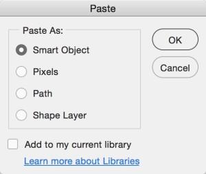
- Paste the logo as a Smart Object. Move and resize as needed and hit Return/Enter when you’re satisfied.
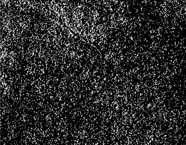
Now you need to find a good grungy pattern. Feel free to make one of your own using custom Photoshop brushes or by bringing in something you’ve created elsewhere. I like to leave that stuff to more creative geniuses, so I find one I can use. If you need suggestions, check out my Let’s Get Messy list of grungy and grimy resources.
Remember that the pattern you choose will be used as a mask. You’ll want to make sure it has the right kind of texture for the look you want, but also that it won’t make important elements disappear when overlaid on your logo. The other thing to keep in mind is that it has to be—or be made—transparent. So, either find a pattern with transparency baked in, or pick a design that you can easily select elements from. A grayscale or black and white PNG file with transparency works great.
STEP TWO: The pattern
- Once you’ve found the pattern, copy it, then paste it into your logo file. It will end up on a new layer. Size it to fit over your logo where you want it.
- Feel free to grunge it up even more. Use a combination of brushes and the Clone Stamp tool until you’re satisfied with the level of grunge.
- If your pattern already contains transparency, you can select all non-transparent pixels by Command/Ctrl-clicking on the pattern layer’s icon. Otherwise, you’ll need to select those elements yourself. I use the Magic Wand to select a black area, then choose Similar from the Select menu. If that doesn’t grab everything I need, I repeat the Select Similar process. If the pattern has feathered edges, you might end up not being able to select everything. Since we’re creating a grunge pattern, I wouldn’t worry too much, though.
STEP THREE: The Mask
- Once you have the pattern elements selected, turn off the pattern layer’s visibility by clicking on the eyeball icon.
- Select the layer with the logo element on it.
- Choose the Add Layer Mask icon at the bottom of the Layers panel. Your grunge pattern is now masking the logo.

- You can refine the mask by selecting the layer mask thumbnail on the logo layer, then painting with a brush. Remember that painting with black hides portions of the logo, while painting with white will reveal more of it. I use this when the mask looks great for the most part, but a particularly important element—say some small text—is too masked out to be legible.

That’s it! It actually becomes a really quick process when you do it more than once every two years. Oh, when you’re done, be sure to save it with the transparency intact, like a PNG or PSD file, depending on the image’s final destination.
*Dialog has been edited to protect delicate ears.
This article was last modified on February 23, 2016
This article was first published on February 23, 2016
Commenting is easier and faster when you're logged in!

Recommended for you

How to Create Trees in Photoshop, Part 2
In part 1 of this tutorial, we saw how to use the new Tree feature in the 14.2 u...

7 Key Color Considerations for Logo Design
We humans are surrounded by colors. Our brains are evolved to understand things...

SOS San Francisco: A Case Study for Collective Visual Brainstorming
This article details the creative process used to develop the graphics for SOS S...