London’s Kerning: An Excerpt

Editor’s note: For over 500 years, the center of financial and judicial power in England has grown and remained in and near a square mile of buildings called the City of London. And at the heart of it is arguably the art of printing. From a modest start in a small shop founded around 1500 by Wynkyn de Worde near Fleet Street and Henry VIII’s Bridewell Palace, printing’s importance in the City grew ever larger. It cemented London as the center of empire during expansion, and the center of media and money in the modern era.
Glenn Fleishman wrote a book based on an intensive jaunt he took around London in late 2017 and the research that followed. He visited collections rarely and barely open to the public or researchers, and met printers, designers, archivists, historians, and contemporaries to discuss their work and the future of type, printing, and their history in London.
He also took an especially close look at the work of type designer Berthold Wolpe (1905–1989), who helped shape the face of lettering in London. A rare exhibition of his drawings, covers, and designs took place in autumn 2017, and Glenn was there.
This book looks at the charm of the present and the uncertain future of London’s legacy of printing. Here we have excerpted one chapter from his book, London’s Kerning, examining the two typefaces that have grown to define London’s image.
Johnston and Albertus: the Faces of London
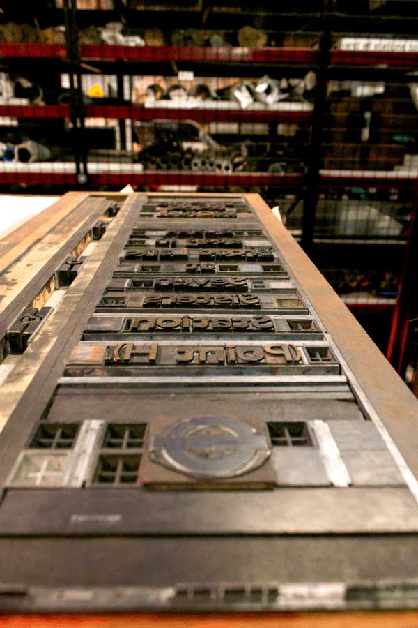
Johnston Sans locked in metal at London Transport Museum (LTM) Depot, Acton (photo by Alexander Baxevenis)
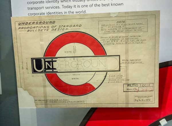
London feels like a city of type. This is in part because of the remarkable prescient exercise in branding that the Underground and London-area buses engaged in starting in 1916 with bold, clean symbols and their own typeface, Johnston, sometimes called Johnston Sans or Johnston Railway Type. Created by Edward Johnston under the direction of transit visionary Frank Pick, the type was intended to be crisp, legible, and unpretentious, and work in a large variety of circumstances.
Johnston unifies the city, because it’s omnipresent and consistent without being oppressive. It’s the typographic lifeblood of the streets and stations. It works hand-in-hand with the roundel (or “bullseye”) symbol developed for the Underground in the early 1900s, and later expanded to all transit. (You can find the roundel everywhere. I looked down at one of the many treads in the Mornington Crescent Tube stop, a stop made famous via a BBC comedy program, and spotted the roundel?—?with non-Johnston type?—?on every single metal reinforcement.)
Albertus has a more local impact, but it’s become the city’s second face since its release in the mid-1930s. It’s used in the heart of London and in the Borough of Lambeth, where Wolpe and his wife lived for many years, and where The Type Archive that hosted an exhibition of his work is based. You can see Albertus in formal settings and casually — as in a restaurant sign I spotted from a bus while traveling to the city’s Postal Museum.
Because London has been a city for about two millennia, and despite fire and the Blitz and urban renewal and the current feverish pace of redevelopment, it has accreted buildings and signage. Often, a sign or plaque or piece of stone is all that’s left of a building. This memory adds to the layers of type.
This is quite apparent in the City of London, also known as the Square Mile for its dimensions, about 1.12 square miles, and where Albertus dominates. It’s the financial center of the metropolis, and also where the courts fall in or near. There’s an argument that late 15th century and early 16th century printer de Worde establishing a press in Fleet Street also led to the coalescing of these functions in that tiny area: all of them had heavy need of printing, often with fast turnarounds.
(A quick history lesson that I learned while visiting and later become more informed about: It was only in 1889 that a city-wide authority was created to act as a unified political entity covering the City of London and 32 boroughs. The City of London is its own city and county. There is a ceremonial Lord Mayor of the City of London distinct from the political mayor of Greater London, a role that’s existed only since 2000. This mayor, among other jobs, directs Transport for London [TfL], which runs nearly all metropolitan public transit.)
The layers of London are apparent everywhere. In Fleet Street, I poked into one side alley, which alerted me to the path to Dr Johnson’s house and a variety of other establishments, as well as featuring the City of London borough sign in Albertus, and a bronze plaque in the ground with the front page of a newspaper. Nearly all the news organizations that made their homes on Fleet Street went under or decamped to Canary Wharf or elsewhere years before, so all that’s left are the plaques, some building signage, and the St Bride Foundation and its printing library.
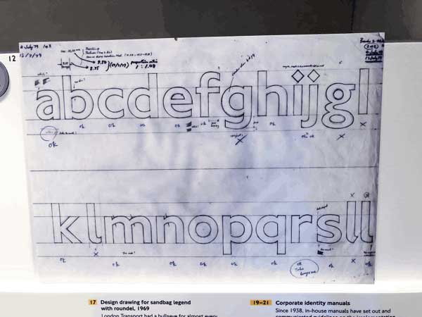
Drawings of New Johnston from the late 1970s (LTM)
An important set of type distinctions: Johnston Sans is not Gill Sans, though Eric Gill did assist on Johnston Sans in its early stages. But a quite similar face, Granby, designed by the Stephenson Blake typefounders, routinely stood in for Johnston in smaller type sizes. Johnston was only cut in metal in 48 points and larger. Nearly everything printed at text type sizes, including maps, used Granby! And one more fine point is that Granby didn’t come in very small sizes, like 8 point. For that, Stephenson Blake offered…Gill Sans.
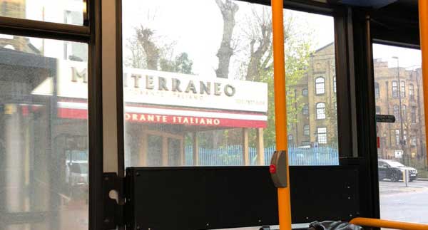
Albertus on a restaurant sign captured from a bus en route to the Postal Museum.
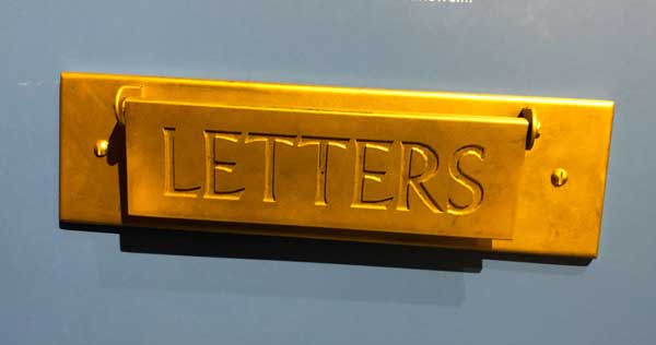
Letters flap in Albertus in exhibit at the Postal Museum
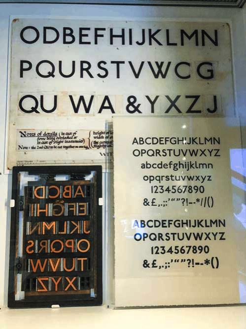
Later Johnston Sans drawings, specimens, and letterpress lockup (LTM)
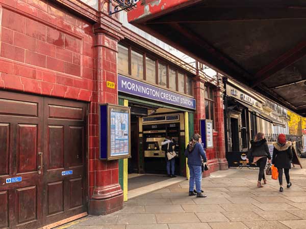
The Mornington Crescent station
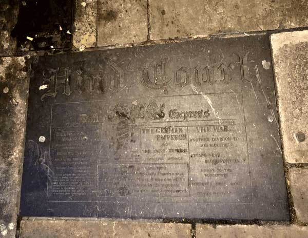
A newspaper plaque on Fleet Street

A WWII notice that only ticket holders can access a particular bomb shelter (LTM)
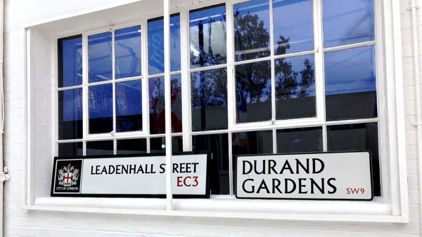
City of London and Borough of Lambeth signage, both of which rely on Albertus (The Type Archive)
(All photos by Glenn Fleishman except as marked)
Note: You can find links to purchase Glenn’s full book, London’s Kerning, on this page.
This article was last modified on March 7, 2018
This article was first published on March 7, 2018
Commenting is easier and faster when you're logged in!
Recommended for you

Scanning Around With Gene: A Bridal Shower for Sophie
I’m on week three of my away-from-home, care-giving journey, so I still have lim...

Sony's Music Timeline
To celebrate 125 years of musical history, Sony has unveiled a large-scale graph...

Vintage Print Magazine Covers
Print magazine has been in business since 1940, showcasing creative excelle...


