



The motto of the venerable and successful Siegel+Gale branding company is “Simple is smart.” It followed that slogan to the letter in its recent retooling of the logo for pharmaceutical company Pfizer:
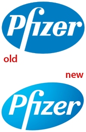
What do you think of the changes to the logo? Is it better, worse, or about the same? To speak up, click one of the Comments buttons above or below this article.
For an excellent analysis of the revamped logo and Siegel+Gale’s more radical changes to other aspects of Pfizer’s brand, see Armin Vit’s article “Pfizer Moves Pforward” on the UnderConsideration Web site.
This article was last modified on December 14, 2022
This article was first published on November 6, 2009
Commenting is easier and faster when you're logged in!

Recommended for you
Six Successful Creative Kickstarters
We’ve all had that great idea we were convinced would change the world. Mo...

Never More Than a Minute
One of the silent features of InDesign is one of its best: When you work in InDe...

Stamps.com Launches Presorted First-Class PhotoStamps
Stamps.com® (NASDAQ:STMP) , the leading provider of Internet-based postage...