
InDesigner: American Spa
As Pamela Pfiffner reports, this magazine has a serene aesthetic that matches its market.

This article appears in Issue 27 of InDesign Magazine.
Picture yourself entering a spa in search of a soothing soak or a gentle massage. The walls are painted in muted, serene colors designed to calm the nerves and rejuvenate the body. It’s quiet, save for the soft rush of a rippling fountain. Ahhhh.
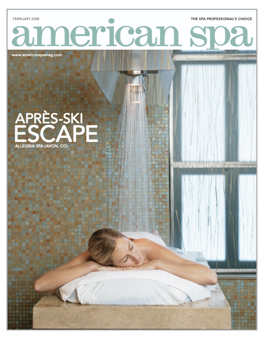
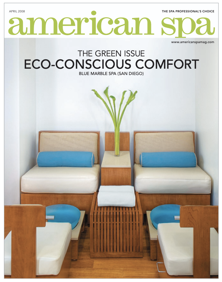
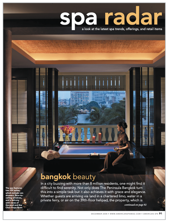
That’s the tone of American Spa magazine, a monthly targeting professional spa owners and managers. The 13-year old magazine provides tips and trends in the spa industry and features spa businesses and resorts around the world. As such the magazine’s design must reflect the industry itself.
“We address our audience with our serene design with clean lines and easy to navigate sections,” says design director Deena Goldblatt. “We want our readers to feel like they’ve entered the spa and can sense how it would feel to be there.” Mission accomplished. American Spa’s design has been recognized with several awards in the last few years: silver and bronze awards for feature and opening spread from the American Society of Business Publication Editors in 2007; a bronze award for overall design by Folio in 2006; and a design merit award for contents and departments by the Society of Publication Design in 2005.
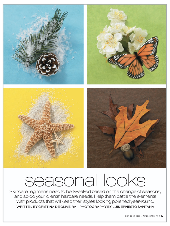
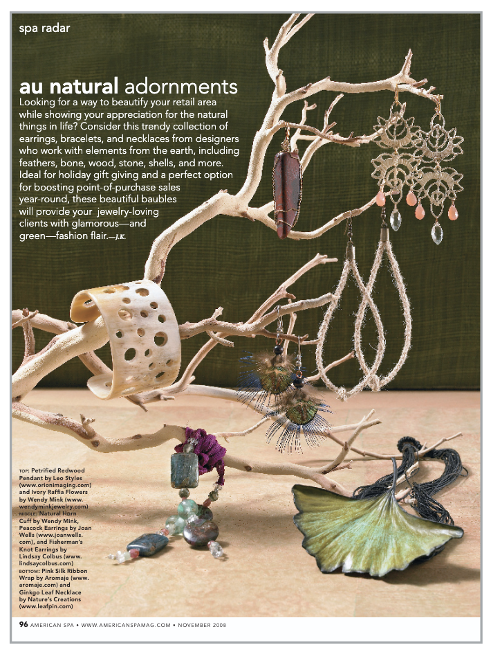
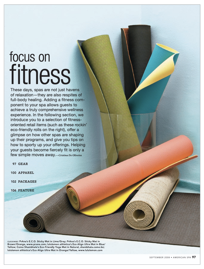
Elegant photography is a hallmark of the magazine. “For our menu pages, we want to show the lush ingredients used in the treatments. For our features, we like to show off the interior design of the spa as well as its architecture,” Goldblatt says. “Overall, the shots are very clean and simple. We let the spa’s aesthetics shine.”
The color palette used in American Spa reflects the mission of the magazine. “We use bright and lively tones interspersed with calming tones, “Goldblatt says. “I like to emphasize the excitement of new trends while reserving the more serene tones for the quiet spa images.”
Produced in Adobe InDesign CS2, Goldblatt says that the software is well suited for magazine design. “InDesign allows the user to add Photoshop clipping paths, which is very useful, and shadows that can sometimes help with type readability,” Goldblatt says. “Transparencies are great too since we can create them right in InDesign instead of importing them from Photoshop.”
The Links feature appeals to Goldblatt as well. “It’s very useful since we go through many rounds of color correcting. I can update an image with one click and it will be positioned in the exact same size and position.”
InDesign’s support for OpenType fonts is equally important Goldblatt says, as it provides the glyphs necessary for some company names. “Fonts that are not OpenType don’t always include the accent marks that we need,” she says. Minion Pro serves as the body type, while Avenir is used for department headers and sidebars. Glypha appears for display type such as headers and quotes. Feature display type is chosen according to the feel of the spa highlighted.
As a result, the design of American Spa is uncluttered and tranquil, simultaneously inspirational and calming—much like a spa itself.

Commenting is easier and faster when you're logged in!

Recommended for you

InDesigner: RAND Review
Kelly McCathran looks at the design and production of the RAND Review, a publica...

InDesigner: Jacek Utko
Diane Burns interviews one of Europe’s most successful newspaper designers.

Interview with Monika Gause, Print Designer and Illustrator Expert
Q&A with Monika Gause, who is presenting at the 2026 Design + AI Summit for Crea...