


Illustrator How-To: Using Pathfinder Effects to Design Woodcut Logos with Doug Panton

This story is taken from “Adobe Master Class: Illustrator Illuminated.”
Doug Panton uses Illustrator to design corporate identities that can be used for advertising, packaging, and branding, among other uses. The corporate logos he creates are often extracted from larger illustrations, which mean all elements must not only work together as a whole but must be easily dissembled into discrete parts as well.
Illustrator’s Pathfinder techniques are an indispensable part of Panton’s toolbox. With Pathfinder effects he can add, subtract, intersect, crop, and otherwise work with multiple paths so that each element retains its integrity yet merges seamlessly into the larger picture. This approach affords him great flexibility. See how in this excerpt.

We’ve posted this story as a PDF file. Click “Ridpath Furniture Project” to open the PDF file in your Web browser. You can also download the PDF to your machine for later viewing.
To open the PDF, you’ll need Adobe Acrobat or Adobe Reader. We highly recommend Adobe Reader 7.0 or above to view this PDF. Download the latest Acrobat Reader here.
To learn how to configure your browser for viewing PDF files, see the Adobe Reader tech support page.
This article was last modified on January 3, 2023
This article was first published on June 13, 2003
Commenting is easier and faster when you're logged in!

Recommended for you
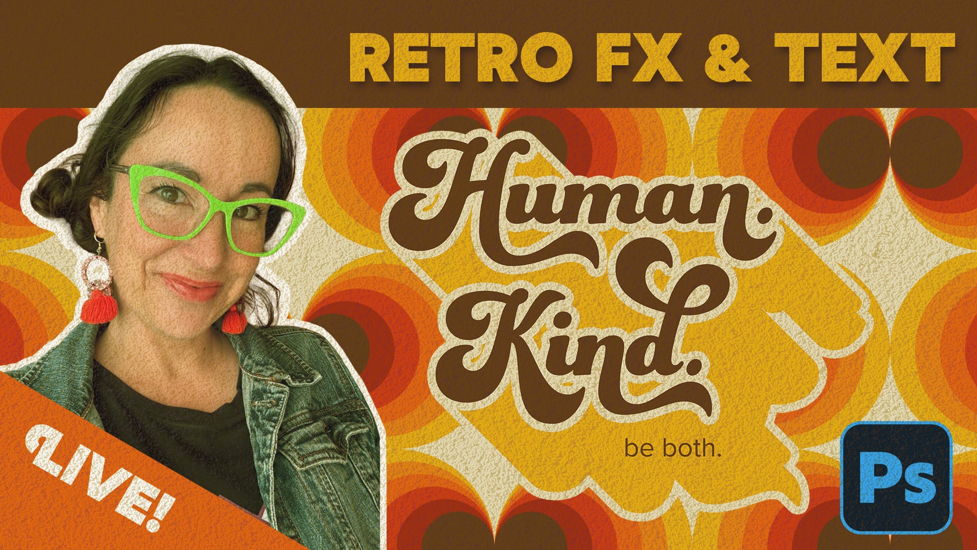
Livestream Video: Creating Retro Looks & Type Treatments in Photoshop
Making new things look old is always a fun challenge!

Index Fixes: Sorting
InDesign doesn't distinguish letter-by-letter and word-by-word sorting, it suppo...

Closed Captioning in Premiere
Add captions to your Premiere video to ensure everyone benefits from its audio t...