
In this “Three Minutes Max” video, Mike Rankin uses a little known character to break a drop cap out into its own text frame for easy formatting. By inserting a discretionary line break, the drop cap can be styled separately, but InDesign will still see it all as one complete word.
Three Minutes Max comes from a fun—yet very competitive—session at our annual CreativePro Week conference. Speakers have three minutes to wow the audience with the tip and win a prize for a lucky conference attendee.
Subscribe to the CreativePro YouTube channel for more helpful design tips!
This article was last modified on August 29, 2025
This article was first published on July 17, 2024
Commenting is easier and faster when you're logged in!

Recommended for you

Kerning Drop Caps
How to automate the kerning of tricky letter combinations in drop caps with InDe...
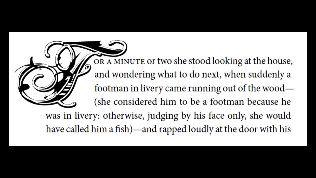
The Drama of Drop Caps
Initial caps add excitement to a design. Here’s how to make, format, and fine-tu...

Adjust the Space Between a Drop Cap and the Next Letter with Kerning
When you assign drop cap formatting to a paragraph (so that one or more letters...