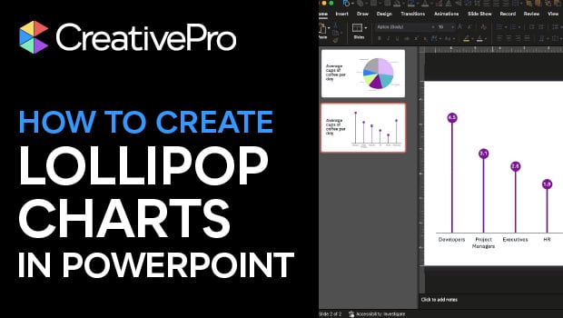
In this PowerPoint how-to video, Stephy Hogan demonstrates why pie charts aren’t always the best choice and how a lollipop chart can make data comparisons clearer. She starts by converting a pie chart into a column chart, then shows how to build a custom lollipop chart using a line chart with markers and drop lines. The result is a clean, eye-catching alternative that helps your data stand out.
Subscribe to the CreativePro YouTube channel for more helpful design tips!
This article was last modified on December 18, 2025
This article was first published on December 16, 2025
Commenting is easier and faster when you're logged in!

Recommended for you
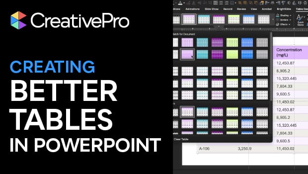
Tips for Creating Better Tables in PowerPoint
Making tabular data in PowerPoint look good can be challenging, but Stephy Hogan...