
This article appears in Issue 41 of CreativePro Magazine.
Buying a display (also called a computer video monitor) can be as confusing as buying a computer. Part of the confusion comes from product pages that list specifications that often aren’t relevant to creative work and that don’t list what’s actually important.
If you read my CreativePro article “How to Buy a Computer for Creative Work” (Issue 40), you already know that how you buy computer hardware is determined by the requirements of the creative medium you work in. That certainly applies to displays too.
The Most Important Features
Many product listings talk about display size, resolution, refresh rate, panel type, and viewing angles. When you buy a display for creative work, pay attention to the set of features below, some of which might not be on those spec sheets.
Color accuracy
If you fill an object with a specific color value, are you sure that’s exactly what the display shows you? Most displays aren’t perfectly accurate out of the box, although you can usually improve it by creating a custom display profile for it using calibration software with a display measurement device, such as one in the Calibrite Display or Datacolor Spyder series.
Display color accuracy is represented by a Delta E (?E) value, which describes how close the display is to the standard it was calibrated to. If the Delta E value is under 3, the inaccuracy is so small most people won’t notice; if it’s below 1, color professionals probably won’t notice.
Unfortunately, Delta E is not typically listed on spec sheets. It’s better and more objective to find it out from review websites that test for it. If you calibrate or profile the display yourself, the software you
use should tell you the Delta E value of the display’s corrected state (Figure 1).

Figure 1. Calibration software reports that the average Delta E value of this display is still well under 3 (very accurate) after 10 years of use.
Uniformity
The more evenly a display is lit from edge to edge, the better its uniformity (Figure 2). Lower quality displays may have poor uniformity (are lit inconsistently, typically darker in the corners). You probably won’t find perfect uniformity on a budget, but you should still be able to steer clear of the worst examples.

Figure 2. The same tone displayed with poor uniformity (left) vs. good uniformity (right).
Poor uniformity can be a problem if you color-correct photos or videos. For example, if a display is noticeably darker in a certain spot, you might think a photo is too dark there, so you apply an edit that lightens that area. But the image wasn’t actually darker there, so when the image is seen on a display with better uniformity the image now looks too light in that area: The display’s poor uniformity misled you into an unnecessary edit.
Color gamut
In the early years of digital media, almost all displays were based on the cathode-ray tube (CRT), so the range of colors most creative professionals saw on their display—the color gamut—was whatever their CRT display could reproduce. When the industry started standardizing colors, the sRGB color space (a mathematical model for representing colors) was based on what a common CRT could achieve.
sRGB is still a commonly used color space even though the CRT is no longer common, having been replaced by flat panels: liquid crystal displays (LCDs) and organic light-emitting diode (OLED) displays. If you work in digital or print media that can reproduce colors that are well outside sRGB, you might want a wide gamut display. The two most common are P3 and Adobe RGB.
They’re similar in volume, covering slightly different color ranges, but both are large enough to cover significantly more print colors than sRGB (Figure 3). P3 is more appropriate for video editing. Most Apple computer and mobile displays are based on the P3 space, and some display manufacturers offer product lines that cover Adobe RGB.

Figure 3. sRGB doesn’t completely cover this specific CMYK print gamut, but both P3 and Adobe RGB cover almost all of it. Gamuts are 3D volumes; this graph represents only a 2D slice of it.
Dynamic range
The range of tones a display can reproduce is its dynamic range. At first you might think that all displays can show a full range from black to white, but it isn’t that simple (Figure 4).
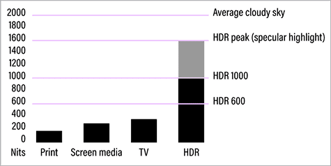
Figure 4. Luminance ranges for different media. Only HDR gets close to matching what our eyes see outdoors.
Many displays can’t show a true black. For example, if you have a common LCD display, its backlight might be faintly visible in image areas that should be black, making it lighter than when the display is fully turned off. When black isn’t black, that can be a problem when you’re trying to edit the darkest shadow tones. OLED displays tend to have a better black level because they don’t have a backlight; they can fully shut off pixels that should be black.
What about the white end? Old CRT displays were relatively dim, often reaching around 100 nits (a unit we use to measure brightness, or luminance, on displays). Many current flat panel displays are set to between 150 and 400 nits. Displays claiming HDR support can sustain as high as 1000 nits.
Is more better? HDR displays do a better job of representing the full dynamic range that our eyes see in daylight, so HDR content can look stunning. Some video and 3D workflows do involve HDR content. However, if you need to edit color-accurate work for print or general web/mobile viewing, your display doesn’t need to be brighter than 100 to 150 nits. This is partly because print can never match the brightness of a high luminance display.
What About the Other Specs?
After you account for the specs above that really matter, almost everything else is a convenience feature.
Resolution
For displays, what’s called “resolution” (Figure 5) usually means the width and height of the display panel in pixels, such as 1920 × 1080 px.

Figure 5. Higher display resolution can mean extending the width and height in pixels (top), increasing the pixel density in the same area (bottom), or both.
When one display has more pixels than another, the main benefit is having more work area to spread out tool panels, and to view documents larger with less scrolling. When display resolution is expressed in “K” such as 4K, 5K, and 6K, that’s a marketing term about the width of the display in pixels, and it isn’t exact; for example, a 4K display can be 3840 or 4096 px across.
The importance of resolution is often overstated, because the four criteria in the previous section are usually more important for creative work. For example, color-accurate pixels are a higher priority than more pixels; I’d much rather edit a photo on a calibrated wide gamut 4K display than on an uncalibrated 5K display.
A resolution value sometimes represents pixel density in dots per inch (dpi) or pixels per inch (ppi). Traditionally, computer displays have been between 96 and 130 dpi. Another benefit of higher resolution happens when a display has roughly double the traditional pixel density, because the additional pixels are used to double the detail of UI elements at the same size instead of to expand the work area. This is the idea behind Retina (Apple) and HiDPI (Windows/Android) displays: It isn’t just more pixels but more pixel density, like the difference between a 150-dpi print and a 300-dpi print made at the same size in inches.
Size (in diagonal inches or centimeters)
I’ve heard someone say they assumed that a 32-inch display must be better than a 27-inch display. But that’s not necessarily true. Many 32-inch displays have the same number of pixels as the 27-inch display in the same product line, and the color accuracy might not be any better. A larger display is better only if it has more pixels, better color, and the like.
Refresh rate
Many displays market their high refresh rate. A typical display today might redraw at 60 times a second, so it has a refresh rate of 60 Hertz (Hz). Gamers love higher refresh rates because they must react as instantaneously as possible to what’s happening on screen; they might prioritize a 120 Hz display. For photo editing, graphic design, and other static art, refresh rate isn’t a high priority unless your work includes something like high-frame-rate video editing. Some prefer higher refresh rates because it feels smoother and more responsive when scrolling a window or moving objects around the screen.
Contrast ratio
Contrast ratio can be another way to state dynamic range (covered earlier). Display companies often brag about contrast ratio, but it’s one of the least useful numbers on a typical spec sheet. There’s no standard for measuring contrast ratio, and it often doesn’t represent the display’s capabilities after calibration. Like color accuracy and uniformity, post-calibration contrast ratio is best found in objective review websites that actually test the display, not from the manufacturer’s spec sheet.
If most of your work targets print or web/mobile graphics, contrast ratio isn’t very important anyway. For example, the contrast ratio of print is relatively low, so just about any good display can cover that; for web graphics, you only need a contrast ratio comparable to the generic phones and computer screens people use to surf the web.
Blue light reduction
There’s been some concern that blue light might damage eyesight, but it turns out that working habits that minimize overall eyestrain can yield more significant benefits than focusing on blue light alone. If color reproduction quality is critical for your work, you might choose to disregard or even avoid or disable blue light reduction features in case they alter the color accuracy of the display.
How Calibration Affects Your Choice
“Calibrate your monitor” is good advice, but what does it do? Formally, calibration means to adjust a device until it meets a desired standard. For example, suppose you applied the color RGB (111, 63, 177) but on screen the color shown is measured as RGB (110, 64, 175). Calibrating the display adjusts it so that it shows exactly the color values you specified, within the limits of the display.
In most computer displays, the correction you get from calibration is applied by the operating system (the OS, such as macOS or Windows) using a display profile. The correction is done in software and is specific to that computer, and sometimes specific to a user account on that computer if that’s where the profile is stored.
In higher-priced professional displays, a calibration correction can be stored in the display itself (called hardware calibration), with several advantages. For example, you can restrict a wide gamut display to the smaller color gamut of a specific medium, such as color grading a video for delivery in the Rec.709 color standard on a display that’s natively wide gamut Adobe RGB. Also, the calibration correction is independent of the computer, so it’s corrected for any computer or device connected to it.
Do you need hardware calibration? Not necessarily, because it’s often good enough to create a custom profile for your display and combine that with an application’s soft-proofing feature. But if your projects require complete control and flexibility over precise and accurate color, a display with hardware-based calibration and switchable calibration presets can be worth paying extra for… if you also commit to understanding and using its advanced color features.
Other Features to Think About
After you work out your requirements for the color-related features discussed earlier, you can think about features that are more about convenience than color performance.
Aspect ratio
Many displays have a width-to-height proportion, or aspect ratio, of 16:9, which is the aspect ratio of HDTV. For computer work, aspect ratio is largely a matter of personal preference. Some find it easier to arrange their windows and panels on a display that’s closer to square. Others prefer to spread out their work on one ultrawide (21:9 aspect ratio) display instead of across two displays. 16:9 has become so common that if you choose a different aspect ratio such as ultrawide, it can be more difficult to find the combination of color accuracy, uniformity, and color gamut that you want.
Video connections
Most displays now use HDMI or DisplayPort connections. If you don’t see those ports on your computer or dock/hub, don’t give up: A connection might still be possible if you have USB-C ports, because a USB-C port can potentially carry video signals. For example, if a display has an HDMI port and the only unused port on your computer is USB-C, see if your computer supports HDMI video through its USB-C ports. If it does, you can simply use a cable with USB-C on one end and HDMI (or a USB-C to HDMI adapter) on the other end. The Thunderbolt 3, 4, and 5 protocols also use USB-C connectors, so it’s often possible to connect a display to a Thunderbolt port.
Other ports to consider
Some displays have USB-C ports that have enough power to charge your laptop and some have audio ports for connecting speakers or headphones. Others have specialized ports such as SDI, which you might need if you do professional video production.
If you want to use the display to charge a laptop make sure the display has at least one USB-C port that supports USB-C Power Delivery or PD (that’s different than lower power charging for phones), and that it provides enough power for your laptop. For example, my laptop comes with a 60-watt AC adapter, so I can charge it from any USB-C PD port providing 60 watts or more.
Some displays have multiple downstream USB or Thunderbolt ports, meaning they can work as a hub or dock to expand the ports available to your computer.
Working as a KVM switch
If you have multiple computers, such as a desktop and a laptop, you might be interested in a KVM feature. KVM stands for Keyboard/Video/Mouse, and it lets you share one display with two computers. You connect one keyboard and mouse to the (video) display, and the display also provides two USB upstream ports into which you can plug two different computers. You can then use the display to switch which computer uses the keyboard, video, and mouse. Some displays let you show the video from both computers using a side-by-side or picture-in-picture (PIP) feature.
Choosing a Display for Different Creative Fields
There are so many choices and specs that it can help to have a general idea of what kind of display would work for the creative work you do.
Photo editing
What you’ll need depends on whether you focus on print or on-screen display.
For print, a wide color gamut display can help you preview and soft-proof more of the colors that a desktop photo printer or CMYK printing press can reproduce. If you work with commercial clients who have very high color standards or if you sell fine art prints, consider a wide color gamut display with high color accuracy and uniformity, one that supports hardware-level color calibration.
Do you need an HDR display? Not if you always print, because ink on paper simply can’t reproduce HDR highlights. If you post photos to social media or on websites, support for HDR image formats is gradually increasing but is not yet universal enough to count on.
If you want to use the HDR editing and preview features in Adobe Lightroom, Lightroom Classic, and Camera Raw, Adobe recommends a display that can sustain 1000 nits of luminance to properly preview HDR highlights (Figure 6).

Figure 6. In Adobe Camera Raw (shown here) and Lightroom, with HDR editing enabled, highlights in the HDR portion of the histogram cannot be previewed (red) on a non-HDR display (left). Highlights can be previewed (white) on a display that meets Adobe HDR display requirements.
Traditional print and web design
A color-accurate display that covers sRGB can work well if most of your jobs are headed for a printer, press, or website. If you have commercial clients who have larger printing budgets and tighter quality requirements, it would be better to follow the advice above for photo editing. Remember, features such as HDR and high refresh rate are not currently useful for web design, and not useful at all for print design.
Video editing
If you edit videos for YouTube or social media, most displays will be fine. If you deliver video for tighter or more demanding professional standards, then choose more carefully.
HDR editing is more common in pro video production than for print or web work. If you need to deliver HDR video to clients, make sure you know which of the many HDR features and standards your display needs to support, such as HLG and PQ curves, Dolby Vision, HDR10+, and so on.
If a client’s delivery requirements include the P3 color space, then an sRGB display won’t be enough. Some displays have presets for various cinema, video, and broadcast color standards.
If you need to deliver at 4K resolution or higher, you’ll want a display with at least 4K resolution. 5K lets you show an entire 4K video at 1:1 with room for editing controls around it.
A note about Apple XDR displays
Apple displays that have XDR in the name have a useful combination of features including wide color gamut (P3), accurate factory calibration, high pixel density, high refresh rate, and HDR luminance that meets Adobe requirements for HDR editing. This isn’t an endorsement or recommendation, but it’s notable that this combination of features is not commonly found in a single display, especially on laptops. This makes XDR displays suitable for a wide range of creative work. Apple XDR displays are standard in the 14- and 16-inch MacBook Pros (not the MacBook Air), iPad Pro, and even the iPhone.

This Is Easier than It Used to Be
It‘s a good time to shop for a display. Fifteen years ago, affordable displays were inconsistent in many ways, including color accuracy. Today, displays generally perform at a higher level and are more likely to be acceptable for creative color work, especially after calibration. Options that were once exotic and expensive are now available in lower price ranges.
On a budget, focus on good color accuracy and uniformity. As your budget allows, seek out excellent accuracy and uniformity, and consider wide color gamut, more precise factory calibration, higher resolution, maybe HDR, and more convenience features such as ports and speakers.
Commenting is easier and faster when you're logged in!

Recommended for you
How to Create an AI Talking Avatar in Adobe Express
Learn how to turn your photo into a talking avatar with HeyGen AI Video Generato...

Creating Blends in Illustrator
Learn how to morph objects, colors, and paths with the blend tool

Scanning Around With Gene: Yosemite, Kodachrome, and Curt Teich
Today’s column incorporates a number of my favorite things. First, there’s Yosem...