


This article is excerpted from the December 2008/January 2009 issue of InDesign Magazine (#27). Buy the issue or subscribe to the magazine at www.indesignmag.com.
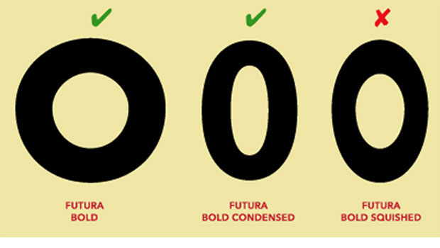
Choosing typefaces for a project can expose deep-rooted vulnerabilities within even the most stout-hearted designers. Font doubt may give rise to self-esteem issues and the malady that design educator and author Ellen Lupton calls “typochrondria.”
If you’ve ever suffered from this affliction, you’re not alone. As a designer, you know the basics: Don’t mix typefaces that are too similar to each other but don’t combine those that are too discordant, don’t confuse styles and eras, and don’t buy poor-quality fonts. But beyond that, what’s the right way to choose type?
To hear what the experts have to say and to see samples of good type choices, click on this link to box.net or on the image below to download the PDF.

Although this article was written for InDesign Magazine, its advice is applicable no matter what software you use.
To open the PDF, you’ll need Adobe Acrobat or Adobe Reader. We highly recommend Adobe Reader 7.0 or above to view this PDF. Download the latest Acrobat Reader here.
To learn how to configure your browser for viewing PDF files, see the Adobe Reader tech support page.
This article was last modified on August 19, 2021
This article was first published on May 11, 2009
Commenting is easier and faster when you're logged in!

Recommended for you

TypeTalk: Typography for Presentations
Follow these simple guidelines to create a visually successful presentation that...

TypeTalk: The Complete Guide to Line Spacing
Line spacing, or leading (as much of today’s design software calls it), is a typ...
TypeTalk: Why Distorting Type Is a Crime
Ilene Strizver explains why not to distort type and what to do instead.