


At first glance, the topic of EPUB typography might seem to be the InDesign equivalent of herding cats. After all, when it comes to reflowable EPUBs, rendering varies form device to device, and users can change the fonts, size of the text, etc. But there are steps you can follow when producing ebooks that will make for better looking type. And in fact, Nigel French has put together a video series devoted to the topic of EPUB typography over at lynda.com. Among the free videos from the series are ones on choosing serif vs. sans serif typefaces and why you might want to avoid using drop caps in ebooks.
Deciding on Serif vs. Sans Serif
Using Drop Caps
For lynda.com members, if you are currently signed in to your account, you can also check out these videos from the series:
Embedding Fonts
Controlling Page and Margin Sizes
Controlling Widows, Orphans, and Runts
Creating Indents and Paragraph Spacing
Not a lynda.com member?
Get 10 days of free unlimited access to lynda.com.
This article was last modified on March 5, 2025
This article was first published on September 11, 2015
Commenting is easier and faster when you're logged in!

Recommended for you

CreativePro Video: Convert Static Symbols to Dynamic Symbols in Illustrator
See just how easy it is to convert legacy static symbols in Illustrator to the n...

CreativePro Video: Fill Live Illustrator Text With a Gradient
In this week’s CreativePro video, Mike Rankin shows us how to quickly fill text...
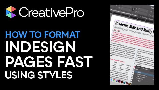
How to Format InDesign Pages Fast Using Styles
Learn the incredible power of the Next Style feature in InDesign, which lets you...