
Four Great Ways to Emphasize Text
A step-by-step guide for directing the reader’s eye with with highlighting, pull-quotes, borders, and anchored graphics


This article appears in Issue 147 of InDesign Magazine.
In this article, I’m going to give you a few formatting techniques that go beyond the ordinary bold or italic to call attention to text in InDesign. I’ll also throw in a bunch of tips along the way. Here’s my first tip: Don’t overdo it. A little emphasis goes a long way. You wouldn’t apply bold, italic, caps, and underlines all to the same text, right? (Please say no.) Similarly, don’t mix gaudy colors, fancy stroke styles, and funky fonts—unless “over-the-top” is what you’re going for. It’s usually best to pick one approach and stick with it throughout the document.
Adding a Highlighter Effect
Remember pulling out your highlighter marker to drag over an important paragraph in a textbook? One highlighter was never enough for me. I used to color code my notes with yellow, pink, orange, and blue—my very own reading rainbow. InDesign can create the look of a highlighter in any color you like, and of course, you can save it as a character style. Select a word. In the Control panel, click the Underline button to apply a line under the word. Now, hold the Option or Alt key and click the Underline button again to open the Underline Options dialog box. You can also open this dialog from the panel menu at the very right of the Control Panel; choose Underline Options (Figure 1).

Figure 1. Either Option/Alt-click the Underline button in the Control panel or choose Underline Options from the Control Panel menu.
Make sure the Underline is turned on (along with the Preview checkbox). Change the color to yellow and Tint to 40%, or whatever color and tint you desire. Set Weight to a few points larger than the size
of the text you have selected. Experiment to find an Offset value that centers the large underline nicely above and below the text. Larger values push the underline further down, smaller values push the underline up. Most likely, you’ll end up with a slightly negative number (Figure 2). Click OK.
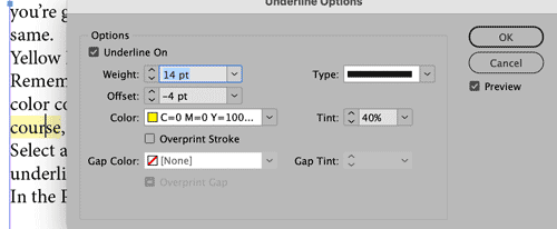
Figure 2. Here are my settings for creating a highlighter effect.
With the highlighted text selected, create a new character style, name it highlighter, and away you go! Of course, you can then duplicate the style and create variations with other colors if you need them. And unlike the highlighters of our youth, these will never run dry or smudge the lettering. Tip: Don’t forget that you can also assign keyboard shortcuts to quickly apply your style to selected text. One of the complaints I have about this highlighting effect is that the yellow doesn’t extend past the letters on either side. To work around this, you can use Find/Change to surround the highlighted text with thin spaces, which are also highlighted (Figure 3).

Figure 3. The look of the highlighter with (top) and without (bottom) the extra thin spaces added in by the Find/Change query.
After you’ve highlighted all the text you want to, choose Edit > Find/Change and click the GREP tab at the top of the panel. In the “Find what” field, type (.+) where the . means “any character,” the + means “or more,” and the parentheses tell InDesign to remember all these characters as “found text” to be put back in the “Change to” field. In the “Change to” field type ?~<$1~< where ~< indicates a thin space (you can find the code in the menu @ > White Space > Thin Space) and $1 represents the found text. Another thin space follows the found text. In the bottom part of the Find/Change dialog, click in the Find Format area and specify that you want to find only characters that are using the highlighter character style. Then, click the Change Format option and choose the same highlighter character style to format all the text, including the thin spaces. I’d suggest running this GREP Find/Change only after all your text is final and the highlights are put in place. Otherwise, you’ll end up with two or more spaces around some of the highlighted words, depending on how many times you run this Find/Change. Tip: Want the ends of the highlight to be rounded instead of square? Set the underline stroke Type to Dotted, then set the Gap to the same color and tint (Figure 4).

Figure 4. When you set Tint and Gap Tint to the same colors, a dotted stroke becomes a rounded highlighter effect.
Highlighting with Custom Edges
Want even more freedom to customize the look of your highlighter effect? You can add all kinds of unique looks to the edges of the highlighting with anchored objects. See this post for the details.
Adding a Pull Quote
Formatting text as a pull quote is a tried-and-true technique that will draw the reader’s eye to an important bit of text. This trick will format the entire paragraph within a story, so you don’t have to put the pull quote in a separate frame, and it will flow with the rest of the text. Or, if you don’t want it to ever move, you can simply put the text in a separate frame and use the pull quote paragraph style. I love setting up pull quotes because I get to use to use a bunch of cool InDesign tricks to accomplish the job (Figure 5).

Figure 5. This pull quote can be formatted within the paragraph. Notice the soft return after the first quote and the Right Indent Tab before the last quote.
First, make sure you have a hard return (use the Return or Enter key) above and below the paragraph of text you’d like to use as your quote. Using the Control panel, add .5 in (3 p) of Space Before and Space After the paragraph. Then change the font—use something that’s attractive and contrasts with the body text font, but not so fancy that it sacrifices readability. Increase Font Size to about 4–6 points larger than the body text. Also consider changing the color and increasing the leading, if desired. Type in a curly quote mark (“) at the beginning of the quote, by choosing Type > Insert Special Character > Quotation Marks > Double Left Quotation Mark. Then type a soft return (Shift+Return/Enter) to make the rest of the paragraph move to the next line, but not make it another paragraph. Select the quote mark and increase the size, choose a font which makes a cool quote (I used Aquatic Heavy), and change the baseline shift, color, and tint. With the quote selected, create a new character style, and name it First Quote. At the end of the quote paragraph, type a right curly quote (”). Put your cursor in front of the quote and press Shift+Tab to add a Right Indent Tab (or choose Type > Insert Special Character > Other > Right Indent Tab). This will push the quote mark to align with the right indent of the paragraph. Select the closing quote, apply the First Quote character style, and then adjust the baseline shift to fit nicely. Make a new character style named Last Quote, based on the First Quote style but with a different baseline shift value. If you need to make any changes to the color, font, or size of both quotes, you need to change only the First Quote style, because it is the “parent” style. Now, put your cursor in the paragraph (be sure not to select either of the quotes). Make a new paragraph style named Pull Quote. In the Paragraph Rules area of the dialog box, turn on the Rule Above. Set the color, offset, and left indent to make the line start after the quote. Make sure to turn on the Preview option to see how the settings are affecting the line. Do the same for the Rule Below (make sure to choose Rule Below and turn on the checkbox), and modify the right indent to accommodate the large Last Quote. Now for maximum efficiency, make a GREP style to automatically apply the two quote character styles where they are needed. Edit the Pull Quote paragraph style. Go to the GREP Style area of the dialog box. For Apply Style, choose the character style First Quote. For To Text, click the @ menu and choose Quotation Marks > Double Left Quotation Mark. Add another GREP Style by clicking the New GREP Style button, and repeat the same process for the closing quote, applying the Last Quote character style to the Double Right Quotation Mark (Figure 6).

Figure 6. Use the GREP Style settings in the paragraph style to automatically apply the character styles to the first and last quotes.
Now, each time you need a pull quote, simply add a return before the paragraph, type the quote, and press Shift+Return/Enter. Then at the end of the paragraph, add the Right Indent Tab and closing quote mark. With the magic of GREP, your pull quote paragraph style will now apply both character styles and the paragraph style all at once!
Bafflingly Bold
Using a bold font is one of the most basic ways to emphasize text. And if you’ve been using InDesign for more than one day, you’ve probably learned the keyboard shortcut for applying bold: Command/Ctrl+Shift+B. What could be simpler, right? Well… not always. Check out this post for some reasons why that keyboard shortcut can give you unexpected results, depending on the font you’re using.
Adding a Square (or Line) to the Start of a Paragraph
Borders don’t always need to be applied around a paragraph. You can apply a thick border just to the left side of a paragraph to make a square for a heading, or apply a colored vertical line along the left of a multi-line paragraph. These decorative accents will move with the paragraph and are applied with a paragraph style. Format your headline text with a bold font and a larger size than the body text. In this example, I’m using 16 pt for my headline. With your cursor in the paragraph, go to the Control Panel menu and choose Paragraph Borders and Shading. Turn on the Border option at the top and the Preview option at the bottom of the dialog box. Reduce the stroke weight to 0 for all sides. Click the chain link between the strokes to unlink the values and increase the stroke for the left side only to 10–20 pts. Change the color and tint as desired. You can also experiment with a Round Cap or Projecting Cap for different looks. Click the chain link to unlink the Offsets, and increase the Left value to move the mark away from the text. To alter the shape and vertical position of the mark, adjust the Top Edge and Bottom Edge values. Make sure to save this in a paragraph style, so it’s easy to apply and change if need be (Figure 7).

Figure 7. Use Paragraph Borders and Shading to add a square to the left of a heading.
Note: If this left-side border technique is applied to a multi-line paragraph, then it will grow and shrink with the number of lines in the paragraph. This is one of my favorite ways to call more attention to a paragraph, and you can also combine it with a font change to bring even more emphasis (Figure 8).
Figure 8. Example of a border applied only to the left side of the paragraph
Adding an Icon or Photo
Another way to call attention to a heading or paragraph of text is to add an anchored object to the left of a paragraph. The anchored object can be a graphic of any sort—a photo, icon, colored frame, text frame, arrow, line, even a group of frames—which is anchored to the paragraph. Naturally, the main benefit of anchoring the graphic is that it moves with the text as words are added or deleted. Start by creating a text frame, and fill it with a heading and three or more paragraphs. Create a separate text frame, and type the word LOOK in it. Choose a font, color the text Paper (white), fill the frame with a color, and center the text vertically and horizontally. (You can also place a photo or icon in a small frame.) Select the LOOK frame and drag the little square at the top-right corner. The color of this square depends on the layer that the frame resides on. Don’t drag the yellow square, which is for creating rounded corners. Drag this little square into the text, and release it at the beginning of the Heading paragraph. With the LOOK frame selected, choose Object > Anchored Object > Options. Set the Anchored Object Reference Point to the top-right corner. Now, set the Anchored Position Reference Point to the left of the page, and for X Relative To choose Text Frame. The X Offset is how far the top-right corner of the LOOK text frame sits from the left edge of the frame that contains the story (modifying X Offset moves the LOOK box left and right). For Y Relative To, choose Line (Baseline). The Y Offset is how far the top-right corner of the LOOK text frame sits from the baseline of the text into which the LOOK frame was anchored (modifying Y Offset moves the LOOK box up and down) (Figure 9).
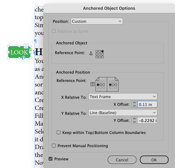
Figure 9. The Anchored Object Options settings to hang an anchored frame outside of a text frame
If you turn the Preview option on, you can change the X and Y Offsets to see exactly how they move the LOOK frame and position it as desired. If you’d like to copy and paste the LOOK frame, already anchored and in position in front of another paragraph of text, select the Yen (“Y”) hidden character in front of the text (Type > Show Hidden Characters). Copy and paste it to another part of the text.
Made in the Shade
Want to see more creative ways for calling attention to an entire paragraph? Check out Steve Laskevtich’s article on designing with Borders and Shading in Issue #144.
Make Your Mark
Use these techniques to draw attention to particular words, phrases, and paragraphs, and feel free to adapt them as you like. Experiment and come up with new eye-catching looks. Just remember as I mentioned at the beginning of the article: A little emphasis goes a long way. Think of it as a bit of spice to add flavor to your designs and get the intended message across to the reader.
Commenting is easier and faster when you're logged in!

Recommended for you

Accentuating Paragraphs With Borders and Shading
How to use borders and shading features to make your designs pop by adding a col...
Moving Side-tabs Using Only One Master Page and Chartwell Bars
Colin Flashman devises a clever technique with section markers, anchored objects...

The Burns Effect: Using Anchored Objects in Nonintuitive Ways
Here's a trick from Diane Burns that lets you make a text frame expand (or shrin...