
Don’t tell Jonathan Hoefler or Tobias Frere-Jones, but I have such a crush on their typefaces. Seriously — when I see just about anything from them for the first time I can only gaze at it, slack-jawed, practically drooling, for hours. (My crushes aren’t the prettiest things.)
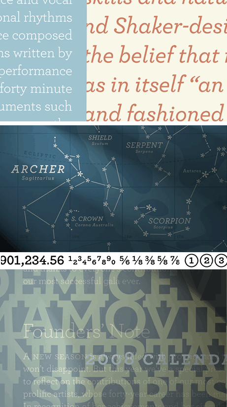
I’m similarly passionate about one of their newest releases, Archer, although I’ve seen it for years in the pages of Martha Stewart Living. Now us mere mortals can buy Archer, a slab serif with a many-faceted personality. The least expensive package, which contains 10 styles, is $199. The top of the line is $399 and includes 40 styles in eight weights.
Ready to drool? Take a look at these samples:

What are your type crushes? I dare you to post them in the Fonts and Typesetting Forum!
This article was last modified on December 17, 2022
This article was first published on March 12, 2008
Commenting is easier and faster when you're logged in!

Recommended for you
Titling Fonts Are Hard to Find But Hard to Beat
Once upon a time — that is, before the industrial and electronic revolutio...
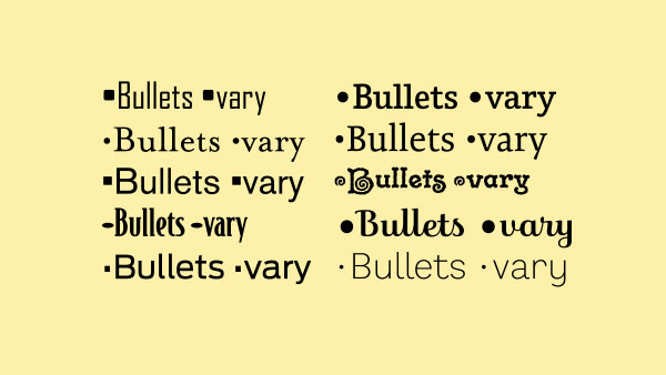
TypeTalk: The Ins and Outs of Bullets
Default bullet points aren't your only option. Follow these tips to customize yo...
Think You Know What OpenType Is? Think Again! Part 2
OpenType is today’s font format of choice for design professionals. Compared to...