Designing Books
In in-depth look at the process of designing a book from start to finish, through the eyes of a veteran designer and teacher.

This article appears in Issue 105 of InDesign Magazine.
Designing a book is a challenge that combines time-honored aesthetics, a sound knowledge of InDesign’s long document features, and an openness to resourceful workarounds. Whether you’re laying out a novel, a technical document, or a treatise, the fundamentals are the same: you want to build a publication that is easy to read, easy to navigate, and—because you’ll inevitably need to make changes along the way—easy to update.
That said, each book is also very different, and so there is no one-size-fits-all approach to designing or creating a book in InDesign. However, in this article I will guide you through the design of one book, explaining my thinking and technique along the way, in hopes that the tour will be enjoyable and educational.
Choosing the Page and Margin Size
The size and aspect ratio of a book is a profound design decision. If this choice is within your remit—i.e., if the page size isn’t presented as a fait accompli by the client or publisher—here are some things to consider to make sure your choice best suits the content and the reader.
A quick glance at any bookshelf confirms that the majority of books are tall (portrait) in orientation. But if your book is
heavily illustrated and the images are predominantly horizontal, a square, or possibly landscape, format might be suitable.
In the New Document dialog box, I’ll select Primary Text Frame (Figure 1), because a novel—a continuous text flow—is where primary text frames work best.
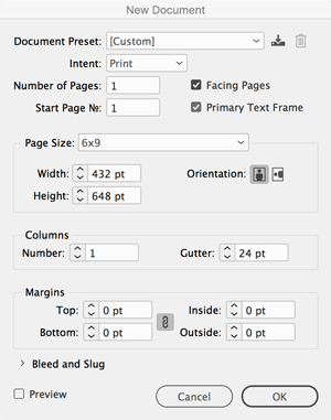
Figure 1. Setting up the new document.
(It’s not essential to use a primary text frame, but this feature allows me to later apply a different master page to a document page if I need to, ensuring that the text continues to flow properly.)
I choose a page size of 6 × 9 inches—a popular size for trade paperbacks, but more importantly, a page with a 2:3 aspect ratio—proportions that minds far greater than mine have long considered ideal for a book page.
I start with the margins at 0. Once in the document, on the master page spread, I adapt the page canon identified by Jan Tschichold (1902–1974) in his studies of medieval manuscripts to determine the size of the margins. Divide the page into 9 rows and 9 columns with zero gutters for both. Assign one-ninth of the width to the inside margin, two-ninths to the outside margin, one-ninth to the top, and two-ninths to the bottom. The resulting type area has the same proportions as the page, and the height of the type area equals the page width (Figure 2).
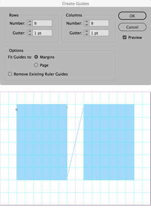
Figure 2. Using Jan Tschichold’s “golden canon of page construction” dividing the page into ninths to yield margin proportions 2 (inside):3 (top):4 (outside):6 (bottom}.
But… the margins are so big that—to the modern eye—they look extravagant. I’m designing the book to be valued, rather than as a piece of ephemera, but even so I don’t want to appear profligate. To strike a balance, I decrease the size of the bottom and outside margins (Figure 3).

Figure 3. Updating the margins for more practical usage. The dotted line shows the margins suggested by the Van de Graaf canon as identified by Jan Tschichold. The tinted cyan frames indicate my adapted type area.
The result allows for an extra line and a slightly wider column measure but still provides a pleasing frame around the type area and sufficient space for the reader’s fingers and thumb to hold the book.
Crucially, the type area is now wide enough to allow for between 55–70 characters per line, meaning that, with the right settings, I can achieve well justified type (Figure 4).

Figure 4. Use the Info panel to count the number of characters per line.
Cleaning Up the Text
Having placed and flowed the text into my document pages (using my primary text frame), my next steps involve cleaning up the text. You know the sort of thing: removing unwanted spaces, extra carriage returns, and trailing white space. For these tasks I often use the predefined GREP queries in the Find/Change dialog box (Figure 5).

Figure 5. Purging unwanted returns and spaces by choosing a preset from the Query menu.
In addition, I use Find/Change and a page-by-page scan of the document to fix things like em dashes, ellipses, and quote marks. Because I find the em dash too wide in many fonts, I often reduce its width and add a small space on either side, as in Figure 6.

Figure 6. Em dashes and surrounding spaces at 80% width (top) and 100%.
(I avoid thin spaces or sixth spaces around the em dashes, as these are non-breaking and will make the job of justifying the text harder.) For this I use a character style with a horizontal width of 80% (though, as with so many recipes, you should “season to your own taste”). It may seem a bit early to be getting so detailed, but it’s best to make these changes at the outset. One way to handle these adjustments is with a GREP style.
I also cross-check the document with the manuscript (in this case, a PDF) for any instances of text that should be italicized, and I apply an italic character style. Because character styles are relative, they will adjust to whatever paragraph style is later applied.
Choosing the Type
Now I can turn my attention to choosing the typeface(s). Working with a historical text, I want the typeface to support this. Do I choose a typeface popular when the text was written (1883) or do I opt for a typeface that evokes the time in which the novel is set (1750s)? An obvious choice that ticks both boxes is Caslon—specifically, Carol Twombly’s revival Adobe Caslon Pro, which, as well as meeting the top-line job description, also has a wide range of OpenType features like real small caps, oldstyle numerals, and swash characters that I need (Figure 7). (A swashbuckling adventure must, of course, include typographic swashes.)

Figure 7. Adobe Caslon and Tribute on Typekit.
So, for my first draft it was Caslon all the way. And then, through no fault of its own (it’s me, not Caslon), I got bored. I opted instead for Tribute—a Caslon-esque oldstyle from Emigre Fonts and, crucially, because I didn’t want to incur any further expense, available on Typekit. Ultimately, I felt like Tribute had more personality—and to be honest, it was new and exciting. The fact that there was no supporting bold weight, rather than dissuading me, was just the sort of constraint I like and made it all the more attractive. After all, nineteenth century printers rarely used bold weights in book typography. This felt authentic: one typeface, with one supporting italic.
It’s always better to make such important design decisions up front, but if you’re using paragraph styles, which of course I am, then changing your mind isn’t a big deal.
Composing the Text
The book follows a simple format: chapter number, chapter title, a particular first paragraph, and then body (Figure 8).
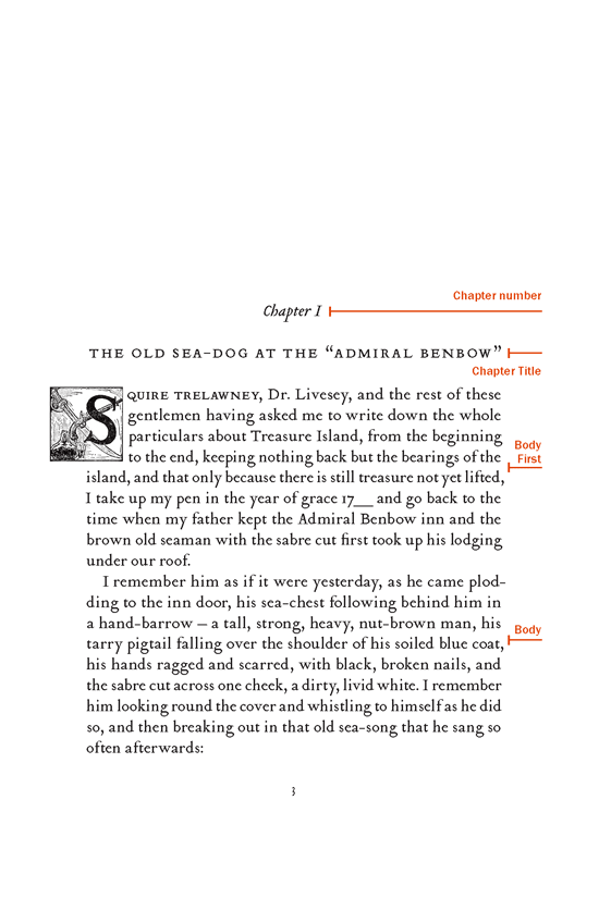
Figure 8. The basic sequence of styles, repeated for all chapters in the book.
And repeat, repeat, repeat for 34 chapters. There are some passages to be indented, and of course the table of contents, the front matter, and the captions, but for the most part the formatting is easy and repetitious.
The simplest approach to applying these styles is to select all the text and apply the “body” paragraph style. I then apply the chapter number style, which includes a Keep option that forces chapters to begin on a new page (Figure 9).

Figure 9. The Chapter Number style includes the Keep option to start on a new page; once that’s applied, the document will immediately acquire some structure.
The formatting of chapter numbering in the original manuscript was inconsistent, so to clean things up I used Find/Change to replace the existing text with an auto-numbered paragraph style. This includes uppercase roman numeral numbering, as per the original manuscript, and the word “Chapter” as a prefix (Figure 10).

Figure 10. Auto numbering the chapter style. The GREP Find/Change here looks for any digit followed by a return and replaces it with just a blank return.
Because the chapter title always follows the chapter number, I use the wonderful “Fix Paragraph Style Pairs” script from Thomas Silkjaer. This script allows you to run a find/change operation on the styles applied to pairs of sequential paragraphs (Figure 11).

Figure 11. Two applications of the Fix paragraph style pairs script whips the document into shape in no time.
When styles need to be applied in a predictable way, this script can save a lot of time.
Then, because the chapter title style is always followed by the body first style, I run the script a second time to complete most of the paragraph styling.
With just three paragraph styles applied—with a Find/Change query and a script—the book is instantly transformed from an amorphous mass of text into a structured, readable document. As is often the case with such projects, it takes 5% of the time to get the content mostly in place, and the other 95% to finish the job. But it’s that intense work of finessing the details that makes all the difference.
My primary objective with the body text is to achieve a good type color or density. Both ragged right and justified alignment have their challenges. I prefer justified type for books, and here the challenge is to avoid big and varying gaps between the words. Hyphenating the text helps, but I’ll want to change InDesign’s default H&J (hyphenation and justification) settings, because.… well, because they suck.
The hyphenation settings in my body paragraph styles ensure that only words with a minimum of 7 characters can be hyphenated, that there are no two-letter stubs, and that no laddering is caused by consecutive hyphens (Figure 12).

Figure 12. My preferred, stricter, hyphenation settings result in fewer hyphens.
Plus, I certainly don’t want to see hyphenation in the last word of a paragraph or when a word breaks across a page or column.
Next, my custom justification settings reduce the variation in the size of the word spacing. In order to do this, I allow a small variation in the letter spacing: just +/–2% (Figure 13).

Figure 13. Combined with the hyphenation settings, these justification settings result in a more even type color.
And I set a small variation—just 98–102%—in the Glyph scaling (the horizontal scale of the letters). Changing the proportions of letterforms can make purists twitchy, but such a minor fluctuation at 12 pt (my chosen type size) will be virtually imperceptible (Figure 14).

Figure 14. Glyph scaling is a fallback when word spacing and letter spacing can’t achieve the required justification settings. This figure shows the worst-case scenario in terms of horizontal width scaling, which is still almost unnoticeable.
It is a small price to pay for such an overall improvement.
Enabling Optical Margin Alignment (OMA) in the Story panel (Type > Story)—that lovely feature that consistently punches above its weight—further strengthens the sharpness of the right edge (Figure 15).

Figure 15. Page 60 using the custom H&J settings combined with Optical Margin Alignment. The page to the right shows the size of the word spaces (To learn how to do this, see this InDesignSecrets article). There are no hyphens, and the variation in word spacing is less than that in the second example (below), which uses the default H&J settings and no Optical Margin Alignment.

Figure 15. Continued from previous page. Default H&J settings, no Optical Margin Alignment.
OMA pushes punctuation and hyphens at the end of the line beyond the right edge of the frame. (Note that this will later need to be ignored for my numbered TOC styles.)
My H&J settings, combined with an appropriately wide column measure, mean I can achieve even spacing for the majority of lines. However, to alert me to any problems, I turn on the Show H&J Violations checkbox in the Composition pane of the Preferences dialog box (Figure 16).

Figure 16. Turn on H&J violations to see at a glance where there are spacing problems in the text.
Keep in mind that H&J Violations does not show bad spacing, per se, but rather highlights where InDesign is unable to honor the settings you’re requesting. As with all settings that impose constraints on the type, something has to give, and we can’t expect miracles.
I next add GREP styles to the body text paragraph style to prevent short last lines and also to avoid single words—such as I, A , and salutations like Mr., Mrs, Dr.—from occurring at the end of a line (Figure 17).

Figure 17. The GREP Style settings applied to the body paragraph style. The first, and most important, ensures that there will be at least 8 characters (including punctuation) on the last line of the paragraph. You can see that every fix comes at a price—in this case, causing looser word spacing on the first line of the paragraph, as indicated by the yellow highlighting of the H&J Violations.
My reasoning is more nuanced than simply saying “Don’t end a paragraph with a single word.” The point of zapping short last lines (or “runts”) is to avoid trapped white space between the last line of one paragraph and the first line indent of the next. If the paragraph ends with a single word that is a long word, significantly wider than the first line indent of the following paragraph, I don’t consider it a problem, and “fixing” it might create a spacing issue where none currently exists.
With text that contains many short paragraphs of dialog, there are bound to be widows and orphans: last and first lines of paragraphs that get stranded at the top or bottom of pages. It’s important to be realistic. We can’t fix everything—not because we’re settling for less than excellence, but because all these restrictive fixes that we apply can, if we’re not careful, end up making things look worse. For that reason, I’m less bothered by widows that straddle a facing page, choosing instead to target those that occur over a page turn. You can control widows and orphans using the settings in the Keep Options panel of the Paragraph Styles dialog box, or choose Keep Options from the Control panel menu to set it on a paragraph-by-paragraph basis (Figure 18).
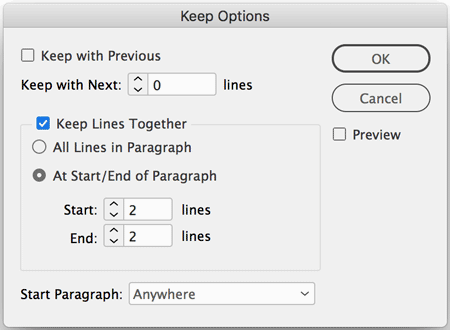
Figure 18. Keep Options lets you avoid single paragraph lines at the top of the page (widows) or bottom of the page (orphans) by “gluing” the lines together.
Another way to massage away typographic troubles is to apply a cautious amount of negative tracking to the text, no more than –10 (10/1000 of an em). For maximum control, I have my Kerning/Tracking preference set to 1 in Units & Increments (Figure 19).

Figure 19. After setting the Kerning/Tracking keyboard shortcut increment to 1 (see below), I can fine-tune the tracking of this paragraph to fix the widow line, “slowly, end for end…” at the bottom of page 177, that would otherwise have been pushed to the top of page 178. The green highlight is due to my settings in the Composition preferences dialog box.
I also turn on the Composition preference Custom Tracking/Kerning so I can spot at a glance where tracking is applied. When you’re trying to fix a widow or orphan, keep in mind that the fix may lie in a paragraph that comes earlier in the text. Everything you do at this point will have a ripple effect. That can be bad or it can be good.
Another trick up my sleeve (and let’s keep this between us) is that on those chapters where the tracking won’t shift stubborn widows and orphans, I apply a variant of the chapter number style that has one less line space above it. (I discuss how I control that spacing in “Styling the Chapter Opening Pages,” below.) These choices are in part about where you’re willing to compromise. I feel this is where a compromise can be made, because the reader is unlikely to compare the size of the top margin from one chapter to the next (Figure 20).

Figure 20. To gain a line when needed, this variant of the chapter number style has one less line space above it. While the document is in progress, I’ll often change the text color of these “alternate” styles, so that I can spot them at a glance as I move through the document. (Of course, then I need to remember to change the color back at the end.)
With all of these measures to prevent composition problems, use a light touch. First, do no harm. Keep in mind that every fix has potentially negative consequences. We want to make sure that the cure is an improvement, not a step backwards.
And now the real work begins.
Adding Page Numbers and a Running Header
Now let’s turn our attention to the shape of the page, outside the margin guides. Of course, we want to add page numbers and running heads to our document master page. However, before adding the text frames for the folio, add guides around the type area. Choose Layout > Create Guides, and opt for 1 row, 1 column, fitted to the margins (Figure 21).
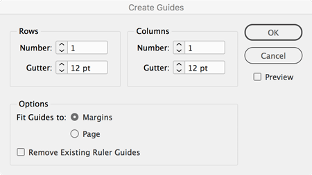
Figure 21. Adding guides around the type area.
If you want only vertical guides, set Row to zero. Now you know exactly how wide to draw the text frames to align them with the type area.
After adding text frames in the correct position (one on each facing page), add the auto page number characters (from Type > Insert Special Character > Markers), and, for the running header, use text variables (more on those in a minute). In positioning the header and footer items, I want to ensure that I’m repeating the spacing values used in the text. Using a temporary frame as a “measuring stick” helps achieve this (Figure 22).

Figure 22. The distance between elements is visually consistent.
So that the left and right page numbers mirror each other, set up your paragraph style (I usually call it “folio”) to use the Align Away from Spine horizontal alignment, and then a center tab for the publication name/running header (Figure 23).

Figure 23. Align the page numbers to the outside margins using
Align Away From Spine. Center
the title with a center tab.
Normally, running-header text variables are relatively straightforward: you define one in Type > Text Variables > Define, tell it to grab the chapter title paragraph style, and then insert that variable in the running header text frame. So that’s how I started out in this book, but quickly realized it wouldn’t work because some of the chapter titles are too long! Unfortunately, text variables don’t wrap across multiple lines, so they just get squished in the header text frame! The solution? Use a character style text variable (Figure 24).
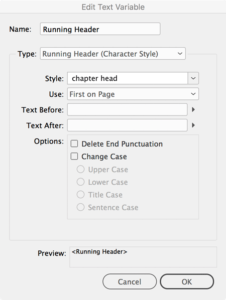
Figure 24. Defining the Running Header text variable.
Create a separate character style and, in each chapter title, manually apply it to the text you want to appear in the running head. (You can read more about this solution here.)
Styling the Chapter Opening Pages
Each chapter’s opening page requires its own treatment. I don’t want to see a running header, and I also want a much bigger top margin, to provide a visual pause between chapters (Figure 25).
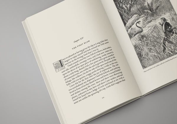
Figure 25. The chapter opener requires more visual space.
The most obvious solution is to create a second master page, based on Master A. And that does work, but the problem here—and anyone experienced with long documents will have run into this—is that if the text reflows, you’re likely to end up with a chapter opening master page applied to a document page and vice versa.
My solution is to stick with just a single master page, and to incorporate both the larger margin and “no-header” into the chapter number paragraph style. That sounds strange, so let me explain. I’ll apply both a Rule Above and a Rule Below to the chapter number paragraph style—the first, with a Color set to None, to move the chapter number a specified distance from the top margin; the second, with a color set to Paper, to “white out” the header (old-school PageMaker style; Figure 26).
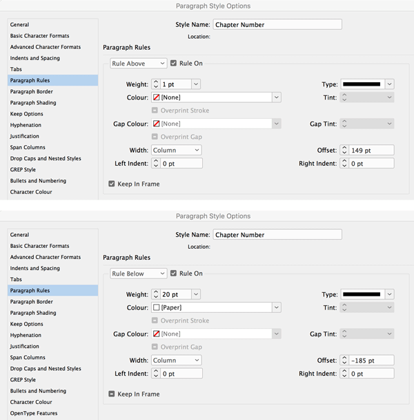
Figure 26. The paragraph rules that move the text down (rule above) and “white out” the header (rule below) rely on large, specific Offset values.
Using this approach, the text can flow freely, and you don’t need to worry about what master page goes where. Paragraph rules aren’t intended to be used this way, but that’s not going to stop me.
This technique leaves us with chapter opening pages that are no longer numbered. To address this, I’ll anchor a text frame containing a page number marker. Get it right once, create an object style to capture the anchored object settings (Figure 27), apply the style to the object, and then copy the object to all the other chapter openers.

Figure 27. The page number frame is anchored relative to the spine so that it will work on left and right pages.
Because I have a lot of chapters, I decided to supercharge this step by copying the anchored frame to the clipboard and using a GREP Find/Change to paste the contents of the clipboard at the beginning of every chapter (Figure 28). For more on this trick, see this InDesignSecrets article.
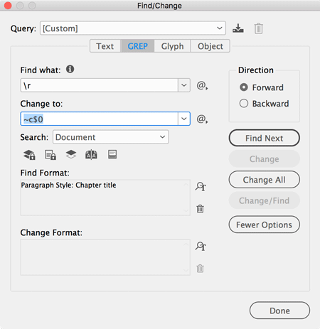
Figure 28. Using a GREP Find/Change to paste the anchored page number on every chapter opening page.
While on the subject of the chapter headings, I should also mention this book contains several sections. These each start on a new recto (right-hand page), and I’ve used the Type Contextual Controls to add swash characters to the initial letters manually, as well as, where appropriate and available, to the last character (Figure 29).
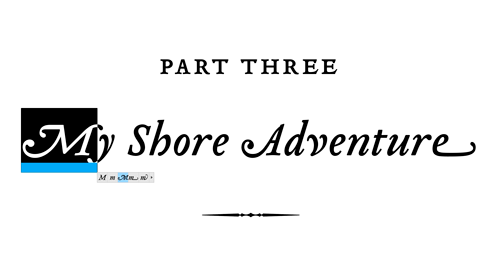
Figure 29. The Type Contextual Controls allow you to choose from available alternates for the selected character.
This, like the slow and deliberate work of adjusting the type composition to fit the page, is simply one of the tasks that must be stepped through manually and with aesthetic consideration.
Then, with the help of the Glyphs panel, I add an ornament from Adobe Wood Type Ornaments after each section title (Figure 30).
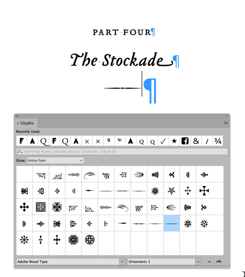
Figure 30. Use the Glyphs panel to find the ornament you’re after.
Editing the Images and Adding the Captions
It’s time to add the images to our book. In our case, the images were not cleanly scanned, so they require minor editing in Photoshop: straightening with the Perspective Crop tool to fix minor distortions, and a Levels adjustment to set the white point to pure white. I also apply a Smart Sharpen filter to crisp up the detail. While the cropping requires individual attention, the Levels and sharpening are applied as an Action. While in Photoshop, I also choose File > File Info, and type the image’s caption into the Description field.
Back in InDesign, I choose Object > Caption > Caption Setup, and specify how I want my captions to appear—which metadata and which paragraph style to use, as well as choosing to group the image with a caption (Figure 31).

Figure 31. Adding the image metadata and setting up the captions before applying a caption to each of the images. Final result shown in bottom image.
Because I will need to create captions many times (once for each image), I like to assign a keyboard shortcut to the Object > Captions > Create Static Caption menu command. By the way, I’m using static captions rather than live captions because the latter won’t word wrap across lines, while static captions will.
Anchoring the Images
Technically, the biggest challenge of the book is to anchor the illustrations. Because they are contextual—that is, they are captioned with a line from the text on the facing page—it’s essential that they be precisely positioned and move with the text. Similarly, the initial caps at the beginning of each chapter must flow with the paragraph.
As you may know, anchored objects and text wraps don’t always play nicely together: when a text wrap is applied to an anchored object (as in the case of our initial caps), the first line of the paragraph to which the graphic is anchored fails to wrap. This means jumping through some hoops. For example, we can anchor the initial caps in the preceding paragraph, the chapter title.
However, full page illustrations force me deep into the land of “Workaround.” Here’s the trick I use: create a blank paragraph for the anchored object. With hidden characters shown, drag the object’s anchor marker (the little blue square in the upper-right corner of the frame or group) to the front of the paragraph mark. Set the point size of all the text in this paragraph to 0.1 and the leading to zero. Save this as paragraph style. Then adjust the anchored object settings to position the graphic exactly where it should go. After some trial and error, I came up with the settings in Figure 32.

Figure 32. The anchored object options of the object style applied to the images determines their position, once anchored in the text.
However, this won’t work if you’re using a baseline grid (which of course I am). No matter how small you make the leading value, InDesign insists on making the line be one grid increment (15 points in this book).
The solution is to turn off Align to Grid for the text. Then tease, rather than force, the text onto the grid using a combination of a first baseline offset (yes, that obscure option you’ve spent years ignoring) and leading, and ensuring that the total spacing of all paragraphs is a multiple of the leading (Figure 33).
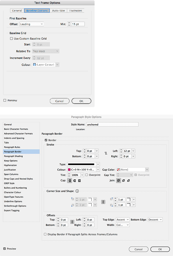
Figure 33. Setting up the anchored image and caption groups.
Another problem is that the “invisible” paragraphs to which the images are anchored are just that: invisible, almost impossible to find in layout view when you need to. So while the book is in production, add a colored border to the paragraph, and then offset the border beyond the left of the text frame (Figure 33).
That way, you can spot at a glance where your images are anchored (Figure 34). Just remember to turn this off before you go to press.
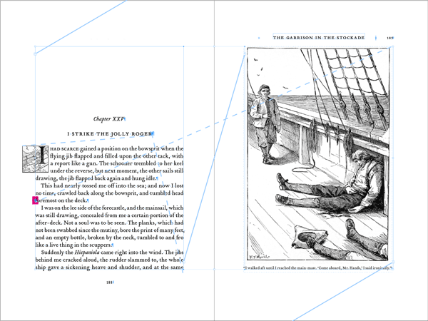
Figure 34. The anchored objects. The dashed lines indicate where in the body text the objects are anchored. Notice the color shading to the left of the text, providing another quick visual indicator where the hard-to-select paragraph is. Just remember to turn off the border before you finish!
To Book…or Not to Book
InDesign’s Book feature will allow you to manage multiple chapters as a “Book” and then control the styles and page numbering across that Book. Some people love this feature. I’m not one of them.
I do all I can to avoid the Book feature. If you’re part of a team, with different members working simultaneously on individual chapters, and/or your pages are graphically dense, then you need the Book feature. However, if you’re working by yourself and the book’s structure is simple, why complicate things? I prefer to work with one long document; that way I can flit back and forth from the front of the book to the back with ease, and I don’t need to worry about synchronizing styles or updating page numbers. Some might say this is living dangerously: a single long document is more prone to error and you have all your proverbial eggs in one basket. To which I say, use Save As to increment the document regularly and you’ll be fine.
Creating the Front Matter
Because I want the page numbering to start with the text itself, I define part one as a new section (Figure 35).
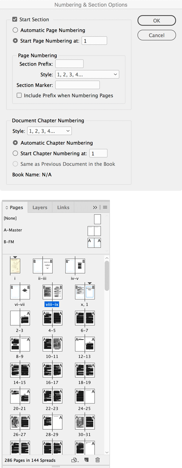
Figure 35. Creating a new section to combine two number styles within the same document.
This means I have two numbering styles in the document: to avoid confusion about which is the real number 1 when printing, for example, I define the numbering style of the front matter as roman numerals, even though I don’t plan to have these numbers visible on the document pages.
Generating the TOC is easy: using Layout > Table of Contents, choose which paragraph styles to include and what styles to apply to the generated text (Figure 36).

Figure 36. The Table of Contents style specifies what paragraph styles to include in the TOC and how they will be styled. Note that a character style “dot leader” is applied to the space between the entry and the number.
It may take some back and forth to get it exactly how you want it. Once the settings are correct, be sure to capture them in a TOC Style—especially since this document requires two tables of contents and we’ll need to distinguish one from the other (Figure 37).

Figure 37. This book has two tables of contents, seen in this mockup.
Recreating the indents of the original document is quite a challenge. It involves adding numbering to the TOC Body Text paragraph style, right-aligning the auto numbers with a combination of left and first line indents, and using a right indent tab to ensure the page numbers are aligned properly. It’s also necessary to have the style ignore Optical Margin Alignment, since that feature causes problems with bulleted or numbered paragraphs (Figure 38).

Figure 38. TOC Body Text paragraph style settings include a Numbering Style and Ignore Optical Margin.
I used the Table of Contents feature a second time to create the list of illustrations. It’s here that I implement the seldom-needed negative Last Line Indent (with a positive Right Indent) to push the page number beyond the right edge of the text (Figure 39).

Figure 39. Using a right indent (12 pt) combined with a negative last line indent (–12 pt) pushes the page numbers out beyond the text, making them more prominent.
Putting it Together
Of course, there are always many other little things that come up when designing and laying out a book. For example, in this particular book, I noticed that the spacing of “g J” (as in Long John) needed attention. So I created a custom a GREP style to loosen the tracking on this particular sequence of characters. And I made various other tweaks and refinements—but what you’ve seen here are essentially the steps I took when laying out this book.
The order in which I took these steps is more or less how they are presented, but of course, in reality, nothing is ever quite so linear. Personally, no matter how methodical I try to be, there are always things that I miss first time around, and this means going back and forth, experimenting with different settings, finding that certain approaches might not work, and adopting others.
With this in mind, my advice is to stay flexible and open to new techniques, use a light touch when fixing “problems,” approach the tasks globally through the use of styles, while at the same time keeping an eagle eye out for exceptions, anomalies, and anything else that requires individual attention. With the knowledge and equipment you have available, your project should turn out to be, well, a treasure.
Commenting is easier and faster when you're logged in!
Recommended for you

InDesign Magazine Issue 65: Long Documents
We’re happy to announce that InDesign Magazine Issue 65 (September, 2014) i...

Targeting Character Ranges with GREP
Learn how to find a sequential range of letters or numbers using GREP in InDesig...


