
Designing with Text Reflections and Cast Shadows
Maya P. Lim shows how to add lighting effects like cast shadows and reflections to type.


This article appears in Issue 117 of InDesign Magazine.
Creating text reflections is fun and easy with InDesign. With this simple typographic trick, you can add an elegant, edgy, or mysterious dimension to an otherwise flat design. And this can look especially fitting if the content has a thematic connection with shininess, mirrors, or shadows. In this article, I’ll show you how to make a reflection, and some ways to apply this technique to create different visual styles.
Creating a Basic Reflection
Follow these simple steps to get started making reflections.
Create the type
In InDesign, drag out a text box, and type the word you want to reflect. Descenders (the parts of letters that hang down below the baseline, in characters such as a lowercase g) will ruin the effect, so you must use a word or typeface without them (or apply all caps). This is also the time to kern the type carefully, so you won’t have to kern the reflection to match later on. Then, to make the frame fit snugly against the text, choose Object > Fitting > Fit Frame to Content (or press Command+Option+C/Ctrl+Alt+C) (Figure 1).
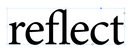
Figure 1. Prepare your (flat-bottomed) text to see double!
Duplicate the text frame
Click on the text frame, copy it, and paste a duplicate of the entire frame onto your page. With the duplicate frame selected, choose Object > Transform > Flip Vertical (Figure 2).

Figure 2. Flip the text vertically.
Drag the duplicate frame so its top lines up exactly with the bottom of the original frame (Figure 3). You now have a reflection of your original word, with the kerning
intact.

Figure 3. A perfect mirror image
Add a gradient feather
Now, let’s make it look like a reflection. With the upside-down text frame still selected, go to the Effects menu (Window > Effects), and double-click on Text, which opens a dialog box. Click on Gradient Feather in the Transparency list on the left (Figure 4).

Figure 4. The Effects dialog box for text
Turn the Preview checkbox on. In the Options section, set the angle to 90°. Make sure the Type is set to Linear. Then, drag the gradient stops to get the look you want. To achieve the effect shown in Figure 5, I kept the left and right stops set at the ends of the slider, and adjusted the midpoint to a location of 15%. You can also adjust the Opacity value of each stop. For this effect, I set the left stop to 60% opacity. Click OK when you’re done. That’s it!
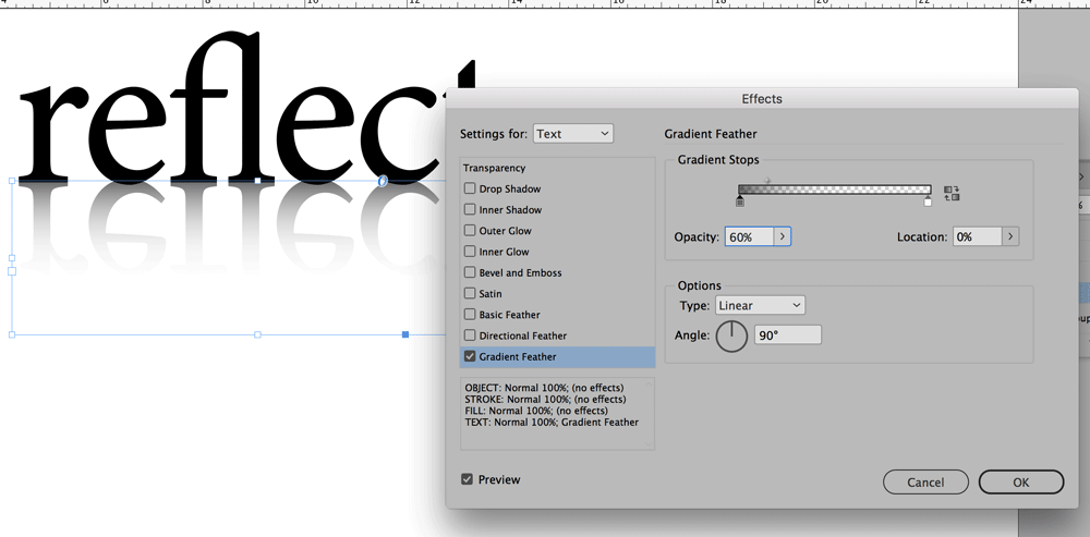
Figure 5. Adjusting just the midpoint produces this very shiny effect.
Inspiration and Advanced Tips
Feeling confident? Great—you’ve already got the basics down. Here are a few fancier methods for you to try.
3D…2…1…
You can create a 3D effect with your text, which makes it look like the word is an object casting a reflection, like in the sticker label for a photography studio shown in Figure 6. This was created by applying the Bevel And Emboss effect to the text.

Figure 6. The Bevel And Emboss effect is found in the Effects panel.
Clever with cursive
Working with a script typeface can be tricky, since adding a reflection can make the text harder to read. To prevent that, make the reflection fainter by decreasing its opacity either with the gradient slider controls (Figure 4) or in the Control panel or Effects panel (Figure 7).
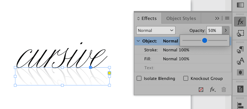
Figure 7. When you use the Control or Effects panel, you’re actually reducing the opacity of the whole text frame.
Combining a reflection with a script typeface can be a very elegant look, which can work well when you need to create something that implies sophistication, luxury, and elegance, like a champagne label (Figure 8).
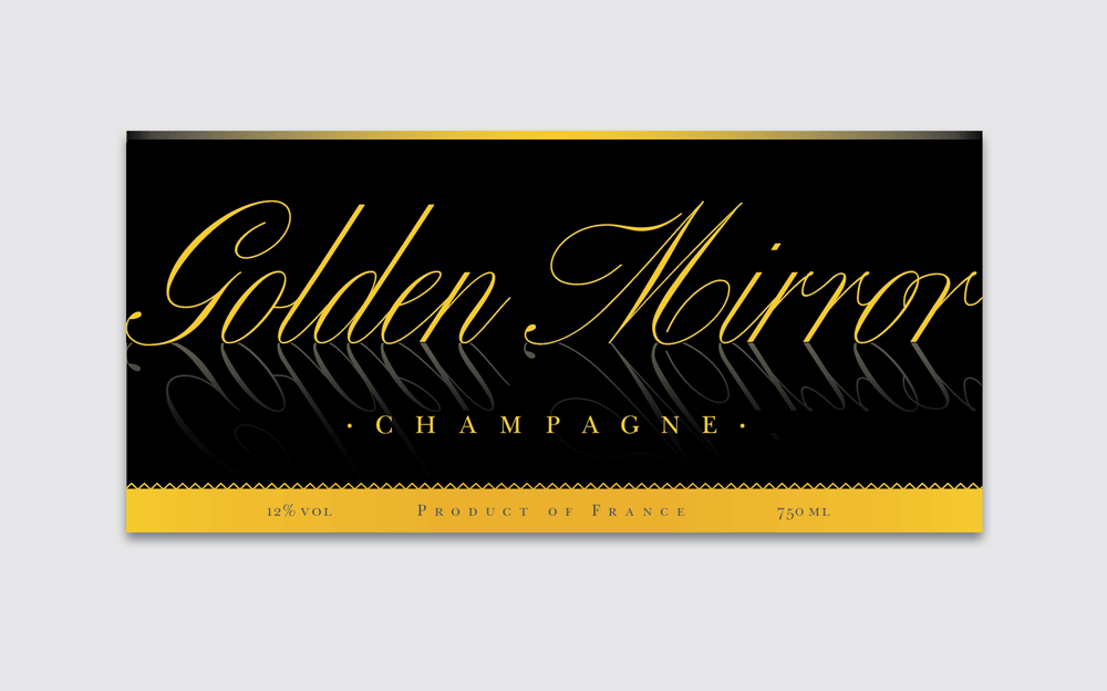
Figure 8. Makes it look pretty fancy, doesn’t it?
Effective color
You can also apply colored gradients to your text to create other lighting effects. Figure 9 shows a business card for a glassblowing company, with the words themselves appearing like glass being fired. Note the subtle reflection at the bottom.
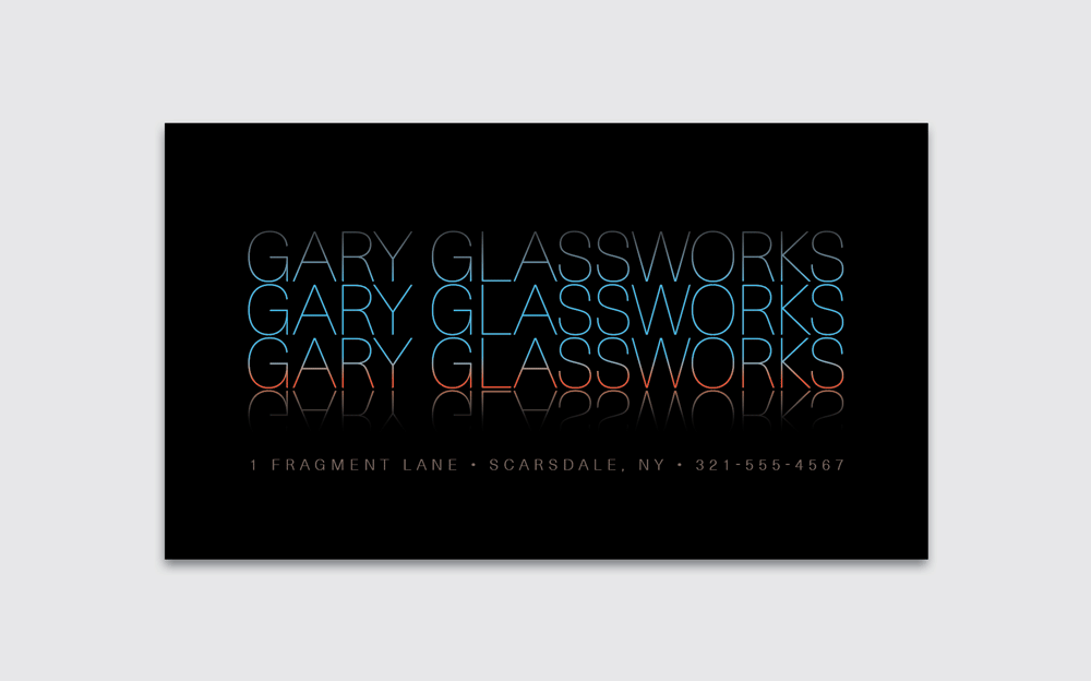
Figure 9
Creating Cast Shadows
You can also skew copies of a text frame to create the look of a cast shadow. To do this, duplicate the frame by copying it, and then choose Edit > Paste in Place. Send the duplicate frame behind the original (Object > Arrange > Send Backward). Then choose Object > Transform > Shear. Adjust the angle as desired, and set the text color to something shadowy (a medium light gray is a good starting point). Then apply a Gradient Feather so the shadow appears to fade out as it gets farther from the text. Since the shadow mingles with the main text, make it subtle so it doesn’t compromise legibility. Figure 10 shows an example of a shopping bag with the name of the company casting ghostly shadows like trees in a misty forest.

Figure 10
Upon Further Reflection…
You can create dozens of engaging designs with reflected text. Just remember to avoid descenders, kern before duplicating the text frame, go subtle for more legibility, and consider using this technique on subject matter that has some connection to reflectivity or shadows. What will you make? Share with us on Twitter @InDesignMag.
Commenting is easier and faster when you're logged in!

Recommended for you

InDesign 102
David Blatner is your guide for what to to tackle after you’ve mastered the basi...
Use Split Window when Applying Colors to Text
How to fix the problem of seeing selected text in inverted colors in InDesign.

Holiday FX: Do You Want to Build An InDesign Snowman?
Do you want to build a snowman? Come on let’s go and play! I know that thi...