

Here’s a quick design tip on choosing background colors from issue 51 of Before&After Magazine.
Generally speaking, background colors that will look best are in, or related to, the colors in the photos of your layout. Background colors can complement or contrast and be light, dark, subtle or bold.
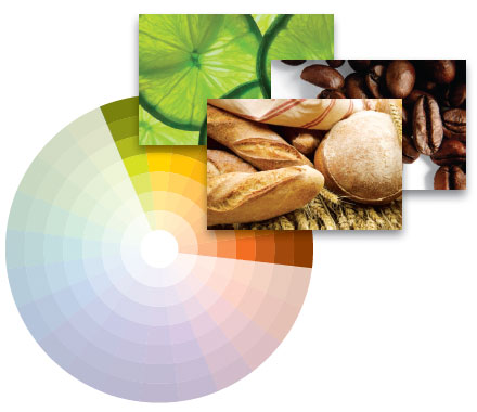
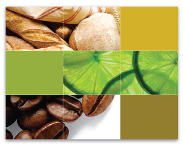
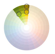
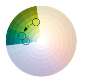
Check out your colors To see what you’re working with, start by placing each photo on the color wheel according to its dominant color. In this case, we see that the colors are clustered in a fairly narrow band from lime green to orange—only one third of the wheel.
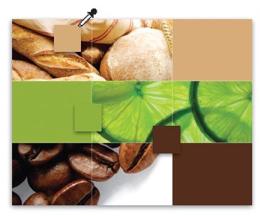
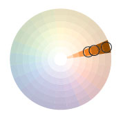
Colors from the images When your photos are as similar as ours are, colors can be eyedroppered directly. The dominant colors of each image will always go together and are often perfect (and so easy!), but if they feel a little flat
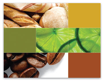
Colors in the range … a fuller, more dimensional look can often be found nearby. Just move up or down a color column or over one.
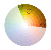
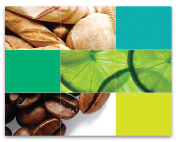
Analogous colors Analogous colors are sideby-side on the wheel and always look good together. The differences are subtle and usually beautiful.
Monochromatic colors Monochromatic colors are light and dark versions of the same hue and always work together.

Outside the range A few columns outside the naturally occurring range can yield beautiful additions that work because they have color in common with an original.
© John McWade/Before & After Magazine, courtesy of Gaye Anne McWade.
Want more great design tips like this? Access to the archive of Before&After Magazine is just one of the many benefits of a CreativePro Membership.
This article was last modified on June 25, 2025
This article was first published on May 27, 2025
Commenting is easier and faster when you're logged in!

Recommended for you
Before&After: Callout Ideas
Pull your reader into a story by using these eye-catching techniques for callout...

Before&After Design Tip: Using Many Photos? Display Them in a Grid!
A beautifully simple way to display a group of photos
Before&After: Design Your Own Christmas Cards
This 16-page article from issue 42 of Before&After Magazine shows you how easy i...